Flutter Appbar 控件介绍
一、使用方法
AppBar({Key key,this.leading,//在标题前面显示的一个控件,在首页通常显示应用的logo;在其他界面通常显示为返回按钮this.automaticallyImplyLeading = true,//控制是否应该尝试暗示前导小部件为nullthis.title,//当前界面的标题文字this.actions,//一个 Widget 列表,代表 Toolbar中所显示的菜单,对于常用的菜单,通常使用 IconButton 来表示;对于不常用的菜单通常使用 PopupMenuButton 来显示为三个点,点击后弹出二级菜单this.flexibleSpace,//一个显示在 AppBar 下方的控件,高度和 AppBar 高度一样,可以实现一些特殊的效果,该属性通常在 SliverAppBar 中使用this.bottom,//一个 AppBarBottomWidget 对象,通常是 TabBar。用来在 Toolbar 标题下面显示一个 Tab 导航栏this.elevation = 4.0,//? 材料设计中控件的 z 坐标顺序,默认值为 4,对于可滚动的 SliverAppBar,当 SliverAppBar 和内容同级的时候,该值为 0, 当内容滚动 SliverAppBar 变为 Toolbar 的时候,修改 elevation 的值this.backgroundColor,//APP bar 的颜色,默认值 ThemeData.primaryColor。改值通常和下面的三个属性一起使用this.brightness,//App bar 的亮度,有白色和黑色两种主题,默认值为 ThemeData.primaryColorBrightnessthis.iconTheme,//App bar 上图标的主题 包括 颜色、透明度、和尺寸信息。默认值为 ThemeData().primaryIconThemethis.textTheme,//App bar 上的文字样式。默认值为 ThemeData().primaryTextThemethis.primary = true,//此应用栏是否显示在屏幕顶部this.centerTitle,//标题是否居中显示,默认值根据不同的操作系统,显示方式不一样,true居中 false居左this.titleSpacing = NavigationToolbar.kMiddleSpacing, //横轴上标题内容 周围的间距this.toolbarOpacity = 1.0, //顶部的工具栏部分的透明度 <=1.0this.bottomOpacity = 1.0,//bottom的工具栏部分的透明度 <=1.0})
二、常用属性
在标题前面显示的一个控件,在首页通常显示应用的logo;在其他界面通常显示为返回按钮
leading: Icon(_selectedChoice.icon) ,
控制是否应该尝试暗示前导小部件为null
automaticallyImplyLeading:true ,
当前界面的标题文字
title: Text(_selectedChoice.title )
一个 Widget 列表,代表 Toolbar 中所显示的菜单,对于常用的菜单,通常使用 IconButton 来表示;对于不常用的菜单通常使用 PopupMenuButton 来显示为三个点,点击后弹出二级菜单
actions: <Widget>[new IconButton( // action buttonicon: new Icon(choices[0].icon),onPressed: () { _select(choices[0]); },),new IconButton( // action buttonicon: new Icon(choices[1].icon),onPressed: () { _select(choices[1]); },),new PopupMenuButton<Choice>( // overflow menuonSelected: _select,itemBuilder: (BuildContext context) {return choices.skip(2).map((Choice choice) {return new PopupMenuItem<Choice>(value: choice,child: new Text(choice.title),);}).toList();},)],
一个显示在 AppBar 下方的控件,高度和 AppBar 高度一样,可以实现一些特殊的效果,该属性通常在 SliverAppBar 中使用
// flexibleSpace: Container(// color: Colors.blue,// width: MediaQuery.of(context).size.width,// child: Text("aaaaaaaaaa"),// height: 10,// )
一个 AppBarBottomWidget 对象,通常是 TabBar。用来在 Toolbar 标题下面显示一个 Tab 导航栏
bottom: new TabBar(isScrollable: true,tabs: choices.map((Choice choice) {return new Tab(text: choice.title,icon: new Icon(choice.icon),);}).toList(),)
材料设计中控件的 z 坐标顺序,默认值为 4,对于可滚动的 SliverAppBar, 当 SliverAppBar 和内容同级的时候,该值为 0, 当内容滚动 SliverAppBar 变为 Toolbar 的时候,修改 elevation 的值
elevation: 1
APP bar 的颜色,默认值为 ThemeData.primaryColor。改值通常和下面的三个属性一起使用
backgroundColor: Colors.red,
App bar 的亮度,有白色和黑色两种主题,默认值为 ThemeData.primaryColorBrightness
brightness:Brightness.light ,
App bar 上图标的颜色、透明度、和尺寸信息。默认值为 ThemeData().primaryIconTheme
iconTheme: ThemeData().iconTheme,
App bar 上的文字主题。默认值为 ThemeData().primaryTextTheme
textTheme: ThemeData().accentTextTheme,
此应用栏是否显示在屏幕顶部
primary: true,
标题是否居中显示,默认值根据不同的操作系统,显示方式不一样,true居中 false居左
centerTitle: true,
横轴上标题内容 周围的间距
titleSpacing: NavigationToolbar.kMiddleSpacing,
顶部的工具栏部分的透明度 <=1.0
toolbarOpacity:1.0,
bottom的工具栏部分的透明度 <=1.0
bottomOpacity: 0.5,
三、一个完整的例子
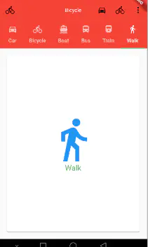
import 'package:flutter/material.dart';import 'ChoiceCard.dart';void main() => runApp(MyApp());class MyApp extends StatelessWidget{@overrideWidget build(BuildContext context) {return MaterialApp(title: 'Text Demo',theme: ThemeData(primarySwatch: Colors.green),home: AppbarPageDemo(title: 'Text Demo'),);}}class AppbarPageDemo extends StatefulWidget {AppbarPageDemo({Key key, this.title}) : super(key: key);final String title;@override_AppbarPageDemoState createState() => _AppbarPageDemoState();}class _AppbarPageDemoState extends State<AppbarPageDemo>{Choice _selectedChoice = choices[0]; // The app's "state".void _select(Choice choice) {setState(() { // Causes the app to rebuild with the new _selectedChoice._selectedChoice = choice;});}@overrideWidget build(BuildContext context) {var _name = "flutter ";return DefaultTabController(length: choices.length,child: Scaffold(appBar: AppBar(//1.在标题左侧显示的一个控件,在首页通常显示应用的 logo;在其他界面通常显示为返回按钮leading: Icon(_selectedChoice.icon) ,//2. ? 控制是否应该尝试暗示前导小部件为nullautomaticallyImplyLeading:true ,//3.当前界面的标题文字title: Text(_selectedChoice.title ),//4.一个 Widget 列表,代表 Toolbar 中所显示的菜单,对于常用的菜单,通常使用 IconButton 来表示;//对于不常用的菜单通常使用 PopupMenuButton 来显示为三个点,点击后弹出二级菜单actions: <Widget>[new IconButton( // action buttonicon: new Icon(choices[0].icon),onPressed: () { _select(choices[0]); },),new IconButton( // action buttonicon: new Icon(choices[1].icon),onPressed: () { _select(choices[1]); },),new PopupMenuButton<Choice>( // overflow menuonSelected: _select,itemBuilder: (BuildContext context) {return choices.skip(2).map((Choice choice) {//skip 跳开前面的两条数据return new PopupMenuItem<Choice>(value: choice,child: new Text(choice.title),);}).toList();},)],//5.一个显示在 AppBar 下方的控件,高度和 AppBar 高度一样,// 可以实现一些特殊的效果,该属性通常在 SliverAppBar 中使用// flexibleSpace: Container(// color: Colors.blue,// width: MediaQuery.of(context).size.width,// child: Text("aaaaaaaaaa"),// height: 10,// ),//6.一个 AppBarBottomWidget 对象,通常是 TabBar。用来在 Toolbar 标题下面显示一个 Tab 导航栏bottom: new TabBar(isScrollable: true,tabs: choices.map((Choice choice) {return new Tab(text: choice.title,icon: new Icon(choice.icon),);}).toList(),) ,//7.? 材料设计中控件的 z 坐标顺序,默认值为 4,对于可滚动的 SliverAppBar,// 当 SliverAppBar 和内容同级的时候,该值为 0, 当内容滚动 SliverAppBar 变为 Toolbar 的时候,修改 elevation 的值elevation: 1,//APP bar 的颜色,默认值为 ThemeData.primaryColor。改值通常和下面的三个属性一起使用backgroundColor: Colors.red,//App bar 的亮度,有白色和黑色两种主题,默认值为 ThemeData.primaryColorBrightnessbrightness:Brightness.light ,//App bar 上图标的颜色、透明度、和尺寸信息。默认值为 ThemeData().primaryIconThemeiconTheme: ThemeData().iconTheme,//App bar 上的文字主题。默认值为 ThemeData().primaryTextThemetextTheme: ThemeData().primaryTextTheme,//此应用栏是否显示在屏幕顶部primary: true,//标题是否居中显示,默认值根据不同的操作系统,显示方式不一样,true居中 false居左centerTitle: true,//横轴上标题内容 周围的间距titleSpacing: NavigationToolbar.kMiddleSpacing,//顶部的工具栏(toolbar)部分的透明度 <=1.0toolbarOpacity:0.8,//bottom的工具栏(tabbar)部分的透明度 <=1.0bottomOpacity: 0.8,),body : TabBarView(children: choices.map((Choice choice) {return new Padding(padding: const EdgeInsets.all(16.0),child: new ChoiceCard(choice: choice),);}).toList(),),));}}const List<Choice> choices = const <Choice>[const Choice(title: 'Car', icon: Icons.directions_car),const Choice(title: 'Bicycle', icon: Icons.directions_bike),const Choice(title: 'Boat', icon: Icons.directions_boat),const Choice(title: 'Bus', icon: Icons.directions_bus),const Choice(title: 'Train', icon: Icons.directions_railway),const Choice(title: 'Walk', icon: Icons.directions_walk),];
作者:sometime-rock
链接:https://juejin.im/post/5c909c4e6fb9a070d7557284
来源:掘金
著作权归作者所有。商业转载请联系作者获得授权,非商业转载请注明出处。

若有收获,就点个赞吧
0 人点赞
