一、概述
先来看两个概念,了解过渡与动画:
过渡:元素可动画属性的计算值产生变化时,需要以怎样的方式过渡到目标值。可以定义过渡时间和过渡函数来控制过渡动画的效果,默认行为是瞬间切换成变化后的结果,即无动画。
动画:使用
@keyframes预定义一系列动画进程中的关键帧,关键帧中可以指定任意可动画属性的值,然后只需要应用动画到你想要的元素上并指定时间,次数,缓动函数,状态,动画结束后的行为等。
二者都会让你的页面元素动起来,区别在于:
过渡(Transition)
- 需要事件触发,比如
hover、click等; - 一次性的;
- 只能定义开始和结束状态,不能定义中间状态;
动画(Animation)
- 不需要事件触发;
- 显示地随着时间的流逝,周期性的改变元素的 CSS 属性值,区别于一次性。
- 通过百分比来定义过程中的不同形态,可以很细腻。
二、忆往昔
我们先来简单回顾一下在CSS中如何实现过渡与动画效果。
1. Transition in CSS
<script setup lang="ts">import { reactive } from 'vue';const classNames = reactive({transition: false});const onButtonTap = () => {classNames.transition = !classNames.transition;}</script><template><div class="box" :class="classNames"></div><button type="button" @click="onButtonTap">Toggle</button></template><style scoped>.box {width: 100px;height: 100px;margin-bottom: 16px;background-color: red;transition: .5s background-color linear;}.transition {background-color: blue;}</style>
演示效果:

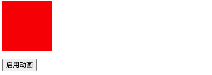
2. Animation in CSS
<script setup lang="ts">import { reactive } from 'vue';const classNames = reactive({ani: false,});const onButtonTap = () => {classNames.ani = true;};</script><template><div class="box" :class="classNames"></div><button type="button" @click="onButtonTap">启用动画</button></template><style scoped>@keyframes ani {to {transform: translateX(300px);background-color: blue;}}.box {width: 100px;height: 100px;margin-bottom: 16px;background-color: red;}.ani {animation: ani 2s linear 1 forwards;}</style>
演示效果:
三、过渡 & 动画
接下来,我们一起了解在 Vue 中,如何使用过渡与动画。
1. 基本使用
Vue 内置组件 <transition /> 在下面情况中,可以给任何元素和组件添加进入和离开动画。
- 条件渲染:
v-if或者v-show - 动态组件:
component - 组件根节点
2. 过渡类名
在进入/离开的过渡中,会有 6 个 class 切换。
| 类名 | 描述 |
|---|---|
v-enter-from |
定义进入过渡的开始状态 |
v-enter-active |
定义进入过渡生效时的状态 |
v-enter-to |
定义进入过渡的结束状态 |
v-leave-from |
定义离开过渡的开始状态 |
v-leave-active |
定义离开过渡生效时的状态 |
v-leave-to |
离开过渡的结束状态 |
注意:假设
transition设有name属性,class 名将v-替换为name 属性值-。比如:
<transition name="fade >",那么v-enter-from将被替换为fade-enter-from,以此类推。

3. 单元素/组件过渡
3.1. CSS 过渡
CSS 过渡是最常用的过渡类型之一,举例:
<script setup lang="ts">import { ref } from 'vue';const visible = ref(true);</script><template><button type="button" @click="visible = !visible">Toggle</button><transition name="slide-fade"><div v-show="visible" class="box"></div></transition></template><style scoped>.box {width: 100px;height: 100px;margin-top: 16px;background-color: red;}/* 可以为进入和离开动画设置不同的持续时间和动画函数 */.slide-fade-enter-active {transition: all 0.75s ease-out;}.slide-fade-leave-active {transition: all 1s cubic-bezier(1, 0.5, 0.8, 1);}.slide-fade-enter-from,.slide-fade-leave-to {transform: translateX(300px);opacity: 0;}</style>
效果演示:
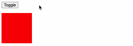
上述示例,点击 Toggle 按钮,切换元素显示状态,使得元素向右位移 300 像素,透明逐渐为0隐藏元素,呈现元素效果相反。
3.2. CSS 动画
CSS 动画用法同 CSS 过渡,区别是在动画中 v-enter-from 类在节点插入 DOM 后不会立即移除,而是在 animationend 事件触发时移除。
<script setup lang="ts">import { ref } from 'vue';const visible = ref(true);</script><template><button type="button" @click="visible = !visible">Toggle</button><transition name="bounce"><div v-show="visible" class="box"></div></transition></template><style scoped>.box {width: 100px;height: 100px;margin-top: 16px;background-color: red;}.bounce-enter-active {animation: bounce-in 0.5s;}.bounce-leave-active {animation: bounce-in 0.5s reverse;}@keyframes bounce-in {0% {transform: scale(0);}50% {transform: scale(1.25);}100% {transform: scale(1);}}</style>
代码解读:
1)上述示例中,通过
@keyframes定义bounce-in动画,该动画从0开始缩放到1.25倍再调整到1倍,所以有会一种从无到有,先放大再缩回原始尺寸的效果。2)隐藏元素时同样使用
bounce-in动画,不过增加了reverse关键字,该关键字的作用和显示的动画刚好相反,让预定义动画反向执行。
效果演示:

3.3. 自定义类名 & animate.css
我们可以通过以下属性来自定义过渡类名:
enter-from-classenter-active-classenter-to-classleave-from-classleave-active-classleave-to-class
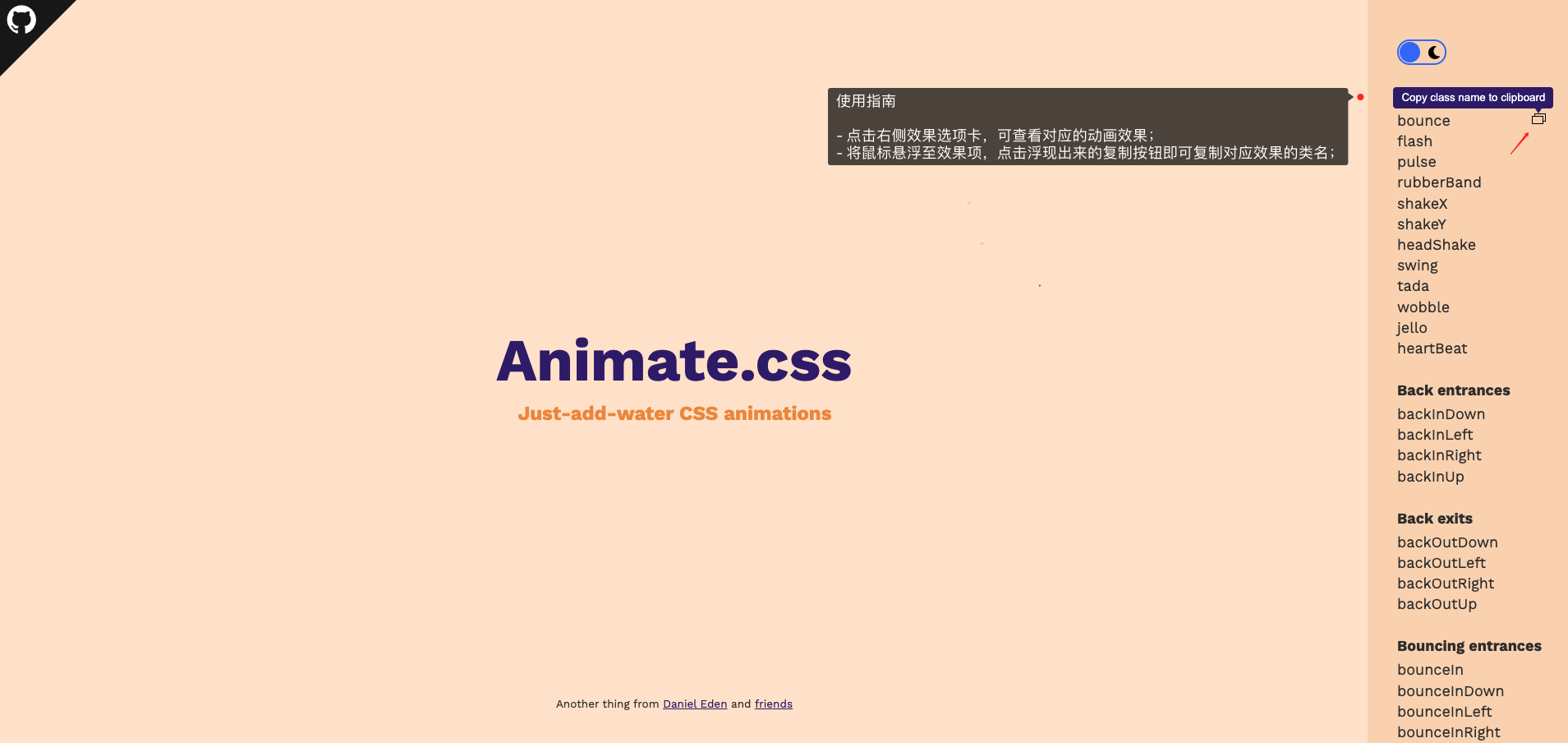
它们的优先级高于普通的类名,当你希望将其它第三方 CSS 动画库与 Vue 的过度系统相结合时十分有用,比如 Animate.css。
接下来我们尝试使用 Animate.css:
Steps 1:安装 animate.css
$ npm install animate.css
Steps 2:导入
import 'animate.css'
Steps 3:打开 Animate.css >> 官网,选择效果并复制效果类名(class name)
应用示例:
<h1 class="animate__animated animate__bounce">An animated element</h1>
提示:
animate__animated这个 className 一定要 加上,不能省略。
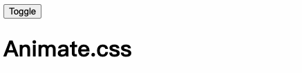
Steps 4: 编写代码,粘贴效果类名(class name)
<script setup lang="ts">import { ref } from 'vue';const visible = ref(true);</script><template><button type="button" @click="visible = !visible">Toggle</button><transitionenter-active-class="animate__animated animate__bounceIn"leave-active-class="animate__animated animate__slideOutRight"><h1 v-show="visible">Animate.css</h1></transition></template>
效果演示:
3.4. 同时使用过渡和动画
Vue 为了知道过渡何时完成,必须设置相应的事件监听器。它可以是 @transitionend 或 @animationend,这取决于给元素应用的 CSS 规则。如果你只使用了其中一种,Vue 能自动识别其正确类型。
但是,在一些场景中,你需要给同一个元素同时设置两种过渡动效,比如有一个通过 Vue 触发的 CSS 动画,并且在悬停时结合一个 CSS 过渡。在这种情况中,你就需要使用 type 属性并设置 animation 或 transition 来显式声明你需要 Vue 监听的类型。
3.5. 显性的过渡持续时间
Vue 在 <transition> 组件上提供 duration 属性显式指定过渡持续时间 (以毫秒计):
<transition :duration="1000">...</transition>
你也可以分别指定进入和离开的持续时间:
<transition :duration="{ enter: 500, leave: 800 }">...</transition>
3.6. JavaScript 钩子函数
可以在 属性 中声明 JavaScript 钩子:
<transition@before-enter="beforeEnter"@enter="enter"@after-enter="afterEnter"@enter-cancelled="enterCancelled"@before-leave="beforeLeave"@leave="leave"@after-leave="afterLeave"@leave-cancelled="leaveCancelled":css="false"><!-- ... --></transition>
- 和之前在 CSS 中的类名类似,这些钩子函数会在过渡到了对应阶段调用;
cancelled是在过程中撤销操作,才会回调;enter和leave对应的钩子函数有两个参数:el:参与动画的元素;done:过渡过程是否完成;
css:false:使元素设置的动画 CSS 失效;
4. 初始渲染的过渡
可以通过 appear 属性设置节点在 初始渲染(即页面在初始化的时候就执行一次动画) 的过渡:
<transition appear><!-- ... --></transition>
5、多元素过渡
对于原生标签可以使用 v-if/v-else 。最常见的多标签过渡是一个列表和描述这个列表为空消息的元素:
<transition><table v-if="items.length > 0"><!-- ... --></table><p v-else>Sorry, no items found.</p></transition>
实际上,通过使用 v-if/v-else-if/v-else 或将单个元素绑定到一个动态属性,可以在任意数量的元素之间进行过渡。例如:
<transition><button v-if="docState === 'saved'" key="saved">Edit</button><button v-else-if="docState === 'edited'" key="edited">Save</button><button v-else-if="docState === 'editing'" key="editing">Cancel</button></transition>
可以重写为:
<script setup lang="ts">import { ref, computed } from 'vue';const docState = ref('saved');const buttonMessage = computed(() => {switch (docState.value) {case 'saved':return 'Edit';case 'edited':return 'Save';case 'editing': return 'Cancel';}});</script><template><transition><button :key="docState">{{buttonMessage}}</button></transition></template>
@过渡模式
<transition> 的默认行为 - 进入和离开同时发生,即 上一个组件还在消失的过程中,但下一个组件已经在出现过程中。我们看看一组示例:
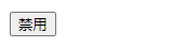
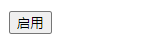
<script setup lang="ts">import { ref, computed } from 'vue';// -- 定义 buttonState 形状(TS语法)type ButtonStateType = 'disable' | 'enable';// -- 定义 buttonState 变量,其类型为 ButtonStateTypeconst buttonState = ref<ButtonStateType>('disable');</script><template><transition><button type="button" v-if="buttonState === 'enable'" @click="buttonState = 'disable'">禁用</button><button type="button" v-else @click="buttonState = 'enable'">启用</button></transition></template><style scoped>@keyframes move-in {from {transform: translateX(100px);opacity: 0;}to {transform: translateX(0);opacity: 1;}}button {/* 为了方便查看效果,使用绝对定位使其重叠在一起 */position: absolute;}.v-enter-active {animation: move-in 1s linear;}.v-leave-active {animation: move-in 1s linear reverse;}</style>
示例效果:

可以看到,在多组件切换时,进入和离开是同时发生的。同时生效的进入和离开的过渡不能满足所有要求,所以 Vue 提供了 过渡模式
in-out:新元素先进行进入过渡,完成之后当前元素过渡离开。out-in:当前元素先进行离开过渡,完成之后新元素过渡进入。
语法形式如下:
<transition mode="in-out"><!-- ... the buttons ... --></transition>
接下来,我们切换两种模式查看效果:
**in-out**
**out-in**
不难发现,in-out 和 out-in 模式刚好相反。
四、列表过渡
目前为止,关于过渡我们已经讲到:
- 单个节点
- 多个节点,每次只渲染一个
那么怎么同时渲染整个列表,比如使用 v-for?在这种场景下,我们会使用 <transition-group> 组件。在我们深入例子之前,先了解关于这个组件的几个特点:
- 默认情况下,它不会渲染一个包裹元素,但是你可以通过
tag属性 指定渲染一个元素。 - 过渡模式不可用,因为我们不再相互切换特有的元素。
- 内部元素 总是需要 提供唯一的
key属性值。 - CSS 过渡的类将会应用在内部的元素中,而不是这个组/容器本身。
1. 列表的进入& 离开过渡
现在让我们由一个简单的例子深入,进入和离开的过渡使用之前一样的 CSS 类名。
<script setup lang="ts">import { reactive } from 'vue';const state = reactive({list: [1, 2, 3, 4, 5, 6],nextNum: 7,});// methodsconst randomIndex = () => Math.floor(Math.random() * state.list.length);// eventsconst onInsert = () => {state.list.splice(randomIndex(), 0, ++state.nextNum);};const onRemove = () => {state.list.splice(randomIndex(), 1);};</script><template><!-- 按钮 --><button type="button" @click="onInsert">INSERT</button><button type="button" @click="onRemove">REMOVE</button><!-- 列表渲染 --><transition-group name="list" tag="div" class="list"><div class="item" v-for="item in state.list" :key="item">{{ item }}</div></transition-group></template><style scoped>button {margin-right: 10px;margin-bottom: 16px;cursor: pointer;}.item {display: inline-block;margin-right: 10px;}.list-enter-active,.list-leave-active {transition: all 1s ease;}.list-enter-from,.list-leave-to {opacity: 0;transform: translateY(30px);}</style>
示例效果:
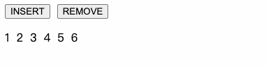
这个例子有一个问题,当添加和移除元素的时候,周围的元素会 瞬间移动 到它们的新布局的位置,而不是平滑的过渡,我们下面会解决这个问题。
2. 列表的移动过渡
为了解决上述示例在添加元素时瞬间移动的问题,可以使用新增的 **v-move** 类,它会应用在元素改变定位的过程中。像之前的类名一样,它的前缀可以通过 name 属性来自定义,也可以通过 move-class 属性手动设置。
v-move 对于设置过渡的切换时机和过渡曲线非常有用,继续上述的例子,我们通过 Lodash >> 打乱集合顺序。
首先安装 loadash:
$ npm install lodash$ npm install @types/lodash --save-dev
修改示例代码:
<script setup lang="ts">// +++import _ from 'lodash';// +++import { reactive } from 'vue';const state = reactive({list: [1, 2, 3, 4, 5, 6],nextNum: 7});// methodsconst randomIndex = () => Math.floor(Math.random() * state.list.length);// events// +++const onShuffle = () => {// 打乱集合顺序state.list = _.shuffle(state.list);};// +++const onInsert = () => {state.list.splice(randomIndex(), 0, ++state.nextNum);};const onRemove = () => {state.list.splice(randomIndex(), 1);};</script><template><!-- +++ --><button type="button" @click="onShuffle">SHUFFLE</button><!-- +++ --><button type="button" @click="onInsert">INSERT</button><button type="button" @click="onRemove">REMOVE</button><transition-group name="list" tag="div" class="list"><div class="item" v-for="item in state.list" :key="item">{{ item }}</div></transition-group></template><style scoped>button {margin-right: 10px;margin-bottom: 16px;cursor: pointer;}.item {display: inline-block;margin-right: 10px;}/* +++ */.list-move {transition: transform 1s;}/* +++ */.list-enter-active,.list-leave-active {transition: all 1s ease;}.list-enter-from,.list-leave-to {opacity: 0;transform: translateY(30px);}</style>
提示:代码中的
+++表示新增代码。
示例效果:
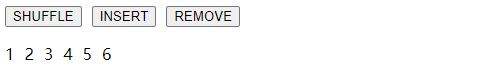
这个看起来很神奇,其实 Vue 内部使用了一个叫 FLIP 的动画技术,它使用 transform 将元素从之前的位置平滑过渡到新的位置。
提示:需要注意的是使用 FLIP 过渡的元素不能设置为
display: inline。作为替代方案,可以设置为display: inline-block或者将元素放置于 flex 布局中。
3. 列表的交错过渡
通过 data 属性与 JavaScript 通信,就可以实现列表的交错过渡:
<script setup lang="ts">import { reactive } from 'vue';import gsap from 'gsap';interface StateProps {list: number[] | null;}const state = reactive<StateProps>({list: null,});// -- 模拟请求数据setTimeout(() => {state.list = [1, 2, 3, 4, 5];}, 1000);const beforeEnter = (el: Element) => {const dom = el as HTMLDivElement;dom.style.cssText = 'opacity: 0; transform: translateY(30px)';};const enter = (el: Element, done: () => void) => {const dom = el as HTMLDivElement;const dataset = dom.dataset;const index = dataset.index || ''; /** 获取data-index,用于设置延迟以达到列表交错效果 */gsap.to(dom, {duration: 1,opacity: 1,translateY: 0,delay: +index * 0.25,onComplete: done,});};</script><template><transition-grouptag="div":css="false"@before-enter="beforeEnter"@enter="enter"><divclass="item"v-for="(item, index) in state.list":key="item":data-index="index"><div class="avatar"></div><div class="info"><div class="title"></div><div class="desc"></div></div></div></transition-group></template><style scoped>.item {width: 90%;padding: 10px;border-radius: 6px;box-shadow: 0 0 10px 1px #eeeeee;margin: 0 auto 16px;display: flex;align-items: center;}.avatar {width: 60px;height: 60px;background: #6bb6fc;border-radius: 12px;margin-right: 16px;}.title {width: 160px;height: 20px;border-radius: 20px;background: #6bb6fc;margin-bottom: 10px;}.desc {width: 80px;height: 20px;border-radius: 20px;background: #9ed0f8;}</style>
演示效果:

五、状态过渡
Vue 的过渡系统提供了非常多简单的方法来设置进入、离开和列表的动效,那么对于数据元素本身的动效呢?比如:
- 数字和运算
- 颜色的显示
- SVG 节点的位置
- 元素的大小和其他的属性
这些数据要么本身就以数值形式存储,要么可以转换为数值。有了这些数值后,我们就可以结合 Vue 的响应性和组件系统,使用 第三方库 来实现切换元素的过渡状态。
@GSAP
GSAP是 GreenSock 提供的一个制作动画的 JavaScript 库:
接下来,我们通过 GSAP 结合 Vue 实现数字滚动的效果。
首先,安装 gsap:
$ npm install gsap
然后直接上示例代码:
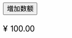
<script setup lang="ts">import { reactive } from 'vue';import gsap from 'gsap';const state = reactive({count: 100,});const onPlus = () => {gsap.to(state, {duration: 0.75 /** 持续时间 */,count: state.count + Math.random() * 100 /** 变更key-value */,ease: 'sine' /** 速度曲线 */,});};</script><template><button type="button" style="cursor: pointer" @click="onPlus">增加数额</button><p>¥ {{ state.count.toFixed(2) }}</p></template>
演示效果:

若有收获,就点个赞吧
0 人点赞
