教程来自于 CSS Tricks:A Complete Guide to Flexbox
容器和条目
容器(container)就是外部的容器,条目(items)就是内部的条目。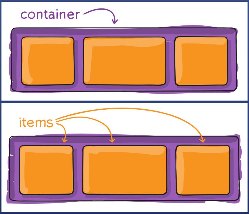
container 有哪些属性
定义一个 flex 容器
.container {display: flex; /* or inline-flex */}
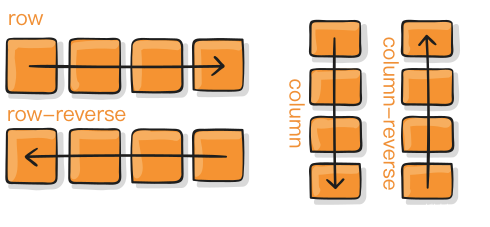
改变 items 流动方向(主轴)
.container {flex-direction: row | row-reverse | column | column-reverse;}
flex-direction: row;行顺序 |
 |
|---|---|
flex-direction: row-reverse; 行逆序 |
|
flex-direction:column; 列顺序 |
|
flex-direction:column-reverse; 列逆序 |
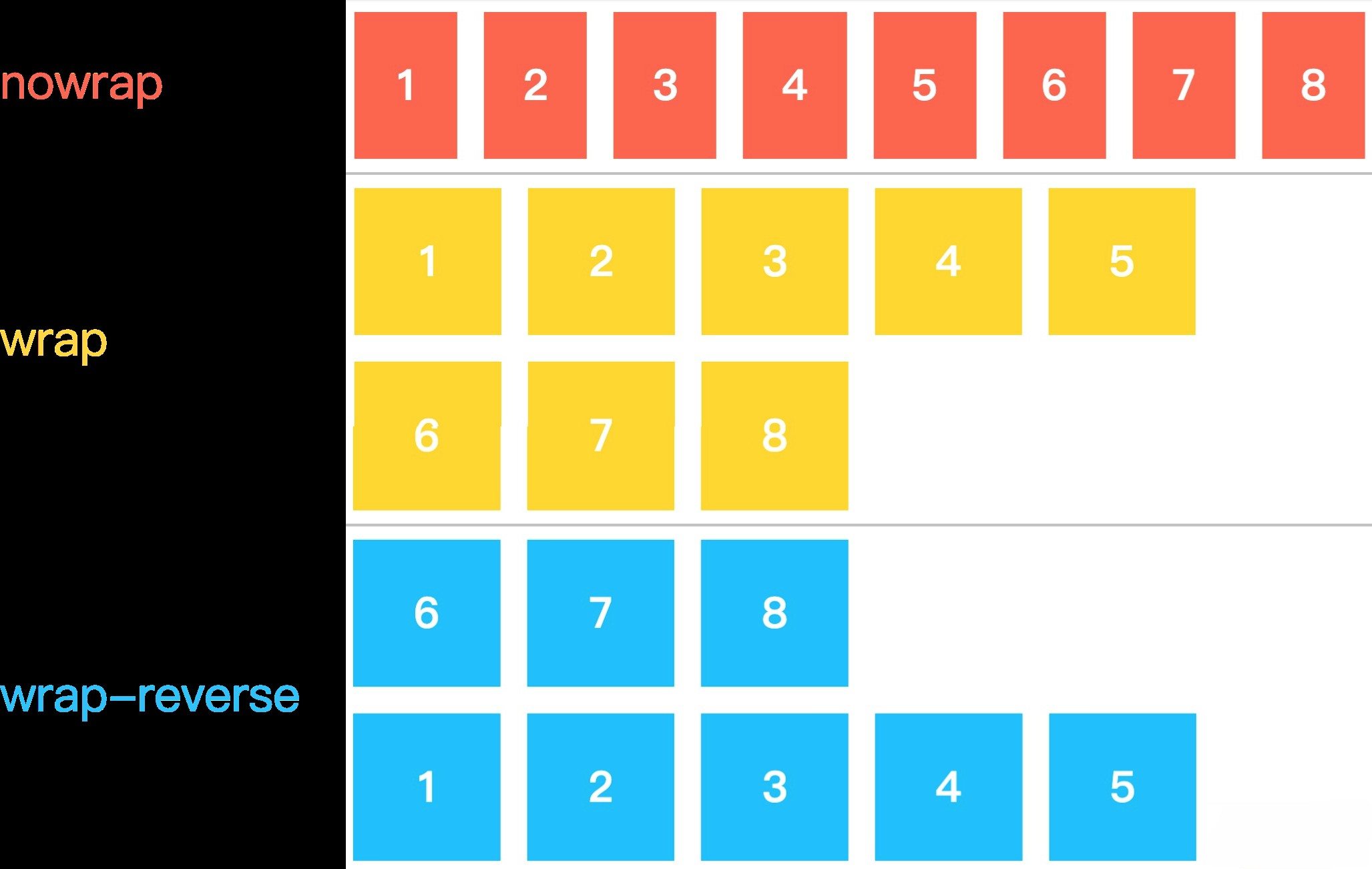
改变折行方式
.container{flex-wrap: nowrap | wrap | wrap-reverse;}
flex-wrap: nowrap; 不换行,使劲挤 |
 |
|---|---|
flex-wrap: wrap; 能换行,就换行 |
|
flex-wrap: wrap-reverse; 向上换行?! |
主轴对齐方式
- 默认主轴是横轴
- 除非改变了
flex-direction方向
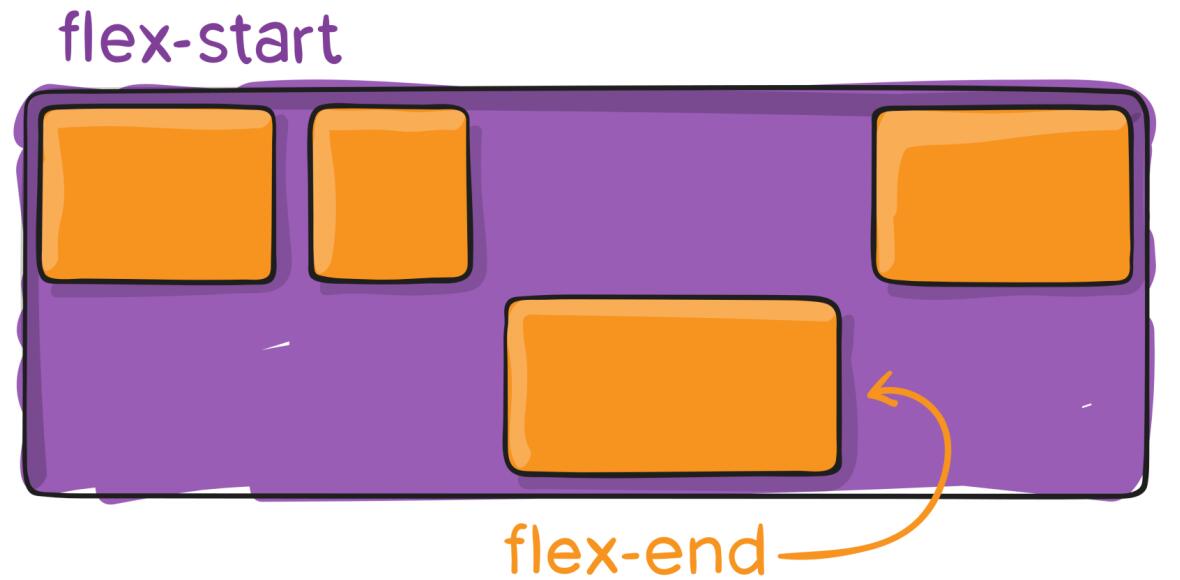
|.container {justify-content: flex-start | flex-end | center | space-between | space-around | space-evenly | start | end | left | right ... + safe | unsafe;}
justify-content: flex-start;
都往左靠 | |
| —- | —- |
|
|
| —- | —- |
| justify-content: flex-end;
都往右靠 | | |justify-content: center;
水平居中,往中间靠 | | |justify-content: space-between;
把空间放到中间 | | |justify-content: space-around;
空间在周围环绕,margin不合并 | | |justify-content: space-evenly;
空间平均,margin 合并 | |
次轴对齐
- 默认次轴是纵轴
|.container {align-items: stretch | flex-start | flex-end | center | baseline | first baseline | last baseline | start | end | self-start | self-end + ... safe | unsafe;}
align-items: flex-start;
向上靠拢 |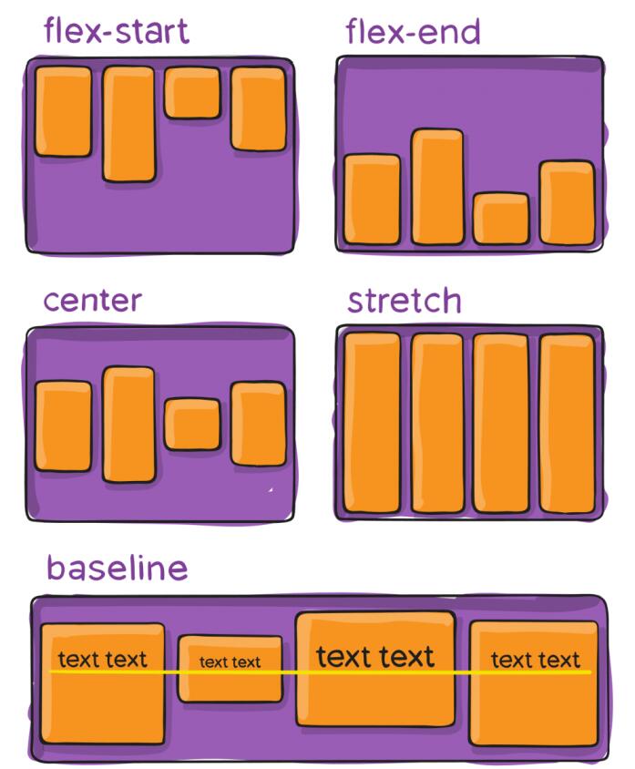 |
| —- | —- |
|
|
| —- | —- |
| align-items: flex-end;
向下靠拢 | | |align-items: flex-center;
垂直居中 | | |align-items: stretch;
往两边延伸 | | |align-items: baseline;
按baseline对齐 | |
多行内容
- 很少用到
|.container {align-content: flex-start | flex-end | center | space-between | space-around | space-evenly | stretch | start | end | baseline | first baseline | last baseline + ... safe | unsafe;}
align-content: flex-start;
元素堆在上面,
空间在下 | |
| —- | —- |
|
|
| —- | —- |
| align-content: flex-end;
元素堆在下面,
空间在上 | | |align-content: center;
元素垂直居中,
空间均匀分布上下 | | |align-content: stretch;
元素贴顶部开始均匀分布,
空间上下均匀分布 | | |align-content: space-between;
元素上下行贴边均匀分布,
把空间平均分布于中间 | | |align-content: space-around;
元素上下不贴边,
上下左右空间平均环绕 | |
item 的属性
.item:frist-child {/* 冒号和 frist中间不能有空格,必须连着,意思是作为第一个儿子的 item */}。item:nth-child(2) {/* n 表示“几”,th 表示“第” ,nth 表示第n个*/}
使用 order 调整条目顺序
默认的
order都是0,如果把order改成一个数,就会按order从小到大排列。.item {order: <integer>; /* default is 0 */}
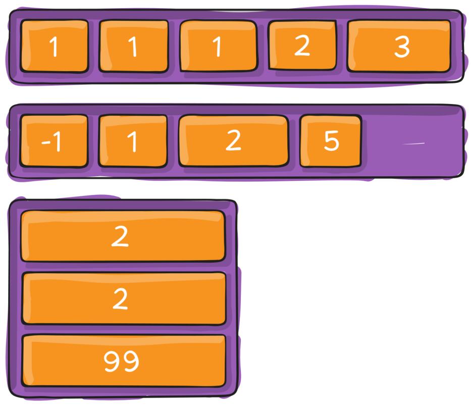
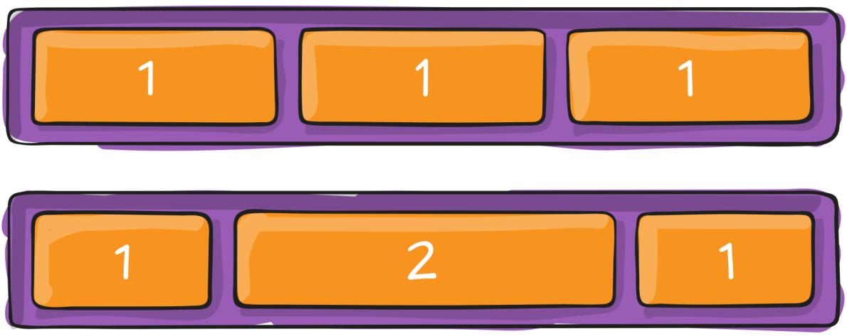
flex-grow控制按比例长胖flex-grow用来分配多余的空间,如果不写flex-grow就默认不分。.item {flex-grow: <number>; /* <number> 负值无效,默认为0 */}
flex-shrink控制如何变瘦句法:
flex-shrink属性只能是一个<number>
取值:负值不被允许一般写
flex-shrink:0防止变瘦,默认是1.item {flex-shrink: <number>; /* default 1 */}
flex-basis控制基准宽度句法:
flex-basis:<number>
取值:对于任何宽度,负长度均无效。默认是
flex-basis:auto.element {flex-basis: 100px;}
align-self定制align-items.item {align-self: auto | flex-start | flex-end | center | baseline | stretch;}
重点:
记住这些代码
display:flexflex-direction: row / column流动方向是横 / 竖flex-wrap: wrap表示是否换行just-content: center / space-between在主(横)轴是怎么对齐的align-items: center表示在纵轴怎么对齐-
经验
永远不要把
width和height写死,除非特殊说明- 电脑上宽度一般都是写死的,手机上都不是写死的
- 用
min-width / max-width / min-height / max-height
flex可以基本满足所有需求flex和margin-xxx:auto配合有意外的效果-
不写死
width:50%max-width: 100pxwidth: 30vw(屏幕宽度的1%,30vw为屏幕宽度30%)min-width: 80%- 特点:不使用 px,或者加
min max前缀

若有收获,就点个赞吧
0 人点赞
