[TOC]
起因:
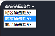
做项目时使用了select标签,希望能更改select的样式,期望效果是select和option的背景都能透明,没有边框。期望效果是option也能透明,于是写了这样的css,
select {
  border-color: transparent;
  background: transparent;
  outline: none;
  color: #fff;
  option {
    color: black;
    opacity: 0;
    background-color: transparent;
    appearance: none;
  }
}
效果并不理想,如图所示,option 的样式没有生效,网上也没有搜到解决方案,有人说option的样式没法修改,抓耳挠腮了好一阵,决定自己封装一个select标签组件。
封装简版select组件:
这个版本的select是一个整体的组件,父组件传入数据数组,select组件依次展示。
<template>
  <div id="myselelct">
    <div class="title" @click="showOption=!showOption">
      <span>{{ choiceTitle }}</span>
      <span class="icon">﹀</span>
  </div>
  <div v-show="showOption">
    <div v-for="ch in options" :key="ch.key" @click="changeOption(ch.key)">
      {{ ch.text }}
    </div>
  </div>
  </div>
</template>
<script>
  export default {
    props: {
      options: {   // 接收父组件传入的所有选项
        type: Array,
        default() {
          return []; // 接收数据格式必须为:[{key:1,text:"hahha"}]
        },
      },
      value: {  // 接收父组件传入的当前值,名字必须value,这样父组件才能用v-model绑定
        type: String,
        default: "",
      },
    },
    data() {
      return {
        showOption: false,// 控制是否显示下拉选框
      };
    },
    computed: {
      choiceTitle() {  // 当前选中的title
        let curOption = this.options.filter(item=>item.key == this.value)
        if (curOption.length > 0) return curOption[0].text
        return "请选择";
      },
    },
    methods: {
      changeOption(val) {
        this.$emit("input", val); // 传给父组件的事件名必须是input,这样才能用v-model绑定
        this.showOption = false; // 收起下拉框
      },
    },
  };
</script>
<style lang="less" scoped>
  #myselelct {
    display: inline-block;
    padding: 5px;
    cursor: default;
    .title {
      .icon {
        margin-left: 5px;
        vertical-align: middle;
      }
    }
  }
</style>
使用:
<my-select class="myselect" :options="type" v-model="choiceType" />
...
<style lang="less" scoped>
  .myselect {
    position: absolute;
    z-index: 10;
    color: #fff;
  }
</style>
这就实现预期效果了: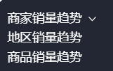
封装完select组件,突然想起elementui不就有这个组件吗,决定搞一个简版的el-slelect组件
参考element-ui,设计select与option组件
element ui的select使用
- v-model中的value就是当前被选中的el-option的 value 属性值
<template>
<el-select v-model="value" placeholder="请选择">
  <el-option
    v-for="item in options"
    :key="item.value"
    :label="item.label"
    :value="item.value">
  </el-option>
</el-select>
</template>
难点分析:
- 组件el-select里面需要插入el-option
- 需要使用插槽
el-select如何获取插槽中el-option组件,或者怎么判断当前选中的是哪一个选项
- 两个组件时嵌套关系,并非父子关系不能使用props,推荐使用provide和inject
- 将el-select的this传递给el-option,在el-option中就可以操作el-select
// provide和inject的简单使用,详细使用参考官网
// 外层组件
export default {
provide() {
return {
data: '这是外层组件的数据',
};
},
}
// 内层组件
export default {
inject: ["data"],
}
使用时需要v-model绑定
<a name="rIycs"></a>
#### option组件
```html
<template>
  <div id="option" class="y-option" ref="option">
    <div class="content" @click="clickItem">
      {{ label }}
    </div>
  </div>
</template>

<script>
export default {
  props: ["label", "value"], // label是选项文字,vaue是选项值
  inject: ["select"], // 接收select组件中的provide数据,"select"就是父组件的this
  created() {
    // 将自身的label和value,push到给select父组件的options中
    this.select.options.push({
      label: this.label,
      value: this.value,
    });
  },
  methods: {
    clickItem() {
      // 改变select中当前选中的元素
      this.select.curValue = this.value;
      this.select.curLabel = this.label;
      // 调用select中的方法,收起下拉选框
      this.select.showOption();
    },
  },
};
</script>

<style scoped>
.content {
  color: #666;
  border-right: 1px solid #666;
  border-left: 1px solid #666;
  border-bottom: 1px solid #666;
  padding: 5px 30px 5px 6px;
  text-align: left;
  cursor: pointer;
  /* 一行显示,超长省略号 */
  white-space: nowrap;
  overflow: hidden;
  text-overflow: ellipsis;
}
</style>
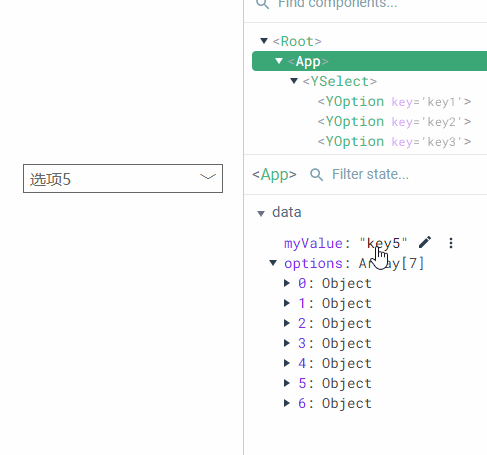
使用
<template>
  <div id="app">
    <y-select v-model="myValue">
      <y-option
        v-for="item in options"
        :label="item.label"
        :value="item.key"
        :key="item.key"
      ></y-option>
    </y-select>
  </div>
</template>

<script>
import ySelect from "./components/ySelect.vue";
import yOption from "./components/yOption.vue";
export default {
  components: { yOption, ySelect },
  data() {
    return {
      myValue: "key5",
      options: [
        { key: "key1", label: "选项1" },
        { key: "key2", label: "选项2" },
        { key: "key3", label: "选项3" },
        { key: "key4", label: "选项4changhcadfjadfajhjfkjg" },
        { key: "key5", label: "选项5" },
        { key: "key6", label: "选项6" },
        { key: "key7", label: "选项7" },
      ],
    };
  },
};
</script>
效果图
关于样式修改,可以在父组件中,使用 .y-select 或 .y-option进行修改,这里就不作阐述了。

若有收获,就点个赞吧
0 人点赞
