

基本语法
简单举例
基本用法
- 导入Matplotlib包中的pyplot模块,并以别名的形式简化引入模块的名称
- 方式一:from matplotlib import pyplot as plt
- 方式二:import matplotlib.pyplot as plt
- plt的基本方法
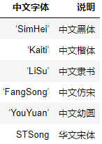
- plt.rcParams[‘font.sans-serif’] = [‘SimHei’]:用来设置字体样式以正常显示中文标签
- 语法格式:
- matplotlib.pyplot.xticks(ticks=None, labels=None, **kwargs)
- matplotlib.pyplot.yticks(ticks=None, labels=None, **kwargs)
- 举例
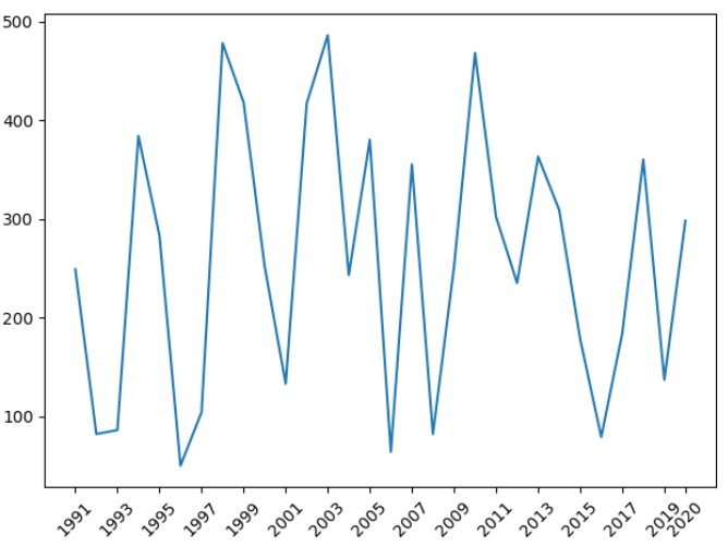
- x轴是数值型,会按照数值型本身作为x轴的坐标 ```python import matplotlib.pyplot as plt import numpy as np
dates = np.arange(1991, 2021) sales = np.random.randint(50, 500, size=len(dates))
plt.xticks([2005, 2010, 2018]) plt.xticks(np.arange(dates.min(), dates.max() + 2, 2), rotation=45) plt.xticks([dates[i] for i in range(0, len(dates), 2)] + [2020], rotation=45)
plt.plot(dates, sales) plt.show()
- x轴是字符串类型,会按照索引作为x轴的坐标```pythonimport matplotlib.pyplot as pltimport numpy as npdates = np.arange(1991, 2021).astype(np.str)sales = np.random.randint(50, 500, size=len(dates))plt.xticks(range(0, len(dates), 2), rotation=45)plt.xticks(range(0, len(dates), 2),['year%s' % dates[i] for i in range(0, len(dates), 2)], rotation=45)plt.plot(dates, sales)plt.show()
设置图例
- 图例是集中于图表一角或一侧的图表上各种符号与颜色所代表内容与指标的说明,有助于更好的认识地图
- 使用plt.legend()显示
- 图例的位置设置:使用loc参数

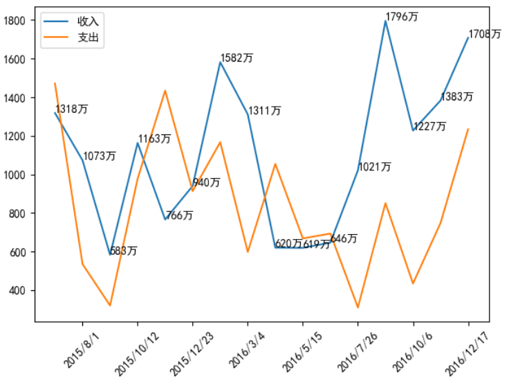
import matplotlib.pyplot as plt
import numpy as np

plt.rcParams['font.sans-serif'] = ['SimHei']
plt.rcParams['axes.unicode_minus'] = False

times = ['2015/6/26', '2015/8/1', '2015/9/6', '2015/10/12', '2015/11/17', '2015/12/23', '2016/1/28', '2016/3/4',
         '2016/4/9', '2016/5/15', '2016/6/20', '2016/7/26', '2016/8/31', '2016/10/6', '2016/11/11', '2016/12/17']

income = np.random.randint(500, 2000, size=len(times))
expenses = np.random.randint(300, 1500, size=len(times))

plt.xticks(range(1, len(times), 2), rotation=45)

plt.plot(times, income, label="收入")
plt.plot(times, expenses, label="支出")

plt.legend(loc="upper right")
plt.show()

设置显示每条数据的值
- 语法格式:plt.text(x, y, string, fontsize=15, verticalalignment=”top”, horizontalalignment=”right”)
- 参数说明
- x,y:表示图表上对应的值
- string:表示说明文字
- fontsize:表示字体大小
- verticalalignment:垂直对齐方式,参数:’center’ | ‘top’ | ‘bottom’ | ‘baseline’
- horizontalalignment:水平对齐方式,参数:’center’ | ‘right’ | ‘left’ ```python import matplotlib.pyplot as plt import numpy as np
plt.rcParams[‘font.sans-serif’] = [‘SimHei’] plt.rcParams[‘axes.unicode_minus’] = False
times = [‘2015/6/26’, ‘2015/8/1’, ‘2015/9/6’, ‘2015/10/12’, ‘2015/11/17’, ‘2015/12/23’, ‘2016/1/28’, ‘2016/3/4’, ‘2016/4/9’, ‘2016/5/15’, ‘2016/6/20’, ‘2016/7/26’, ‘2016/8/31’, ‘2016/10/6’, ‘2016/11/11’, ‘2016/12/17’]
income = np.random.randint(500, 2000, size=len(times)) expenses = np.random.randint(300, 1500, size=len(times))
plt.xticks(range(1, len(times), 2), rotation=45)
plt.plot(times, income, label=”收入”) plt.plot(times, expenses, label=”支出”)
for x, y in zip(times, income): plt.text(x, y, ‘%s万’ % y)
plt.legend() plt.show()
<a name="VOUpA"></a>
### 操作坐标轴
- plt.gca():get current axes,获得四个坐标轴构成的整体
- plt.gca().spines['top' | 'bottom' | 'left' | 'right']:分别获得上、下、左、右坐标轴
```python
import matplotlib.pyplot as plt
import numpy as np
x = np.arange(-50, 51)
y = x ** 2
ax = plt.gca()
ax.spines['right'].set_color('none')
ax.spines['top'].set_color('none')
ax.spines['left'].set_position(('axes', 0.5)) # axes: 移动到轴上的指定比例处,取值在0.0-1.0之间
ax.spines['bottom'].set_position(('data', 0)) # data:移动到轴上的指定数值处
plt.ylim(0, y.max())
plt.plot(x, y)
plt.show()

设置英寸和分辨率
- plt.rcParams[‘figure.figsize’] = (8.0, 4.0):设置英寸
- plt.rcParams[‘figure.dpi’] = 300:设置分辨率
默认的英寸是(6.0, 4.0),默认的分辨率是72,则尺寸为432*288
设置图表的样式
语法格式:plt.plot(x, y, color=’red’, alpha=0.3, linestyle=’-‘, linewidth=5, marker=’o’, markeredgecolor=’r’, markersize=’20’, markeredgewidth=10)
- 参数说明
- alpha:透明度,取值范围是0-1
- linestyle:折线样式
- marker:标记点
- 详细说明
- 注意:可以省略x参数,默认为[0, …, N - 1]递增,N为y轴元素的个数


创建图形对象
基本介绍
- 在Matplotlib中,面向对象编程的核心思想是创建图形对象(figure object),通过图形对象来调用它的方法和属性,这样有助于我们更好地处理多个画布。在这个过程中,pyplot负责生成图形对象,并通过该对象来添加一个或多个axes对象(即绘图区域)
- Matplotlib 提供了matplotlib.figure图形类模块,它包含了创建图形对象的方法,通过调用pyplot模块中figure() 函数来实例化figure对象。figure对象可以理解为一个空白的画布,一个figure对象可以包含多个axes子图,一个axes是一个绘图区域
- figure方法如下

- 绘制子图的常用方式
- add_axes():添加区域
- subplot():均等地划分画布,只是创建了一个包含子图区域的画布,返回区域对象
- subplots():既创建了一个包含子图区域的画布,又创建了一个figure图形对象,返回图形对象和区域对象
- 简单举例

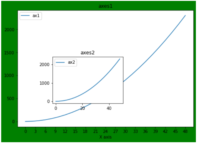
add_axes()函数
- 语法格式:add_axes(rect)
- 作用:创建一个axes对象(轴域对象),添加一个指定的绘图区域。在一个画布中可以包含多个axes对象,但是同一个axes对象只能在一个画布中使用
- 参数说明:rect是位置参数,接受一个由四个元素组成的浮点数列表,形如[left, bottem, width, height],表示添加到画布中的矩形区域的左下角坐标,以及宽度和高度
- 注意:每个元素的值是画布宽度和高度的分数,即将画布的宽、高作为1个单位
- 轴域对象的基本方法:
- set_title():设置区域图表的名称
- set_xlabel()和set_ylabel():设置区域图表的x轴和y轴名称
- set_xticks():设置区域图表的刻度
- legend():设置区域图表的图例 ```python import matplotlib.pyplot as plt import numpy as np
fig = plt.figure(figsize=(6, 4), facecolor=’g’)
x = np.arange(0, 50, 2) y = x ** 2
ax1 = fig.add_axes([0.0, 0.0, 1, 1]) ax1.set_title(“axes1”) ax1.set_xlabel(‘X axis’) ax1.set_xticks(np.arange(0, 50, 3)) ax1.plot(x, y, label=”ax1”) ax1.legend()
ax2 = fig.add_axes([0.2, 0.2, 0.4, 0.4]) ax2.set_title(“axes2”) ax2.plot(x, y, label=’ax2’) ax2.legend()
plt.show()
<a name="RNY0N"></a>
### subplot()函数
- 语法格式:plt.subplot(nrows, ncols, index, *args, **kwargs)
- 作用:均等地划分画布
- 参数说明:nrows和ncols表示要划分成几行几列的子区域,index的初始值为1,用来选定具体的某个子区域
- 注意:
- 可以直接将几个值写到一起,例如plt.subplot(233)
- 如果新建的子图与现有的子图重叠,那么重叠部分的子图将会被自动删除,因为它们不可以共享绘图区域
- 如果子图标题重叠,在最后使用plt.tight_layout()
- 查看方法的详细参数,可以将光标移动到方法上,再使用快捷键shift+tab即可查看
- 区域对象的基本方法:与axes对象的方法类似
```python
import matplotlib.pyplot as plt
import numpy as np
plt.subplot(211, xlabel='x axis')
plt.title('ax1')
plt.plot(range(50, 70), marker='o')
ax2 = plt.subplot(212)
ax2.set_title('ax2')
ax2.set_xlabel('x axis')
ax2.plot(np.arange(12)**2)
plt.tight_layout()
plt.show()

import matplotlib.pyplot as plt

fig = plt.figure()

fig.add_subplot(111)
plt.plot(range(10))

fig.add_subplot(221)
plt.plot(range(15))

fig.add_subplot(222)
plt.plot(range(20))

plt.show()

subplots()函数
- 使用方法和subplot()函数类似,不同之处在于,subplots()既创建了一个包含子图区域的画布,又创建了一个figure图形对象,而subplot()函数只是创建了一个包含子图区域的画布
- 语法格式:fig, ax = plt.subplots(nrows, ncols)
- fig是图形对象,ax包含了所有的axes对象,axes对象的数量等于 nrows*ncols,且每个axes对象均可通过索引值访问(从0开始)

import matplotlib.pyplot as plt
import numpy as np

fig, axes = plt.subplots(2, 2)
x = np.arange(1, 5)

ax1 = axes[0][0]
ax1.plot(x, x * x)
ax1.set_title('square')

axes[0][1].plot(x, np.sqrt(x))
axes[0][1].set_title('square root')

axes[1][0].plot(x, np.exp(x))
axes[1][0].set_title('exp')

axes[1][1].plot(x, np.log10(x))
axes[1][1].set_title('log')

plt.tight_layout()
plt.show()

import matplotlib.pyplot as plt

plt.subplot(321, facecolor='r')
plt.subplot(322, facecolor='r')
plt.subplot(323, facecolor='r')
plt.subplot(324, facecolor='r')
plt.subplot(313, facecolor='b')

plt.show()


若有收获,就点个赞吧
0 人点赞
