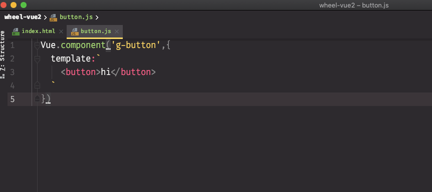
加一个button.js
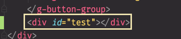
在index.html中使用 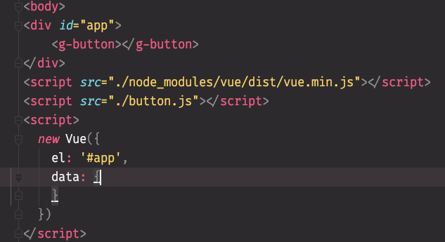
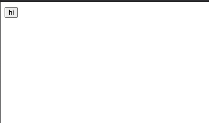
小结:在button.js中写的Vue.component(‘g-button’,{ template:
<button>hi</button>}) ‘g-button’指的是在index中使用的标签名,template是具体的html代码 {//这是一个对象 template:<button>hi</button>}
button样式
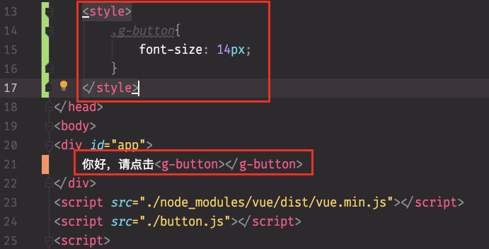
这里设置了g-button的字体大小,但是有可能”你好请点击”的字体大小不是14px,将会导致不协调,此处可以让用户自己设置。
方法一:
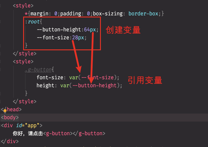
方法二:
使用css覆盖(不推荐,比较麻烦)
使用单文件的模式开发
从上面的代码可以看出,button是写在js文件里面的,样式是写在css里面的,这样不好管理代码,所以使用parcel来进行开发。
parcel官网
C.R.M学习法启动:
``` yarn global add parcel-bundler //yarn方式全局安装 npm install -g parcel-bundler //npm方式全局安装 推荐不使用全局安装所以可以改写成: npm install -D parcel-bundler
相比于项目开始的时候安装vue使用全局的原因是,vue是给用户使用的,所以使用全局安装
<a name="hllOC"></a>### 在项目根目录添加src文件夹1. 1. 在src目录下创建app.js并且把index文件的js迁移过去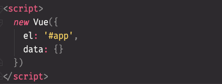<br /><br />3.在index文件中使用依赖的方式引入app.js<br />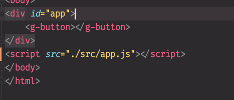 <br />4.使用vue文件重构button.js<br />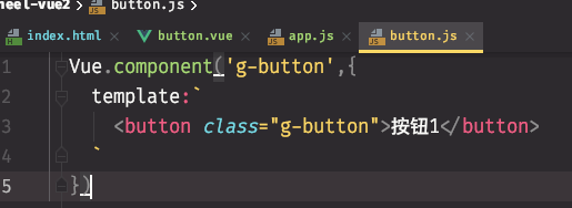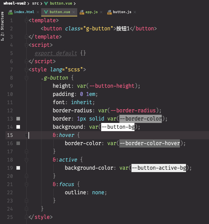> <template></template>里面存放html内容> <script></script> 使用 export default导出对象> <style></style>用来存放css文件在代码迁移完以后,删除button.js文件<br />5.app.js初始化ID为'app',但是index无法识别<g-button><br />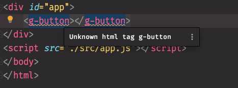<br />需要在app.js中导入vue<br />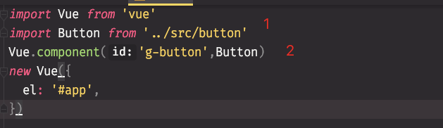> 1.引入button.vue并且取名Button(类似变量名)> 2.声明为Vue的组件6.测试<br />控制台输入./node_modules/.bin/parcel 运行项目会报错,找不到入口<br />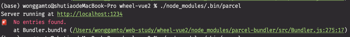<br />使用./node_modules/.bin/parcel index.html (这里指定运行的入口为index.html)即可解决在浏览器运行的时候,出现问题了:页面没有东西,控制台报错<br />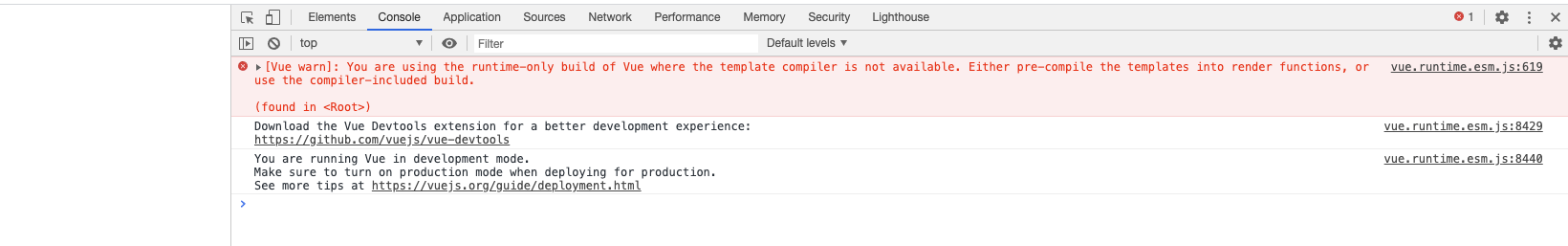<br />提示我的vue使用的是run-time版本,所以报错,在Vue官方文档中的[切换版本](https://cn.vuejs.org/v2/guide/installation.html)内容上面找到对应的版本进行代码添加<br /><br />添加完成后再次运行项目,即可解决。<br />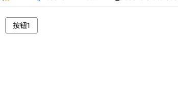---<a name="nFmin"></a>## 插槽的使用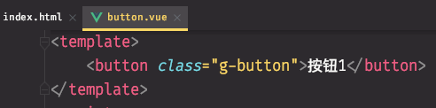<br />button组件中,写死了一个按钮1,用户更希望这些按钮的文字由自己决定,如果直接写在index文件中,是无法读取的<br />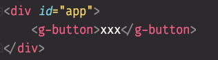<br /><br />解决办法:使用<slot></slot>(插槽)<br />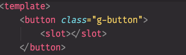<br />添加了插槽以后,就可以在index文件中添加文字了<br />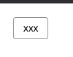---<a name="0sQul"></a>## 添加Icon在[Icon仓库](https://www.iconfont.cn/)查找自己想要的Icon,然后在index页面引入js<br /><br />这时候刷新页面是看不到Icon的,但是在控制台可以看到svg标签出现在html中<br />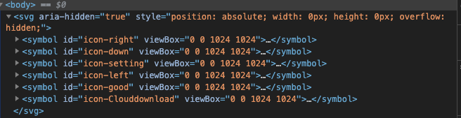<a name="Wwlf0"></a>### 让Icon出现在页面中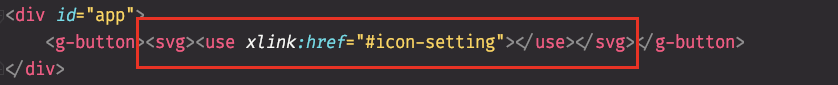```html<g-button><svg><use xlink:href="#icon-setting"></use></svg></g-button>#icon-setting => 指的是在IconFont中设置的Icon的名字
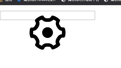
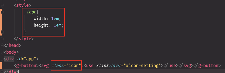
设置Icon的大小(全局样式)
把Icon封装到对应的组件中,方便使用者,让用户自己选择
从代码中分析得出,选择哪个button是由”#icon-xxx”中的xxx来决定的,所以这里可以使用prop来接收用户外部传进来的参数
button组件中,props:[‘icon’]可以理解为形参,index文件中的icon=”setting”可以理解为实参

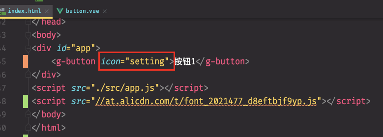
现在就可以接收外部传进来的参数了
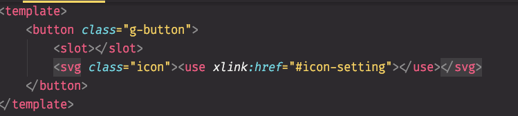
在button组件中,把use标签修改为如下: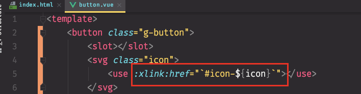
<use :xlink:href="`#icon-${icon}`"></use>xlink左边的 : 是v-bind的缩写,指的是绑定xlink:href这个属性"" 可以去掉``反引号表示的是这是一句js字符串${} 表示这是一个插值,这个值是icon,icon的值是从props中获取的
解决一个Bug
如果用户不传icon,页面上面不显示icon,但是会出现空白的展位,控制台能查看到由svg标签
解决办法:使用v-if判断icon是否存在,如果存在,就让svg出现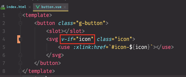
如果不存在则让svg不出现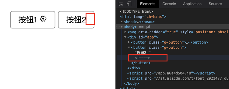
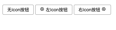
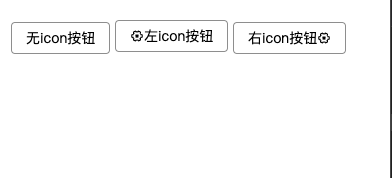
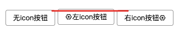
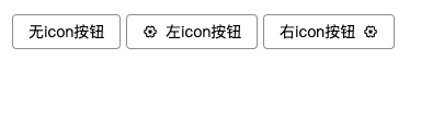
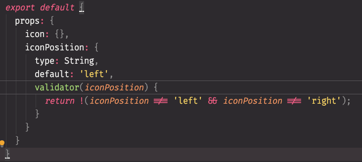
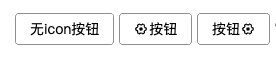
实现根据用户设置icon的位置(左、右)、icon居中
思路:让用户传入一个 iconPosition ,值为:left 或者 right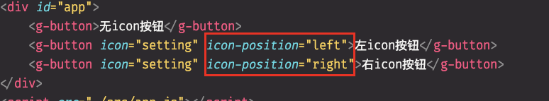
实现方法1(使用v-if v-else):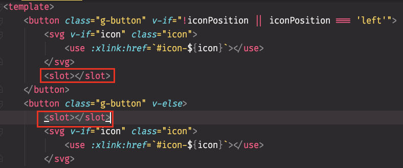
方法2:通过css控制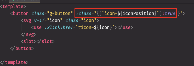
绑定一个class,值为一个对象,key为icon-right\left\undefined,value为true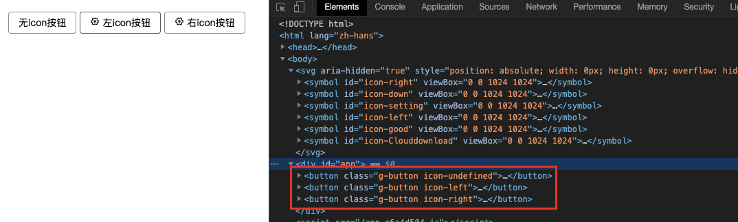
在slot外层添加一层div,原因:如果在slot上面添加class,这个class会自动消失,所以通过添加一个class为content的div解决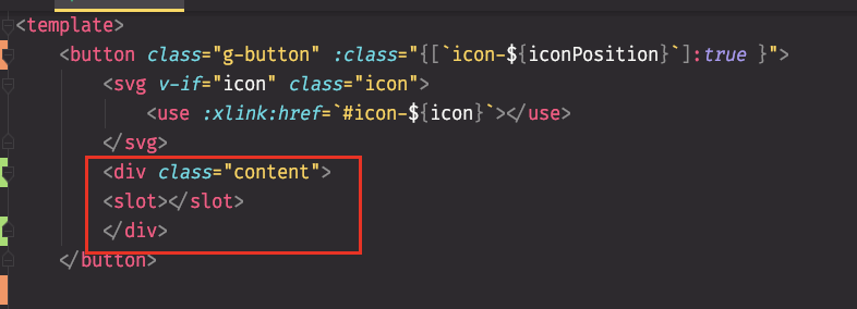
让g-button变成flex布局,并且让icon居中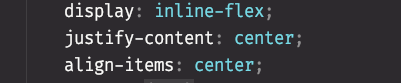
使用order实现默认情况下,icon在前面,content在后面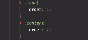
如果是right,那么icon在后面,content在前面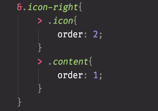
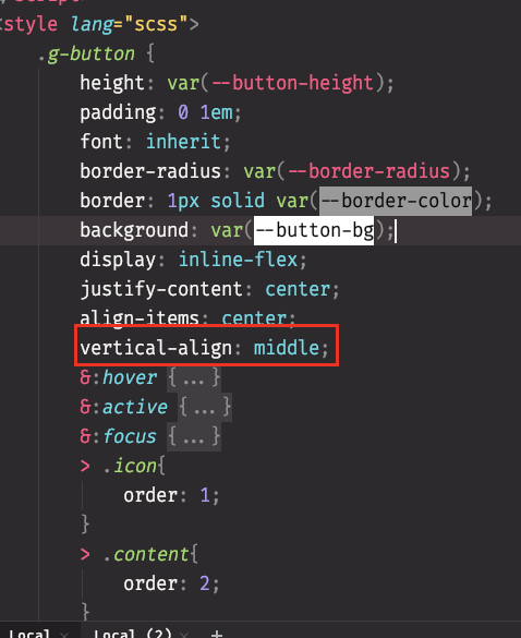
三个按钮无法上下对齐bug
原因:内联元素没有对齐,所有inline元素都有这个问题
解决办法:添加如下代码
vertical-align: middle;
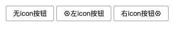
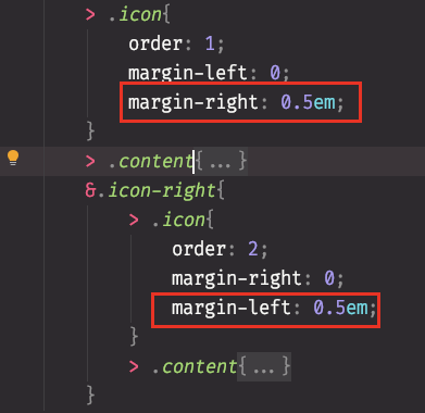
设置icon与文字的间距
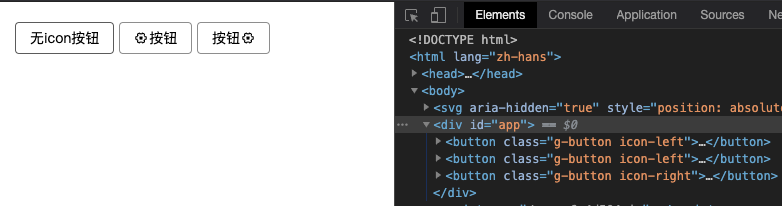
如果iconPositon的值为undefined时
使用props对象解决,key为值的名字,value为值的配置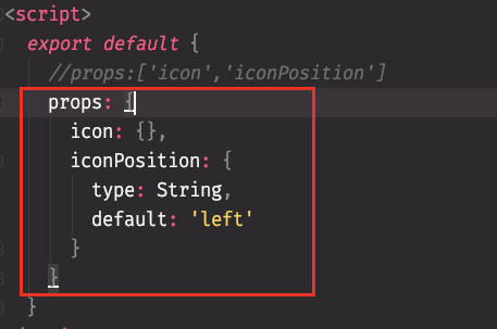
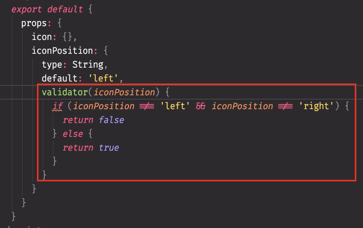
使用属性检查器确保用户只能输入left和right
icon单文件
创建icon.vue文件,然后把icon的html、css迁移过来,再使用一个变量name用来接收用户输入的参数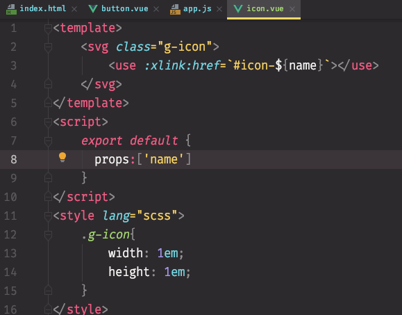
创建icon组件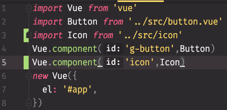
使用icon组件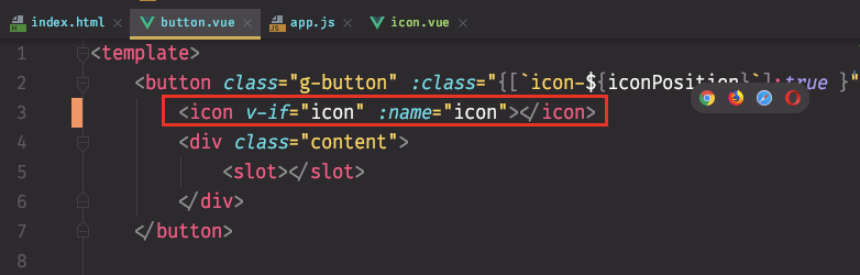
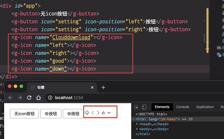
此时发现button的icon都是出现在左侧,在button.vue文件的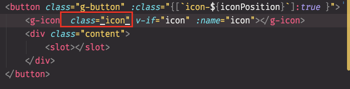
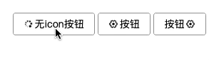
实现icon的loading动画特效
给g-icon添加class=”loading”
插入动画帧并且给动画帧取名spin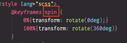
设置动画帧的属性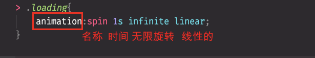
效果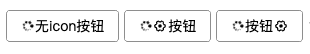
实现点击button出现、关闭loading
添加loading属性,默认值为false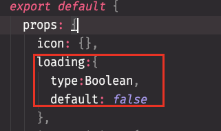
绑定一个loading属性
判断是否为loading,如果true,则显示为loading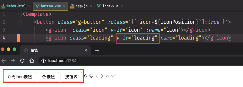
解决一个bug
如果button已经有icon,并且它的loading为true,那么就会出现下面的情况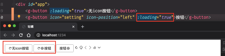
解决:添加判断,如果有icon并且没有loading,那么就显示原来的icon,否则不显示原有的icon,显示loading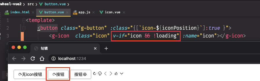
添加icon类,让loading出现的位置与原来的icon的位置一致(使用同一个css)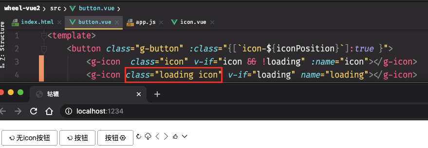
点击button出现loading,再次点击消失
要实现可以切换true/false,就必须让:loading的值是一个变量,不能写死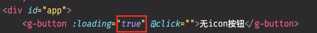
所以true改成变量loading1,并且在app.js中添加一个data,默认值为false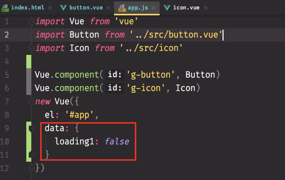
当click时,变量的值取反
此时点击这个button没有反应,原因是因为
这是简便的写法
这是复杂的写法,其实是还原为this的写法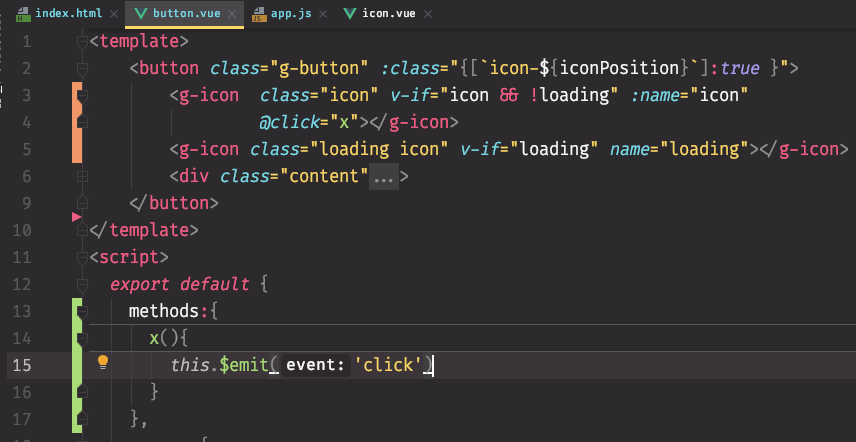
上面的代码,可以再简写: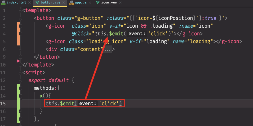
由于vue的机制是在template里面写代码的时候,不需要加this,所以可以把this去掉,最终变成了简便写法
解决一个bug
由于在指定click触发事件的时候,把click事件写在g-icon上,导致点击button无法触发,在把click触发事件放在g-button上即可解决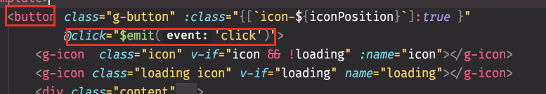
工具推荐
在上一小节解决bug的时候发现,如果不用gif录下来,会导致很多效果看不了,所以google了一下有没有mac适合的gif录制软件,结果找到了,在这里分享一下,叫做 Kap 有兴趣的可以点击看看,纯开源,软件有点大,但是用起来挺方便,还在摸索当中
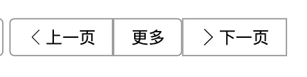
button group(当两个按钮放在一起)
从开发者角度实现原始效果:
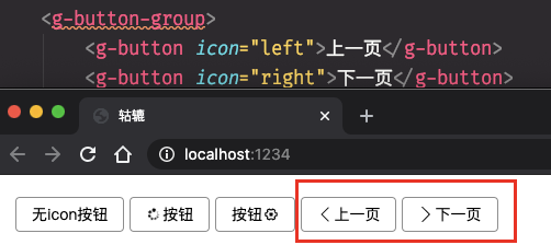
让两个按钮合并在一起
创建button-group组件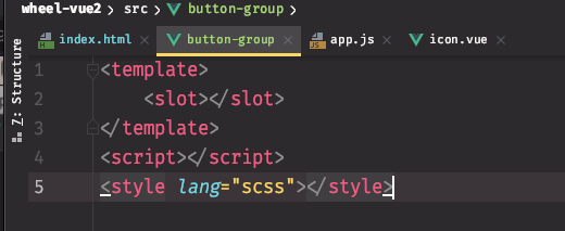
组件全局化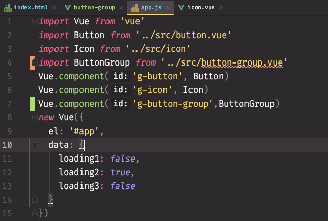
遇到问题:不能使用slot作为根结点,因为slot有可能是两个按钮,vue不支持有两个组件: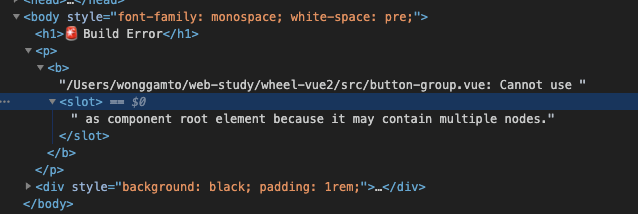
解决办法:在slot外层添加一层div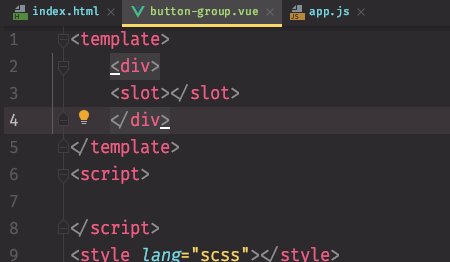
目前的效果: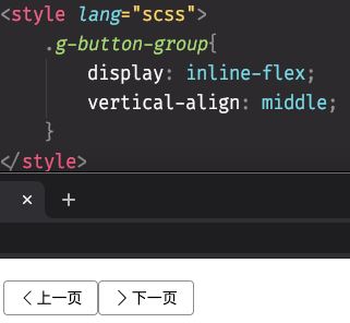
优化: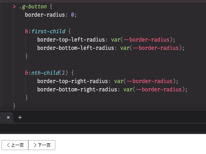
发现问题1(这是一个坑)
如果我在两个按钮之间再添加一个按钮,那么根据上面的css,就会把更多按钮作为第二个子元素,导致后面的两个元素出现问题,解决办法就是把nth-child(2)改成last-child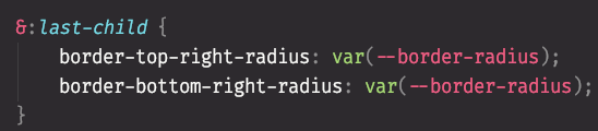
接下来,让边框合并: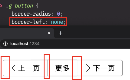
此时第一个元素的做边框不见了,解决办法:判断如果不是第一个子元素,则让做边框为none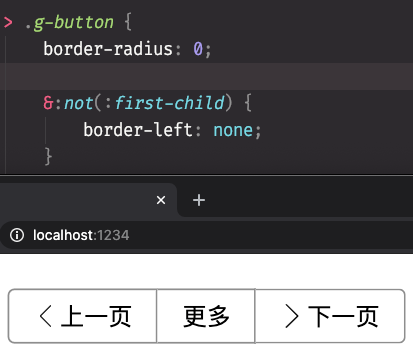
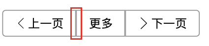
发现问题2(通过负margin z-index解决)
使用上面的方法会出现一个问题:做边框并不是真的合并了,而是被隐藏了而已,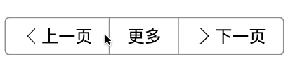
添加负margin以后的效果: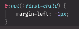
此时由于边框被遮挡了,所以添加hover,让这个button往上浮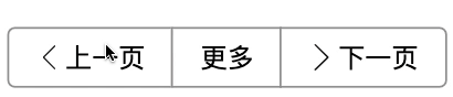
接下来让下一页的icon往右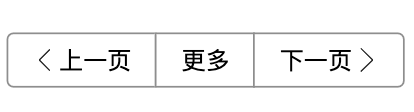
防止用户误操作导致样式丢失
有些用户可能会在button group的子元素中包裹一层div,那么会导致我们的css丢失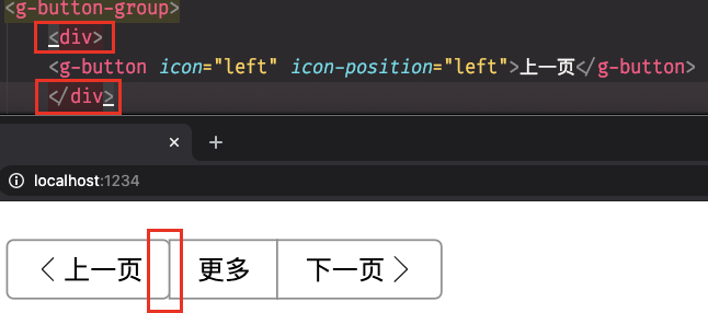
解决办法:使用mounted函数(在元素被挂载的时候调用),判断用户是否有在子元素外面包裹div或者其他标签,如果有,则给出警告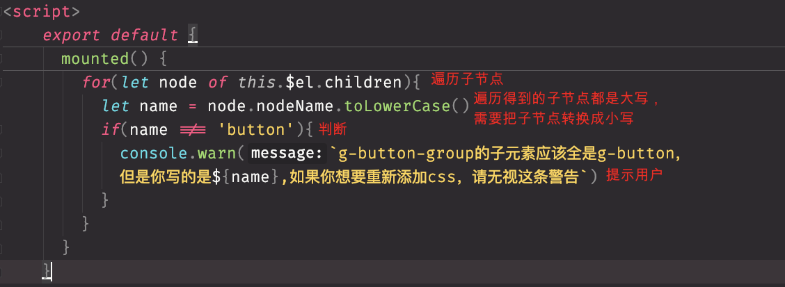
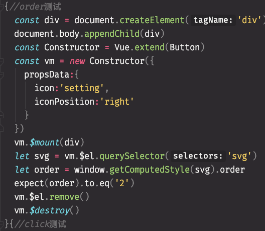
单元测试
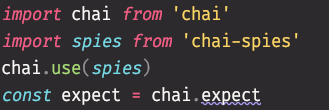
使用chai.js
npm install -D chai安装
开始单元测试

给动态生成的按钮添加一个icon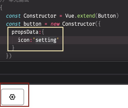
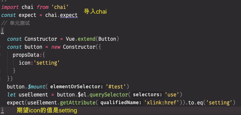
浏览器提示与你期望的setting不匹配,测试不通过
修改为#icon-setting后,测试通过,期望值与原本的值一致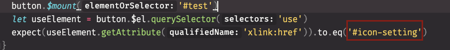
测试的依据:
一般是由输入参数决定的,比如项目当中使用的icon、loading、iconPosition还有触发的事件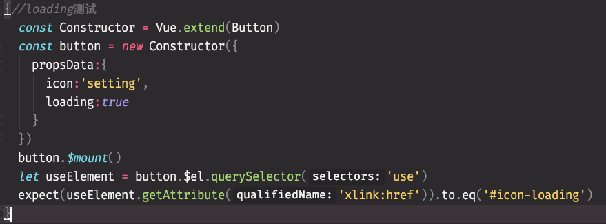
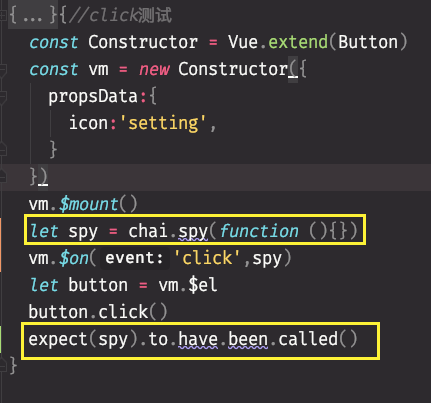
监听click事件的时候需要使用mock
自动化测试
后期补充
input组件
创建input.vue文件
//input.vue<template><div><input type="text"></div></template><script>export default {}</script><style lang="scss"></style>
注册全局组件
//app.jsimport Input from './input'Vue.component('g-input',Input)
页面中添加组件
//index.html<g-input></g-input>
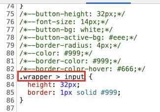
scoped
不使用scoped:
//input.vue<template><div class="wrapper"><input type="text"></div></template><script>export default {name:'GuluInput'}</script><style lang="scss">/*--button-height: 32px;*//*--font-size: 14px;*//*--button-bg: white;*//*--button-active-bg: #eee;*//*--border-radius: 4px;*//*--color: #999;*//*--border-color: #999;*//*--border-color-hover: #666;*/$height:32px;$border-color:#999;.wrapper{> input{height:$height;border: 1px solid $border-color;}}</style>
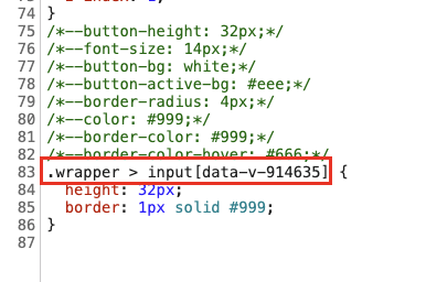
使用scoped:
//input.vue<template><div class="wrapper"><input type="text"></div></template><script>export default {name:'GuluInput'}</script><style lang="scss" scoped>/*--button-height: 32px;*//*--font-size: 14px;*//*--button-bg: white;*//*--button-active-bg: #eee;*//*--border-radius: 4px;*//*--color: #999;*//*--border-color: #999;*//*--border-color-hover: #666;*/$height:32px;$border-color:#999;.wrapper{> input{height:$height;border: 1px solid $border-color;}}</style>
在wrapper中添加border属性后,再次对比: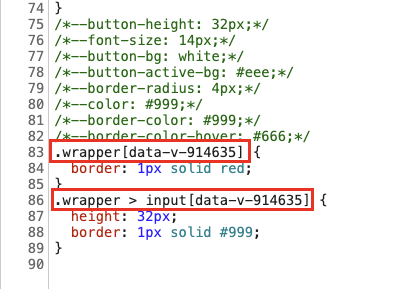
在button.vue组件中添加scoped:
<style lang="scss" scoped>@keyframes spin {0% {transform: rotate(0deg);}100% {transform: rotate(360deg)}}.g-button {height: var(--button-height);padding: 0 1em;font: inherit;border-radius: var(--border-radius);border: 1px solid var(--border-color);background: var(--button-bg);display: inline-flex;justify-content: center;align-items: center;vertical-align: middle;&:hover {border-color: var(--border-color-hover);}&:active {background-color: var(--button-active-bg);}&:focus {outline: none;}> .icon {order: 1;margin-left: 0;margin-right: 0.1em;}> .content {order: 2;}&.icon-right {> .icon {order: 2;margin-right: 0;margin-left: 0.1em;}> .content {order: 1;}}> .loading {animation: spin 1s infinite linear;}}</style>
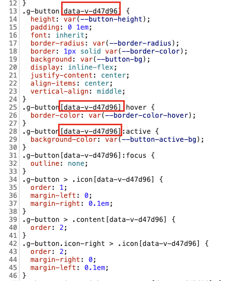
通过对比可以发现,添加了scoped后,scoped会对当前文件里面的标签的所有元素上面自动添加一个唯一的id属性(也是这个组件的唯一ID),这样就可以防止别人跟自己的选择器发生冲突导致样式错乱了。
template的另一个用法
要完成上图的效果,有两种方式:
方法一:
在判断的时候用template标签包裹
<template><div class="wrapper" :class="{'error':error}"><input type="text" :value="value" :disabled="disable" :readonly="readonly"/><template v-if="error"><icon name="setting"></icon><span>{{error}}</span></template></div></template>
方法二:
使用div包裹,然后写两个v-if
<template><div class="wrapper" :class="{'error':error}"><input type="text" :value="value" :disabled="disable" :readonly="readonly"/><div class="xxx"><icon v-if="error" name="setting"></icon><span v-if="error">{{error}}</span></div></div></template>
相对于方法一和方法二,方法二还需要再给div取一个class,再去匹配样式,比较麻烦,推荐使用方法一,使用template
测试驱动开发
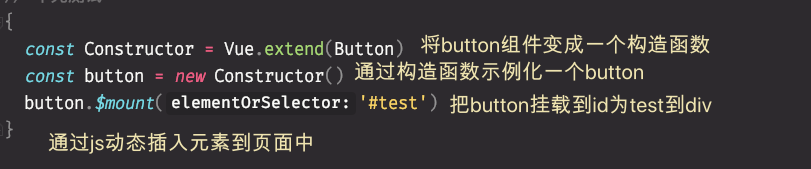
it('接收 只读',()=>{const Constructor = Vue.extend(Input)const vm = new Constructor({propsData:{readonly:true}}).$mount()const inputElement = vm.$el.querySelector('input')console.log(inputElement.outerHTML)//输出inputElemeent的值expect(inputElement.readOnly).to.equal(true)vm.$destroy()})
在测试的时候发现,如果expect(inputElement.readOnly).to.equal(true)的readOnly写成readonly会导致测试不通过。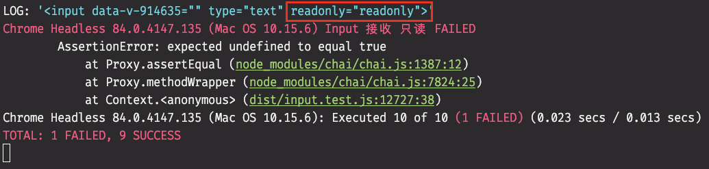
遇到问题
//正确的测试用例it('接收 error',()=>{const Constructor = Vue.extend(Input)const vm = new Constructor({propsData:{error:"错误信息"}}).$mount()const useElement = vm.$el.querySelector('use')expect(useElement.getAttribute('xlink:href')).to.equal('#icon-error')const errorMessage = vm.$el.querySelector('.error-message')expect(errorMessage.innerText).to.equal('错误信息')vm.$destroy()})})
在测试error的时候,分为几个步骤:
- 测试icon是否为error
- 测试props传入的错误信息是否与期待值是一致的
在进行测试的时候发现,截止到测试icon都是正确的,但是到测试错误信息的时候发现怎么也不通过,原因:
把innerText写成了innerHtml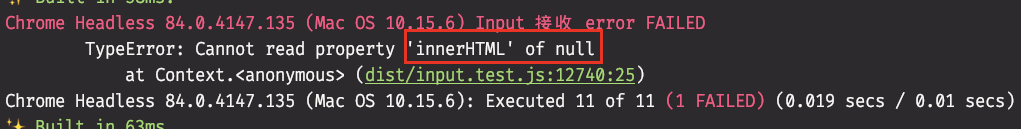
再次尝试又出现问题: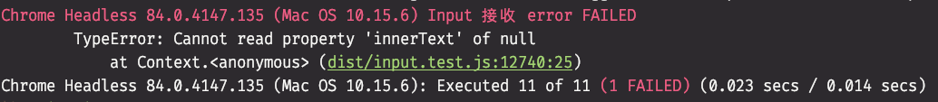
const errorMessage = vm.$el.querySelector('.error-message')
我把 .error-message 写成了~~.errorMessage ~~ , 这里指的是input组件中错误信息的class
<span class="error-message">{{error}}</span>
小结
要注意你要测试的那个元素若果有自己的class,那么写用例的时候一定要保证一致,在用例中写了props,那么你expect的结果也要跟你props的一致,否则不通过。
事件监听测试
describe('事件',()=>{const Constructor = Vue.extend(Input)let vmafterEach(()=>{vm.$destroy()})it('支持 change事件',()=>{vm = new Constructor({}).$mount()const callback = sinon.fake()vm.$on('change',callback)var event = new Event('change')let inputElement=vm.$el.querySelector('input')inputElement.dispatchEvent(event)expect(callback).to.have.been.calledWith(event)})it('支持 input事件',()=>{vm = new Constructor({}).$mount()const callback = sinon.fake()vm.$on('input',callback)var event = new Event('input')let inputElement=vm.$el.querySelector('input')inputElement.dispatchEvent(event)expect(callback).to.have.been.calledWith(event)})it('支持 focus事件',()=>{vm = new Constructor({}).$mount()const callback = sinon.fake()vm.$on('focus',callback)var event = new Event('focus')let inputElement=vm.$el.querySelector('input')inputElement.dispatchEvent(event)expect(callback).to.have.been.calledWith(event)})it('支持 blur事件',()=>{vm = new Constructor({}).$mount()const callback = sinon.fake()vm.$on('blur',callback)var event = new Event('blur')let inputElement=vm.$el.querySelector('input')inputElement.dispatchEvent(event)expect(callback).to.have.been.calledWith(event)})})
优化上述代码
describe('事件', function () {var Constructor = _vue.default.extend(_input.default);var vm;afterEach(function () {vm.$destroy();});it('支持 change/input/focus/blur事件', () => {['change', 'input', 'focus', 'blur'].forEach((eventName) => {vm = new Constructor({}).$mount();const callback = sinon.fake();vm.$on(eventName, callback);let event = new Event(eventName);let inputElement = vm.$el.querySelector('input');inputElement.dispatchEvent(event);console.log(eventName)expect(callback).to.have.been.calledWith(event);});});
让input支持v-model(双向绑定)
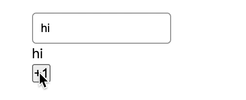
举个例子:
通过一个input组件,实现input的时候,message的值可以自动改变,然后添加一个button,让message+1,实现message发生改变,input组件的内容也可以自动改变
//app.jsnew Vue({el: '#app',data: {......message:'hi'}})
//input.vue//原本我本绑定的是event,如果要完成双向绑定,则需要获取event对应target的值<div class="wrapper" :class="{'error':error}"><input type="text" :value="value" :disabled="disable" :readonly="readonly"@change="$emit('change',$event.target.value)"@input="$emit('input',$event.target.value)"@focus="$emit('focus',$event.target.value)"@blur="$emit('blur',$event.target.value)"/>
//index.html//原本使用的是:value绑定一个value,现在可以使用v-model的语法糖实现双向绑定<div class="box"><g-input v-model="message"></g-input><p>{{message}}</p><button @click="message+=1">+1</button></div>
遇到问题
在跑测试用例的时候,发现报错
//input.test.jsit('支持 change/input/focus/blur事件', () => {['change', 'input', 'focus', 'blur'].forEach((eventName) => {vm = new Constructor({}).$mount()const callback = sinon.fake()vm.$on(eventName, callback)let event = new Event(eventName)event.target = {//给出一个假定的targevalue:'hi'}let inputElement = vm.$el.querySelector('hi')console.log(event)inputElement.dispatchEvent(event)expect(callback).to.have.been.calledWith(event.target.value)//判断target的值})})
测试结果给出当前对象是readonly属性,不能添加target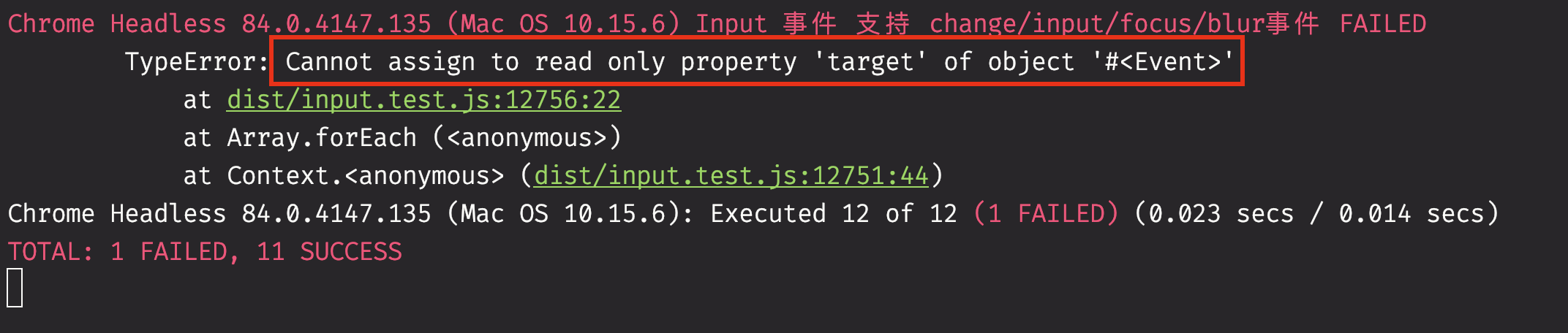
添加如下代码解决:
//input.test.jsit('支持 change/input/focus/blur事件', () => {['change', 'input', 'focus', 'blur'].forEach((eventName) => {vm = new Constructor({}).$mount()const callback = sinon.fake()vm.$on(eventName, callback)let event = new Event(eventName)Object.defineProperty(event,'target',{value:{value:'hi'},enumerable:true})let inputElement = vm.$el.querySelector('hi')inputElement.dispatchEvent(event)expect(callback).to.have.been.calledWith(event.target.value)//判断target的值})})
小结:
在之前的测试中,我们calledWith的是event,在测试双向绑定的时候测试的是出啊发event.target的值,但是event缺少target的值,我们无法直接通过event获取,而且在测试的时候是没有这个值的,所以我们可以通过Object.defineProperty这个API让浏览器自动补全的target的值。
网格系统(栅格系统)
伪定义:把一个div分成n个部分(n=12,24,36…),每个部分无空隙或者有空隙,主要用于做横向布局
雏形
使用row和col实现
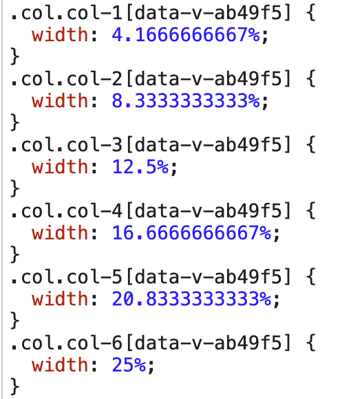
//col.vue<template><div class="col"><slot></slot></div></template><style scoped lang="scss">.col{height: 100px;background: grey;width: 50%;border:1px solid red;$class-prefix:col-;//生成class前缀@for $n from 1 through 24{&.#{$class-prefix}#{$n}{//scss的插值语法:前缀-n 例如: col-1 col-2width: ($n / 24) * 100%;}}}</style>
重点代码
$class-prefix:col-;//生成class前缀@for $n from 1 through 24{&.#{$class-prefix}#{$n}{//scss的插值语法:前缀-n 例如: col-1 col-2width: ($n / 24) * 100%;}}//这一块代码可以通过scss的forEach生成 前缀-n 的class。然后通过class自动生成对应的布局
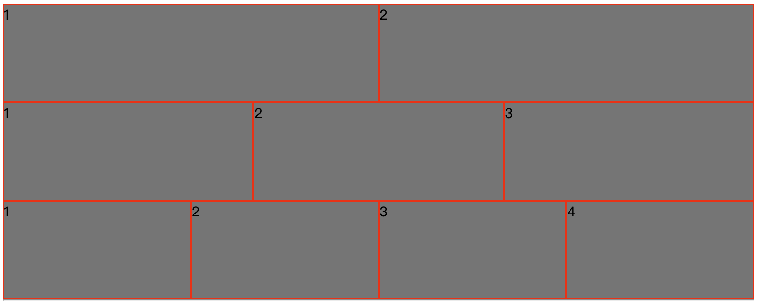
//index.html<g-row><g-col>1</g-col><g-col>2</g-col></g-row><g-row><g-col>1</g-col><g-col>2</g-col><g-col>3</g-col></g-row><g-row><g-col>1</g-col><g-col>2</g-col><g-col>3</g-col><g-col>4</g-col></g-row>
遇到一个问题
解决问题
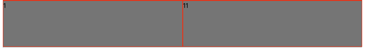
//index.html<g-row><g-col span="2">1</g-col><g-col span="22">11</g-col></g-row>
这次不使用:span绑定,直接使用span属性,但是这样的话span就是一个字符串,所以需要在props中添加属性,span表示一个对象,type表示属性,[Number,String]表示属性值
<script>export default {name:'GuluCol',props:{span:{type:[Number,String]}}}</script>
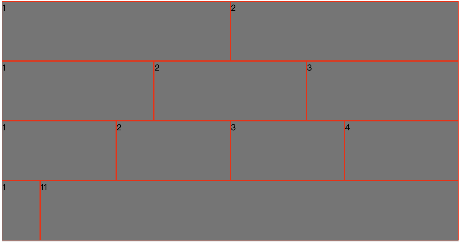
小结
如果要做成非对称的布局,只需要添加一个span即可
实现根据用户传入的参数决定中间有空隙的效果
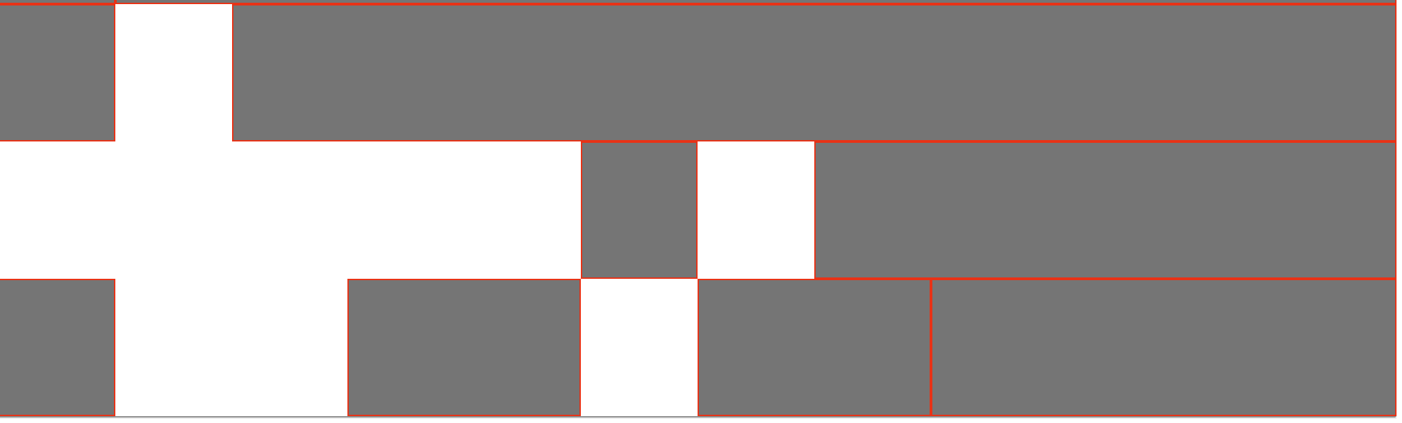
//index.html<g-row><g-col span="2"></g-col><g-col span="20" offset="2"></g-col></g-row><g-row><g-col span="2" offset="10"></g-col><g-col span="10" offset="2"></g-col></g-row><g-row><g-col span="2"></g-col><g-col span="4" offset="4"></g-col><g-col span="4" offset="2"></g-col><g-col span="8" ></g-col></g-row>
绑定offset(偏移)属性
//col.vue<template><div class="col" :class="[`col-${span}`, `offset-${offset}`]"><slot></slot></div></template><script>export default {name: 'GuluCol',props: {span: {type: [Number, String]},offset: {type: [Number, String]}}}</script>$class-prefix:offset-;@for $n from 1 through 24{&.#{$class-prefix}#{$n}{margin-left: ($n/24)*100%;}}
指向绑定的offset、声明offset属性、遍历offset
小结
因为偏移、布局的宽度最大值为24,所以这两个值相加的和不能超过24
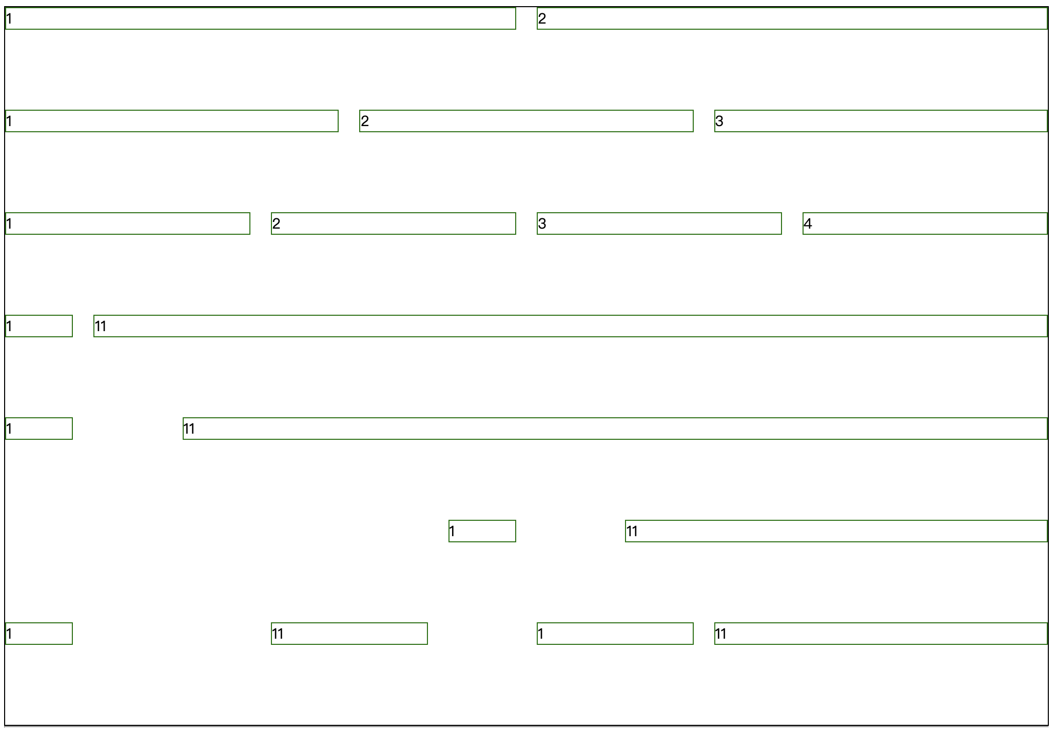
实现生成固定的空隙
尝试使用margin:0 10px;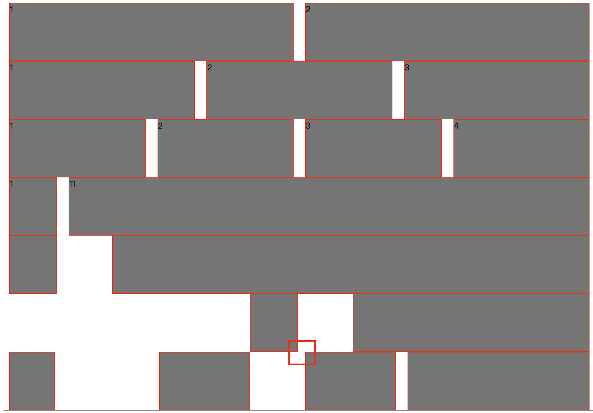
这里没有对齐
改用padding:0 10px;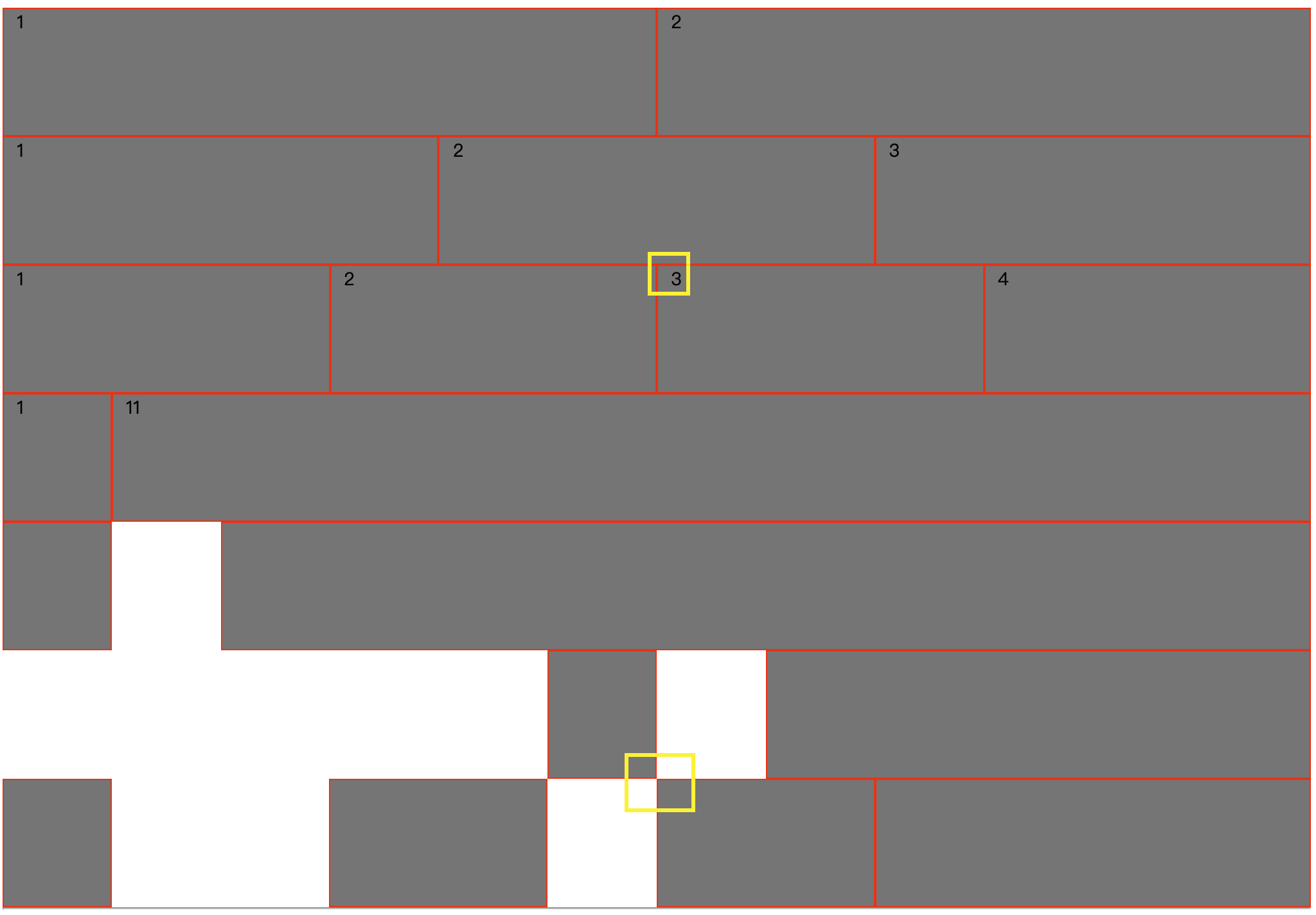
此时发生了偏移,而且也对齐了,但是偏移的效果不明显,只能通过对比每个格子中的数字才能看出偏移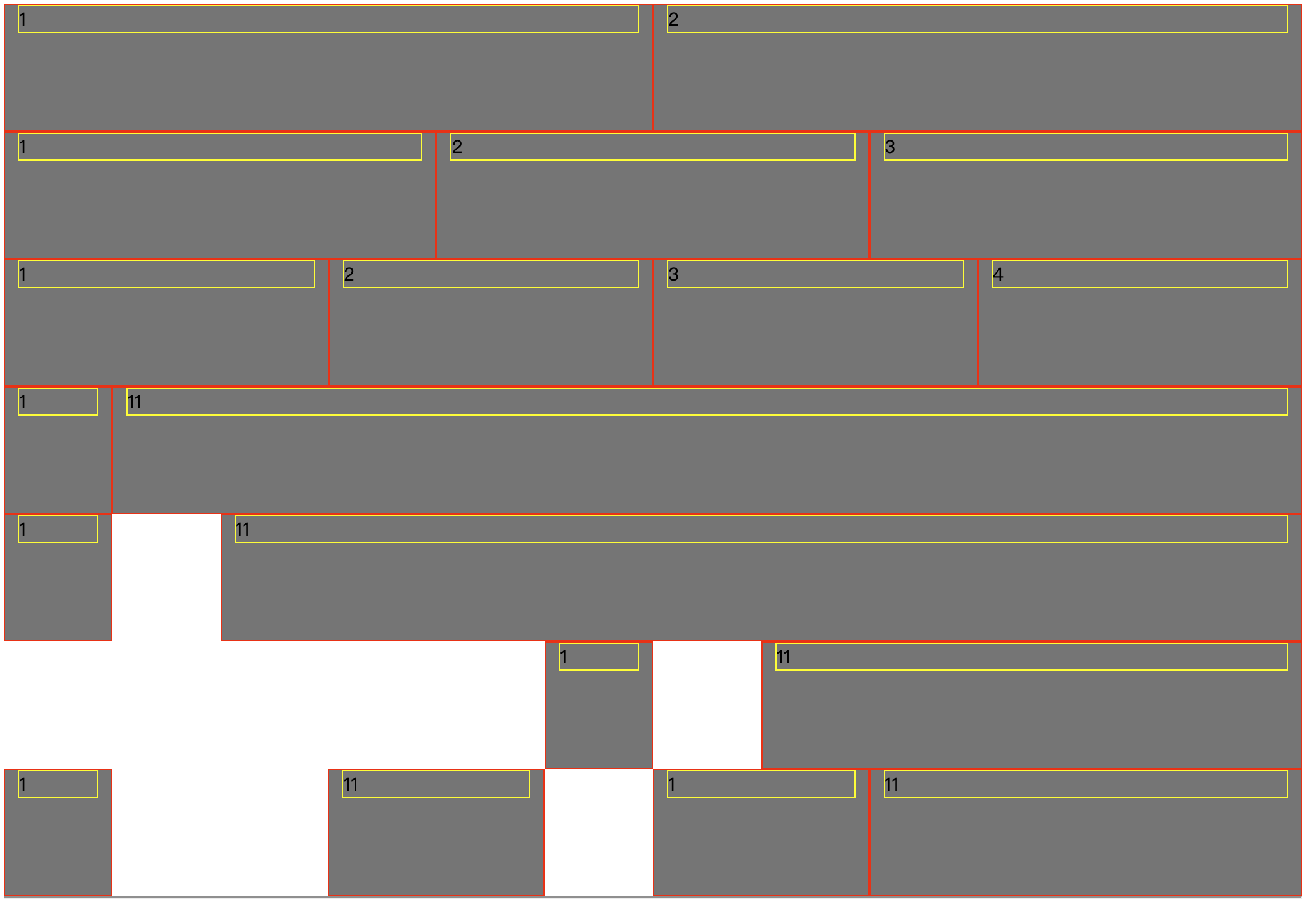
加上border后,方便观察,通过观察添加padding后和背景色的效果发现,border和左右的页面宽度之间有10px的padding,解决的办法(负margin):
//row.vue<template><div class="row"><slot></slot></div></template><style scoped lang="scss">.row{display: flex;margin:0 -10px;}</style>
实现用户自己设置固定大小的间隙
//index.html<g-row gutter="20"><g-col>1</g-col><g-col>2</g-col></g-row>
使用钩子实现基本功能
mounted和created的区别:
created创建完对象以后并没有把对象放进页面中,mounted是在创建完对象的一瞬间把对象放进页面中
mounted和created的顺序:
先创建父元素,然后创建子元素,然后挂载子元素,最后挂载父元素 
模仿淘宝首页
topbar

//index.html<style>.demoBox{height:50px;background: grey;border:1px solid red;}</style><g-row class="topbar"><g-col class="demoBox" span="9"><g-row><g-col>1</g-col><g-col>2</g-col><g-col>3</g-col><g-col>4</g-col></g-row></g-col><g-col class="demoBox" span="15"><g-row><g-col>1</g-col><g-col>2</g-col><g-col>3</g-col><g-col>4</g-col><g-col>5</g-col><g-col>6</g-col><g-col>7</g-col></g-row></g-col></g-row>

小技巧:
在创建标签的时候,让webstorm自动填充内容可以使用以下代码:

若有收获,就点个赞吧
0 人点赞
