CSS
1. CSS 概述
1.1 CSS 简介
层叠样式表(英文全称:Cascading Style Sheets)是一种用来表现HTML(标准通用标记语言的一个应用)或XML(标准通用标记语言的一个子集)等文件样式的计算机语言。CSS不仅可以静态地修饰网页,还可以配合各种脚本语言动态地对网页各元素进行格式化。
CSS 能够对网页中元素位置的排版进行像素级精确控制,支持几乎所有的字体字号样式,拥有对网页对象和模型样式编辑的能力。
1.2 CSS 发展历程
随着HTML的成长,为了满足页面设计者的要求,HTML添加了很多显示功能。但是随着这些功能的增加,HTML变的越来越杂乱,而且HTML页面也越来越臃肿。于是CSS便诞生了。
1994年哈坤·利提出了CSS的最初建议。而当时伯特·波斯(Bert Bos)正在设计一个名为Argo的浏览器,于是他们决定一起设计CSS。同年,W3C组织(World WideWeb Consortium)成立,CSS的创作成员全部成为了W3C的工作小组并且全力以赴负责研发CSS标准,层叠样式表的开发终于走上正轨。有越来越多的成员参与其中,例如微软公司的托马斯·莱尔顿(Thomas Reaxdon),他的努力最终令Internet Explorer浏览器支持CSS标准。哈坤、波斯和其他一些人是这个项目的主要技术负责人。
1996年底,CSS初稿已经完成,同年12月,层叠样式表的第一份正式标准(Cascading style Sheets Level 1)完成,成为w3c的推荐标准。
1997年初,W3C组织负责CSS的工作组开始讨论第一版中没有涉及到的问题。其讨论结果组成了1998年5月出版的CSS规范第二版。
1.3 CSS 特点
CSS为HTML标记语言提供了一种样式描述,定义了其中元素的显示方式。CSS在Web设计领域是一个突破。利用它可以实现修改一个小的样式更新与之相关的所有页面元素。
总体来说,CSS具有以下特点:
- 丰富的样式定义
- 易于使用和修改
- 多页面应用(定义一个外部独立的css文件,被多个页面共享 : 前端框架)
- 层叠(不同样式间可以叠加效果)
- 页面压缩
1.4 CSS 工作原理
CSS是一种定义样式结构如字体、颜色、位置等的语言,被用于描述网页上的信息格式化和显示的方式。CSS样式可以直接存储于HTML网页或者单独的样式单文件。无论哪一种方式,样式单包含将样式应用到指定类型的元素的规则。外部使用时,样式单规则被放置在一个带有文件扩展名_css的外部样式单文档中。
2. CSS 引入方式
2.1 内联样式
内联样式:作用在标签内部的样式
- 位置 : 将样式直接写到标签的style属性上即可
- style就是标签的属性
- style格式 : style=”key1:val1;key2:val2;…”
- 缺点 : 一个标签就要写一套完整的样式,所以通用性不强随着内联样式的增多,网页的结构会变的非常混乱
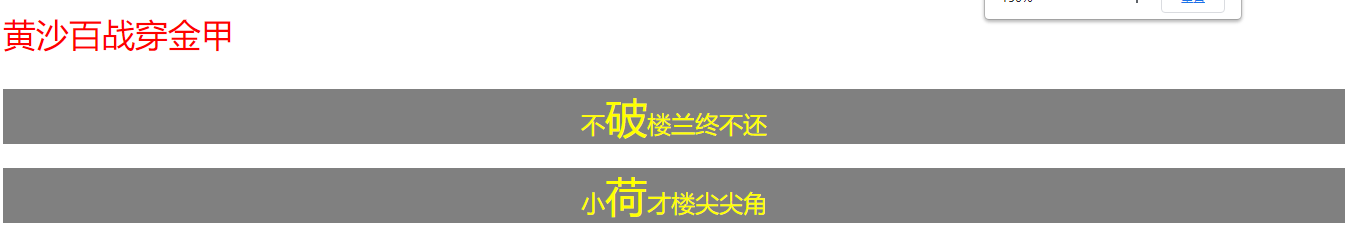
<p style="color:red;font-size: 22px">黄沙百战穿金甲</p><p style="background-color:gray;color: yellow;text-align: center">不<span style="font-size: 28px;">破</span>楼兰终不还</p><p style="background-color:gray;color: yellow;text-align: center">小<span style="font-size: 28px;">荷</span>才楼尖尖角</p>
2.2 内部样式
内部样式 : 通过 来引入
- 位置 : head标签中定义
- 语法 :
选择一个元素 {
key1: val1;
key2:val2;
} - 特点 : 样式和html是分离的
- 优势 : 提高了代码的复用性和扩展性,极大的优化html的语法结构,增强代码的阅读性
- 缺点:随着CSS样式的增多,会使得html页面变得非常庞杂,css和html耦合性太强,没有彻底分离
<!DOCTYPE html>
<html lang="en">
<head>
<meta charset="UTF-8">
<title>Title</title>
<style>
#p1 { /* 获取到body中id="p1"的元素 :id选择器(唯一的) */
color: #ff361e;
}
.msg { /*获取到body中class="msg"的所有元素 : 类选择器*/
background-color: gray; /*容器的背景样式*/
color: yellow; /*字体的颜色*/
text-align: center; /*文本的对齐方式 : 居中*/
}
.f-28{
font-size: 28px;
}
</style>
</head>
<body>
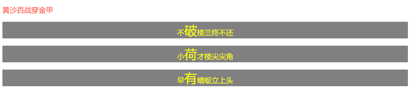
<p id="p1">黄沙百战穿金甲</p>
<p class="msg">不<span class="f-28">破</span>楼兰终不还</p>
<p class="msg">小<span class="f-28">荷</span>才楼尖尖角</p>
<p class="msg">早<span class="f-28">有</span>蜻蜓立上头</p>
</body>
</html>
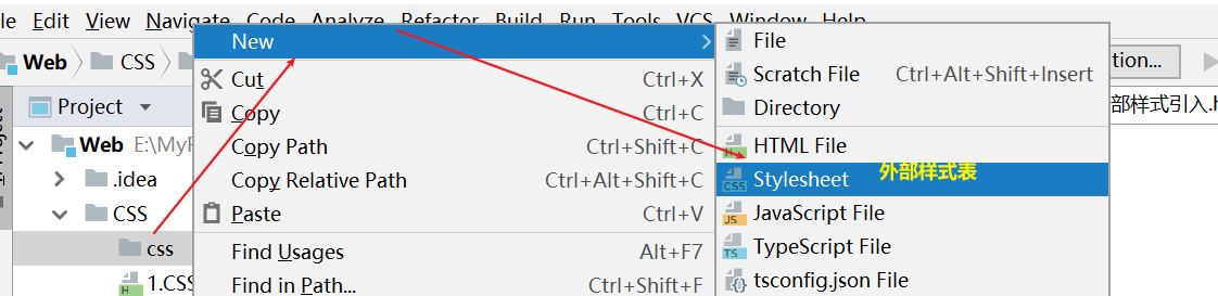
2.3 外部样式
要求 : 外部创建一个css扩展名的外部css文件,在HTML页面中通过link标签来引入这个外部样式即可
<link rel="stylesheet" href="样式的位置">
#p1 {  /* 获取到body中id="p1"的元素 :id选择器(唯一的) */
    color: #ff361e;
}
.msg { /*获取到body中class="msg"的所有元素 : 类选择器*/
    background-color: gray; /*容器的背景样式*/
    color: #a9ffd8; /*字体的颜色*/
    text-align: center; /*文本的对齐方式 : 居中*/
}
.f-28{
    font-size: 28px;
}
<!DOCTYPE html>
<html lang="en">
<head>
    <meta charset="UTF-8">
    <title>Title</title>
    <!--链接外部样式-->
    <link rel="stylesheet" href="css/test.css">
    <!--扩展: 导入外部样式(使用很少,了解即可)-->
   <!-- <style>
        @import "css/test.css";
    </style>-->
</head>
<body>
    <p id="p1">黄沙百战穿金甲</p>
    <p class="msg">不<span class="f-28" style="color: red;">破</span>楼兰终不还</p>
    <p class="msg">小<span class="f-28">荷</span>才楼尖尖角</p>
    <p class="msg">早<span class="f-28">有</span>蜻蜓立上头</p>
</body>
</html>
2.4 优先级
<!DOCTYPE html>
<html lang="en">
<head>
    <meta charset="UTF-8">
    <title>Title</title>
    <!--约定优于编程:外部样式需要放在自己写的style标签的上面-->
    <link rel="stylesheet" href="css/test.css">
    <style>
        .my{
            color: yellow;
            font-weight: bold; /*字体加粗*/
            font-style: italic; /*斜体*/
            /*【层叠】样式:不同样式可以叠加
                 相同样式之间通过优先级顺序会覆盖*/
        }
    </style>

</head>
<body>
    <div class="my" style="color: blue">衣带渐宽终不悔</div>

    <h2>结论 【样式引入的优先级 : 内联 > 内部 > 外部】</h2>
</body>
</html>
link和@import有何区别:
相同点:
1.都可以在html中引入css文件
2.本质上,link是服务于整个网页,@import是服务于css
区别:
1.link是一个标签,@import是一种语法
2.link不只可以引入css文件,还可以引入其他文件格式,@import只能引入css文件
3.加载时间:link加载css文件,随着页面的加载而加载,@import等待页面加载完成之后再加载css文件
4.兼容性:link兼容比@import要好一些
5.JavaScript可以操作link引入样式,@import不能被操作。
6.@import是属于CSS2.1特有的,对不兼容CSS2.1的浏览器是无效的
结论 : 使用link
3. CSS 简单选择器
3.1 id选择器
id选择器基本结构:
#自定义id名称{
    css 属性设置。。。
}
id选择器 (具有唯一性,一般只能作用于一个标签)
3.2 标记选择器
标记选择器基本结构:
标记的名字{

}
标记选择器(标签选择器)
3.3 class类选择器
class选择器(类选择器)基本结构:
.自定义的类名{
    css属性设置
}
<!DOCTYPE html>
<html lang="en">
<head>
<meta charset="UTF-8">
<title>Title</title>
<!--内部样式-->
<style>
/*id选择器 : 具有唯一性只能使用一次(很少使用)*/
#title {
color: blue;
}
/*类选择器 : 找到具有相同class的所有元素,可以被反复使用(设计框架的基础)*/
.content {
font-size: 28px; /*字体大小*/
font-weight: bold; /*加粗*/
font-family: 楷体;
font-style: italic; /*斜体*/
color: skyblue; /*文本颜色*/
}
/*元素选择器 : 找出body中所有的这个元素(设计框架的基础样式里使用)*/
p {
background-color: #fbff41;
}
</style>
</head>
<body>
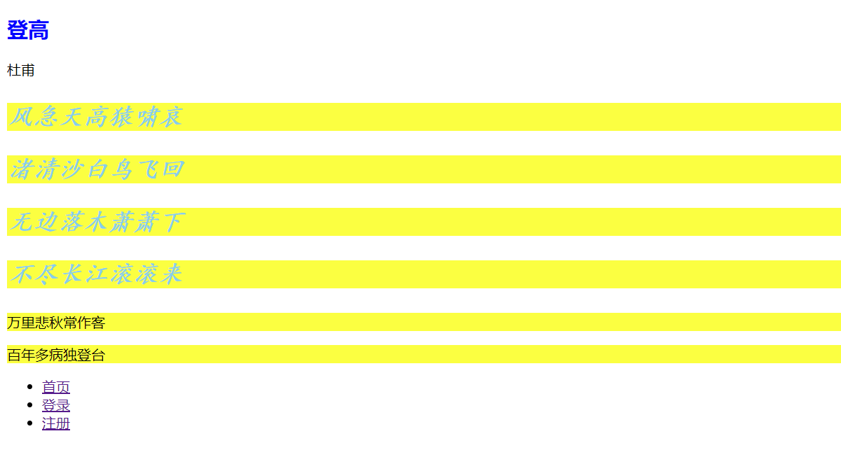
<h2 id="title">登高</h2>
<span>杜甫</span>
<p class="content">风急天高猿啸哀</p>
<p class="content">渚清沙白鸟飞回</p>
<p class="content">无边落木萧萧下</p>
<p class="content">不尽长江滚滚来</p>
<p>万里悲秋常作客</p>
<p>百年多病独登台</p>
<ul>
<li><a href="">首页</a></li>
<li><a href="">登录</a></li>
<li><a href="">注册</a></li>
</ul>
</body>
</html>
4. 复合选择器
4.1 组合选择器
如果多个选择器都有相同的样式,我们可以将多个选择器放在一起,然后设置相同的样式
多个选择器中间使用逗号隔开,代表选择器分组
语法:
  div,p,span{   // 提取多个标签的共同样式

  }
  等同于
  div{

  }
  p{

  }
  span{

  }
<!DOCTYPE html>
<html lang="en">
<head>
    <meta charset="UTF-8">
    <title>Title</title>
    <style>
        /*组合选择器 : 让多个选择器具备相同的样式效果,【选择器】之间使用,隔开
            通过逗号可以共享样式
        */
        /*div,header.author,p {*/
        /*div,.author,p {*/
        div,header,p {
             background-color: #333;
             color: #fff;
             font-size: 32px;
         }
        /*header.author :  表示class="author"的header标签*/
    </style>
</head>
<body>
    <div>Beyond</div>
    <p>周杰伦</p>
    <span>那英</span>
    <span class="author">王菲</span>
    <header class="author">宋祖儿</header>
    <header>头条</header>
</body>
</html>
4.2 层次选择器
找到页面中满足条件的后代标签,找到某个元素里面的子元素或孙元素,可以指定范围
中间用空格隔开
语法:
  div p{

  }
4.3 子元素选择器
只找直接子元素,只找儿子,不找孙元素
中间使用 >来隔开
语法:
  div > p{

  }
<!DOCTYPE html>
<html lang="en">
<head>
    <meta charset="UTF-8">
    <title>Title</title>
    <style>

       .user>li{
            color: #ff361e;
       }
       .user-1>li{
            color: #896fff;
       }
       /* 父元素>子元素 : 获取到所有的直接子元素(亲儿子) */
        /*.hero>div {*/
       /* 父元素 子元素 : 获取当前父元素下的所有子元素(后辈元素)*/
        .hero div {
            color: #a9ffd8;
        }

    </style>
</head>
<body>
<ul class="user">
    <li>首页</li>
    <li>登录</li>
    <li>注册</li>
    <li>个人中心
        <ul class="user-1">
            <li>修改密码</li>
            <li>实名认证</li>
            <li>个人资料</li>
        </div>
    </li>
</ul>

        <div class="hero">
            <div>刘备</div>
            <span>
                <div>张飞</div>
                <div>关羽</div>
                <div>黄忠</div>
            </span>
            <div>赵云</div>
            <div>马超</div>
        </div>
<hr>

<ul class="admin">
    <li>首页</li>
    <li>登录</li>
    <li>注册</li>
    <li>个人中心
        <ul>
            <li>修改密码</li>
            <li>实名认证</li>
            <li>个人资料</li>
        </ul>
    </li>
</ul>
</body>
</html>
4.4 属性选择器
| 选择器 | 描述 |
|---|---|
| [属性名] | 用于选取指定带有属性名的元素 |
| [属性名=属性值] | 用于选取指定属性名和属性值的元素 (精确匹配) |
| [属性名*=属性值] | 用于选取标签上的属性值带有指定的值的元素(模糊匹配) |
| [属性名~=属性值] | 用于选取属性值中包含指定词汇的元素 |
| [属性名^=属性值] | 用于选取指定值开头的元素 |
| [属性名$=属性值] | 用于选取带有指定值结束的元素 |
<!DOCTYPE html>
<html lang="en">
<head>
    <meta charset="UTF-8">
    <title>Title</title>
    <style>
        /*查找name="pwd"的元素 :  使用属性选择器 [key="val"]*/
        input[name="username"] { /*查找name="username"的所有input*/
            width: 100px;
            height: 50px;
            font-size: 20px;
            text-align: center;
        }
        div {
            background-color: #49daff;
        }
    </style>
</head>
<body>

<input type="text" name="username">
<input type="text" name="username">
<input type="password" name="pwd">
<div name="username">ADMIN</div>

</body>
</html>
4.5 过滤选择器
E:nth-of-type(n):筛选指定位置的子元素
E:nth-of-type(odd):筛选所有行数为奇数的子元素
E:nth-of-type(even):帅选所有行数为偶数的子元素
E:nth-child(odd)
E:nth-child(even)
E:first-child:获取首元素
E:last-child:获取末尾元素
<!DOCTYPE html>
<html lang="en">
<head>
    <meta charset="UTF-8">
    <title>Title</title>
    <style>
        /*1. 查找到第一个ul
            :nth:child(元素的下标:默认从1开始)
            :nth:child(2n) 查找的是偶数下标的元素  :nth:child(even)
            :nth:child(2n+1)查找的是奇数下标的元素  :nth:child(odd)
         */
        /*ul:nth-child(1){
           color: #ff361e;
        }*/

        /*
            :first-child  获取第一个元素
            :last-child   获取最后一个元素
        */
        /*ul:last-child {
            color: #ff361e;
        }*/

        /*2. 查找到上海 */
       /* ul:first-child>li:first-child {
            color: #896fff;
        }*/
       /*  ul>li:first-child {
            color: #896fff;
        }*/
        ul>li:nth-child(even) {
            color: #896fff;
        }
    </style>
</head>
<body>
<ul>
    <li>上海</li>
    <li>北京</li>
    <li>深圳</li>
    <li>广州</li>
</ul>
<ul>
    <li>杭州</li>
    <li>南京</li>
    <li>西安</li>
    <li>武汉</li>
</ul>
<ul>
    <li>江苏省</li>
    <li>吉林省</li>
    <li>黑龙江</li>
    <li>河北省</li>
</ul>
</body>
</html>
4.6 补充选择器
(1)兄弟选择器
相邻兄弟选择器:找到满足条件的后面第一个相邻兄弟标签
语法:找到页面中所有的div后面的相邻第一个p兄弟标签
div + p{

}
(2)后续兄弟选择器
后续兄弟选择器:找到满足条件后面所有的兄弟标签,不会找到子元素
语法: 找到页面中所有div后面的所有兄弟标签p
div ~ p{

}
4.7 权重
- 相同选择器,后面的会覆盖前面的样式
- 不同选择器,权重大小:id选择器>类选择器>标签选择器
- 权重相同情况下:内联>内部>外部
1.选择器的权重(优先级问题)
    (1)相同选择器:内联>内部>外部
    (2)在相同位置下,定义基础选择器:id选择器>类选择器(属性选择器)>标签>通配符选择器
    (3)复合选择器的权重的计算需要将所有基础都进行计算
2.选择器的权重计算方案
    (1)加法计算
        a.内联样式权重默认为1000
        b.id选择器权重默认为100
        c.类选择器(属性选择器、伪类)权重为10
        d.元素选择器(伪元素)权重为1
        e.继承的属性权重为0
    (2)注意:在加法运算中,不满足满10进1的说法
3.4个0的计算方式(0,0,0,0)
    a.第一个0代表是否有内联样式,有则为1,无则为0
    b.第二个0代表id选择器的个数
    c.第三个0代表类选择的个数
    d.第四个0代表标签选择器的个数
从第一个0开始进行对比,如果不同,值的选择器权重最大,如果相同对比第二个值,依次类推。
4.!important
!important这个属性用来定义最终的显示效果,用来这个字可以设置当前的属性样式权重最大。比较暴力,会破坏选择器权重的计算,是最终作用的样式,如果同一标签上多个选择器都有,那么通过选择器权重来决定。
5. CSS常见样式
5.1 颜色

5.2 文本样式
font-family:设置字体类型(默认 宋体,标题默认是黑体)
font-weight:设置字体是否加粗 normal(默认的正常字体),bold(加粗的字体)自定义粗细(100-900)
font-size:设置字体的大小单位px
font-style:设置字体是否为斜体 normal(正常字体),italic(x斜体)
color:设置字体的颜色(值可以颜色对应的英文,也可以是 颜色的16进制的值)

line-height:设置标签的高度
text-align:设置文字显示的方向 值 left,center,right

text-decoration:设置下划线  underline,line-through, overline   none 去掉默认下划线

text-indent:设置首行缩进的距离单位 em或者px

letter-spacing:设置字符间距
wrod-spacing:设置单词间距
text-transform: 设置字母大小写转换
    三个属性值介绍:
    uppercase(将字母全部转换成大写输出)
    lowercase(将字母全部转换成小写输出)
    capitalize(所有字母全部转换成首字母大写 ,其余保持原状输出);

多余文字隐藏,用…代替(只显示单行文本,多余文字隐藏,用…)
/* 规定文字不换行 */
white-space: nowrap;
/* 超出部分隐藏 */
overflow: hidden;
/* 多余用...代替 */
text-overflow: ellipsis;
<!DOCTYPE html>
<html lang="en">
<head>
<meta charset="UTF-8">
<title>Title</title>
<style>
.title {
font-size: 32px; /*字体的大小 : 单位是像素*/
font-weight: bold; /*字体加粗*/
font-family: 宋体; /*字体*/
/*font-style: italic; !*字体的展示形态 :斜体 normal正常*!*/
color: #fff560; /*字体的颜色*/
background-color: #999;
width: 500px;
height: 80px;
/*文本的位置控制 : 水平 + 垂直 居中*/
text-align: center; /*容器中的文本水平居中: 位置会根据父容器的宽度来自动计算*/
line-height: 80px; /*设置行高 : 实现文本在容器中垂直居中*/
}
.date {
/*文本的装饰效果 :underline下划线 overline上划线 line-through中划线*/
text-decoration: underline;
}
a {
/*将所有的超链接去掉默认的下划线*/
text-decoration: none; /*去掉文本的所有装饰效果*/
}
a:hover{ /* 选择器:hover: 当鼠标悬停在该元素上时触发的样式效果 (鼠标悬停效果)*/
text-decoration: underline;
}
.article {
width: 800px;
background-color: #f0f0f0;
margin: 0px auto; /*外边距: 元素与元素之间外边的距离 auto:左右距离自动计算*/
}
.article>p {
text-indent: 2em;
}
.info {
font-size: 14px;
color: #e0e0e0;
width: 160px;
/*超出部分隐藏*/
overflow: hidden;
/*强制不换行*/
white-space: nowrap;
/*超出部分使用省略号代替*/
text-overflow: ellipsis; /* ellipsis : 省略号*/
}
</style>
</head>
<body>
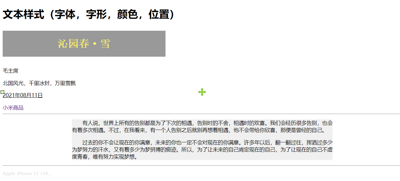
<h1>文本样式(字体,字形,颜色,位置)</h1>
<p class="title">沁园春·雪</p>
<p>毛主席</p>
<p>北国风光,千里冰封,万里雪飘</p>
<p class="date">2021年08月11日</p>
<a href="">小米商品</a>
<hr>
<div class="article">
<p>有人说,世界上所有的告别都是为了下次的相遇,告别时的不舍,相遇时的欢喜。我们会经历很多告别,也会有着多次相遇。不过,在我看来,有一个人告别之后就别再想着相遇,他不会带给你欣喜,那便是曾经的自己。</p>
<p>过去的你不会让现在的你满意,未来的你也一定不会对现在的你满意。许多年以后,翻一翻过往,挥洒过多少为梦努力的汗水,又有着多少为梦拼搏的痕迹。所以,为了让未来的自己肯定现在的自己,为了让现在的自己不虚度青春,唯有努力实现梦想。</p>
</div>
<hr>
<p class="info">Apple iPhone 12 128GB 黑色 支持移动联通电信5G 双卡双待手机</p>
</body>
</html>
5.3 边框样式
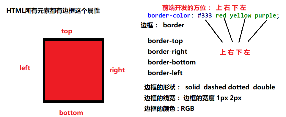
1.设置边框的方向有,top(上),bottom(下),left(左),right(右)
2.单条边框设置:border-方向:边框线条的类型 边框的颜色 边框的宽度
3.同时绘制4条边框:border:边框线条的类型 边框的颜色 边框的宽度
4.边框的属性值介绍:
其中边框的类型:solid单实线/double双实线/dashed虚线/dotted点缀线
边框颜色:颜色的英文单词,#16进制 rgb
边框宽度:px
<!DOCTYPE html>
<html lang="en">
<head>
<meta charset="UTF-8">
<title>Title</title>
<style>
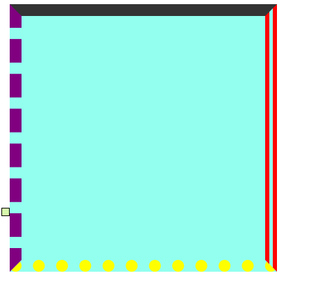
.d1 {
width: 200px;
height: 200px;
background-color: #92ffef;
/*添加边框效果了
线宽(px) 线型(solid/double/dotted/dashed) 颜色(RGB)
solid : 实线 double:双划线
dotted:点状虚线 dashed :横杠虚线
*/
border-top: 10px solid rgb(255,0,0);
border-right: 10px double #00FF00;
border-bottom: 10px dotted blue;
border-left: 10px dashed yellow;
/*扩展写法(很少用)*/
border-color: #333 red yellow purple; /*上右下左*/
border-color: #333 red yellow; /*上 左右 下*/
border-color: #333 red; /*上下 左右*/
border-color: #333; /*四个边框颜色统一*/
}
</style>
</head>
<body>
<div class="d1"></div>
</body>
</html>
5.3.1 倒圆角
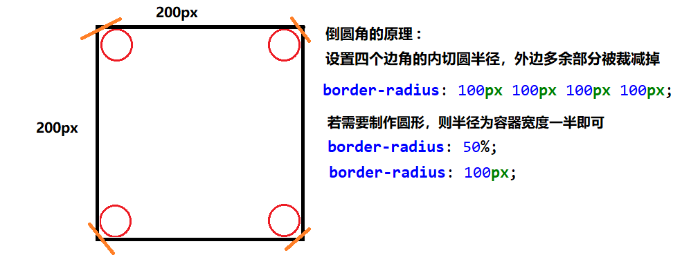
圆角 : border-radius
格式:border-radius: 20px  10px  50px  30px;
四个属性值按顺时针排列

利用border-radius属性制作圆形的两个要点
元素的宽度和高度必须相同
圆角的半径为元素宽度的一半,或者直接设置圆角半径值为50%
<!DOCTYPE html>
<html lang="en">
<head>
    <meta charset="UTF-8">
    <title>Title</title>
</head>
<style>
    .d1 {
        width: 200px;
        height: 200px;
        background-color: #896fff;
        /*倒圆角*/
        /*border-radius: 100px 100px 100px 100px;*/
        /*border-radius: 100px;*/
        /*border-radius: 10px;*/
        border-radius: 50%; /*倒角圆的半径是容器宽度的一半*/
    }
    a {
      text-decoration: none;
    }
    .btn {
        border-radius: 4px;
        border: none; /*取消边框*/
        border: 1px solid #b0b0b0;
        background-color: #fff;
        padding: 5px 10px; /*内边距:内填充*/
    }
    .btn-primary {
        background-color: #337ab7;
        color: #fff;
        border: 1px solid #295d8c;
    }
    .btn-success {
        background-color: #5cb85c;
        color: #fff;
        border: 1px solid #4a934a;
    }
    .btn-danger {
        background-color: #db3425;
        color: #fff;
        border: 1px solid #c42d20;
    }
</style>
<body>
    <div class="d1"></div>

    <hr>
    <button type="button" class="btn btn-primary">查询所有</button>
    <button type="button" class="btn btn-success">我的笔记</button>
    <button type="button" class="btn">添加笔记</button>
    <button type="button" class="btn btn-danger">删除笔记</button>

    <a href="" class="btn btn-danger">删除商品</a>
</body>
</html>

5.4 背景样式
(1). 背景图片相关属性的设置
Background:[color] [image][repeat][position]
    []表示此属性可以省略
    [color]:设置背景颜色
    [image]:url(“背景图片地址”)设置背景图片
    [repeat]:背景图片是否重复(repeat 可重复 no-repeat 不可重复repeat-x:只沿水平方向平铺
    repeat-y:只沿垂直方向平铺) ;
    [potion]:x,y  (x:水平方向的偏移量设置,y垂直偏移量,如果设置负数会反向偏移)

(2).设置背景图片大小
Background-size:width height (width:设置背景图片的宽度,height:设置背景图片的高度)
除此之外还可以设置如下属性:
    auto:默认值,使用背景图片保持原样。
    percentage:当使用百分比设置背景图片时,不是根据背景图片的尺寸来计算的,而是根据元素的高度,宽度来计算。
    cover:整个背景图片放大来填充元素
    contain:让背景图片保持原先的高度宽度比例,缩放到正好能够填充至元素中。

(3).background-attachment:背景固定
    scroll:随着滚动条滚动,默认值
    fixed:固定,将背景固定在盒子里面
<!DOCTYPE html>
<html lang="en">
<head>
    <meta charset="UTF-8">
    <title>Title</title>
    <style>
        .box {
            /*背景颜色*/
            /*background-color: #896fff;*/
            /*背景图片*/
            /*background-image: url("images/logo.png");*/
            /*background-repeat: no-repeat;*/
            /*background-position: 100px 200px;*/
            /*background-attachment: scroll ; !*默认是scroll*!*/
            /*scroll : 背景随着滚动而移动 fixed: 背景固定不动*/
            /*官方推荐一种新式的写发*/
            background: url("images/logo.png") no-repeat 100px 200px fixed;

            height: 2000px;
        }


    </style>
</head>
<body>
    <div class="box"></div>
</body>
</html>
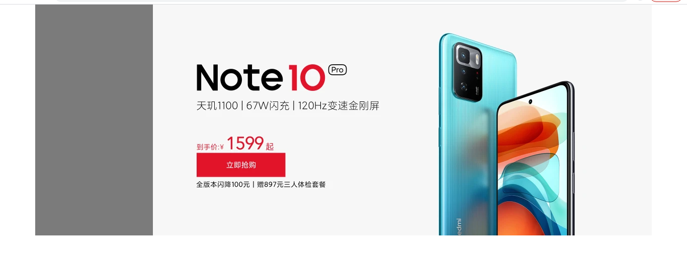
案例1 :
<!DOCTYPE html>
<html lang="en">
<head>
<meta charset="UTF-8">
<title>Title</title>
<style>
.article {
width: 600px;
margin: 0 auto;
background: url("images/bg.jpg") no-repeat 500px 300px fixed;
}
.article>.title {
text-align: center;
}
.article>p {
text-indent: 2em;
font-size: 18px;
line-height: 1.5;
}
</style>
</head>
<body>
<div class="article">
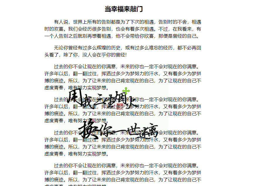
<h2 class="title">当幸福来敲门</h2>
<p>有人说,世界上所有的告别都是为了下次的相遇,告别时的不舍,相遇时的欢喜。我们会经历很多告别,也会有着多次相遇。不过,在我看来,有一个人告别之后就别再想着相遇,他不会带给你欣喜,那便是曾经的自己。</p>
<p>无论你曾经有过多么辉煌的历史,或有过多么难忘的经历,都不必再回头看了,除了你,没人会在乎你的曾经!</p>
<p>过去的你不会让现在的你满意,未来的你也一定不会对现在的你满意。许多年以后,翻一翻过往,挥洒过多少为梦努力的汗水,又有着多少为梦拼搏的痕迹。所以,为了让未来的自己肯定现在的自己,为了让现在的自己不虚度青春,唯有努力实现梦想。</p>
<p>过去的你不会让现在的你满意,未来的你也一定不会对现在的你满意。许多年以后,翻一翻过往,挥洒过多少为梦努力的汗水,又有着多少为梦拼搏的痕迹。所以,为了让未来的自己肯定现在的自己,为了让现在的自己不虚度青春,唯有努力实现梦想。</p>
<p>过去的你不会让现在的你满意,未来的你也一定不会对现在的你满意。许多年以后,翻一翻过往,挥洒过多少为梦努力的汗水,又有着多少为梦拼搏的痕迹。所以,为了让未来的自己肯定现在的自己,为了让现在的自己不虚度青春,唯有努力实现梦想。</p>
<p>过去的你不会让现在的你满意,未来的你也一定不会对现在的你满意。许多年以后,翻一翻过往,挥洒过多少为梦努力的汗水,又有着多少为梦拼搏的痕迹。所以,为了让未来的自己肯定现在的自己,为了让现在的自己不虚度青春,唯有努力实现梦想。</p>
<p>过去的你不会让现在的你满意,未来的你也一定不会对现在的你满意。许多年以后,翻一翻过往,挥洒过多少为梦努力的汗水,又有着多少为梦拼搏的痕迹。所以,为了让未来的自己肯定现在的自己,为了让现在的自己不虚度青春,唯有努力实现梦想。</p>
<p>过去的你不会让现在的你满意,未来的你也一定不会对现在的你满意。许多年以后,翻一翻过往,挥洒过多少为梦努力的汗水,又有着多少为梦拼搏的痕迹。所以,为了让未来的自己肯定现在的自己,为了让现在的自己不虚度青春,唯有努力实现梦想。</p>
<p>过去的你不会让现在的你满意,未来的你也一定不会对现在的你满意。许多年以后,翻一翻过往,挥洒过多少为梦努力的汗水,又有着多少为梦拼搏的痕迹。所以,为了让未来的自己肯定现在的自己,为了让现在的自己不虚度青春,唯有努力实现梦想。</p>
<p>过去的你不会让现在的你满意,未来的你也一定不会对现在的你满意。许多年以后,翻一翻过往,挥洒过多少为梦努力的汗水,又有着多少为梦拼搏的痕迹。所以,为了让未来的自己肯定现在的自己,为了让现在的自己不虚度青春,唯有努力实现梦想。</p>
<p>过去的你不会让现在的你满意,未来的你也一定不会对现在的你满意。许多年以后,翻一翻过往,挥洒过多少为梦努力的汗水,又有着多少为梦拼搏的痕迹。所以,为了让未来的自己肯定现在的自己,为了让现在的自己不虚度青春,唯有努力实现梦想。</p>
<p>过去的你不会让现在的你满意,未来的你也一定不会对现在的你满意。许多年以后,翻一翻过往,挥洒过多少为梦努力的汗水,又有着多少为梦拼搏的痕迹。所以,为了让未来的自己肯定现在的自己,为了让现在的自己不虚度青春,唯有努力实现梦想。</p>
<p>过去的你不会让现在的你满意,未来的你也一定不会对现在的你满意。许多年以后,翻一翻过往,挥洒过多少为梦努力的汗水,又有着多少为梦拼搏的痕迹。所以,为了让未来的自己肯定现在的自己,为了让现在的自己不虚度青春,唯有努力实现梦想。</p>
<p>过去的你不会让现在的你满意,未来的你也一定不会对现在的你满意。许多年以后,翻一翻过往,挥洒过多少为梦努力的汗水,又有着多少为梦拼搏的痕迹。所以,为了让未来的自己肯定现在的自己,为了让现在的自己不虚度青春,唯有努力实现梦想。</p>
<p>过去的你不会让现在的你满意,未来的你也一定不会对现在的你满意。许多年以后,翻一翻过往,挥洒过多少为梦努力的汗水,又有着多少为梦拼搏的痕迹。所以,为了让未来的自己肯定现在的自己,为了让现在的自己不虚度青春,唯有努力实现梦想。</p>
<p>过去的你不会让现在的你满意,未来的你也一定不会对现在的你满意。许多年以后,翻一翻过往,挥洒过多少为梦努力的汗水,又有着多少为梦拼搏的痕迹。所以,为了让未来的自己肯定现在的自己,为了让现在的自己不虚度青春,唯有努力实现梦想。</p>
<p>过去的你不会让现在的你满意,未来的你也一定不会对现在的你满意。许多年以后,翻一翻过往,挥洒过多少为梦努力的汗水,又有着多少为梦拼搏的痕迹。所以,为了让未来的自己肯定现在的自己,为了让现在的自己不虚度青春,唯有努力实现梦想。</p>
<p>过去的你不会让现在的你满意,未来的你也一定不会对现在的你满意。许多年以后,翻一翻过往,挥洒过多少为梦努力的汗水,又有着多少为梦拼搏的痕迹。所以,为了让未来的自己肯定现在的自己,为了让现在的自己不虚度青春,唯有努力实现梦想。</p>
<p>过去的你不会让现在的你满意,未来的你也一定不会对现在的你满意。许多年以后,翻一翻过往,挥洒过多少为梦努力的汗水,又有着多少为梦拼搏的痕迹。所以,为了让未来的自己肯定现在的自己,为了让现在的自己不虚度青春,唯有努力实现梦想。</p>
<p>过去的你不会让现在的你满意,未来的你也一定不会对现在的你满意。许多年以后,翻一翻过往,挥洒过多少为梦努力的汗水,又有着多少为梦拼搏的痕迹。所以,为了让未来的自己肯定现在的自己,为了让现在的自己不虚度青春,唯有努力实现梦想。</p>
<p>过去的你不会让现在的你满意,未来的你也一定不会对现在的你满意。许多年以后,翻一翻过往,挥洒过多少为梦努力的汗水,又有着多少为梦拼搏的痕迹。所以,为了让未来的自己肯定现在的自己,为了让现在的自己不虚度青春,唯有努力实现梦想。</p>
</div>
</body>
</html>
案例2:
<!DOCTYPE html>
<html lang="en">
<head>
    <meta charset="UTF-8">
    <title>Title</title>
    <style>
        body {
            background: url("images/qixi1.jpg") no-repeat ;
            background-size: cover; /*让整个背景充满整个屏幕*/
        }
        .msg {
            color: #fff;
            font-size: 48px;
            text-align: center;
            margin-top: 200px;
        }
    </style>
</head>
<body>
    <h1 class="msg">但愿人长久,千里共婵娟</h1>
</body>
</html>

5.5 列表样式
list-style-type:设置小图标的样式  none(去掉原始小图标)
list-style-position:设置小图标显示的位置
    inside(将小图标设置在li的里面),outside(将小图标设置在li的外面)
list-style-image url(“小图标的相对位置”) :自定义小图标
list-style:复合属性

注意:
(1).ul 和 ol默认是上面的外边距margin-top:16px 和下外边距margin-bottom:16px,padding-left:40px左边内容和边框的距离
(2).常用list-style:none;去除列表的标志项
列表样式可以使用在ul和ol上,也可以使用在li上
(3).应用场景:常用于导航的设计,或者一些列表内容显示
案例
<!DOCTYPE html>
<html lang="en">
<head>
<meta charset="UTF-8">
<title>Title</title>
<style>
*{
margin: 0px;
padding: 0px;
}
a {
text-decoration: none;
}
.tuijian {
list-style: none;
text-align: center;
width: 265px;
background: #5ea6eb;
overflow: hidden;
}
.tuijian>li{
margin: 10px 0px;
}
.tuijian img {
border: 1px solid #fff;
}
.tuijian a {
color: #fff; /*特殊点: 超链接的颜色需要作用在自身上才能生效*/
}
.jingxuan>.route {
list-style-image: url("images/travel/icon1.gif");
}
.jingxuan>.route>li {
margin: 10px 0px;
}
.nav {
width: 780px;
height: 33px;
background-color: #4236ff;
}
</style>
</head>
<body>
<div class="banner">
<img src="images/travel/banner.jpg" alt="">
</div>
<div class="nav">
</div>
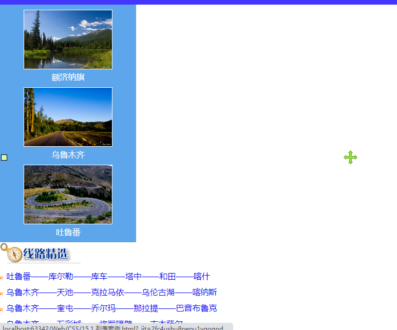
<ul class="tuijian">
<li>
<a href="">
<img src="images/travel/tuijian1.jpg" alt="">
<p>额济纳旗</p>
</a>
</li>
<li>
<a href="">
<img src="images/travel/tuijian2.jpg" alt="">
<p>乌鲁木齐</p>
</a>
</li>
<li>
<a href="">
<img src="images/travel/tuijian3.jpg" alt="">
<p>吐鲁番</p>
</a>
</li>
</ul>
<div class="jingxuan">
<div>
<img src="images/travel/route_h1.gif" alt="">
</div>
<div class="route">
<li><a href="#">吐鲁番——库尔勒——库车——塔中——和田——喀什</a></li>
<li><a href="#">乌鲁木齐——天池——克拉马依——乌伦古湖——喀纳斯</a></li>
<li><a href="#">乌鲁木齐——奎屯——乔尔玛——那拉提——巴音布鲁克</a></li>
<li><a href="#">乌鲁木齐——五彩城——将军隔壁——吉木萨尔</a></li>
</div>
</div>
</body>
</html>
5.6 表格样式
border-collapse:collapse 将表格设置为单一边框
<!DOCTYPE html>
<html lang="en">
<head>
<meta charset="UTF-8">
<title>Title</title>
<style>
.table {
width: 80%; /*表格的宽度默认占用父容器的80%宽度*/
margin: 0 auto;
border-collapse: collapse /*合并单元格*/
}
.table tr {
border-bottom: 1px solid #e0e0e0;
}
.table-bordered,.table-bordered td,.table-bordered th {
border: 1px solid #b0b0b0;
}
.text-center {
text-align: center;
}
.table-hover>tbody>tr:hover{
background-color: #333;
color: #fff;
}
</style>
</head>
<body>
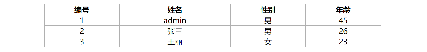
<table class="table table-bordered">
<thead>
<tr>
<th>编号</th>
<th>姓名</th>
<th>性别</th>
<th>年龄</th>
</tr>
</thead>
<tbody class="text-center">
<tr>
<td>1</td>
<td>admin</td>
<td>男</td>
<td>45</td>
</tr>
<tr>
<td>2</td>
<td>张三</td>
<td>男</td>
<td>26</td>
</tr>
<tr>
<td>3</td>
<td>王丽</td>
<td>女</td>
<td>23</td>
</tr>
</tbody>
</table>
</body>
</html>
*{
    margin: 0px;
    padding: 0px;
}
a {
    text-decoration: none;  /*去掉超链接的下划线*/
}
ul{
    list-style: none;
}
.btn {
    border-radius: 4px;
    border: none; /*取消边框*/
    border: 1px solid #b0b0b0;
    background-color: #fff;
    padding: 5px 10px; /*内边距:内填充*/
}
.btn-primary {
    background-color: #337ab7;
    color: #fff;
    border: 1px solid #295d8c;
}
.btn-success {
    background-color: #5cb85c;
    color: #fff;
    border: 1px solid #4a934a;
}
.btn-danger {
    background-color: #db3425;
    color: #fff;
    border: 1px solid #c42d20;
}
.table {
    width: 80%; /*表格的宽度默认占用父容器的80%宽度*/
    margin: 0 auto;
    border-collapse: collapse;  /*合并单元格*/
    line-height: 2;
}
.table tr {
    border-bottom: 1px solid #e0e0e0;
}
.table-bordered,.table-bordered td,.table-bordered th {
    border: 1px solid #b0b0b0;
}
.text-center {
    text-align: center;
}
.table-hover>tbody>tr:hover{
    background-color: #333;
    color: #fff;
}
<!DOCTYPE html>
<html lang="en">
<head>
<meta charset="UTF-8">
<title>Title</title>
<!--引入前端CSS框架-->
<link rel="stylesheet" href="css/myui.css">
<!--写自己的CSS样式来替换框架的效果-->
<style>
.table>tbody>tr:nth-child(odd) { /*实现奇数行的隔行变色*/
background: #f0f0f0;
}
.tools {
margin: 20px 0px;
}
.tools button{
margin-left: 30px;
}
</style>
</head>
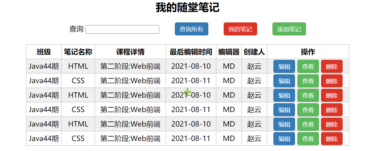
<body>
<h2 class="text-center">我的随堂笔记</h2>
<div class="tools text-center">
<label for="search">查询</label>
<input type="text" id="search" name="keyword">
<button type="button" class="btn btn-primary">查询所有</button>
<button type="button" class="btn btn-danger">我的笔记</button>
<button type="button" class="btn btn-success">添加笔记</button>
</div>
<!--table>tbody>tr*3>td*7-->
<table class="table table-bordered">
<thead>
<tr>
<th>班级</th>
<th>笔记名称</th>
<th>课程详情</th>
<th>最后编辑时间</th>
<th>编辑器</th>
<th>创建人</th>
<th>操作</th>
</tr>
</thead>
<tbody class="text-center">
<tr>
<td>Java44期</td>
<td>HTML</td>
<td>第二阶段:Web前端</td>
<td>2021-08-10</td>
<td>MD</td>
<td>赵云</td>
<td>
<button type="button" class="btn btn-primary">编辑</button>
<button type="button" class="btn btn-success">查看</button>
<button type="button" class="btn btn-danger">删除</button>
</td>
</tr>
<tr>
<td>Java44期</td>
<td>CSS</td>
<td>第二阶段:Web前端</td>
<td>2021-08-11</td>
<td>MD</td>
<td>赵云</td>
<td>
<button type="button" class="btn btn-primary">编辑</button>
<button type="button" class="btn btn-success">查看</button>
<button type="button" class="btn btn-danger">删除</button>
</td>
</tr>
<tr>
<td>Java44期</td>
<td>HTML</td>
<td>第二阶段:Web前端</td>
<td>2021-08-10</td>
<td>MD</td>
<td>赵云</td>
<td>
<button type="button" class="btn btn-primary">编辑</button>
<button type="button" class="btn btn-success">查看</button>
<button type="button" class="btn btn-danger">删除</button>
</td>
</tr>
<tr>
<td>Java44期</td>
<td>CSS</td>
<td>第二阶段:Web前端</td>
<td>2021-08-11</td>
<td>MD</td>
<td>赵云</td>
<td>
<button type="button" class="btn btn-primary">编辑</button>
<button type="button" class="btn btn-success">查看</button>
<button type="button" class="btn btn-danger">删除</button>
</td>
</tr>
</tbody>
</table>
</body>
</html>
5.7 伪类样式
| 属性 | 描述 |
|---|---|
| :link | 超链接没有被访问的样式 |
| :visited | 超链接被访问过的样式 |
| :hover | 鼠标移入的样式 |
| :active | 当前控件被激活的样式 |
| :focus | 向拥有键盘输入焦点的元素添加样式 |
| :first-child | 选取元素中的第一个子元素;即选择满足条件的标签,并且这个标签是某个元素的第一个子元素 |
<!DOCTYPE html>
<html lang="en">
<head>
<meta charset="UTF-8">
<title>Title</title>
<style>
*{
margin: 0px;
padding: 0px;
}
ul {
list-style: none;
}
.aside {
width: 330px;
margin: 100px auto;
}
.aside li {
height: 40px;
line-height: 40px;
font-size: 14px;
color: #a0a0a0;
border-bottom: 1px dashed #b0b0b0;
}
.aside .title {
background: #E9185A;
color: #fff;
padding: 5px 10px;
}
.aside .label{
width: 25px;
height: 25px;
background: #333;
color: #fff;
text-align: center;
line-height: 25px;
font-size: 16px;
font-weight: bold;
border-radius: 50%;
margin-right: 10px;
}
.aside .label,.aside .info {
/*可以将块级元素变成行内块元素的显示效果*/
display: inline-block;
}
.aside .info:hover {
color: #ff6700;
}
</style>
</head>
<body>
<div class="aside">
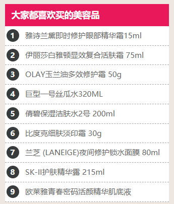
<h3 class="title">大家都喜欢买的美容品</h3>
<ul>
<li>
<div class="label">1</div>
<div class="info">雅诗兰黛即时修护眼部精华霜15ml</div>
</li>
<li>
<div class="label">2</div>
<div class="info">伊丽莎白雅顿显效复合活肤霜 75ml</div>
</li>
<li>
<div class="label">3</div>
<div class="info">OLAY玉兰油多效修护霜 50g</div>
</li>
<li>
<div class="label">4</div>
<div class="info">巨型一号丝瓜水320ML</div>
</li>
</ul>
</div>
</body>
</html>
5.8 样式的继承
CSS继承:css中有很多的属性,并不是所有的属性都可以被继承,有些可以,有些默认不可以继承,还有些不能被继承
继承分为两种:
    自动继承:子元素不需要任何操作,可以直接从父元素获取到
    手动继承:子元素需要自己写代码,从父元素继承样式
1.自动继承
    (1).能够被自动继承的属性有哪些:
        a.文本样式:color
        b.字体样式(font系列)的css样式可以被自动继承
            font-family
            font-size
            font-weight
            font-style
        c.文本样式的css样式可以被自动继承
            text-align
            line-height
            text-indent
            word-spacing
            letter-spacing
            color
            text-transform
            list-style可以被自动继承
        d.鼠标样式 cursor
        e.cursor是设置鼠标的样式,默认子元素可以继承,但是label不能自动继承
2.手动继承
使用inherit手动继承
哪些属性不能被自动继承
width、height、margin、padding等等

面试题
谈一谈css中样式的继承的概念
常见的样式中哪些可以被继承,哪些不能被继承?
5.9 颜色渐变
线性渐变:
颜色沿着一条直线过渡:从左到右、从右到左、从上到下等
径向渐变:
圆形或椭圆形渐变,颜色不再沿着一条直线变化,而是从一个起点朝所有方向混合
语法:linear-gradient ( position,  color1,  color2,…)
position: to-bottom(从上到下渐变),to-top(从下到上渐变),to-left(从右至左渐变),to-right(从左至右渐变)。

渐变色文字:
-webkit-background-clip: text;  使用背景来填充文本
-webkit-text-fill-color: transparent; 通过透明色来填充文本

示例代码:
<!DOCTYPE html>
<html>
<head lang="en">
    <meta charset="UTF-8">
    <title>背景颜色渐变</title>
    <style>
        div{
            width: 600px;
            margin: 0px auto;
            line-height: 100px;
            background:linear-gradient(to   right,red,orangered,yellow,green,cyan,blue,purple);
            text-align: center;
            color: white;
            font-size: 25px;
            font-weight: bold;
        }
    </style>
</head>
<body>
    <div>背景颜色渐变</div>
</body>
</html>
5.10 文字阴影
基本格式:text-shadow : color  x-offset  y-offset  blur-radius
    color :阴影颜色
    x-offset:水平偏移量(设置负数反向偏移)
    y-offset:垂直偏移量(设置负数反向偏移)
    blur-radius:阴影模糊半径,代表阴影向外模糊的模糊范围

代码示例:实现凹凸文字
<!DOCTYPE html>
<html lang="en">
<head>
    <meta charset="UTF-8">
    <title>Title</title>
    <style type="text/css">
        body{
            background: gray;
        }
        div{
            color: gray;
        }
        div:nth-of-type(1){
            text-shadow: black 2px 2px 1px,white -2px -2px 1px;
            font-size: 50px;
        }
        div:nth-of-type(2){
            text-shadow: black -2px -2px 1px,white 2px 2px 1px;
            font-size: 50px;
        }
    </style>
</head>
<body>
    <div>凸起文字:师者之传道授业解惑也。</div>
    <div>凹下文字:人非生而知之者。</div>
</body>
</html>
5.11 盒子阴影
基本格式:box-shadow:[inset]  color  x-offset  y-offset  blur-radius  ;
    [insert]:内阴影 可以省略
     color :阴影颜色
    x-offset:水平偏移量(设置负数反向偏移)
    y-offset:垂直偏移量(设置负数反向偏移)
    blur-radius:阴影模糊半径,代表阴影向外模糊的模糊范围
5.12 鼠标光标样式
cursor 属性:设置鼠标光标的样式:
注释:请在此列表的末端始终定义一种普通的光标,以防没有由 URL 定义的可用光标。
    default    默认光标(通常是一个箭头)
    auto    默认。浏览器设置的光标。
    crosshair    光标呈现为十字线。
    pointer    光标呈现为指示链接的指针(一只手)
    move    此光标指示某对象可被移动。
    e-resize    此光标指示矩形框的边缘可被向右(东)移动。
    ne-resize    此光标指示矩形框的边缘可被向上及向右移动(北/东)。
    nw-resize    此光标指示矩形框的边缘可被向上及向左移动(北/西)。
    n-resize    此光标指示矩形框的边缘可被向上(北)移动。
    se-resize    此光标指示矩形框的边缘可被向下及向右移动(南/东)。
    sw-resize    此光标指示矩形框的边缘可被向下及向左移动(南/西)。
    s-resize    此光标指示矩形框的边缘可被向下移动(南)。
    w-resize    此光标指示矩形框的边缘可被向左移动(西)。
    text    此光标指示文本。
    wait    此光标指示程序正忙(通常是一只表或沙漏)。
    help    此光标指示可用的帮助(通常是一个问号或一个气球)。
<!DOCTYPE html>
<html lang="en">
<head>
<meta charset="UTF-8">
<title>Title</title>
<style>
.container {
background: #f0f0f0;
height: 500px;
}
.container .product {
width: 234px;
height: 300px;
background: #fff;
display: inline-block;
margin-left: 20px;
}
.container .product:hover {
/*给盒子添加阴影效果*/
box-shadow: #666 2px 2px 15px;
/*改变鼠标的样式*/
cursor: pointer; /*手指*/
}
.pointer {
cursor: pointer;
}
</style>
</head>
<body>
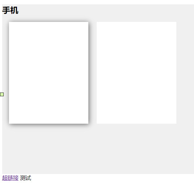
<div class="container">
<h2>手机</h2>
<div class="product"></div>
<div class="product"></div>
</div>
<a href="">超链接</a>
<span class="pointer">测试</span>
</body>
</html>
6.盒子模型
6.1 盒子模型概述
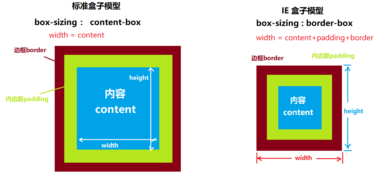
我们可以把页面中的元素都可以看做一个盒子,占据着一定的页面空间,这些占据的空间往往比单纯的内容要大,换句话说,我们可以调整盒子的边框和距离的参数来调节盒子的位置。
总结:从图中可以分析得出:一个盒子的宽度(或高度)是由content+padding+border+margin,并且对于任何一个盒子,都可以分别设定4条边各自的border、padding、margin。因此我们可以利用好盒子的这些属性,就能很好的实现各种各样的排版效果。
6.2 外边距margin
结论 : 左右margin叠加,上下取最大
行级元素只有margin-left , margin-right
让块级元素居中 : margin:0px auto;
margin-top
margin-right
margin-bottom
margin-left
符合属性:margin
示例代码:
margin-top: 10 px /*设置上外边距为10px*/
margin-right : 20 px/*设置右外边距*/
margin-bottom : 20 px/*设置下外边距*/
margin-left : 10px/*设置左外边距*/
margin :30px 50px 70px 40px;/*分别设置上,右,下,左外边距*/
margin :30px 50px;/*设置上下边距为30px,设置左右边距为50px*/
margin :30px 40px 50px;/*设置上外边距为30px 左,右外边距为40px,下外边距50px*/
margin :20px;/*设置4个方向的边距都为20px*/
让块级元素居中
margin:0px auto;/*网页2端对齐*/
6.2.1 外边距重叠
<!DOCTYPE html>
<html lang="en">
<head>
<meta charset="UTF-8">
<title>Title</title>
<style>
*{
margin: 0px;
padding: 0px;
}
.outer {
width: 200px;
height: 200px;
background: #000;
/*overflow: hidden; !*超出部分隐藏*!*/
}
/*.outer:before { !*添加第一个子元素*!
display: table; !*显示方式以块级元素方式来显示*!
content: '';
}*/
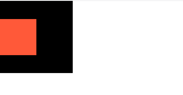
.inner {
width: 100px;
height: 100px;
background: #ff5939;
margin-top: 50px;
/*margin-left: 50px;*/
}
/*需要给父容器添加 class="clearfix" 即可*/
.clearfix:before{
display: table; /*显示方式以块级元素方式来显示*/
content: '';
}
</style>
</head>
<body>
<div class="outer clearfix">
<div class="inner"></div>
</div>
<!--
子容器与父容器外边距重叠了,子容器无法检测出父容器的外边框
解决方案1: 给父容器设置一个超出隐藏
解决方案2(优化) : 给父容器设置一个空内容的 overflow: hidden;
-->
</body>
</html>
6.3 内边距padding
padding-left
padding-right
padding-top
padding-bottom
复合属性:padding
示例代码:
padding-top: 10 px /*设置上内边距为10px*/
padding-right : 20 px/*设置右内边距*/
padding-bottom : 20 px/*设置下内边距*/
padding -left : 10px/*设置左内边距*/
padding:30px 50px 70px 40px;/*分别设置上,右,下,左内边距*/
padding:30px 50px;/*设置上下内边距为30px,设置左右内边距为50px*/
padding:30px 40px 50px;/*设置上内边距为30px 左,右内边距为40px,下内边距50px*/
padding:20px;/*设置4个方向的内边距都为20px*/
6.4 宽度auto和100%
盒子width默认不设置和设置100%的区别:
    (1).默认不设置,auto自适应,在父元素区域里面自适应,
        a.auto的宽度会排除本身padding+border+margin,盒子内容区域是会减掉padding和border和margin之后剩下的区域;
        b.即盒子所占空间的大小就是大盒子的宽度
    (2).100%是参考父元素的宽度,折算下来内容区域是固定值,
        a.盒子的真正大小,内容区域+padding+border;
        b.盒子所占空间的大小:内容+padding+border+margin
6.5 元素居中
<!DOCTYPE html>
<html lang="en">
<head>
<meta charset="UTF-8">
<title>Title</title>
<style>
.d1 {
background: #000;
height: 100px;
width: 1100px;
margin: 0 auto; /*上下0px, 左右auto居中*/
}
.d2 {
background: #f5dbff;
text-align: center; /*让块级元素内的文本水平居中*/
}
span {
background: #faffd7;
}
.p1 {
background: #333;
color: #b0b0b0;
font-size: 18px;
height: 60px;
text-align: center;
line-height: 60px; /*垂直居中:让文字在行内的垂直方向的正中间*/
}
.p1:hover {
color: #fff;
}
.middle {
vertical-align: middle;
/*只能调整行级元素的基准线位置
默认是baseline : 图片与文字的下边对齐
middle : 图片在文字的中间
top :图片与文字的上边对齐
*/
}
.header {
background: linear-gradient(to right bottom,#25225e,#c545f1);
height: 60px;
line-height: 60px;
}
.header>.logo {
/*margin-top: 10px;*/
vertical-align: middle;
}
.header>a{
text-decoration: none;
color: #fff;
font-size: 16px;
}
</style>
</head>
<body>
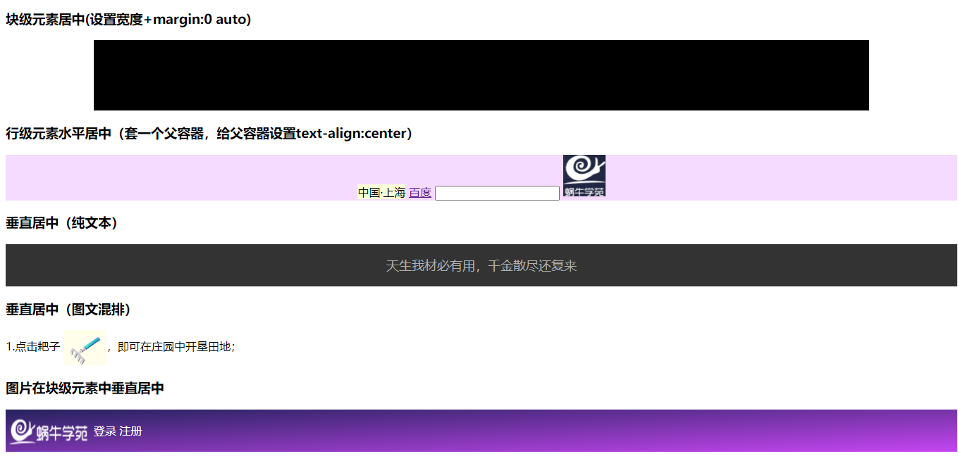
<h3>块级元素居中(设置宽度+margin:0 auto)</h3>
<div class="d1"></div>
<h3>行级元素水平居中(套一个父容器,给父容器设置text-align:center)</h3>
<div class="d2">
<!--标准的行级标签:不能设置宽高-->
<span>中国·上海</span>
<a href="">百度</a>
<!--行内块元素-->
<input type="text">
<img src="images/logo.png" width="60px">
</div>
<h3>垂直居中(纯文本)</h3>
<p class="p1">天生我材必有用,千金散尽还复来</p>
<h3>垂直居中(图文混排)</h3>
<p>1.点击耙子 <img src="images/home/manor-2.jpg" class="middle">,即可在庄园中开垦田地;</p>
<h3>图片在块级元素中垂直居中</h3>
<div class="header">
<img class="logo" src="images/logo2.png" width="120" height="40">
<a href="">登录</a>
<a href="">注册</a>
</div>
</body>
</html>
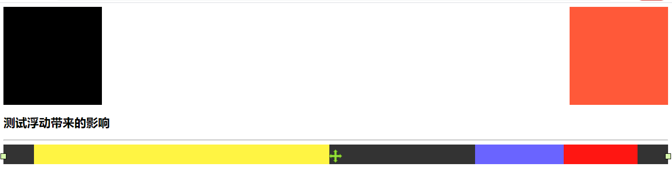
7. 浮动
CSS 的 Float(浮动),会使元素向左或向右移动,其周围的元素也会重新排列。Float(浮动),往往是用于图像,但它在布局时一样非常有用。
float取值:left:左浮动 right:右浮动 none:不浮动
多个元素设置浮动时,后面的元素会找到前面元素的边界就停下来,第一个浮动元素是找到父元素的边界就停下来
块级元素浮动一般会设置宽高,默认的宽度auto失效
特点:
- 同行显示,排列不下时会进行换行
- 浮动会脱离文档流,在标准文档流之上
- 原来的空间不再占有,页面进行了重绘
- 行级元素设置浮动后,可以支持宽高
浮动元素对非浮动元素的影响
- 非浮动元素会占用浮动元素原来的空间
- 如果非浮动元素里面有文本,那么文本会被浮动元素给挤下去
- 实现图文混排,图片浮动,非浮动元素的文本会围绕着图片进行排列
- 子元素浮动,父元素的高度会塌陷
清除浮动
作用:清除浮动元素对非浮动元素的影响,通过clear来清除
语法:clear:left | right | both;
清除左浮动的影响/right:
清除右浮动的影响/both:
同时清除左浮动和右浮动的影响
<!DOCTYPE html>
<html lang="en">
<head>
    <meta charset="UTF-8">
    <title>Title</title>
    <style>
        /*
            float : 释放原来的空间,将所有浮动的元素按照排列规则来显示
            clear : 将前面所有使用浮动定位的元素强制让其占用正常的文档流

        */
        .d1 {
            width: 200px;
            height: 200px;
            background: #000000;
            float: left; /*左浮动*/
        }
        .d2 {
            width: 200px;
            height: 200px;
            background: #ff5939;
            float: right; /*右浮动*/
        }
        .d3 {
            width: 100%;
            height:50px;
            background: #5aff03;
            /*清除浮动*/
            clear: left; /*清除左浮动效果*/
        }
        .header {
            width: 100%;
            height: 40px;
            background: #333;
            color: #b0b0b0;
        }
        .container {
            width: 1226px;
            margin: 0 auto;
        }
        .header .shortcut {
            width: 600px;
            height: 40px;
            background: #fff443;
            float: left; /*左浮动*/
        }
        .header .shop {
            width: 150px;
            height: 40px;
            background: #ff1612;
            float: right;
        }
        .header .info {
            width: 180px;
            height: 40px;
            background: #6a64ff;
            float: right;
        }
        /*给class="clearfix"元素内部追加一个子元素*/
        .clearfix:after {
            display: table;
            content: '';
            clear: both;
        }
    </style>
</head>
<body>
    <div class="model clearfix">
        <div class="d1"></div>
        <div class="d2"></div>
        <!--<div style="clear: both"></div>-->
    </div>

    <!--<div class="d3"></div>-->

    <h2>测试浮动带来的影响</h2>

    <hr>
    <div class="header">
        <div class="container">
            <div class="shortcut"></div>
            <div class="shop"></div>
            <div class="info"></div>
        </div>
    </div>
</body>
</html>
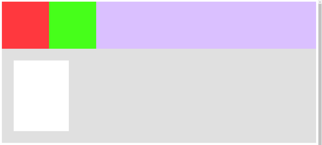
7.1 父容器高度塌陷
当子元素浮动时,可能会导致父容器高度塌陷
浮动的元素会脱离父容器吗?
解决方案 :
- 清除浮动 ,会产生大量的冗余标签
- 直接给父容器设置高度(不多)
- 终极解决方案: 给父容器添加 class=”clearfix”
<!DOCTYPE html>
<html lang="en">
<head>
    <meta charset="UTF-8">
    <title>Title</title>
    <style>
        .father {
            background: #dac0ff;
            /*height: 500px;*/  /*正常的前端开发中父容器的高度一般不设置:由子容器的共同高度来决定*/
        }
        .son1 {
            width: 200px;
            height: 200px;
            background: #ff383e;
            float: left;
        }
        .son2 {
            width: 200px;
            height: 200px;
            background: #46ff1a;
            float: left;
        }
        .clearfix:before,
        .clearfix:after {
            display: table;
            content: '';
            clear: both;
        }
        .outer {
            height: 400px;
            background: #e0e0e0;
        }
        .inner {
            width: 234px;
            height: 300px;
            background: #fff;
            margin: 50px 0px 0px 50px;
        }
        .inner:hover {
            box-shadow: #333 2px 2px 10px;
        }
    </style>
</head>
<body>
<!--
    当子元素浮动时,可能会导致父容器高度塌陷
    浮动的元素会脱离父容器吗?
    解决方案 :
           1. 清除浮动<div style="clear: both"></div> ,会产生大量的冗余标签
           2. 直接给父容器设置高度(不多)
           3. 终极解决方案: 给父容器添加 class="clearfix"
-->
    <div class="father clearfix">
        <div class="son1"></div>
        <div class="son2"></div>
        <!--<div style="clear: both"></div>-->
    </div>
    <div class="outer clearfix">
        <div class="inner">

        </div>
    </div>
    <h2>测试代码</h2>

</body>
</html>
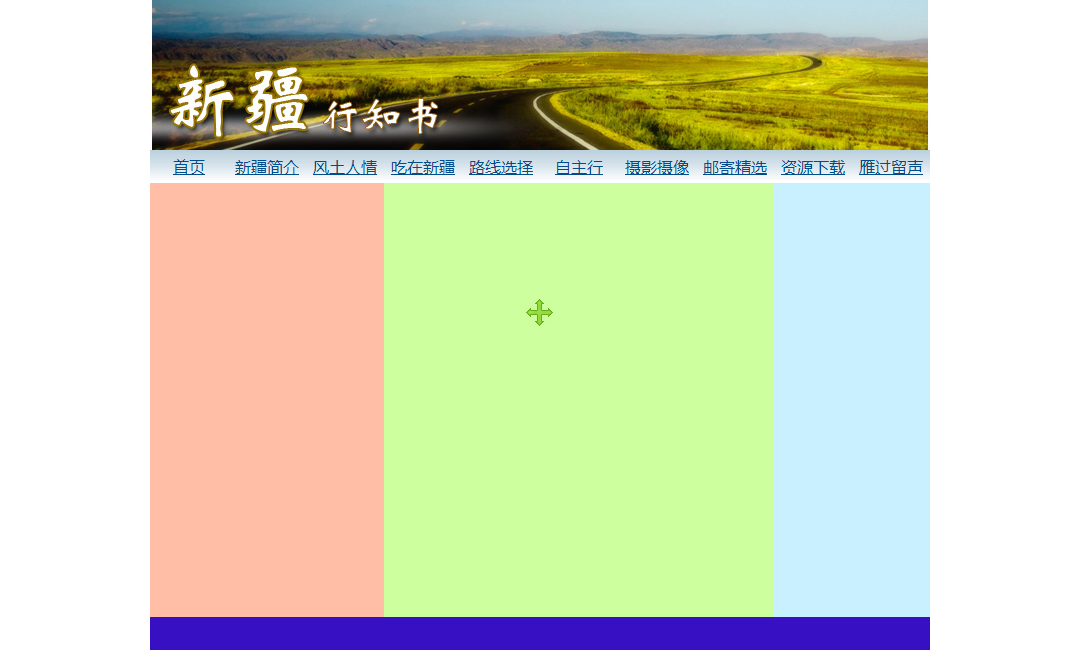
7.2 浮动布局案例
<!DOCTYPE html>
<html lang="en">
<head>
    <meta charset="UTF-8">
    <title>Title</title>
    <style>
        *{
            margin: 0;
            padding: 0;
        }
        .container{
            width: 780px;
            height: 650px;
            background: #b0b0b0;
            margin: 0 auto;
        }
        .header {
            width: 780px;
            height: 150px;
            background: #2d2aff;
        }
        .nav {
              width: 780px;
              height: 33px;
              line-height: 33px;
              background: #ffef0f;
          }
        .nav > ul {
            width: 780px;
            list-style: none;
        }
        .nav>ul>li {
            width: 78px;
            float: left;
            text-align: center;
            /*设置背景图片*/
            background: url("images/travel/button1.jpg") no-repeat;
        }
        .nav>ul>li:hover {
            background: url("images/travel/button1_bg.jpg") no-repeat;
        }
        .nav>ul>li:hover a{
            color: #fff;
        }
        .nav a{
            /*重点 :将超链接设置为块级元素*/
            display: block;
            width: 78px;
            height: 33px;
            color: #024d89;
        }
        .left {
            width: 30%;
            height: 434px;
            background: #ffbea5;
            float: left;
        }
        .middle {
            width: 50%;
            height: 434px;
            background: #cdff9f;
            float: left;
        }
        .right {
            width: 20%;
            height: 434px;
            background: #c9f0ff;
            float: left;
        }
        .footer {
            width: 780px;
            height: 33px;
            background: #3710c4;
            clear: both;
        }
    </style>
</head>
<body>
    <div class="container">
        <!--头部广告-->
        <div class="header">
            <img src="images/travel/banner.jpg" alt="">
        </div>
        <!--导航条-->
        <div class="nav">
            <ul>
                <li><a href="">首页</a></li>
                <li><a href="">新疆简介</a></li>
                <li><a href="">风土人情</a></li>
                <li><a href="">吃在新疆</a></li>
                <li><a href="">路线选择</a></li>
                <li><a href="">自主行</a></li>
                <li><a href="">摄影摄像</a></li>
                <li><a href="">邮寄精选</a></li>
                <li><a href="">资源下载</a></li>
                <li><a href="">雁过留声</a></li>
            </ul>
        </div>
        <div class="left"></div>
        <div class="middle"></div>
        <div class="right"></div>
        <div class="footer"></div>
    </div>
</body>
</html>
8.css定位
8.1 position属性介绍
position属性
属性值如下:
1.static:默认值,没有定位
2.relative:相对定位
3.absolute:绝对定位
4.fixed:固定定位
8.2 相对定位
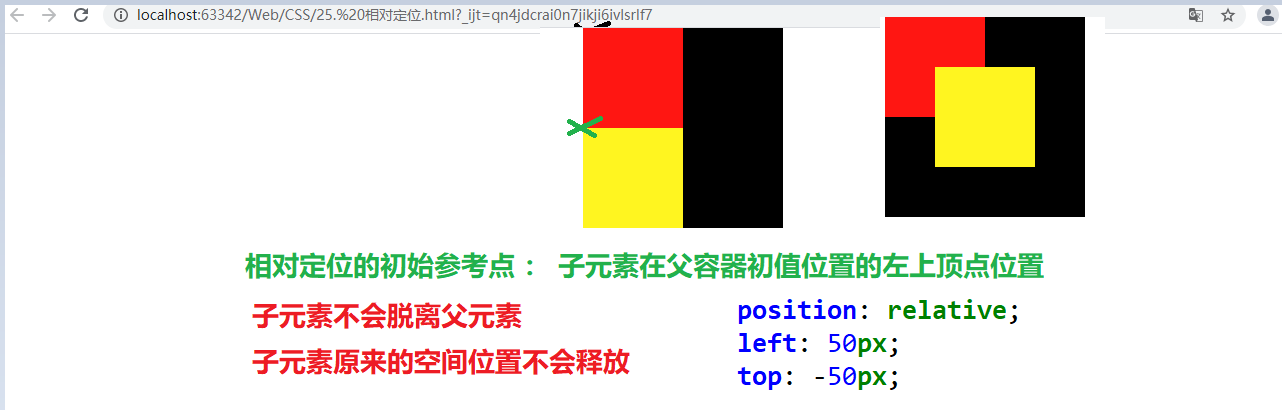
1.语法:position:relative
2.定义偏移量:
    top:设置元素距离上边框的偏移量
    left:距离左边的偏移量
    right:距离右边的偏移量
    bottom:距离下边的偏移量
3.特点:
<1>.设置元素的相对定位后,元素不会脱离文档流,只是破坏文档流。
<2>.只给元素设置相对定位,对元素本身是不会有影响,除非设置偏移量,元素才会发生移动。
<3>.元素一旦设置了偏移量,会按照指定的方向进行一定,移动过程中不遵循标准文档流,移动完成还在标准文档流里面,移动过程是参考原来的位置进行移动,原来的位置依然保留,不会消失(原来的空间还在)
4.注意:
<1>.子元素相对定位后,父元素进行移动,子元素跟着移动(子元素原来的位置进行了跟着父元素移动,相对定位后也会移动)。
<2>.相对定位一般不会单独使用,不会单独用来布局,配合绝对定位来使用。
<!DOCTYPE html>
<html lang="en">
<head>
    <meta charset="UTF-8">
    <title>Title</title>
    <style>
        *{
            margin: 0px;
            padding: 0px;
        }
        .outer {
            width: 200px;
            height: 200px;
            background: #000000;
            margin: 0 auto;
        }
        .inner1 {
            width: 100px;
            height: 100px;
            background: #ff1612;
        }
        .inner2 {
            width: 100px;
            height: 100px;
            background: #fff520;
            /*相对定位 : 相对于父容器来定位的方式*/
            position: relative;
            right: -50px;
            top: -50px;
            /*bottom: 50px;*/
            /*left: 50px;*/
        }
    </style>
</head>
<body>
    <div class="outer">
        <div class="inner1"></div>
        <div class="inner2"></div>
    </div>

</body>
</html>
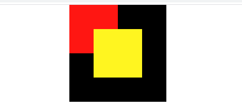
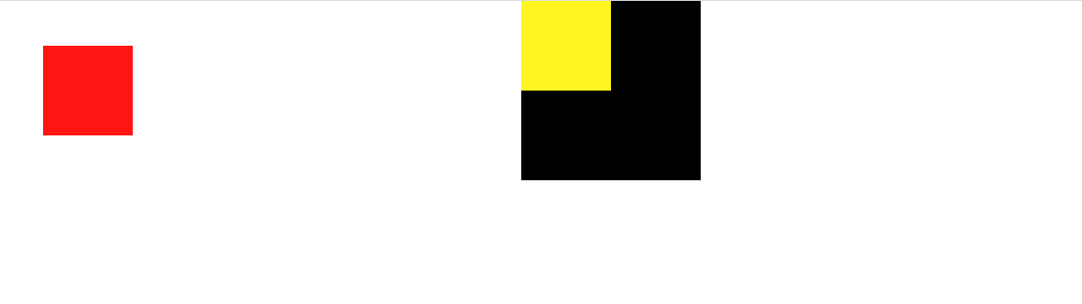
8.3 绝对定位
absolute绝对定位:
<1>.使用了绝对定位的元素以它最近的一个“已经定位”的“祖先元素” 为基准进行偏移
<2>.如果没有已经定位的父元素或者祖先元素,会以浏览器窗口为基准进行定位
absolute属性值:
偏移设置:left、right、top、bottom
<!DOCTYPE html>
<html lang="en">
<head>
    <meta charset="UTF-8">
    <title>Title</title>
    <style>
        *{
            margin: 0px;
            padding: 0px;
        }
        .outer {
            width: 200px;
            height: 200px;
            background: #000000;
            margin: 0 auto;
        }
        .inner1 {
            width: 100px;
            height: 100px;
            background: #ff1612;
            /*绝对定位 :
                    1. 释放原有的定位元素空间,
                    2. 元素会脱离所有的父容器,
                    3. 以浏览器来定位(浏览器的四个顶点 top left right bottom)*/
            position: absolute;
            /*top : 0px;*/
            /*left: 0px;*/
            /*right: 0px;*/
            /*bottom: 0px;*/
            top: 50px;
            left: 50px;
        }

        .inner2 {
            width: 100px;
            height: 100px;
            background: #fff520;
        }
    </style>
</head>
<body>

    <div class="outer">
        <div class="inner1"></div>
        <div class="inner2"></div>
    </div>


</body>
</html>
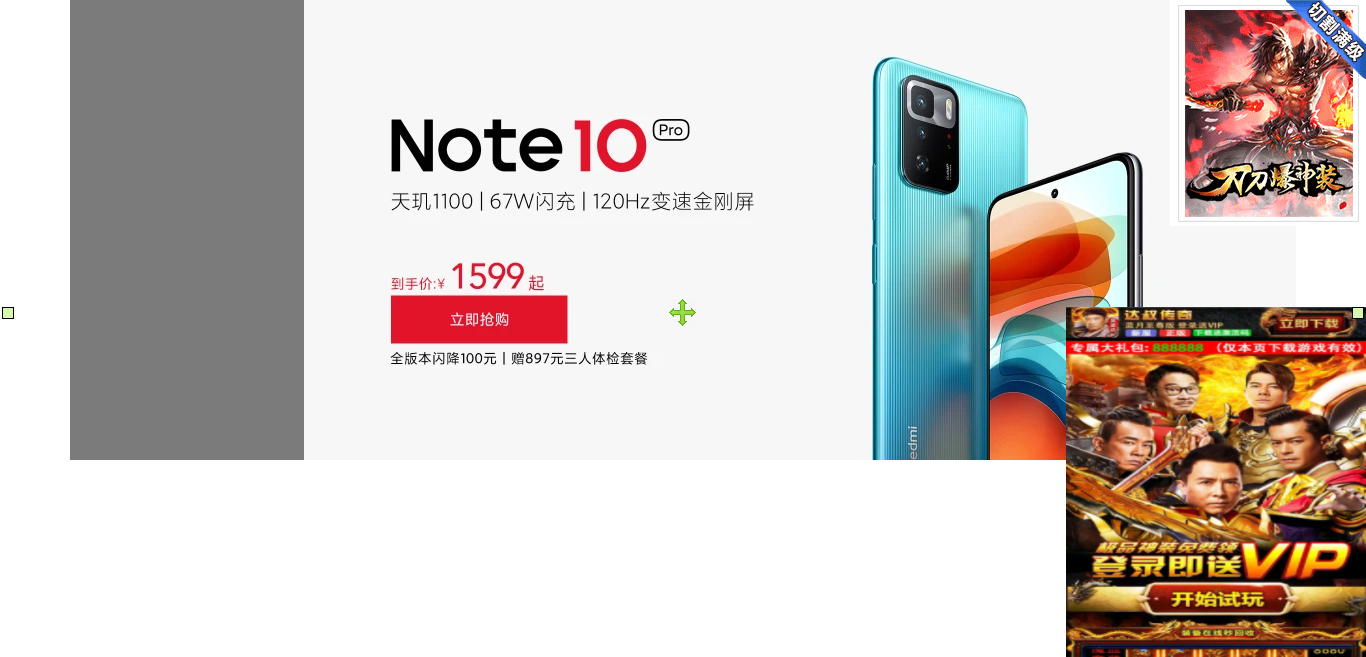
8.3.1 广告设计
<!DOCTYPE html>
<html lang="en">
<head>
    <meta charset="UTF-8">
    <title>Title</title>
    <style>
        *{
            margin: 0px;
            padding: 0px;
        }
        .carousel {
            width: 1226px;
            height: 460px;
            margin: 0 auto;
            /*父容器使用相对定位*/
            position: relative;
        }
        .carousel > .aside{
            width: 234px;
            height: 460px;
            background: rgba(0,0,0,0.5);
            /*子元素使用绝对定位*/
            position: absolute;
            z-index: 100; /*修改定位元素的层级顺序,数字越大,层级越高*/
        }
        .carousel>img {
            width: 100%;
            height: 100%;
            /*绝对定位会释放元素空间*/
            position: absolute;
        }
        /*广告一定使用的是绝对定位*/
        #adv1 {
            position: absolute;
            top: 0px;
            right: 0px;
            z-index: 9999;
        }
        #adv2 {
            width:300px;
            height: 350px;
            position: absolute;
            bottom: 0px;
            right: 0px;
            z-index: 9999
        }
    </style>
</head>
<body>
    <div class="carousel">
        <!--侧边栏-->
        <div class="aside">

        </div>
        <img src="images/bg/bg1.jpg" alt="">
        <img src="images/bg/bg2.webp" alt="">
        <img src="images/bg/bg3.webp" alt="">
    </div>

    <img src="images/adv/a3.gif" id="adv1">
    <img src="images/adv/a5.jpeg" id="adv2">

</body>
</html>
8.4 子绝父相经典定位
<!DOCTYPE html>
<html lang="en">
<head>
    <meta charset="UTF-8">
    <title>Title</title>
    <style>
        *{
            margin: 0px;
            padding: 0px;
        }
        .carousel {
            width: 1226px;
            height: 460px;
            margin: 0 auto;
            /*父容器使用相对定位*/
            position: relative;
        }
        .carousel > .aside{
            width: 234px;
            height: 460px;
            background: rgba(0,0,0,0.5);
            /*子元素使用绝对定位*/
            position: absolute;
            z-index: 100; /*修改定位元素的层级顺序,数字越大,层级越高*/
        }
        .carousel>img {
            width: 100%;
            height: 100%;
            /*绝对定位会释放元素空间*/
            position: absolute;
        }
    </style>
</head>
<body>
    <div class="carousel">
        <!--侧边栏-->
        <div class="aside">

        </div>
        <img src="images/bg/bg1.jpg" alt="">
        <img src="images/bg/bg2.webp" alt="">
        <img src="images/bg/bg3.webp" alt="">
    </div>
</body>
</html>
8.5 固定定位
fixed固定定位
fixed属性值
偏移设置: left、right、top、bottom
类似绝对定位,不过区别在于定位的基准不是祖先元素,而是浏览器窗口
8.6 z-index
z-index:调整元素定位时重叠层的上下位置
z-index属性值:整数,默认值为0
设置了positon属性时,z-index属性可以设置各元素之间的重叠高低关系
z-index值大的层位于其值小的层上方
9. 矢量图标
(1)bootstrap自带的矢量图库
组件使用可以参考 : https://v3.bootcss.com/components/
(2)iconfont 阿里巴巴矢量图库
<!DOCTYPE html>
<html lang="en">
<head>
    <meta charset="UTF-8">
    <title>Title</title>
    <link rel="stylesheet" href="css/font.css">
    <link rel="stylesheet" href="css/iconfont.css">
    <link rel="stylesheet" href="css/myui.css">
</head>
<body>
    <span class="glyphicon glyphicon-cloud"></span>
    <span class="glyphicon glyphicon-user"></span>

    <button type="button" class="btn btn-primary">按钮</button>

    <button type="button" class="btn btn-primary">
        <span class="glyphicon glyphicon-user"></span>
    </button>

    <span class="glyphicon glyphicon-phone"></span>
    <span class="glyphicon glyphicon-user"></span>
    <span class="glyphicon glyphicon-wrench"></span>
    <span class="glyphicon glyphicon-phone-alt"></span>
    <span class="glyphicon glyphicon-shopping-cart"></span>

    <hr>
    <span class="iconfont icon-huawei"></span>
    <span class="iconfont icon-gouwucheman"></span>
    <span class="iconfont icon-gouwuchekong"></span>
    <span class="iconfont icon-weixin" style="color: #4ed03b"></span>
    <span class="iconfont icon-qq" style="color: #1f7bbb"></span>
</body>
</html>
10. 动画
CSS3变形是一些效果的集合,如平移、旋转、缩放、倾斜效果,每个效果都可以称为变形(transform),它们可以分别操控元素发生平移、旋转、缩放、倾斜等变化变形函数:
- translate():平移函数,基于X、Y坐标重新定位元素的位置
- scale():缩放函数,可以使任意元素对象尺寸发生变化
- rotate():旋转函数,取值是一个度数值
- skew():倾斜函数,取值是一个度数值
10.1 translate() :平移
通过translate来设置盒子的移动
语法规则:
transform:translate(x轴移动量,y轴移动量);
transform:translate(x轴移动量);
transform:translateX(x轴移动量);
transform:translateY(Y轴移动量);
注意:
(1).盒子以原来的位置为起点,进行移动
(2).可以设置负值
10.2 scale(): 缩放
通过scale可以控制盒子的缩放
语法:
  transform:scale(x轴缩放比例,y轴缩放比例);
  transform:scale(倍数);//等比例缩放,x轴y轴都缩放
注意:
(1).取值为数字,1代表1倍,和原尺寸一样,小数会缩小,大于1的数会放大
(2).默认参考中心点
10.3 rotate():旋转
通过rotate来设置盒子的2d旋转
语法:
  默认以中心点进行旋转,正值顺时针旋转,负值逆时针旋转
  transform:rotate(角度);
  沿着x轴方向进行旋转
  transfrom:rotateX(角度);
  沿着y轴方向进行旋转
  transform:rotateY(角度);
注意:(角度单位为:deg)
10.4 skew():倾斜
通过skew属性进行盒子沿着x轴或者y轴进行倾斜转换
语法:
  transfrom:skew(角度);
  沿着x轴进行倾斜
  transform:skewX(角度);
  沿着y轴进行倾斜
  transfrom:skewY(角度);
注意:角度越大,越接近x轴或者y轴,当角度为90deg的奇数倍数时,会x轴或者y轴平行,消失不见。
综合案例
<!DOCTYPE html>
<html lang="en">
<head>
<meta charset="UTF-8">
<title>Title</title>
<style>
*{
margin: 0px;
padding: 0px;
}
a {
text-decoration: none;
}
.show {
width: 100%;
height: 3000px;
background: #e0e0e0;
}
.container {
width: 1226px;
margin: 0 auto;
}
.show h2 {
line-height: 50px;
}
.show .lf {
width: 234px;
height: 614px;
background: #000;
float: left;
}
.show .lf img {
width: 234px;
height: 614px;
}
.show .lr {
width: 992px;
height: 614px;
float: left;
}
.show .item {
width: 234px;
height: 260px;
padding: 20px 0px;
background: #fff;
margin-left: 14px;
margin-bottom: 14px;
float: left;
text-align: center; /*让容器中的文本水平居中*/
}
.show .item:hover {
box-shadow: #666 2px 2px 15px;
transform: translate(0px,-2px);
transition: 1s;
}
.show .item a {
display: block; /* 将超链接转换成块级元素*/
width: 234px;
height: 260px;
}
.show .item .figure img{
width: 160px;
height: 160px;
}
.show .item .figure img:hover {
/*CSS变形动画效果*/
transform: scale(1.1); /*放大几倍*/
/*transform: rotate(360deg); !*旋转360度*!*/
/*transform: skew(45deg);*/
/*transform: translate(2px);*/
transition: 1s;
}
.show .item .title {
color: #333;
font-size: 14px;
margin: 10px 10px 2px;
}
.show .item .desc {
color: #b0b0b0;
font-size: 12px;
margin: 0px 10px 10px;
}
.show .item .price {
color: #ff6700;
font-size: 14px;
margin: 0px 10px 14px;
}
</style>
</head>
<body>
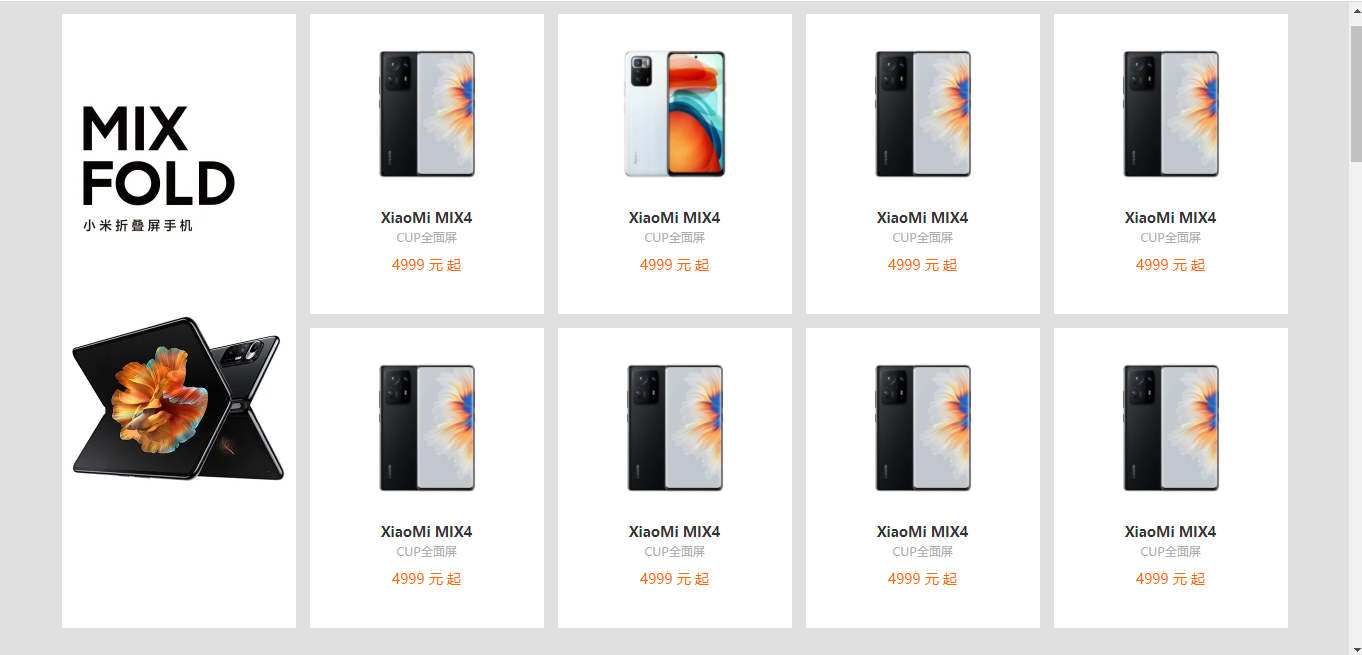
<div class="show">
<h2>手机</h2>
<div class="container">
<!--左边广告区-->
<div class="lf">
<img src="https://cdn.cnbj1.fds.api.mi-img.com/mi-mall/c583f2edc613f1be20fa415910b13ce3.jpg?thumb=1&w=234&h=614&f=webp&q=90" alt="">
</div>
<!--商品区-->
<div class="lr">
<div class="item">
<a href="">
<div class="figure">
<img src="https://cdn.cnbj1.fds.api.mi-img.com/mi-mall/ab07e0fcbec3beb8b0f409db8bee8da4.jpg?thumb=1&w=200&h=200&f=webp&q=90" alt="">
</div>
<h3 class="title">XiaoMi MIX4</h3>
<p class="desc">CUP全面屏</p>
<p class="price">
<span class="num">4999</span>
元
<span>起</span>
</p>
</a>
</div>
<div class="item">
<a href="">
<div class="figure">
<img src="https://cdn.cnbj1.fds.api.mi-img.com/mi-mall/61454401f855cf5ed64747a6ac04bae5.jpg?thumb=1&w=200&h=200&f=webp&q=90" alt="">
</div>
<h3 class="title">XiaoMi MIX4</h3>
<p class="desc">CUP全面屏</p>
<p class="price">
<span class="num">4999</span>
元
<span>起</span>
</p>
</a>
</div>
<div class="item">
<a href="">
<div class="figure">
<img src="https://cdn.cnbj1.fds.api.mi-img.com/mi-mall/ab07e0fcbec3beb8b0f409db8bee8da4.jpg?thumb=1&w=200&h=200&f=webp&q=90" alt="">
</div>
<h3 class="title">XiaoMi MIX4</h3>
<p class="desc">CUP全面屏</p>
<p class="price">
<span class="num">4999</span>
元
<span>起</span>
</p>
</a>
</div>
<div class="item">
<a href="">
<div class="figure">
<img src="https://cdn.cnbj1.fds.api.mi-img.com/mi-mall/ab07e0fcbec3beb8b0f409db8bee8da4.jpg?thumb=1&w=200&h=200&f=webp&q=90" alt="">
</div>
<h3 class="title">XiaoMi MIX4</h3>
<p class="desc">CUP全面屏</p>
<p class="price">
<span class="num">4999</span>
元
<span>起</span>
</p>
</a>
</div>
</div>
</div>
</div>
</body>
</html>

若有收获,就点个赞吧
0 人点赞
