Add a block category
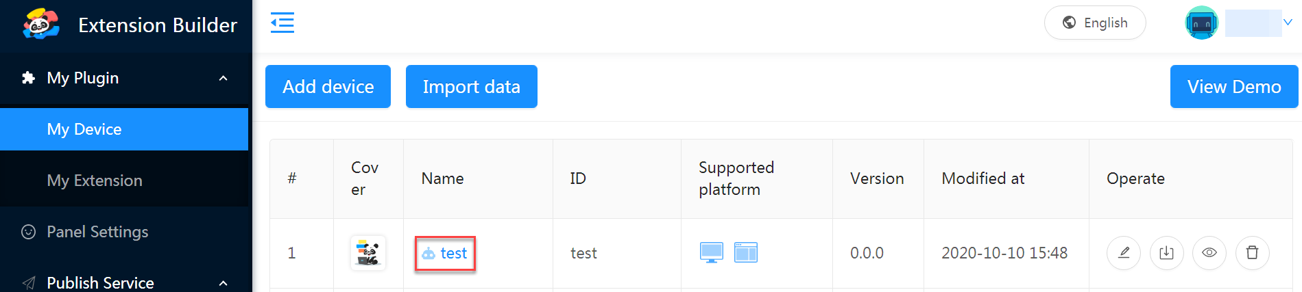
After being created, a device or extension is displayed in the My Device or My Extension list.
The following describes how to configure blocks for a device:
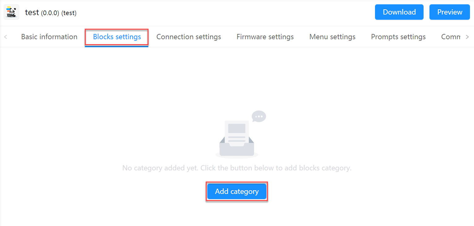
1. Click the name of the device to enter the Blocks settings tab
2. Click “Add category”
3. Set information about the category in the setting area that appears
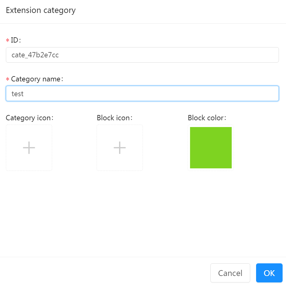
ID
- ID is the unique identifier (ID) of the device, used identification by developers or programs.
- Identifiers can be set to a combination of lowercase characters or digits. If multiple words are used, it is recommended that you use the symbol “_” to separate them, for example,
arduino_unoandcodey. - It is recommended that you use the combination of extension name and category name, for example,
arduinouno_pin
Category name:
- Name of the block category, which will be displayed in the blocks area on mBlock 5
Category icon (optional):
- Icon displayed before the block category name
- Icon format: SVG, 100×100, tranparent background, colored
- Block icon (optional):
- Icon displayed on the leftmost of the block
- Icon format: SVG, 100×100, tranparent background, white
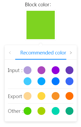
- Block color:
- Color of the blocks in the category
- Unless otherwise required, select a color from the recommended ones
- If no category icon is set, the color you set for the blocks is used as the category icon by default.
Click OK when completing the settings. Then, you can see the added category in the Block category area.
You can click the Edit button of the category to modify information about it and click + at the bottom to add another category.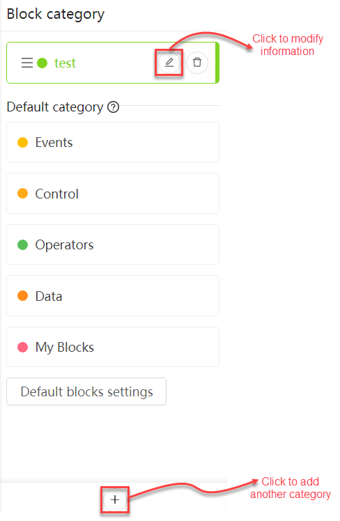
Knowledge point
The differences between device block categories and extension block categories lie in:
- mBlock 5 Extension Builder provides default categories, including Events, Control, Operators, Data, and My Blocks after you add a block category for a device while no default categories are provided after you add a block category for an extension.
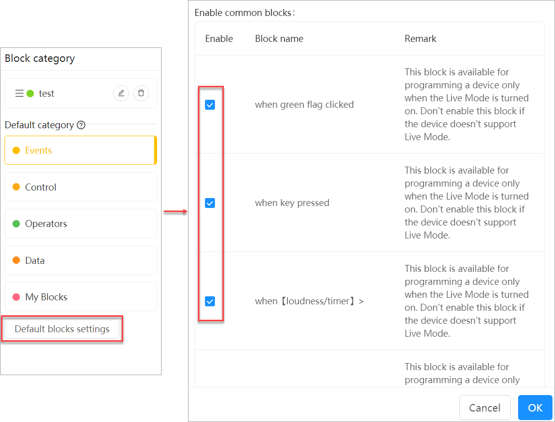
- For block categories for devices, you can click Default blocks settings to enable common blocks you need.
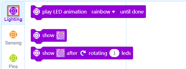
Manage blocks
After selecting a block category, you can manage the blocks in the Blocks list area, including adding, copying, deleting, and dragging a block.
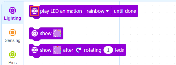
The following figure shows how you can manage blocks in the test category.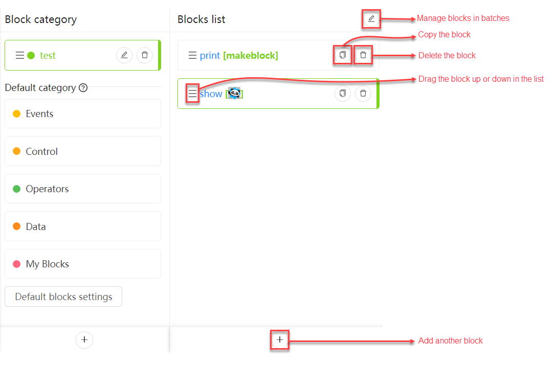
Configure a block
After selecting a block in the Blocks list area, you can set information about it.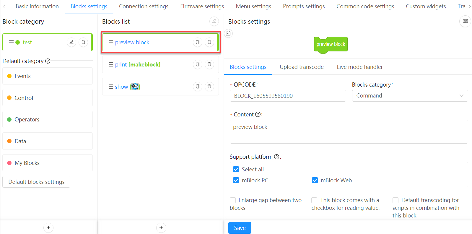
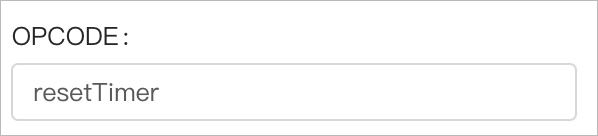
1. Set OPCODE
Set the ID of the block. The ID must be set in English. The camelCase naming mode is recommended and you can describe the function of the block, for example resetTimer (the block resets the timer).
2. Set the block type
Block types
| Block type | Instance | Description |
|---|---|---|
| Command | 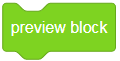 |
Executes a command |
| String |  |
Outputs a character string |
| Number |  |
Outputs a numeric value |
| Boolean |  |
Determines whether a condition is met |
| Events |  |
Activates the subsequent blocks |
| Conditional | 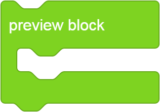 |
Executes the specified command when the specified condition is met |
| Button |  |
Executes the specified command when you click it |
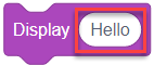
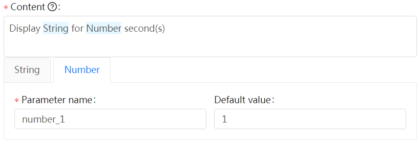
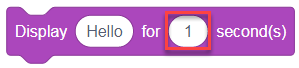
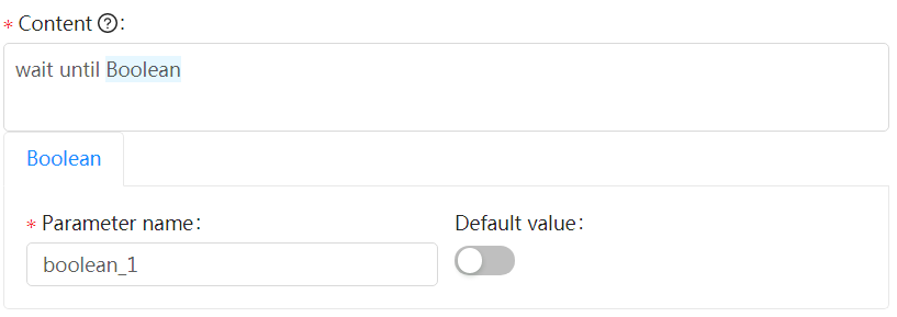
3. Set the content
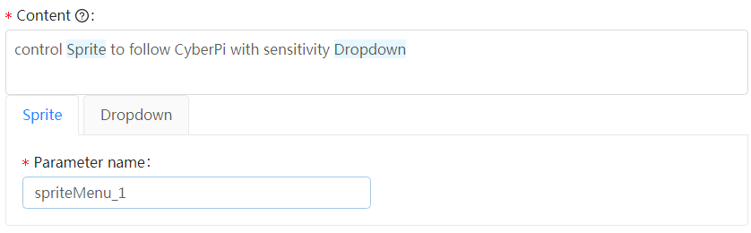
Set the content to be displayed on the block. You can enter “space + @” to set a parameter or parameters for the block.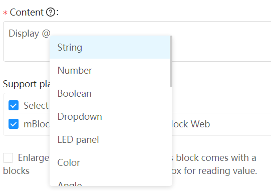
:::info Note: When setting a parameter, you must enter a space before the symbol @. :::
The following parameter types are available:
String
Number
Boolean
Dropdown
LED panel
Color
Angle
Image
Custom widget
Variable dropdown
Variable input dropdown
Sprite
Sound
Costume
Device
Toward
Backdrop
Noteinput
Input dropdown
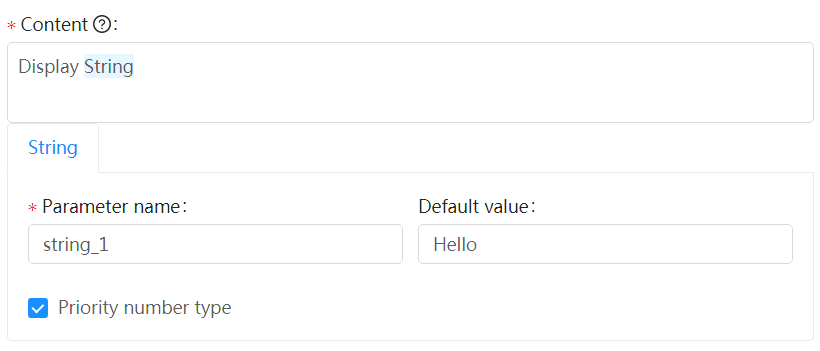
String
You can set a parameter of the String type to any characters. Alternatively, you can put any block of the character string or numeric type into it to serve as its value.
All the values entered are processed as character strings.
If you select Priority number type, the value entered is processed as a numeric value first, and if it isn’t a numeric value, it is processed as a character string.
Number
You can set a parameter of the Number type only to a numeric value. Alternatively, you can drag any block of the numeric type into it to serve as its value.
All the values entered are processed as numeric values.
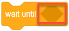
Boolean
You can set a parameter of the Boolean type only by dragging a block of the Boolean type into it.
All the values entered are processed as Boolean values.
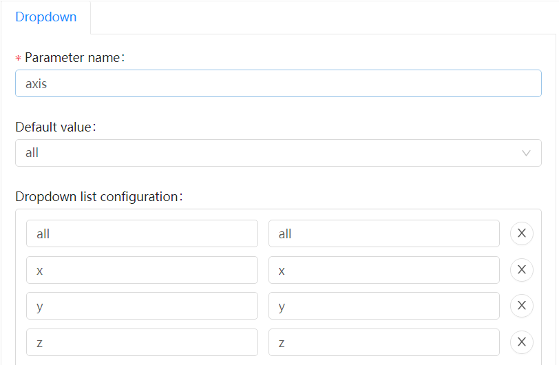
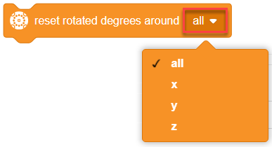
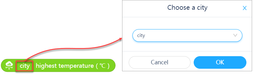
Dropdown
You can click to select an option from the drop-down list box.
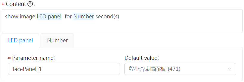
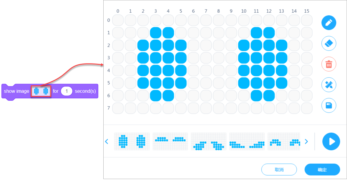
LED panel
You can click to set the image.
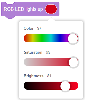
Color
You can click to set the specified color, saturation, and brightness.
Example: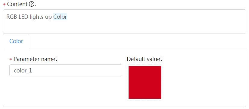
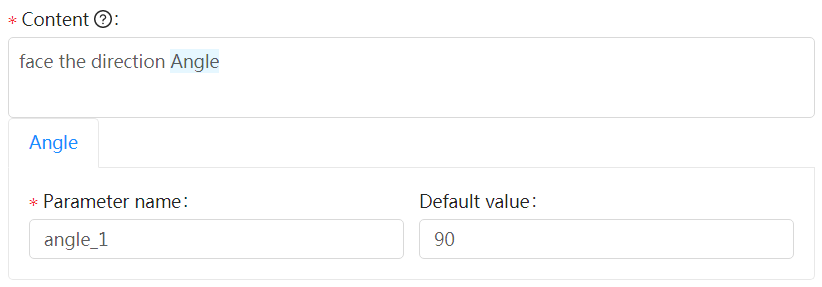
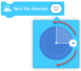
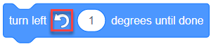
Angle
You can set this parameter to any numeric value. Alternatively, you can drag any block of the numeric type into it to serve as its value or drag the pointer on the direction circle.
Any value entered is processed as the number of degrees.
Image
The image you set is shown in the block.
Requirements for the image: SVG, 12.6 × 12.6 (pixels)
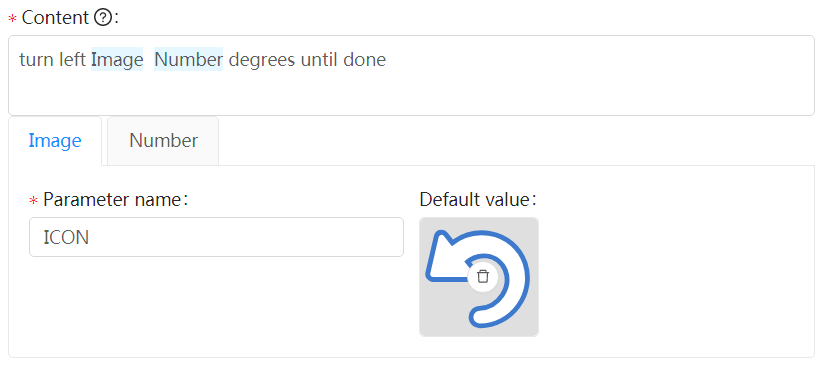
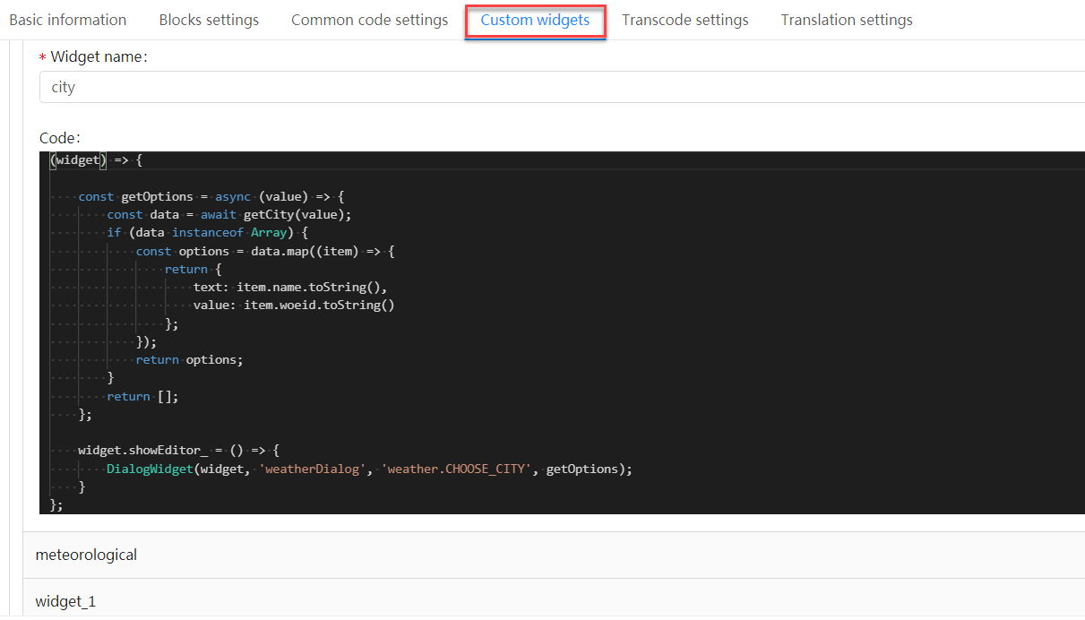
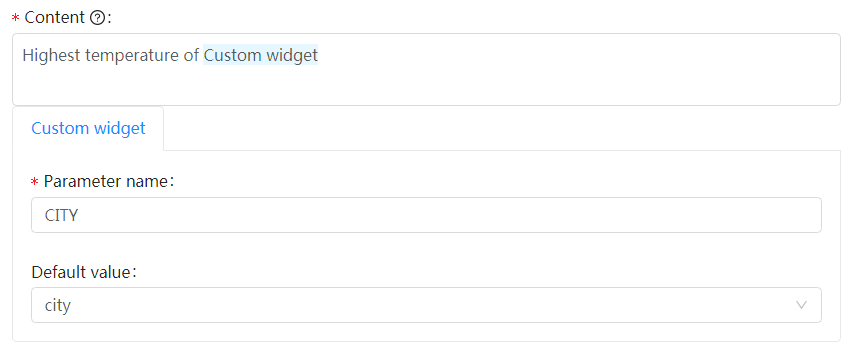
Custom widget
To use the Custom widget parameter, you need to set widgets for the device or extension on the Custom widgets tab first.
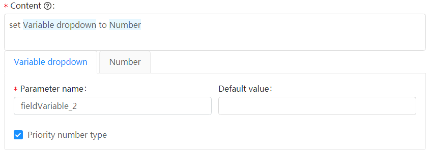
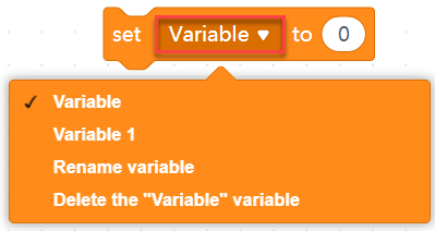
Variable dropdown
You can click to select, rename, or delete a created variable. This parameter can be set only through variable input. If you select Priority number type, the value entered is processed as a numeric value first, and if it isn’t a numeric value, it is processed as a character string.
 **
**
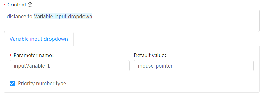
Variable input dropdown
You can click to select a variable or drag a block of the string or numeric type into it to serve as its value.
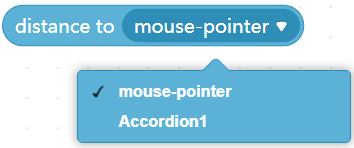
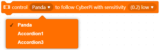
Sprite
You can click to select a sprite from the drop-down list box, which contains all sprites you have added on mBlock 5.
4. Support platform
Select the mBlock 5 platforms to be supported by the block.
Two options are available: mBlock PC and mBlock Web
You can select Select all to select both the options.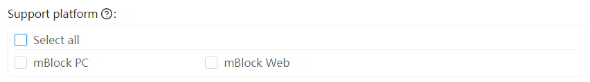
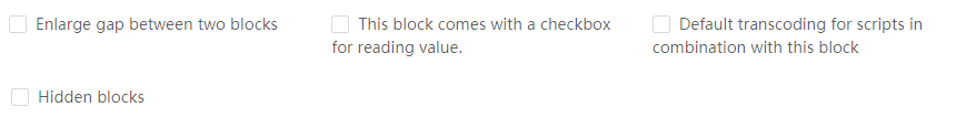
5. Block attributes
| Item | Instance | Remarks |
|---|---|---|
| ☐ Enlarge gap between two blocks | 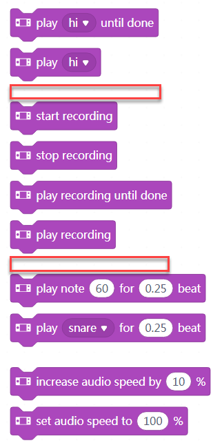 |
Used to group blocks of the same category according to their functions |
| ☐ This block comes with a checkbox for reading value. |  |
Available only for blocks of the numeric and string types |
| ☐ Default transcoding for scripts in combination with this block | If you select this item, only blocks under this block are transcoded. | |
| ☐ Hidden blocks | Used to hide the block in the block list |

若有收获,就点个赞吧
0 人点赞
