教程与目录
一、子图
1.使用 plt.subplots 绘制均匀状态下的子图
2.使用 GridSpec 绘制非均匀子图
二、子图上的方法
思考题
收获
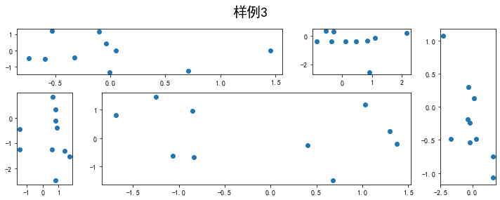
- 系统了解了子图的绘制方法
- 了解了子图也能化成下面样例3的形式,感觉很有趣
- 让我感觉有意思的是,方法”set_xscale”可以直接把坐标替换为指数或者对数;之前的话我可能就得生成对应表变量再画图了
思考题
- 墨尔本1981年至1990年的每月温度情况,要求图片:
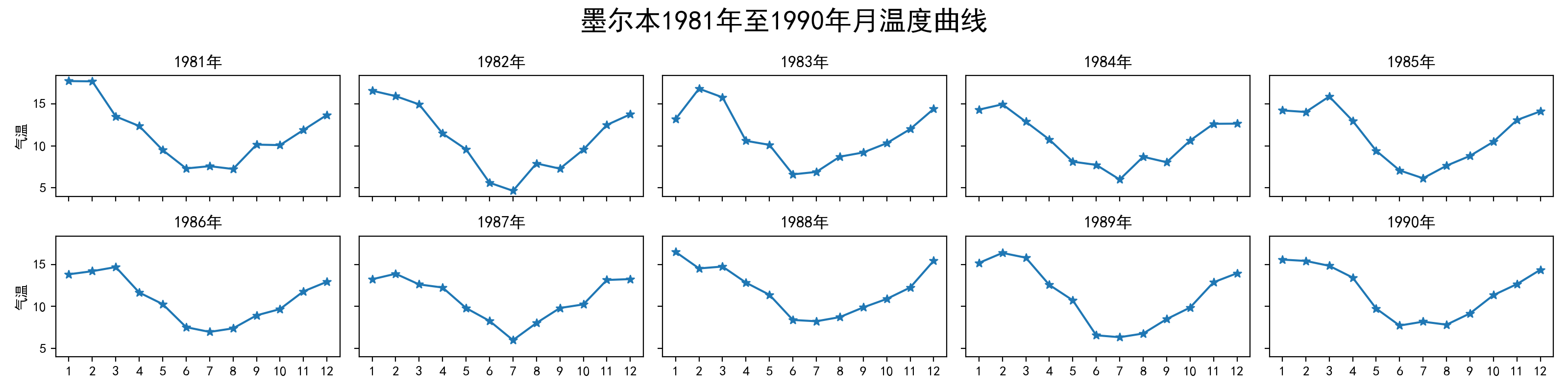
import numpy as npimport pandas as pdimport matplotlib as mplimport matplotlib.pyplot as pltdf = pd.read_csv(".\data\layout_ex1.csv")df['year'] = df['Time'].apply(lambda x: x.split('-')[0])df['month'] = df['Time'].apply(lambda x: x.split('-')[1])df[['year','month']] = df[['year','month']].astype(int)mpl.rc("font",family='MicroSoft YaHei',weight='bold')fig, axs = plt.subplots(2, 5, figsize=(20, 4), sharex=True, sharey=True)fig.suptitle(u'墨尔本1981年至1990年月温度曲线', size=20)for i in range(2):for j in range(5):year = 1981+i*5+jaxs[i][j].plot(range(1,13), df.loc[df['year']==year, 'Temperature'].values, marker = "*")axs[i][j].set_title('%d年'%(year))axs[i][j].set_xticks(range(1,13))if j==0: axs[i][j].set_ylabel('气温')fig.tight_layout()
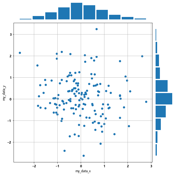
- 画出数据的散点图和边际分布用 np.random.randn(2, 150) 生成一组二维数据,使用两种非均匀子图的分割方法,做出该数据对应的散点图和边际分布图。要求图片:
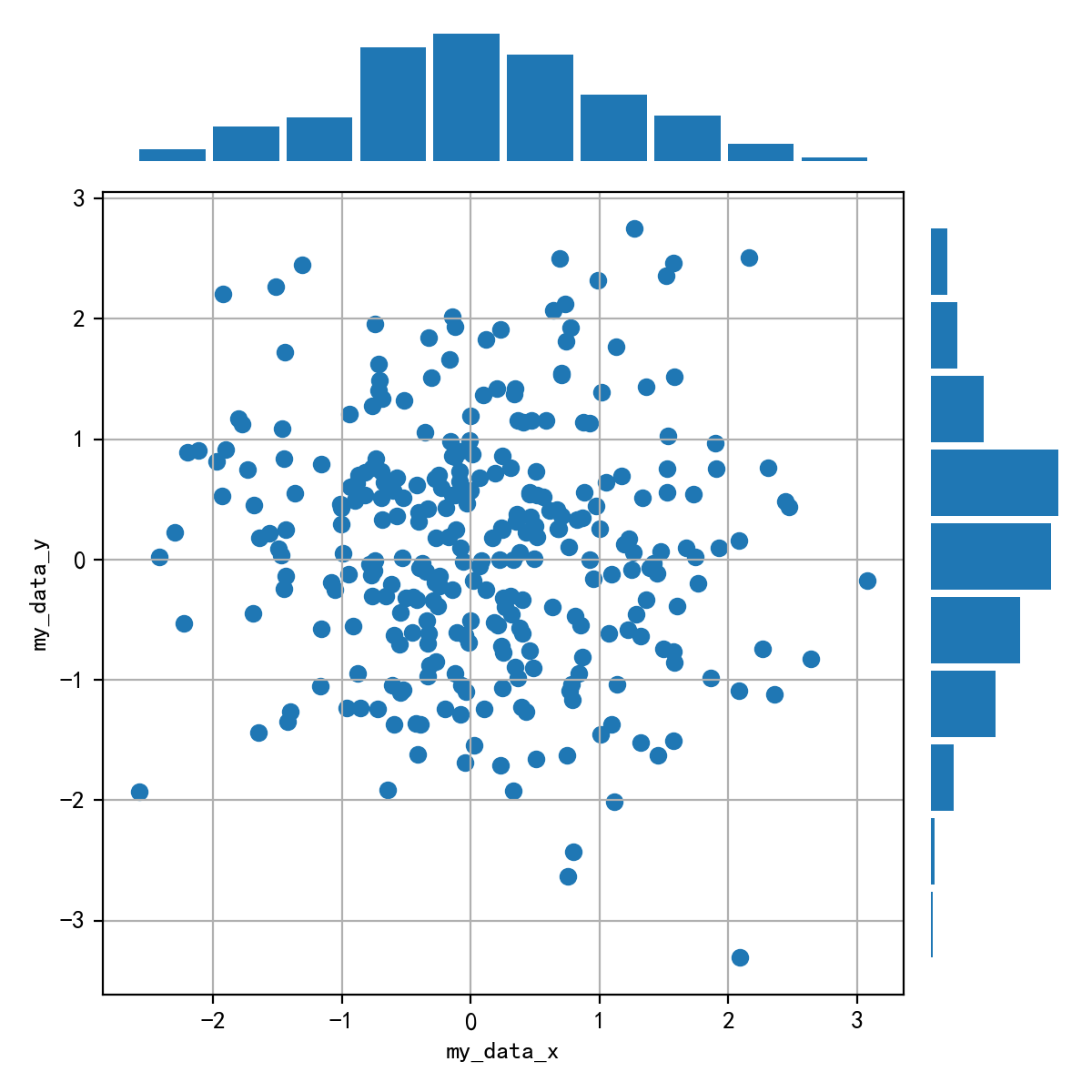
import numpy as npimport pandas as pdimport matplotlib as mplimport matplotlib.pyplot as pltdata = np.random.randn(2, 150)fig = plt.figure(figsize=(8,8))spec = fig.add_gridspec(nrows=2, ncols=2, width_ratios=[8,1], height_ratios=[1,8])ax1 = fig.add_subplot(spec[0, 0])ax1.hist(data[0], rwidth=0.9)ax1.axis('off')ax2 = fig.add_subplot(spec[1, 0])ax2.scatter(data[0], data[1])ax2.set_xlabel('my_data_x')ax2.set_ylabel('my_data_y')ax2.grid(True)ax3 = fig.add_subplot(spec[1, 1])ax3.hist(data[1], rwidth=0.9, orientation='horizontal')ax3.axis('off')fig.tight_layout()

若有收获,就点个赞吧
0 人点赞
