教程及目录
一、概述
1.matplotlib的三层api
2.Artist的分类
二、基本元素-primitives
1.2DLines
2.patches
3.collections
4.images
三、对象容器-Object container
1.Figure容器
2.Axes容器
3.Axis容器
4.Tick容器
收获
- 清晰了plt画图的基本类及关系:
- matplotlib有三个层次的API:
- matplotlib.backend_bases.FigureCanvas 代表了绘图区,所有的图像都是在绘图区完成的
- matplotlib.backend_bases.Renderer 代表了渲染器,可以近似理解为画笔,控制如何在 FigureCanvas 上画图。
- matplotlib.artist.Artist 代表了具体的图表组件,即调用了Renderer的接口在Canvas上作图。
- Artist有两种类型:primitives 和containers。
- matplotlib有三个层次的API:
思考题
- primitives 和 container的区别和联系是什么,分别用于控制可视化图表中的哪些要素
- 相当于:container是画板,primitives是画板上的画;
- primitive是基本要素,它包含一些我们要在绘图区作图用到的标准图形对象,如曲线Line2D,文字text,矩形Rectangle,图像image等。
- container是容器,即用来装基本要素的地方,包括图形figure、坐标系Axes和坐标轴Axis。
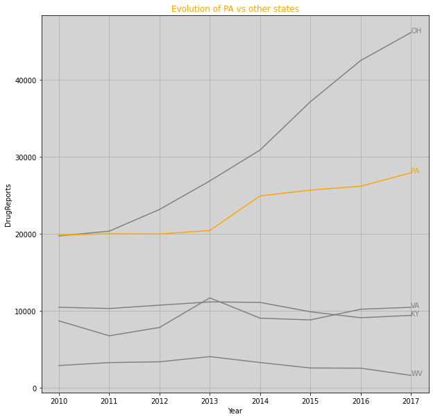
- 使用提供的drug数据集,对第一列yyyy和第二列state分组求和,画出下面折线图。PA加粗标黄,其他为灰色。图标题和横纵坐标轴标题,以及线的文本暂不做要求。
import numpy as npimport pandas as pdimport matplotlib.pyplot as pltdf = pd.read_csv(".\data\Drugs.csv")ax = df.groupby(['YYYY','State'])['DrugReports'].sum().unstack().plot(figsize=(10,10),color=['gray','gray','orange','gray','gray'],legend=False)ax.text(2017, 9394, "KY",color='gray')ax.text(2017, 46104, "OH",color='gray')ax.text(2017, 27894, "PA",color='orange')ax.text(2017, 10448, "VA",color='gray')ax.text(2017, 1614, "WV",color='gray')ax.patch.set_facecolor('lightgray')ax.set_title('Evolution of PA vs other states', color='orange')ax.set_xlabel('Year')ax.set_ylabel('DrugReports')ax.grid()
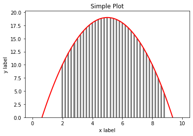
- 分别用一组长方形柱和填充面积的方式模仿画出下图,函数 y = -1 (x - 2) (x - 8) +10 在区间[2,9]的积分面积
import numpy as npimport matplotlib as mplimport matplotlib.pyplot as plt# step1 准备数据x = np.linspace(0, 10, 100)y = -1 * (x - 2) * (x - 8) +10x3 = np.arange(2, 9, 0.2)y3 = -1 * (x3 - 2) * (x3 - 8) +10# step2 设置绘图样式,这一模块的扩展参考第五章进一步学习,这一步不是必须的,样式也可以在绘制图像是进行设置mpl.rc('lines', linewidth=2, linestyle='-')# step3 定义布局, 这一模块的扩展参考第三章进一步学习fig, ax = plt.subplots()# step4 绘制图像, 这一模块的扩展参考第二章进一步学习ax.plot(x, y, color='red')# ax.fill_between(x2, y2, 0, color='gray')ax.bar(x3,y3, alpha=1, width=0.1, color='gray')# step5 添加标签,文字和图例,这一模块的扩展参考第四章进一步学习ax.set_xlabel('x label')ax.set_ylabel('y label')ax.set_title("Simple Plot")ax.set_ylim(0)plt.show()
import numpy as npimport matplotlib as mplimport matplotlib.pyplot as plt# step1 准备数据x = np.linspace(0, 10, 100)y = -1 * (x - 2) * (x - 8) +10x2 = np.linspace(2, 9, 100)y2 = -1 * (x2 - 2) * (x2 - 8) +10# step2 设置绘图样式,这一模块的扩展参考第五章进一步学习,这一步不是必须的,样式也可以在绘制图像是进行设置mpl.rc('lines', linewidth=2, linestyle='-')# step3 定义布局, 这一模块的扩展参考第三章进一步学习fig, ax = plt.subplots()# step4 绘制图像, 这一模块的扩展参考第二章进一步学习ax.plot(x, y, color='red')ax.fill_between(x2, y2, 0, color='gray')# step5 添加标签,文字和图例,这一模块的扩展参考第四章进一步学习ax.set_xlabel('x label')ax.set_ylabel('y label')ax.set_title("Simple Plot")ax.set_ylim(0)plt.show()


若有收获,就点个赞吧
0 人点赞
