教程与目录
一、Figure和Axes上的文本
1.文本API示例
2.text - 子图上的文本
3.xlabel和ylabel - 子图的x,y轴标签
4.title和suptitle - 子图和画布的标题
5.annotate - 子图的注解
6.字体的属性设置
二、Tick上的文本
1.简单模式
2.Tick Locators and Formatters
a) Tick Formatters
b) Tick Locators
三、legend(图例)
思考题
收获
- 作图可以千变万化,但是对应的接口貌似就那么几个,所以之后想画什么图的时候,用这些基本的接口去思考怎么绘制;
- 清楚了set_xticks和set_xticklabels的关系,之前试过几次没去搞懂区别;
- tick上的文本,可以用set_xticklabels一个一个设置,也可以用set_major_locator、set_major_formatter和matplotlib.ticker.AutoLocator、matplotlib.ticker.FormatStrFormatter函数统一设置
思考题
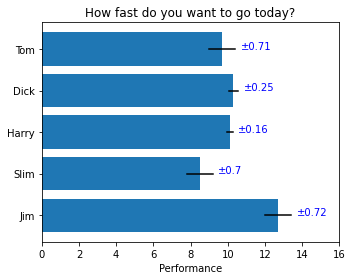
- 请尝试使用两种方式模仿画出下面的图表(重点是柱状图上的标签),本文学习的text方法和matplotlib自带的柱状图标签方法bar_label。要求图片:
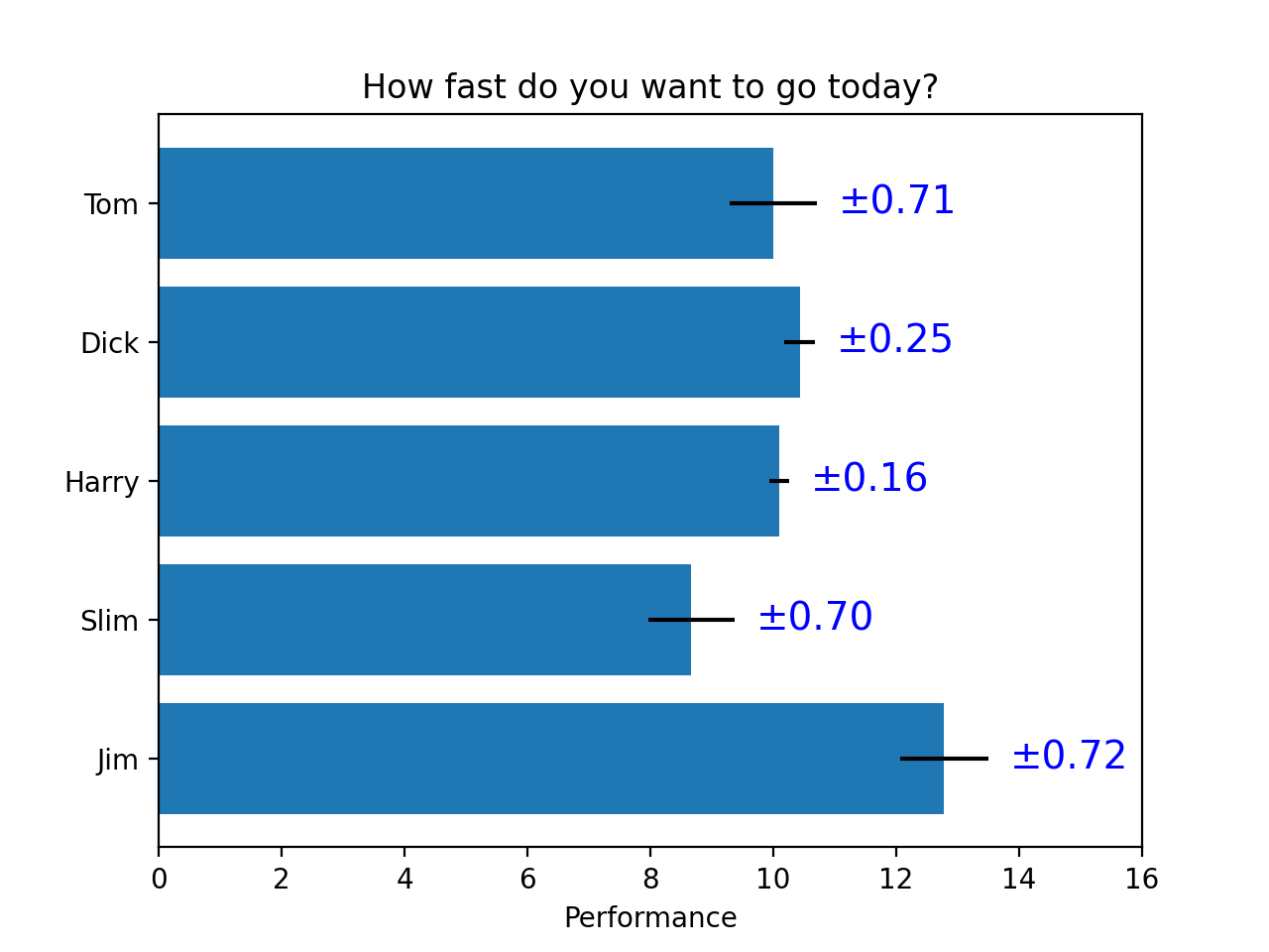
import matplotlib.pyplot as plt# 生成数据yname = ['Jim', 'Slim', 'Harry', 'Dick', 'Tom']xvalue = [12.7, 8.5, 10.1, 10.3, 9.7]xvalue_error = [0.72, 0.7, 0.16, 0.25, 0.71]n = len(xvalue)# 画图fig, ax = plt.subplots(1, 1, figsize=(5,4), tight_layout=True)ax.barh(range(n), xvalue)for i in range(n):ax.plot([xvalue[i]-xvalue_error[i],xvalue[i]+xvalue_error[i]], [i,i], color='black')ax.text(xvalue[i]+xvalue_error[i]+0.3,i,"±{}".format(xvalue_error[i]), color='blue')ax.set_title("How fast do you want to go today?")ax.set_xlabel("Performance")ax.set_xticks(range(0,18,2))ax.set_yticks([0,1,2,3,4])ax.set_yticklabels(yname)plt.show()

若有收获,就点个赞吧
0 人点赞
