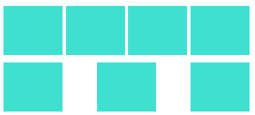
HTML 结构:
<div class="box"><div class="item item1"></div><div class="item item2"></div><div class="item item3"></div><div class="item item4"></div><div class="item item5"></div><div class="item item6"></div><div class="item item7"></div></div>
样式:
.box {
  width: 500px;
  display: flex;
  justify-content: space-between;
  align-items: center;
  flex-wrap: wrap;
}
.item {
  width: 24%;
  height: 100px;
  background-color: turquoise;
  margin-top: 15px;
}
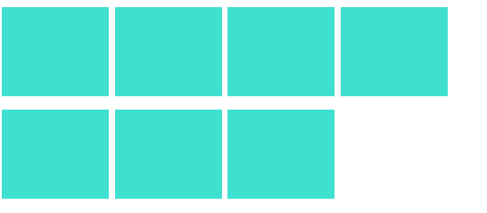
如果行数是固定的
1. 固定margin
不使用justify-content:space-between声明在模拟两端对齐效果。中间的间隙我们使用margin进行控制。
.box {
  width: 500px;
  display: flex;
  /* justify-content: space-between; */
  align-items: center;
  flex-wrap: wrap;
}
.item {
  width: 24%;
  height: 100px;
  background-color: turquoise;
  margin-top: 15px;
}
// :nth-child(4n)表示排序为4的倍数的子元素
.item:not(:nth-child(4n)) {
  // 4%为100% - 24% * 4
  // 因为是两端对齐一行四个,所以最后一个不要设置margin-right
  margin-right: calc(4% / 3);
}
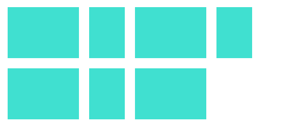
2. 动态margin
.box {
  width: 500px;
  display: flex;
  justify-content: space-between;
  align-items: center;
  flex-wrap: wrap;
}
.item {
  width: 24%;
  height: 100px;
  background-color: turquoise;
  margin-top: 15px;
}
// 还差一个元素
.item:last-child:nth-child(4n - 1) {
  // 24%为子元素的宽度
  margin-right: calc(24% + 4% / 3);
}
// 还差两个元素
.item:last-child:nth-child(4n - 2) {
  // (24% + 4% / 3) * 2
  margin-right: calc(48% + 8% / 3);
}
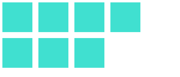
如果每一项的宽度不固定
1. 最后一项margin-right:auto
.box {
  width: 500px;
  display: flex;
  justify-content: space-between;
  align-items: center;
  flex-wrap: wrap;
}
.item {
  height: 100px;
  background-color: turquoise;
  margin: 10px;
}
.item1, .item3, .item5, .item7 {
  width: 28%;
}
.item2, .item4, .item6 {
  width: 14%;
}
.item:last-child {
  margin-right: auto;
}
2. 利用伪类元素
.box {
  width: 500px;
  display: flex;
  justify-content: space-between;
  align-items: center;
  flex-wrap: wrap;
}
.item {
  height: 100px;
  background-color: turquoise;
  margin: 10px;
}
.item1, .item3, .item5, .item7 {
  width: 28%;
}
.item2, .item4, .item6 {
  width: 14%;
}
.box:after {
  content: '';
  flex: auto;
  /* flex: 1; */
}
如果行数不固定
.box {
  width: 480px;
  display: flex;
  justify-content: space-between;
  align-items: center;
  flex-wrap: wrap;
}
.item {
  width: 100px;
  height: 100px;
  background-color: turquoise;
  margin: 10px;
}
i {
  width: 100px;
  margin: 0 10px;
}
参考

若有收获,就点个赞吧
0 人点赞
