通过 Seaborn 分布图,您可以显示带有线条的直方图。 这可以以各种变化形式显示。 我们将 Seaborn 与 Python 绘图模块 Matplotlib 结合使用。
分布图绘制观测值的单变量分布。 distplot()函数将 Matplotlib hist函数与 Seaborn kdeplot()和rugplot()函数结合在一起。
示例
分布图示例
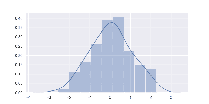
下图显示了一个简单的分布。 它使用random.randn()创建随机值。如果您也手动定义值,它将起作用。
import matplotlib.pyplot as pltimport seaborn as sns, numpy as npsns.set(rc={"figure.figsize": (8, 4)}); np.random.seed(0)x = np.random.randn(100)ax = sns.distplot(x)plt.show()
分布图示例
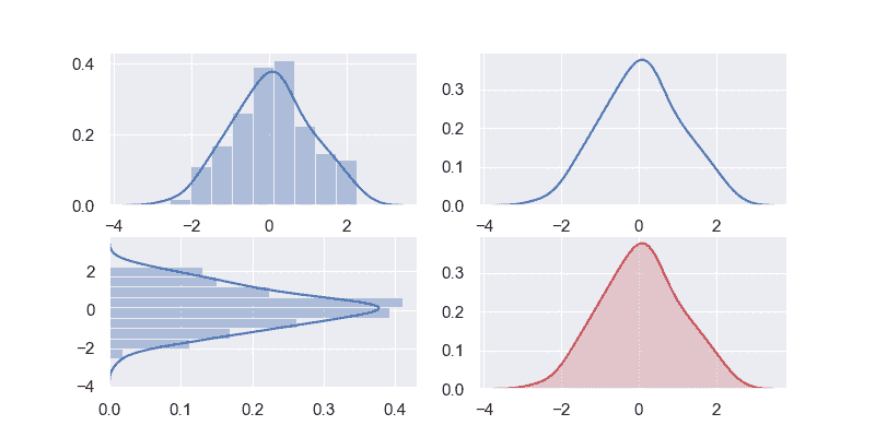
您可以显示分布图的各种变化。 我们使用pylab模块中的subplot()方法来一次显示 4 种变化。
通过更改distplot()方法中的参数,您可以创建完全不同的视图。 您可以使用这些参数来更改颜色,方向等。
import matplotlib.pyplot as pltimport seaborn as sns, numpy as npfrom pylab import *sns.set(rc={"figure.figsize": (8, 4)}); np.random.seed(0)x = np.random.randn(100)subplot(2,2,1)ax = sns.distplot(x)subplot(2,2,2)ax = sns.distplot(x, rug=False, hist=False)subplot(2,2,3)ax = sns.distplot(x, vertical=True)subplot(2,2,4)ax = sns.kdeplot(x, shade=True, color="r")plt.show()
Seaborn 分布
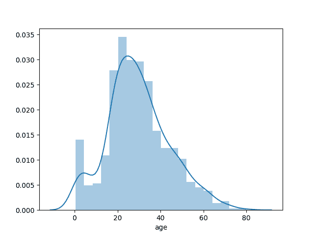
您也可以在直方图中显示 Seaborn 的标准数据集。这是一个很大的数据集,因此仅占用一列。
import matplotlib.pyplot as pltimport seaborn as snstitanic=sns.load_dataset('titanic')age1=titanic['age'].dropna()sns.distplot(age1)plt.show()
分布图容器
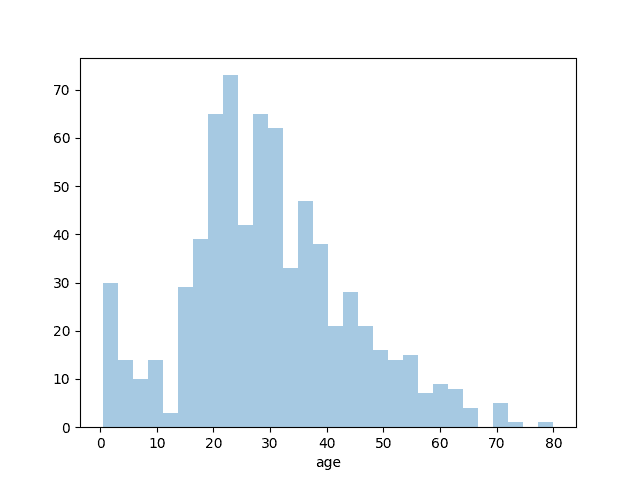
如果您想更改桶的数量或隐藏行,也可以。当调用方法distplot()时,您可以传递箱数并告诉直线(kde)不可见。
import matplotlib.pyplot as pltimport seaborn as snstitanic=sns.load_dataset('titanic')age1=titanic['age'].dropna()sns.distplot(age1,bins=30,kde=False)plt.show()
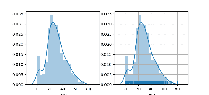
Seaborn 不同的绘图
下面的示例显示了其他一些分布图示例。 您通过grid(True)方法调用激活了一个网格。
import matplotlib.pyplot as pltimport seaborn as snstitanic=sns.load_dataset('titanic')age1=titanic['age'].dropna()fig,axes=plt.subplots(1,2)sns.distplot(age1,ax=axes[0])plt.grid(True)sns.distplot(age1,rug=True,ax=axes[1])plt.show()

若有收获,就点个赞吧
0 人点赞
