居中布局
title: 主流 CSS 布局(水平居中、垂直居中、居中 )
date: 2019-11-01 14:11:51
tags:
- CSS
CSS 布局
html 页面的整体结构或骨架
- 布局不是某个技术内容 而是一种设计思想
[ 布局方式 ]
- 水平居中布局
- 垂直居中布局
- 居中布局( 水平 + 垂直 )
什么是水平居中布局
水平居中布局 元素相对于页面/元素相对于父元素水平居中
[ 实现方式 ]
- inline-block + text-align 属性配合使用
注:[优点] 浏览器兼容性比较好 [缺点] text-align 属性具有继承性 导致子级元素的文本居中显示
解决方法:在子级元素重新设置 text-align 属性覆盖掉父级元素的 text-align 属性
<style>*{margin: 0;padding: 0;}.parent {width: 100%;height: 200px;background-color: #00ffff;/* 方法一: inline-block + text-align 属性配合使用 为父元素 添加 text-align 属性 为子元素添加 display 属性- text-align 属性 为文本内容设置对其方式+ left: 左对齐+ center: 居中对齐+ right: 右对齐*/text-align: center;}.child {width: 300px;height: 200px;background-color: #ff0000;/* display 属性:- block: 块级元素- inline: 内联元素 (text-align 有效)+ width 和 height 属性无效- inline-block: 行内块元素 (块级 + 内联 )*/display: inline-block;}</style><body><!-- 居中布局 --><!-- 方法一: inline-block + text-align 属性配合使用 --><div class="parent"><div class="child"></div></div></body>
- table + margin 属性配合使用
注:[优点] 只需要对子级元素进行设置就可以实现水平居中 [缺点] 如果子级元素脱离文档流,导致 margin 属性失效
解决方法:考虑第一种或第三种解决方案
[ 拓展 ] CSS 中使元素脱离文档流的方式
- 将元素设置浮动 float
- 将元素设置为绝对定位 position: absolute
- 将元素设置为固定定位 position: fixed
<style>*{margin: 0;padding: 0;}.parent {width: 100%;height: 200px;background-color: #00ffff;}.child {width: 300px;height: 200px;background-color: #ff0000;/* 方法二: gtable + margin 属性配合使用 *//* display的值 为 table 或 block */display: table;/* margin 属性: 外边距- 一个值: 上下左右- 两个值: 上下,左右+ auto 根据浏览器自动分配- 三个值: 上,左右,下- 四个值: 上,右,下,左*/margin: 0 auto;}</style>
- absolute + transform 属性配合使用
注:[优点] 无论父级元素是否脱离文档流,不影响子级元素水平居中的效果 [缺点] transform 属性是 CSS 3 中新增的属性 浏览器支持情况不好
解决方法:考虑第一种或第二种解决方案
<style>* {margin: 0;padding: 0;}.parent {width: 100%;height: 200px;background-color: #00ffff;/* 相对定位 */position: relative;}.child {width: 300px;height: 200px;background-color: #ff0000;/* 当把当前元素设置为绝对定位以后- 如果父级元素没有设置定位,当前元素是相对于页面定位的- 如果父级元素设置了定位,当前元素是相对于父级元素定位的*/position: absolute;left: 50%;/* 水平方向平移 */transform: translateX(-50%);/* margin-left: -50%; */}</style>
- … …
什么是垂直居中布局
垂直居中布局 :当前元素相对于页面/父元素垂直方向是居中显示的
[ 实现方式 ]
- table-cell + vertical-align 属性配合使用
注:[优点] 浏览器的兼容性比较好 [缺点] vertical-align 属性 具有继承性 导致子级元素的文本居中显示
如果父级元素中包含除子级元素以外的文本内容,此方法不适用
<style>* {margin: 0;padding: 0;}.parent {/*方法一: table-cell + vertical-align 属性配合使用 */width: 200px;height: 600px;background-color: #00ffff;/* display 属性:- table: 设置当前元素为<table>元素- table-cell:设置当前元素为<td>元素 单元格- 设置完成以后 作为子级元素的div就相当于单元格中的内容了,设置对齐方式即可*/display: table-cell;/*vertical-align 属性: 用于设置文本内容的垂直方向的定对齐方式- top: 顶部对齐- middle: 居中对齐- bottom: 底部对齐*/vertical-align: middle;}.child {width: 200px;height: 300px;background-color: #ff0000;}</style><body><div class="parent"><div class="child"></div></div></body>
- absolute + transform 属性配合使用
注:[优点] 无论父级元素是否脱离文档流,不影响子级元素的垂直居中的效果 [缺点] transform 属性是 CSS 3 中新增的属性 浏览器支持情况不好
解决方法:考虑第一种解决方案
<style>* {margin: 0;padding: 0;}.parent {width: 200px;height: 600px;background-color: #00ffff;position:relative;}/* 方法二: absolute + transform 属性配合使用 */.child {width: 200px;height: 300px;background-color: #ff0000;position: absolute;top: 50%;/* 垂直方向 */transform: translateY(-50%);}</style>
什么是居中布局
居中布局:( 水平 + 垂直 )居中
[ 实现方式 ]
- display:block + margin 属性实现水平方向居中,table-cell + vertical-align 属性实现垂直方向居中
注:[优点] 浏览器兼容性比较好 [缺点] 父元素与子元素都需要增加代码
<style>* {margin: 0;padding: 0;}.parent {width: 1000px;height: 600px;background-color: #00ffff;/* 实现垂直居中 *//* <td> */display: table-cell;vertical-align: middle;}.child {width: 200px;height: 300px;background-color: #ff0000;/* 实现水居中 *//* <table> *//* display: table; */display: block;margin: 0 auto;}</style><body><div class="parent"><div class="child"></div></div></body>
- absolute + transform 属性实现水平和垂直方向的居中
注:[优点] 无论父级元素是否脱离文档流,不影响子级元素的垂直居中的效果,不考虑浏览器兼容性,优于第一中方案 [缺点] transform 属性是 CSS 3 中新增的属性 浏览器支持情况不好同时子父元素都增加了代码
<style>* {margin: 0;padding: 0;}.parent {width: 1000px;height: 600px;background-color: #00ffff;/* 相对定位 不脱离文档流*/position:relative;}.child {width: 200px;height: 300px;background-color: #ff0000;/* 绝对定位 ———— 子绝父相 */position: absolute;top: 50%;left: 50%;transform: translate(-50%, -50%);/* transform: translateX(-50%);transform: translateY(-50%); */}</style>
多列布局
title: 多列布局
date: 2019-11-01 20:42:12
tags:
- CSS
- CSS 布局
什么是多列布局
——几个元素呈现水平方式排列的效果
[ 从元素分类角度 ]
- 块级元素 默认垂直排列 设置浮动实现水平方式排列
- 内联元素 默认水平方式排列
- 行内块元素 默认水平方式排列
[ 多列布局分类 ]
- 两列布局 一列定宽,另外一列宽度自适应
- 三列布局
- 两列定宽且相邻,另外一列宽度自适应
- 两边定宽 中间自适应,即圣杯布局和双飞翼布局 先有圣杯布局然后演变出双飞翼布局
- 等分布局 每一列宽度相同
- 等高布局 每一列高度相同
- CSS 3 三列布局
什么是两列布局
—— 左列确定宽度,右列自动填满剩余空间
两列布局的实现
float + margin 属性实现
** 此方案的优缺点
优点:实现方式简单
缺点:
- 自适应元素 margin 属性值必须与定宽元素的width 值保持一致 高耦合
- 定宽元素浮动与自适应元素不浮动导致浏览器兼容性不好
- 如果右侧容器存在子级元素,为子级元素清除浮动之后,整个页面布局会乱掉
**
<style>* {margin: 0;padding: 0;}.parent {background-color: #eee;}.left,.right {height: 500px;}.left {width:300px;background-color: #00ffff;/* 脱离文档流 */float: left;}.right {/* 自动撑满父盒子 宽度默认父盒子宽度的100% */background-color: #ff0000;/* */margin-left: 300px;}/* .inner {height: 200px;background-color: #00ff00;/*清除浮动 *//* clear: both;} */</style></head><body><div class="parent"><div class="left"> 左: 定宽</div><div class="right"> 右: 自适应<!-- <div class="inner"></div> --></div></div></body>
注:以下是代码优化 为自适应元素添加父级元素并设置浮动 没有解决高耦合的问题
<style>* {margin: 0;padding: 0;}.parent {background-color: #eee;}.left,.right {height: 200px;}.left {width:300px;background-color: #00ffff;/* 脱离文档流 */float: left;/* margin-left: -100%; *//* 提高显示层级 */position: relative;}.right-fix {/* 由于设置浮动,默认宽度为 0 *//* 由于设置 父级元素 的 width: 100%;所以 宽度不够 而掉到第二行*/width: 100%;/* 向左移动 此时覆盖掉 左侧*/margin-left: -300px;float: left;background-color: #000000;}.right {/* 自动撑满父盒子 宽度默认父盒子宽度的100% */margin-left: 300px;/* padding-left: 300px; */background-color: #ff0000;}</style><body><div class="parent"><div class="left"> 左: 定宽</div><div class="right-fix"><div class="right"> 右: 自适应</div></div></div></body>
float + overflow 属性实现
此方案的优缺点
优点:没有第一种解决方案中存在的问题
缺点:overflow 属性开启BFC模式的同时,也存在溢出隐藏,右列内容溢出的时候就会被隐藏 ,由于开启BFC模式,所以不存在第一种解决方案中的同级元素要浮动都浮动的浏览器兼容性问题
<style>* {margin: 0;padding: 0;}.parent {background-color: #eee;height: 500px;}.left,.right {height: 300px;}.left {width: 300px;background-color: #00ffff;float: left;}.right {background-color: #ff0000;/*overflow 属性:- hidden 溢出隐藏 和 开启BFC模式,当前元素的内部环境与外界完全隔离*/overflow: hidden;}</style><body><div class="parent"><div class="left"> 左: 左对齐</div><div class="right"> 右:自适应</div></div></body>
使用 display 属性的 table 相关值
此方案的优缺点
优点:浏览器的兼容性比较好
缺点:将所有元素的 display 属性设置为 table 相关值,受到相应制约,同时也需要重新设置表格的特性,比如双边框、文本内容等问题
<style>* {margin: 0;padding: 0;}.parent {background-color: #eee;height: 500px;/* 表格的单元格的宽度会自动分配,左侧固定,右侧则自适应 */display: table;/*table-layout 属性 用来显示表格单元格、行、列的算法规则- automatic: 默认,列宽度有单元格内容设定- fixed: 列宽由表格宽度和列宽度设定- inherit: 规定应该从父元素继承 table-layout 属性的值*/table-layout: fixed;width: 100%;}.left,.right {height: 300px;display: table-cell;}.left {width: 300px;background-color: #00ffff;}.right {background-color: #ff0000;}</style><body><div class="parent"><div class="left"> 左: 左对齐</div><div class="right"> 右:自适应</div></div></body>
什么是三列布局
—— 两列定宽且相邻,另外一列宽度自适应
三列布局的实现
实现方式与两列布局实现方式类似
float + margin 属性实现
<style>* {margin: 0;padding: 0;}.parent {background-color: #eee;height: 500px;}.left,.center,.right {height: 300px;}.left {width: 300px;background-color: #00ffff;/* */float: left;}.center {width: 300px;background-color: #ffff00;float: left;}.right {background-color: #ff0000;margin-left: 600px;}</style><body><div class="parent"><div class="left"> 左: 定宽</div><div class="center"> 中:定宽 </div><div class="right"> 右:自适应</div></div></body>
float + overflow 属性实现
略,参考两列布局
使用 display 属性的 table 相关值
略,参考两列布局
什么是等分布局
等分布局的实现
- float 属性实现等分布局效果
- display 属性的值有关 table 的值实现
float 属性实现等分布局效果
<style>/****/* {margin: 0;padding: 0;}.parent {background-color: #eee;}.column1,.column2,.column3,.column5,.column6 {height: 500px;width: 20%;float: left;}.column2 {background-color: #ff66ff;}.column3 {background-color: #00ffff;}.column1 {background-color: #ffff00;}.column5 {background-color: #ff0000;}.column6 {background-color: #00ff00;}</style><body><div class="parent"><div class="column1">1</div><div class="column2">2</div><div class="column3">3</div><div class="column5">5</div><div class="column6">6</div></div></body>
display 属性的值有关 table 的值实现
<style>/*****/* {margin: 0;padding: 0;}.parent {background-color: #eee;width: 100%;/* <table> 元素 */display: table;}.column1,.column2,.column3,.column5,.column6 {height: 500px;/* <td> 元素 */display: table-cell;}.column2 {background-color: #ff66ff;}.column3 {background-color: #00ffff;}.column1 {background-color: #ffff00;}.column5 {background-color: #ff0000;}.column6 {background-color: #00ff00;}</style><body><div class="parent"><div class="column1">1</div><div class="column2">2</div><div class="column3">3</div><div class="column5">5</div><div class="column6">6</div></div></body>
等分布局的空白间距
[ 方法一 代码修改 ]
<style>/** 间距 + 容器宽度 = (间距 + 列宽度) * N列数***/* {margin: 0;padding: 0;}.parent-fix {/* 溢出隐藏 */overflow: hidden;}.parent {background-color: #eee;/* 解决高度塌陷 */overflow: hidden;/* height: 500px; */margin-left: -20px;}.column1,.column2,.column3,.column5,.column6 {height: 500px;width: 20%;float: left;padding-left: 20px;/* margin-left: 20px; *//*box-sizing 属性*/box-sizing: border-box;}.column2 .inner {background-color: #ff66ff;}.column3 .inner {background-color: #00ffff;}.column1 .inner {background-color: #ffff00;}.column5 .inner {background-color: #ff0000;}.column6 .inner {background-color: #00ff00;}.inner {height: 500px;}</style><body><div class="parent-fix"><div class="parent"><div class="column1"><div class="inner"></div></div><div class="column2"><div class="inner"></div></div><div class="column3"><div class="inner"></div></div><div class="column5"><div class="inner"></div></div><div class="column6"><div class="inner"></div></div></div></div></body>
[ 方法二 代码修改 ]
<style>/** 实际开发中 parent 元素 width 的值是有一个范围* 在此案例中 parent-fix 的宽度为 1369px - 20px**/* {margin: 0;padding: 0;}.parent-fix {overflow: hidden;}.parent {background-color: #eee;width: 1369px;/* <table> 元素 */display: table;margin-left: -20px;}.column1,.column2,.column3,.column5,.column6 {height: 500px;/* <td> 元素 */display: table-cell;padding-left: 20px;box-sizing: border-box;}.column2 .inner {background-color: #ff66ff;}.column3 .inner {background-color: #00ffff;}.column1 .inner {background-color: #ffff00;}.column5 .inner {background-color: #ff0000;}.column6 .inner {background-color: #00ff00;}.inner {height: 500px;}</style><body><div class="parent-fix"><div class="parent"><div class="column1"><div class="inner"></div></div><div class="column2"><div class="inner"></div></div><div class="column3"><div class="inner"></div></div><div class="column5"><div class="inner"></div></div><div class="column6"><div class="inner"></div></div></div></div></body>
什么是等高布局
等高布局的实现
- display 属性的值有关 table 的值实现
- padding + margin 实现等高布局效果
display 属性的值有关 table 的值实现
<style>/** 表格中的单元格 默认是等高的,无论内容多少***/* {margin: 0;padding: 0;}.parent {background-color: #eee;/* <table> 元素 */display: table;table-layout: fixed;}.left,.right {width: 300px;/* <td> 元素 */display: table-cell;}.left {background-color: #ffff00;}.right {background-color: #ff66ff;}</style><body><div class="parent"><div class="left">imooc</div><div class="right">Lorem ipsum dolor sit amet consectetur adipisicing elit. Quis repudiandae dolore minus maxime ex quos consectetur cumque autem iure vero corrupti at est cupiditate, praesentium dolorem itaque doloremque soluta veritatis!</div></div></body>
padding + margin 实现等高布局效果
<style>/*****/* {margin: 0;padding: 0;}.parent {background-color: #eee;/* 解决高度塌陷 */overflow: hidden;}.left,.right {width: 300px;float: left;padding-bottom: 99999px;margin-bottom: -99999px;}.left {background-color: #ffff00;}.right {background-color: #ff66ff;}</style></head><body><div class="parent"><div class="left">imooc</div><div class="right">Lorem ipsum dolor sit amet consectetur adipisicing elit. Quis repudiandae dolore minus maxime ex quos consectetur cumque autem iure vero corrupti at est cupiditate, praesentium dolorem itaque doloremque soluta veritatis!</div><div class="left">imooc</div><div class="right">Lorem ipsum dolor sit amet consectetur adipisicing elit. Quis repudiandae dolore minus maxime ex quos consectetur cumque autem iure vero corrupti at est cupiditate, praesentium dolorem itaque doloremque soluta veritatis!</div><div class="left">imooc</div><div class="right">Lorem ipsum dolor sit amet consectetur adipisicing elit. Quis repudiandae dolore minus maxime ex quos consectetur cumque autem iure vero corrupti at est cupiditate, praesentium dolorem itaque doloremque soluta veritatis!</div></div></body>
CSS 3 多列布局
[ column 属性 ]
——column 属性是一个简写属性 包含 column-count 属性 定义列的数量 和 column-width 属性定义列的宽度
column-count 属性 用于设置列的数量或允许的最大列数
auto: 默认值,用于表示列的数量由其他 CSS 属性绝对决定
number: 必须是正整数,用于表示定义列的数量
column-width 属性 用于设置列的宽度或列的最小宽度
- auto: 默认值,用于表示列的宽度由其他 CSS 属性绝对决定
- length: 必须是正整数,用于表示定义列的宽度
<style>/*****/* {margin: 0;padding: 0;}.parent {background-color: #eee;/* column-count: 6; *//* column-width: 200px; *//* 简写属性 */columns: 6 auto;}.column1,.column2,.column3,.column5,.column6 {height: 300px;}.column2 {background-color: #ff66ff;}.column3 {background-color: #00ffff;}.column1 {background-color: #ffff00;}.column5 {background-color: #ff0000;}.column6 {background-color: #00ff00;}</style><body><div class="parent"><div class="column1"></div><div class="column2"></div><div class="column3"></div><div class="column6"></div><div class="column5"></div><div class="column6"></div></div></body>
[ 列的间距 ]
- column-gap 属性用于设置列于列之间的间距,该属性需要为多列显示时的元素设置
- normal: 用于表示使用浏览器定义列的默认间距,默认值 1em
- length: 必须是正整数,用于表示定义列之间的间距
<style>.parent {background-color: #eee;/* column-count: 6; *//* column-width: 200px; *//* 简写属性 */columns: 5 auto;column-gap: 20px;}</style>
[列的边框 column-rule ]
—— column-rule 属性用于定义列于列之间的边框,其中包括边框宽度、边框颜色、边框样式。
- column-rule-width: 列于列之间的边框宽度
- column-rule-color: 列于列之间的边框颜色
- column-rule-style: 列于列之间的边框样式
<style>.parent {background-color: #eee;/* column-count: 6; *//* column-width: 200px; *//* 简写属性 */columns: 5 auto;column-gap: 20px;/* column-rule-width: 5px;column-rule-color: #ff0000;column-rule-style: double; *//* 简写属性 */column-rule: 5px #ff0000 double;}</style>
[ 横跨多列 ]
- column-span 属性 用于定义一个列元素是否跨列
- none:表示元素不跨列
- all: 表示元素跨所有列
<style>.column6 {background-color: #00ff00;column-span: all;}</style>
[ 列的填充 ]
- column-fill 属性用于定义列的高度由内容决定,还是同一高度
- auto: 默认值,列的高度由内容绝对
- balance: 列的高度根据内容最多的一列的高度为准
<style>.column6,.column7,.column8,.column9 {/* 浏览器兼容不好 包括chrome浏览器 */column-fill: balance;}</style><div class="parent"><div class="column6">Lorem ipsum dolor sit amet consectetur, adipisicing elit. Ipsum eum dolorum ad quod velit. Corporis inventore alias nostrum dignissimos nihil saepe harum vitae, sint, id voluptate, reprehenderit officiis magnam repellat?</div><div class="column7">Lorem ipsum dolor sit amet consectetur adipisicing elit. Tenetur iure dolorum deleniti soluta ipsum at ratione magni recusandae, sapiente necessitatibus, expedita nobis, animi corrupti exercitationem delectus ullam unde sed autem.</div><div class="column8">Lorem ipsum dolor sit amet consectetur, adipisicing elit. Eius placeat blanditiis harum? Eum, sit corporis illo maxime, nemo excepturi nisi eveniet, error quis ex cum ut nulla sunt aut saepe?Lorem ipsum dolor sit amet consectetur, adipisicing elit. Facilis debitis officia distinctio cupiditate tempora! Debitis corrupti omnis rerum voluptates laboriosam hic alias repellat nostrum, expedita rem perspiciatis totam maxime labore!</div><div class="column9">Lorem ipsum dolor, sit amet consectetur adipisicing elit. Laborum, earum. Nobis illo maxime necessitatibus voluptatibus quam nemo blanditiis impedit perferendis, porro delectus eligendi laboriosam voluptate adipisci, culpa vitae accusantium nesciunt.</div></div>
经典布局
什么是圣杯布局
- 布局效果类似于圣杯而得名,也叫做三行三列布局。
- 定宽 — 自适应 — 定宽
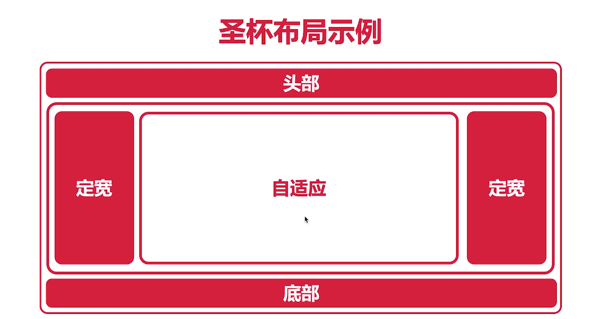
[根据两列布局实现 定宽 — 自适应 — 定宽 布局方式]
<style>/* 改变了结构顺序,搜索引擎抓取主要内容变为最后* 结构不同,解决方案也会不同**/* {margin: 0;padding: 0;}.header,.footer {height: 100px;background-color: #000;}.parent {background-color: #eee;padding: 10px;}.left,.center,.right {height: 300px;}.left,.right {width: 300px;}.left {width: 300px;background-color: #00ffff;float: left;}.center {background-color: #ffff00;margin-left: 300px;margin-right: 300px;}.right {background-color: #ff0000;float: right;}/* 中间自适应部分没有浮动,右边元素浮动,在兄弟元素中,前边元素没有浮动,后边的元素浮动,浮动的元素不允许超过前边的元素,依旧垂直方向排列,把right的结构位置调到前面*/</style></head><body><div class="header"></div><div class="parent"><div class="left"> 左: 定宽</div><div class="right"> 右:自适应</div><div class="center"> 中:定宽 </div></div><div class="footer"></div></body>
圣杯布局的实现
<style>/* 改变了结构顺序,搜索引擎抓取主要内容变为最后* 结构不同,解决方案也会不同* 根据问题,把center调至最前,但是需要其他方法解决,即给三个div添加父元素*/* {margin: 0;padding: 0;}.header,.footer {height: 100px;background-color: #000;}.parent {background-color: #eee;/* 解决父级元素高度塌陷 */height: 300px;/* 对应 left 的宽度 */margin-left: 300px;/* 对应 right 的宽度 */margin-right: 300px;}.left,.center,.right {height: 300px;/* 使三个div 浮动 */float: left;}.left,.right {width: 300px;}.left {background-color: #00ffff;/* 将当前元素从当前行移动到上一行同一个位置*/margin-left: -100%;/* 将当前元素移动到理想位置 */position: relative;left: -300px;}.center {width: 100%;background-color: #ffff00;}.right {background-color: #ff0000;margin-left: -300px;position: relative;right: -300px;}</style><body><div class="header"></div><div class="parent"><div class="center"> 中:定宽 </div><div class="left"> 左: 定宽</div><div class="right"> 右:自适应</div></div><div class="footer"></div></body>
什么是双飞翼布局
—— 最早由淘宝团队提出,是针对圣杯布局的局部优化解决方案,主要优化了圣杯布局中开启定位的问题。
双飞翼布局的实现
<!DOCTYPE html><html lang="en"><head><meta charset="UTF-8"><meta name="viewport" content="width=device-width, initial-scale=1.0"><meta http-equiv="X-UA-Compatible" content="ie=edge"><title>双飞翼布局</title><style>/****/* {margin: 0;padding: 0;}.header,.footer {height: 100px;background-color: #000;}.parent {height: 300px;background-color: #eee;}.left {width: 300px;height: 300px;background-color: #00ffff;float: left;margin-left: -100%;}.center {width: 100%;height: 300px;background-color: #ffff00;float: left;}.right {width: 300px;height: 300px;background-color: #ff0000;float: left;margin-left: -300px;}.inner {height: 300px;background-color: #ff66ff;margin-left: 300px;margin-right: 300px;}</style><body><div class="header"></div><div class="parent"><div class="center"><div class="inner">中:定宽</div></div><div class="left"> 左: 定宽</div><div class="right"> 右:自适应</div></div><div class="footer"></div></body></html>
全屏布局
title: 全屏布局
date: 2019-11-01 20:43:24
tags:
- CSS
- CSS 布局
什么是全屏布局?
—— HTML页面铺满整个浏览器串口窗口,并且没有横竖滚动条,而且可以跟随浏览器窗口的大小变化而变化。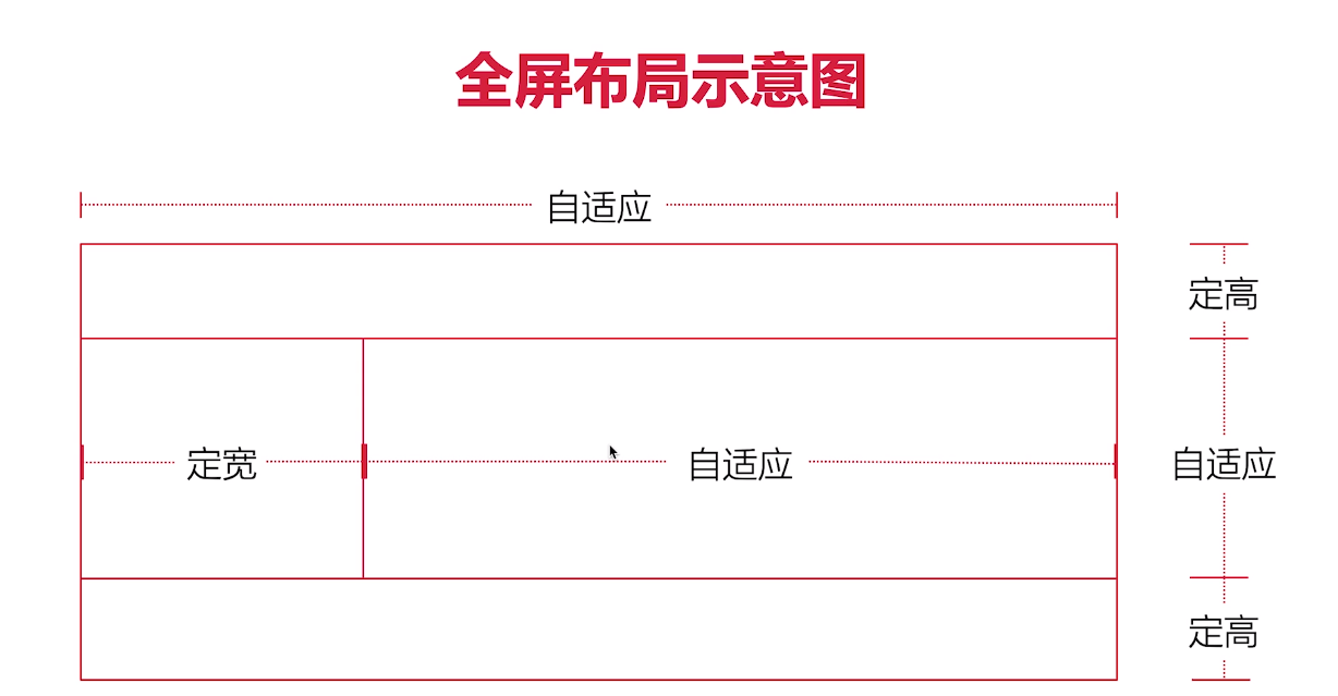
<style>/** .content .right {height: 1000px;background-color: rgb(243, 239, 12);margin-left: 300px;}* 此元素的高度可以不用设置,由内容高度撑开。**/html,body{margin: 0;padding: 0;/* 避免全屏出现滚动条*/overflow: hidden;}header {height: 100px;background-color: #eee;position: fixed;top: 0;left: 0;right: 0;}.content {/* 提供滚动条 */overflow: auto;background-color: rgb(14, 197, 221);position: fixed;left: 0;right: 0;top: 100px;bottom: 100px;}.content .left {width: 300px;height: 100%;background-color: rgb(247, 54, 54);position: fixed;left: 0;top: 100px;bottom: 100px;}.content .right {height: 1000px;background-color: rgb(243, 239, 12);margin-left: 300px;}footer {height: 100px;background-color: rgb(39, 38, 38);position:fixed;bottom: 0;left: 0;right: 0;}</style><body><header></header><div class="content"><div class="left"></div><div class="right"></div></div><footer></footer></body>
总结
居中布局
- 水平居中布局
- 垂直居中布局
- 居中布局( 水平 + 垂直 )
多列布局
- 两列布局
- 三列布局
- 等分布局
- 等高布局
- CSS 3 多列布局
经典布局
- 圣杯布局
- 双飞翼布局
全屏布局
未涉及的布局
- 网格布局
- 弹性盒子布局 CSS3
**没有任何一种布局方式是全优的,在实际应用中根据实际情况选择最合理的布局方式**

若有收获,就点个赞吧
0 人点赞
