折线图介绍
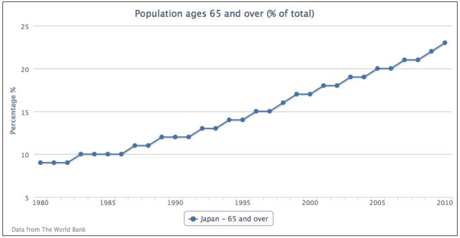
从单一一个折线图表开始.选用World Bank 组织(www.worldbank.org)提供的众多数据中的一个。下面的代码片段创建了一个简单的折线图,表现了日本过去三十年中65岁以上人口的百分比:
var chart = new Highcharts.Chart({chart: {renderTo: 'container'},title: {text: 'Population ages 65 and over (% of total)',},credits: {position: {align: 'left',x: 20},text: 'Data from The World Bank'},yAxis: {title: {text: 'Percentage %'}},xAxis: {categories: ['1980', '1981','1982', ... ],labels: {step: 5}},series: [{name: 'Japan - 65 and over',data: [ 9, 9, 9, 10, 10, 10, 10 ... ]}]});如下图:
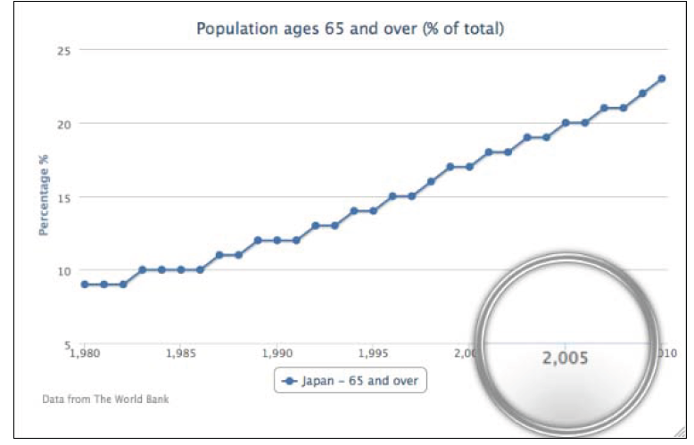
除了在 categories属性中手动定义年份,还可以使用 series中的 pointStart选项来初始化x轴的第一个点的值。因此我们在 xAxis中无任何配置但在seies中定义了 pointStart,代码如下:
xAxis:{},series: [{pointStart : 1980,name: 'Japan - 65 and over',data: [ 9, 9, 9, 10, 10, 10, 10 ... ]}]
虽然这是个简化的例子,x轴的标签会自动匹配数据通过 Highcharts的 numberFormat方法,这样使得在每个三位数字(大于1000的数字)后加上一个逗号,下面是x轴的具体输出:
为了解决这个问题,我们需要重写标签的 formatter选项,这很简单,只要返回一个标签值来绕开默认 numberFormat方法的调用就可以了。 此外,还需要将 allowDecimal选项置为false.因为,当调整图表大小时会延长x轴,小数就会显示出来。
下面是使用 pointStart来控制x轴年份值得最终版本:
xAxis: {labels:{formatter: function() {// 'this' keyword is the label objectreturn this.value;}},allowDecimals: false},series: [{pointStart: 1980,name: 'Japan - 65 and over',data: [ 9, 9, 9, 10, 10, 10, 10 ... ]}]
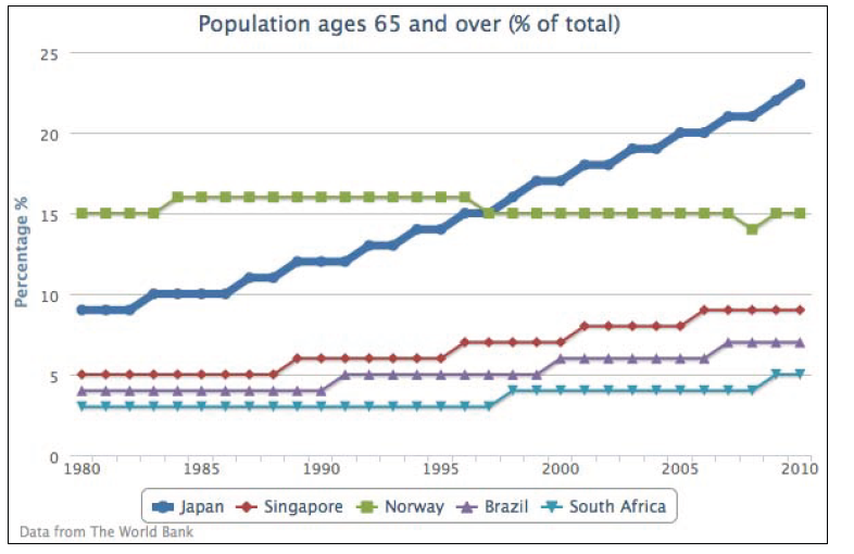
扩展到多个系列的折线图
下面我们新增加几个系列折线,并把日本的折线增加到6个像素宽,代码如下:
series: [{lineWidth: 6,name: 'Japan',data: [ 9, 9, 9, 10, 10, 10, 10 ... ]}, {Name: 'Singapore',data: [ 5, 5, 5, 5, ... ]}, {...}]
日本系列的人口折线变成了图标中的焦点,如下截图:
向更加复杂的折线图前进!为了展示颠倒的折线图,使用 chart.inverted 选项将y轴和x轴置为相反的方向。 然后改变坐标轴的颜色匹配相同系列的颜色。同时,禁用了所有系列的数据点标记,最后添加 yAxis:1 属性用来 使第二个系列坐标轴与第二个y轴数组数据匹配,这样就得到了上下两个不同颜色,不同刻度的“y”(其实是颠倒后的y)坐标轴,如下:
chart: {renderTo: 'container',inverted: true,},yAxis: [{title: {text: 'Percentage %'},lineWidth: 2,lineColor: '#4572A7'}, {title: {text: 'Age'},opposite: true,lineWidth: 2,lineColor: '#AA4643'}],plotOptions: {series: {marker: {enabled: false}}},series: [{name: 'Japan - 65 and over',type: 'spline',data: [ 9, 9, 9, ... ]}, {name: 'Japan - Life Expectancy',yAxis: 1,data: [ 76, 76, 77, ... ]}]
下面是颠倒过后并有两个“y”轴的图标:
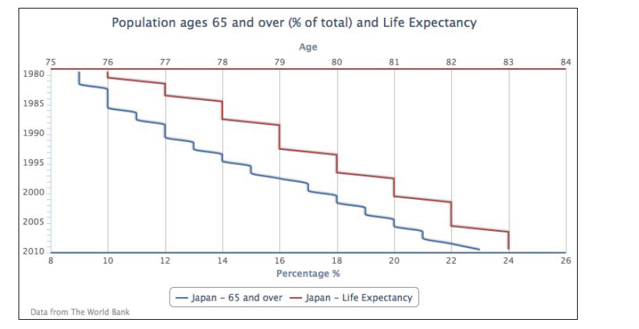
上图中数据的表示看起来可能有点奇怪,因为我们把通常的时间标签交换成到了y轴并且数据的走势不便于理解。其实 inverted option 一般是用来展示不连续的数据格式或用于柱状图中。我们从上图中获取的信息是这样的: 12%的日本人口在65岁及以上,1990年的平均寿命是79岁。
同过设置 plotOptions.series.marker.enabled 为 false 可以关闭所有数据点的标记,如果想为一个特定的系列展示数据点标记,可以关闭全局的标记并打开那个特定系列的标记属性,或者其他方式
plotOptions: {series: {marker: {enabled: false}}},series: [{marker: {enabled: true},name: 'Japan - 65 and over',type: 'spline',data: [ 9, 9, 9, ... ]}, {
下面的图表展示了只有65及以上年龄的系列有数据点标记:

本章结束咯~

若有收获,就点个赞吧
0 人点赞
