一、第一个Flutter程序
创建好Flutter项目后,修改入口文件。
main.dart
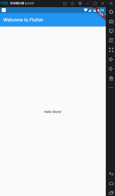
import 'package:flutter/material.dart';void main() => runApp(new MyApp());class MyApp extends StatelessWidget {@overrideWidget build(BuildContext context) {return new MaterialApp(title: 'Flutter Demo',theme: new ThemeData(primarySwatch: Colors.blue,),home: new Scaffold(appBar: new AppBar(title: new Text('Welcome to Flutter'),),body: new Center(child: new Text('Hello World'),),),);}}
第一句:
void main() => runApp(new MyApp());
是以下简写:
void main() {runApp(new MyApp());}
main 函数使用了 => 符号, 这是Dart中单行函数或方法的简写。
MyApp 继承自 StatelessWidget,widget的主要工作是提供一个 build() 方法来描述如何根据其他较低级别的widget来显示自己。
二、框架
应用
创建一个 MaterialApp 应用程序, 常用的属性有:
debugShowCheckedModeBanner: false是否显示 Debug 字样, 默认 truetheme: ThemeData.dark()应用程序主题title: title应用程序标题home: Scaffold(...)应用程序首页, 通常使用 Scaffold 脚手架搭建
主题
ThemeData 用于定义主题样式(背景颜色、字体大小、字体颜色等)。
MaterialApp(...theme: new ThemeData(primaryColor: Color(0xff1ABC9C),appBarTheme: AppBarTheme(color: Color(0xff1ABC9C),actionsIconTheme: IconThemeData(color: Colors.white),iconTheme: IconThemeData(color: Colors.white),textTheme: TextTheme(title: TextStyle(color: Colors.white,fontSize: 20))),),);
也可使用内置主题:
theme: ThemeData.dark()
页面骨架
一个完整的数路由页可能会包含导航栏、抽屉菜单(Drawer)以及底部 Tab 导航菜单等。如果每个路由页面都需要开发者自己手动去实现这些,这会是一件非常麻烦且无聊的事。幸运的是,Flutter Material Scaffold 是一个路由页的骨架,我们使用它可以很容易地拼装出一个完整的页面。
常用的属性有:
appBar: AppBar()导航栏body: Widget...主要内容drawer: Drawer()抽屉floatingActionButton: FloatingActionButton()悬浮按钮bottomNavigationBar: BottomAppBar()底部导航栏
导航栏
AppBar:定义导航栏。
AppBar 的定义:
AppBar({Key key,this.leading, // 导航栏左侧Widgetthis.actions, // 导航栏右侧Widgetthis.title,// 页面标题this.bottom, // 导航栏底部菜单,通常为Tab按钮组this.elevation = 4.0, // 导航栏阴影this.centerTitle, //标题是否居中this.automaticallyImplyLeading = true, //如果leading为null,是否自动实现默认的leading按钮this.backgroundColor,... //其它属性见源码注释})
比如: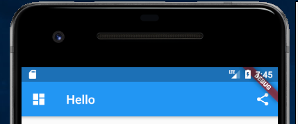
appBar: new AppBar(title: new Text(title),leading: IconButton(icon: Icon(Icons.dashboard), onPressed: () {}),actions: <Widget>[ //导航栏右侧菜单IconButton(icon: Icon(Icons.share), onPressed: () {}),],),
悬浮按钮
FloatingActionButton 是 Material 设计规范中的一种特殊 Button,通常悬浮在页面的某一个位置作为某种常用动作的快捷入口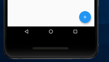
floatingActionButton: new FloatingActionButton(onPressed: _incrementCounter,tooltip: 'Increment',child: new Icon(Icons.add),),// 指定 floatingActionButton 的位置floatingActionButtonLocation: FloatingActionButtonLocation.centerDocked,
侧边抽屉
Drawer:侧边抽屉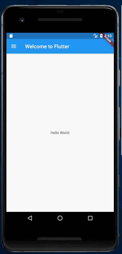
drawer: Drawer(child: Column(crossAxisAlignment: CrossAxisAlignment.start,children: <Widget>[Padding(padding: const EdgeInsets.only(top: 38.0),child: Row(children: <Widget>[Padding(padding: const EdgeInsets.symmetric(horizontal: 16.0),child: ClipOval(child: Image.asset("assets/imgs/avatar.png",width: 80,height: 80,),),),Text("Quanzaiyu",style: TextStyle(fontWeight: FontWeight.bold),)],),),Expanded(child: ListView(children: <Widget>[ListTile(leading: const Icon(Icons.add),title: const Text('Add account'),),ListTile(leading: const Icon(Icons.settings),title: const Text('Manage accounts'),),],),),],),),
底部导航栏
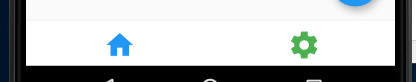
bottomNavigationBar: BottomAppBar(color: Colors.grey, // 背景色child: Container(height: 50.0,child: Row(mainAxisAlignment: MainAxisAlignment.spaceAround,children: <Widget>[IconButton(iconSize: 24,icon: Icon(Icons.home, size: 36, color: Colors.blue,),tooltip: 'home',onPressed: () {},),IconButton(iconSize: 24,icon: Icon(Icons.settings, size: 36, color: Colors.green,),tooltip: 'settings',onPressed: () {},)],),),),
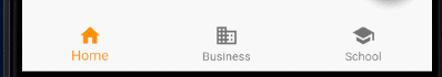
int _selectedIndex = 0;bottomNavigationBar: BottomNavigationBar(items: const <BottomNavigationBarItem>[BottomNavigationBarItem(icon: Icon(Icons.home),title: Text('Home'),),BottomNavigationBarItem(icon: Icon(Icons.business),title: Text('Business'),),BottomNavigationBarItem(icon: Icon(Icons.school),title: Text('School'),),],currentIndex: _selectedIndex,selectedItemColor: Colors.amber[800],onTap: (int index) {setState(() {_selectedIndex = index;});},),
参考:
其他
- FlutterLogo 一个flutter的图标
三、使用外部包
在 pubspec.yaml 中加入 english_words 包
dependencies:flutter:sdk: fluttercupertino_icons: ^0.1.0english_words: ^3.1.0
使用以下命令更新包:
flutter packages get
修改 main.dart:
import 'package:flutter/material.dart';import 'package:english_words/english_words.dart';void main() {runApp(new MyApp());}class MyApp extends StatelessWidget {@overrideWidget build(BuildContext context) {return new MaterialApp(title: 'Flutter Demo',theme: new ThemeData(primarySwatch: Colors.blue,),home: new Scaffold(appBar: new AppBar(title: new Text('Welcome to Flutter'),),body: new Center(child: new RandomWordsWidget(),),),);}}class RandomWordsWidget extends StatelessWidget {@overrideWidget build(BuildContext context) {// 生成随机字符串final wordPair = new WordPair.random();return Padding(padding: const EdgeInsets.all(8.0),child: new Text(wordPair.toString()),);}}
以上, 使用 new WordPair.random() 随机生成英文单词, 通过 wordPair.toString() 将之转化为字符串
还可使用 wordPair.asPascalCase 生成驼峰形式的单词
Pub仓库
Pub 是Google官方的Dart Packages仓库,类似于node中的npm仓库,android中的jcenter。我们可以在Pub上面查找我们需要的包和插件,也可以向Pub发布我们的包和插件。我们将在后面的章节中介绍如何向Pub发布我们的包和插件。
四、事件处理
单击
- onTapDown 指针已经在特定位置与屏幕接触
- onTapUp 指针停止在特定位置与屏幕接触
- onTap tap事件触发
- onTapCancel 先前指针触发的onTapDown不会在触发tap事件
双击
- onDoubleTap 用户快速连续两次在同一位置轻敲屏幕.
长按
- onLongPress 指针在相同位置长时间保持与屏幕接触
垂直拖动
- onVerticalDragStart 指针已经与屏幕接触并可能开始垂直移动
- onVerticalDragUpdate 指针与屏幕接触并已沿垂直方向移动.
- onVerticalDragEnd 先前与屏幕接触并垂直移动的指针不再与屏幕接触,并且在停止接触屏幕时以特定速度移动
水平拖动
- onHorizontalDragStart 指针已经接触到屏幕并可能开始水平移动
- onHorizontalDragUpdate 指针与屏幕接触并已沿水平方向移动
- onHorizontalDragEnd 先前与屏幕接触并水平移动的指针不再与屏幕接触,并在停止接触屏幕时以特定速度移动
GestureDetector
很多组件都包含一些事件处理的属性, 比如 GestureDetector、ListView 等。
示例:GestureDetector 的使用
new GestureDetector(onTapDown: _handleTapDown, // 处理按下事件onTapUp: _handleTapUp, // 处理抬起事件onTap: () {// ...},onTapCancel: _handleTapCancel,child: new Text('Click me!'),);
参考资料

若有收获,就点个赞吧
0 人点赞
