一、行与列
Row 和 Column 都继承自 Flex 组件
Row
Row 可以在水平方向排列其子 widget。定义如下:
Row({...TextDirection textDirection,MainAxisSize mainAxisSize = MainAxisSize.max,MainAxisAlignment mainAxisAlignment = MainAxisAlignment.start,VerticalDirection verticalDirection = VerticalDirection.down,CrossAxisAlignment crossAxisAlignment = CrossAxisAlignment.center,List<Widget> children = const <Widget>[],})
Column
Column 可以在垂直方向排列其子组件。参数和 Row 一样,不同的是布局方向为垂直,主轴和交叉轴正好相反
参数
Row 和 Column 的参数相同, 都有以下常用参数:
- textDirection:主轴排列方式
- 取值:
TextDirection.ltr(默认) |TextDirection.rtl
- 取值:
- mainAxisSize:主轴宽度
- 取值:
MainAxisSize.max(默认) |MainAxisSize.min
- 取值:
- mainAxisAlignment:主轴对齐方式
- 取值:
MainAxisAlignment.start(默认) |MainAxisAlignment.end|MainAxisAlignment.center - 如果
mainAxisSize取值为MainAxisSize.min, 则此属性无效 mainAxisAlignment跟textDirection有关- 若
textDirection为TextDirection.ltr, 则 row: start 为左, end 为右; column: start 为上, end 为下 - 若
textDirection为TextDirection.rtl, 则 row: start 为右, end 为左; column: start 为下, end 为上
- 若
- 取值:
- verticalDirection:交叉轴排列方式
- 取值:
VerticalDirection.down(默认) |VerticalDirection.up
- 取值:
- crossAxisAlignment:交叉轴对齐方式
- 取值:
CrossAxisAlignment.start|CrossAxisAlignment.center(默认) |CrossAxisAlignment.start crossAxisAlignment跟verticalDirection有关- 若
verticalDirection为VerticalDirection.down, 则 row: start 为上, end 为下; column: start 为左, end 为右 - 若
verticalDirection为VerticalDirection.up, 则 row: start 为下, end 为上; column: start 为右, end 为左
- 若
- 取值:
二、弹性布局(Flex)
Flex 组件可以沿着水平或垂直方向排列子组件,如果你知道主轴方向,使用 Row 或 Column 会方便一些。
Flex 继承自 MultiChildRenderObjectWidget,对应的 RenderObject 为 RenderFlex,RenderFlex 中实现了其布局算法。
水平排列的情况
Flex(direction: Axis.horizontal,children: <Widget>[Expanded(flex: 1,child: Container(height: 30.0,color: Colors.red,child: Text('Hello ')),),Expanded(flex: 2,child: Container(height: 30.0,color: Colors.green,child: Text('world')),),],);
以上,左右两个子元素的比例为 2:1
Expanded 组件可以按比例 “扩伸” Row、Column 和 Flex 子组件所占用的空间。
flex 参数为弹性系数,如果为 0 或 null,则 child 是没有弹性的,即不会被扩伸占用的空间。如果大于 0,所有的 Expanded 按照其 flex 的比例来分割主轴的全部空闲空间。
垂直排列的情况
Flex(direction: Axis.vertical,children: <Widget>[Expanded(flex: 2,child: Container(height: 30.0,color: Colors.red,),),Spacer(flex: 1,),Expanded(flex: 1,child: Container(height: 30.0,color: Colors.green,),),],);
以上, 上中下三个子元素的比例为 2:1:1
其中,Spacer 的功能是占用指定比例的空间,实际上它只是 Expanded 的一个包装类。
三、容器(Container)
Container 是一个组合类容器,它本身不对应具体的 RenderObject,它是 DecoratedBox、ConstrainedBox、Transform、Padding、Align 等组件组合的一个多功能容器,所以我们只需通过一个 Container 组件可以实现同时需要装饰、变换、限制的场景。
Container 的定义:
Container({double width, // 容器的宽度double height, // 容器的高度this.alignment, // 内容对齐方式this.margin, // 容器外补白,不属于decoration的装饰范围this.padding, // 容器内补白,属于decoration的装饰范围Color color, // 背景色Decoration decoration, // 背景装饰Decoration foregroundDecoration, // 前景装饰BoxConstraints constraints, // 容器大小的限制条件this.transform, // 变换this.child, // 内容})
示例:
Container(margin: EdgeInsets.only(top: 100, left: 100), // 容器外填充constraints: BoxConstraints.tightFor(width: 200, height: 150), // 卡片大小decoration: BoxDecoration( // 背景装饰gradient: RadialGradient( // 背景径向渐变colors: [Colors.red, Colors.orange],center: Alignment.center,radius: .98),boxShadow: [ // 卡片阴影BoxShadow(color: Colors.black54,offset: Offset(20, 20),blurRadius: 14)]),alignment: Alignment.center, // 卡片内文字居中transform: Matrix4.rotationZ(.2), // 卡片倾斜变换child: Text( // 卡片文字"Hello",style: TextStyle(color: Colors.white, fontSize: 40),),)
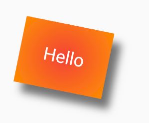
Container 类比于 HTML 中的 div, 可以对其进行各种定制
四、盒子
ConstrainedBox
ConstrainedBox 用于对子组件添加额外的约束。例如,如果你想让子组件的最小高度是 80 像素,你可以使用 const BoxConstraints(minHeight: 80.0) 作为子组件的约束。
SizedBox
SizedBox 用于给子元素指定固定的宽高,如:
SizedBox(width: 80.0,height: 80.0,child: ...)
UnconstrainedBox
UnconstrainedBox 不会对子组件产生任何限制,它允许其子组件按照其本身大小绘制。一般情况下,我们会很少直接使用此组件,但在”去除”多重限制的时候会有帮助,我们看下下面的代码:
ConstrainedBox(constraints: BoxConstraints(minWidth: 60.0, minHeight: 100.0), //父child: UnconstrainedBox( //“去除”父级限制child: ConstrainedBox(constraints: BoxConstraints(minWidth: 90.0, minHeight: 20.0),//子child: redBox,),))
上面代码中,如果没有中间的 UnconstrainedBox,那么根据上面所述的多重限制规则,那么最终将显示一个 90×100 的红色框。但是由于 UnconstrainedBox “去除”了父 ConstrainedBox 的限制,则最终会按照子 ConstrainedBox 的限制来绘制 redBox,即 90×20:
但是,UnconstrainedBox 对父组件限制的“去除”并非是真正的去除:上面例子中虽然红色区域大小是 90×20,但上方仍然有 80 的空白空间。也就是说父限制的 minHeight(100.0)仍然是生效的,只不过它不影响最终子元素 redBox 的大小,但仍然还是占有相应的空间,可以认为此时的父 ConstrainedBox 是作用于子 UnconstrainedBox 上,而 redBox 只受子 ConstrainedBox 限制。
在实际开发中,当我们发现已经使用 SizedBox 或 ConstrainedBox 给子元素指定了宽高,但是仍然没有效果时,几乎可以断定:已经有父元素已经设置了限制!举个例子,如 Material 组件库中的 AppBar(导航栏)的右侧菜单中,我们使用 SizedBox 指定了 loading 按钮的大小,代码如下:
AppBar(title: Text(title),actions: <Widget>[SizedBox(width: 20,height: 20,child: CircularProgressIndicator(strokeWidth: 3,valueColor: AlwaysStoppedAnimation(Colors.white70),),)],)
我们会发现右侧 loading 按钮大小并没有发生变化!这正是因为 AppBar 中已经指定了 actions 按钮的限制条件,所以我们要自定义 loading 按钮大小,就必须通过 UnconstrainedBox 来“去除”父元素的限制,代码如下:
AppBar(title: Text(title),actions: <Widget>[UnconstrainedBox(child: SizedBox(width: 20,height: 20,child: CircularProgressIndicator(strokeWidth: 3,valueColor: AlwaysStoppedAnimation(Colors.white70),),),)],)
五、约束
BoxConstraints
BoxConstraints 用于设置限制条件,它的定义如下:
const BoxConstraints({this.minWidth = 0.0, // 最小宽度this.minHeight = 0.0, // 最小高度this.maxWidth = double.infinity, // 最大宽度this.maxHeight = double.infinity // 最大高度})
示例:
ConstrainedBox(constraints: BoxConstraints(minWidth: double.infinity, // 宽度尽可能大minHeight: 200.0 // 最小高度为200像素),child: Container(height: 50,child: Flex(direction: Axis.horizontal,children: <Widget>[Expanded(flex: 2,child: Container(color: Colors.red,),),Expanded(flex: 1,child: Container(color: Colors.green,),)],)),);
注意到,上面使用到了 ConstrainedBox,规定最小高度为 200,虽然子元素指定高度为 50,但由于约束条件的限制还是 200;但如果将子元素的高度调到 200 以上,则以子元素的高度为准。
:::info 有多重限制时,对于 minWidth 和 minHeight 来说,是取父子中相应数值较大的。 :::
比如:
ConstrainedBox(constraints: BoxConstraints(minWidth: 90.0, minHeight: 20.0),child: ConstrainedBox(constraints: BoxConstraints(minWidth: 60.0, minHeight: 60.0),child: redBox,))
最终取:minWidth: 90.0, minHeight: 60.0
BoxConstraints.tightFor
实际上 SizedBox 只是 ConstrainedBox 的一个定制,上面代码等价于:
ConstrainedBox(constraints: BoxConstraints.tightFor(width: 80.0,height: 80.0),child: redBox,)
而 BoxConstraints.tightFor(width: 80.0,height: 80.0) 等价于:
BoxConstraints(minHeight: 80.0,maxHeight: 80.0,minWidth: 80.0,maxWidth: 80.0)
六、填充
在容器中可以使用 margin 和 padding 属性对其进行 外边距/内边距 控制:
Container(margin: EdgeInsets.all(20.0), // 容器外补白color: Colors.orange,child: Text("Hello world!"),),Container(padding: EdgeInsets.all(20.0), // 容器内补白color: Colors.orange,child: Text("Hello world!"),),
以上等价于使用 Padding 和 BoxDecoration 组件进行排列
// 先 Padding 再 DecoratedBox, 等价于 paddingPadding(padding: EdgeInsets.all(20.0),child: DecoratedBox(decoration: BoxDecoration(color: Colors.orange),child: Text("Hello world!"),),),// 先 DecoratedBox 再 Padding, 等价于 marginDecoratedBox(decoration: BoxDecoration(color: Colors.orange),child: Padding(padding: const EdgeInsets.all(20.0),child: Text("Hello world!"),),),
Padding
Padding 组件的定义:
Padding({...EdgeInsetsGeometry padding,Widget child,})
EdgeInsetsGeometry 是一个抽象类,开发中,我们一般都使用 EdgeInsets 类,它是 EdgeInsetsGeometry 的一个子类,定义了一些设置填充的便捷方法。
EdgeInsets
EdgeInsets 提供的便捷方法:
zero无边距fromLTRB(double left, double top, double right, double bottom)分别指定四个方向的填充。all(double value)所有方向均使用相同数值的填充。only({left, top, right ,bottom })可以设置具体某个方向的填充(可以同时指定多个方向)。symmetric({ vertical, horizontal })用于设置对称方向的填充,vertical 指 top 和 bottom,horizontal 指 left 和 right。
示例:
EdgeInsets.all(20.0)EdgeInsets.only(left: 8.0, top: 10)EdgeInsets.symmetric(vertical: 8.0)EdgeInsets.fromLTRB(20.0,.0,20.0,20.0)
七、对齐
Align
Align 组件可以调整子组件的位置,并且可以根据子组件的宽高来确定自身的的宽高,定义如下:
Align({Key key,this.alignment = Alignment.center,this.widthFactor,this.heightFactor,Widget child,})
参数
- alignment:对齐方式,参考 Alignment
- widthFactor 和 heightFactor:用于确定 Align 组件本身宽高的属性;它们是两个缩放因子,会分别乘以子元素的宽、高,最终的结果就是 Align 组件的宽高。如果值为 null,则组件的宽高将会占用尽可能多的空间。
Alignment
Alignment 继承自 AlignmentGeometry,表示矩形内的一个点,他有两个属性 x、y,分别表示在水平和垂直方向的偏移
0 为中, -1 为 start(上、左), 1 为 end(下、右), 可以大于 1 或小于 0, 这样则离开边界向外延伸
- Alignment(x, y) 确定 x,y 轴位置
- Alignment.topLeft = Alignment(-1.0, -1.0)
- Alignment.topCenter = Alignment(0.0, -1.0)
- Alignment.topRight = Alignment(1.0, -1.0)
- Alignment.centerLeft = Alignment(-1.0, 0.0)
- Alignment.center = Alignment(0.0, 0.0)
- Alignment.centerRight = Alignment(1.0, 0.0)
- Alignment.bottomLeft = Alignment(-1.0, 1.0)
- Alignment.bottomCenter = Alignment(0.0, 1.0)
- Alignment.bottomRight = Alignment(1.0, 1.0)
FractionalOffset
FractionalOffset 继承自 Alignment,它和 Alignment 唯一的区别就是坐标原点不同!FractionalOffset 的坐标原点为矩形的左侧顶点,这和布局系统的一致,所以理解起来会比较容易。FractionalOffset 的坐标转换公式为:
实际偏移 = (FractionalOffse.x * childWidth, FractionalOffse.y * childHeight)
示例:
Container(height: 120.0,width: 120.0,color: Colors.blue[50],child: Align(alignment: FractionalOffset(0.2, 0.6),child: FlutterLogo(size: 60,),),)
Center
Center 继承自 Align,可将元素直接居中对齐
八、流式布局
在使用 Flex、Row 和 Colum 时,如果子 widget 超出屏幕范围,则会报边界溢出错误
Wrap
Wrap 的主要作用是在子元素超过父元素的情况下进行换行, 避免溢出错误
Wrap({...this.textDirection,this.direction = Axis.horizontal,this.alignment = WrapAlignment.start,this.crossAxisAlignment = WrapCrossAlignment.start,this.verticalDirection = VerticalDirection.down,this.spacing = 0.0,this.runAlignment = WrapAlignment.start,this.runSpacing = 0.0,List<Widget> children = const <Widget>[],})
Wrap 大部分属性都与 Flex 相同, Wrap 有几个特有的属性:
- spacing:主轴方向子 widget 的间距
- runSpacing:纵轴方向的间距
- runAlignment:纵轴方向的对齐方式
示例:
Wrap(spacing: 8.0, // 主轴(水平)方向间距runSpacing: 4.0, // 纵轴(垂直)方向间距alignment: WrapAlignment.center, //沿主轴方向居中children: <Widget>[new Chip(avatar: new CircleAvatar(backgroundColor: Colors.blue, child: Text('A')),label: new Text('Hamilton'),),new Chip(avatar: new CircleAvatar(backgroundColor: Colors.blue, child: Text('M')),label: new Text('Lafayette'),),new Chip(avatar: new CircleAvatar(backgroundColor: Colors.blue, child: Text('H')),label: new Text('Mulligan'),),new Chip(avatar: new CircleAvatar(backgroundColor: Colors.blue, child: Text('J')),label: new Text('Laurens'),),],)
Flow
我们一般很少会使用 Flow,因为其过于复杂,需要自己实现子 widget 的位置转换,在很多场景下首先要考虑的是 Wrap 是否满足需求。Flow 主要用于一些需要自定义布局策略或性能要求较高(如动画中)的场景。
Flow 有如下优点:
- 性能好;Flow 是一个对子组件尺寸以及位置调整非常高效的控件,Flow 用转换矩阵在对子组件进行位置调整的时候进行了优化:在 Flow 定位过后,如果子组件的尺寸或者位置发生了变化,在 FlowDelegate 中的 paintChildren()方法中调用 context.paintChild 进行重绘,而 context.paintChild 在重绘时使用了转换矩阵,并没有实际调整组件位置。
- 灵活;由于我们需要自己实现 FlowDelegate 的 paintChildren()方法,所以我们需要自己计算每一个组件的位置,因此,可以自定义布局策略。
缺点:
- 使用复杂。
- 不能自适应子组件大小,必须通过指定父容器大小或实现 TestFlowDelegate 的 getSize 返回固定大小。
示例: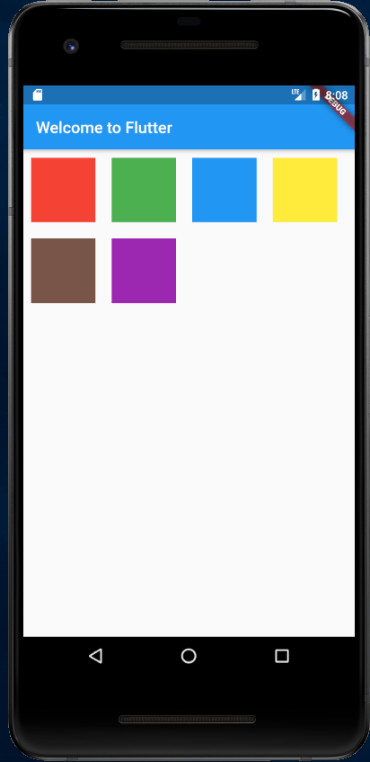
import 'package:flutter/material.dart';void main() => runApp(new MyApp());class MyApp extends StatelessWidget {@overrideWidget build(BuildContext context) {var colors = [Colors.red,Colors.green,Colors.blue,Colors.yellow,Colors.brown,Colors.purple,Colors.lime];Widget flexText = Flow(delegate: TestFlowDelegate(margin: EdgeInsets.all(10.0)),children: colors.map((color) => new Container(width: 80.0, height: 80.0, color: color,)).toList(),);return new MaterialApp(title: 'Flutter Demo',theme: new ThemeData(primarySwatch: Colors.blue,),home: new Scaffold(appBar: new AppBar(title: new Text('Welcome to Flutter'),),body: flexText),);}}class TestFlowDelegate extends FlowDelegate {EdgeInsets margin = EdgeInsets.zero;TestFlowDelegate({this.margin});@overridevoid paintChildren(FlowPaintingContext context) {var x = margin.left;var y = margin.top;//计算每一个子widget的位置for (int i = 0; i < context.childCount; i++) {var w = context.getChildSize(i).width + x + margin.right;if (w < context.size.width) {context.paintChild(i,transform: new Matrix4.translationValues(x, y, 0.0));x = w + margin.left;} else {x = margin.left;y += context.getChildSize(i).height + margin.top + margin.bottom;//绘制子widget(有优化)context.paintChild(i,transform: new Matrix4.translationValues(x, y, 0.0));x += context.getChildSize(i).width + margin.left + margin.right;}}}@overridegetSize(BoxConstraints constraints){// 指定Flow的大小return Size(double.infinity,400.0);}@overridebool shouldRepaint(FlowDelegate oldDelegate) {return oldDelegate != this;}}
可以看到我们主要的任务就是实现 paintChildren,它的主要任务是确定每个子 widget 位置。由于 Flow 不能自适应子 widget 的大小,我们通过在 getSize 返回一个固定大小来指定 Flow 的大小。
九、层叠布局
Flutter 中使用 Stack 和 Positioned 这两个组件来配合实现绝对定位。Stack 允许子组件堆叠,而 Positioned 用于根据 Stack 的四个角来确定子组件的位置。
Stack
Stack 类似于 CSS 中的 position: relative;
Stack({this.alignment = AlignmentDirectional.topStart,this.textDirection,this.fit = StackFit.loose,this.overflow = Overflow.clip,List<Widget> children = const <Widget>[],})
参数
- alignment:此参数决定如何去对齐没有定位(没有使用 Positioned)或部分定位的子组件。所谓部分定位,在这里特指没有在某一个轴上定位:left、right 为横轴,top、bottom 为纵轴,只要包含某个轴上的一个定位属性就算在该轴上有定位。
- textDirection:参考 Row 和 Column 的 textDirection
- fit:此参数用于确定没有定位的子组件如何去适应 Stack 的大小。
- StackFit.loose 表示使用子组件的大小
- StackFit.expand 表示扩伸到 Stack 的大小
- overflow:此属性决定如何显示超出 Stack 显示空间的子组件;值为 Overflow.clip 时,超出部分会被剪裁(隐藏),值为 Overflow.visible 时则不会。
- Overflow.visible 溢出部分可见
- Overflow.clip 溢出部分隐藏
Positioned
Positioned 类似于 CSS 中的 position: absolute;
const Positioned({Key key,this.left,this.top,this.right,this.bottom,this.width,this.height,@required Widget child,})
left、top 、right、 bottom 分别代表离 Stack 左、上、右、底四边的距离。width 和 height 用于指定需要定位元素的宽度和高度。注意,Positioned 的 width、height 和其它地方的意义稍微有点区别,此处用于配合 left、top 、right、 bottom 来定位组件,举个例子,在水平方向时,你只能指定 left、right、width 三个属性中的两个,如指定 left 和 width 后,right 会自动算出(left+width),如果同时指定三个属性则会报错,垂直方向同理。
如果是多个Widget定位, 后来者居上 (没有发现类似于css中的z-index属性可以用于调整, 这点很烦)。
如果定位了的元素的子元素也进行了定位, 子元素居上。
Positioned 只能在 Stack 的 children 中使用,在其他的 Widget 中使用会报错。
示例:
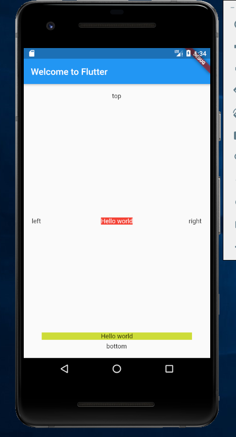
ConstrainedBox(constraints: BoxConstraints.expand(),child: Stack(alignment:Alignment.center , // 指定未定位或部分定位widget的对齐方式children: <Widget>[Container(child: Text("Hello world",style: TextStyle(color: Colors.white)),color: Colors.red,),Positioned(left: 18.0,child: Text("left"),),Positioned(top: 18.0,child: Text("top"),),Positioned(right: 18.0,child: Text("right"),),Positioned(bottom: 18.0,child: Text("bottom"),),Positioned(left: 40.0,right: 40.0,bottom: 40.0,child: Container(decoration: BoxDecoration(color: Colors.lime,),child: Center(child: Text("Hello world"),),),),],),)
十、缩放盒子
FittedBox
FittedBox 会在自己的尺寸范围内缩放并且调整child位置,使得child适合其尺寸。做过移动端的童鞋可能会联想到ImageView控件,它是将图片在其范围内,按照规则,进行缩放位置调整。FittedBox跟ImageView是有些类似的,可以猜测出,它肯定有一个类似于ScaleType的属性。
定义:
const FittedBox({Key key,this.fit = BoxFit.contain, // 适配方式this.alignment = Alignment.center, // 对齐方式Widget child,})
示例:
Container(color: Colors.amberAccent,width: 300.0,height: 300.0,child: new FittedBox(fit: BoxFit.fitWidth,alignment: Alignment.topLeft,child: new Container(color: Colors.red,child: new Text("FittedBox"),),),)
主要是配置 fit 的值:
- BoxFit.none 原样输出
- BoxFit.fitWidth 适合宽度
- BoxFit.fitHeight 适合高度
- BoxFit.cover 以长边适配
- BoxFit.contain 以短边适配
AspectRatio
AspectRatio 的作用是调整child到设置的宽高比
AspectRatio 首先会在布局限制条件允许的范围内尽可能的扩展, widget的高度是由宽度和比率决定的
如果在满足所有限制条件过后无法找到一个可行的尺寸,AspectRatio最终将会去优先适应布局限制条件,而忽略所设置的比率
定义:
AspectRatio({Key key,@required this.aspectRatio,Widget child,})
示例:
Container(width: 200.0,child: new AspectRatio(aspectRatio: 1.5,child: new Container(color: Colors.red),),);
以上示例, 定义了一个高度为200的区域,内部AspectRatio比率设置为1.5,最终AspectRatio的是宽300高200的一个区域。
参考资料

若有收获,就点个赞吧
0 人点赞
