例如我们有一个需求:做一个横向滚动的容器,内部内容从左至右横向排列,X轴超出部分通过滚动条拖动显示
<ul><li>1</li><li>2</li><li>3</li><li>4</li><li>5</li><li>6</li><li>7</li></ul>
ul {width: 300px;display: flex;justify-content: space-between;align-items: center;overflow-x: scroll;}ul li {width: 100px;height: 100px;background-color: #f90;color: #fff;list-style-type: none;flex-shrink: 0;}
效果如图: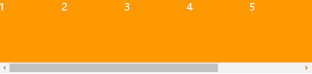
移动端效果:
如果我们不希望在移动端中出现滚动条该怎么办呢?
方法一:
使用::-webkit-scrollbar私有属性
MDN文档
注意点:
_::-webkit-scrollbar_是_webkit_内核浏览器的私有属性
只有谷歌浏览器和Safari有效
默认情况安卓、苹果手机浏览器上自带webkit内核,所以此属性兼容手机
ul {width: 300px;display: flex;justify-content: space-between;align-items: center;overflow-x: scroll;}ul::-webkit-scrollbar {display: none;}ul li {width: 100px;height: 100px;background-color: #f90;color: #fff;list-style-type: none;flex-shrink: 0;}

可以看见滚动条消失了,但是此属性并不是万能的,因为还是存在一定的兼容性问题。
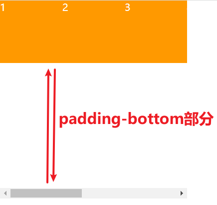
方法二(奇淫巧技):
我们可以给ul父容器增加一个padding-bottom
ul {width: 300px;display: flex;justify-content: space-between;align-items: center;overflow-x: scroll;padding-bottom: 200px;}ul li {width: 100px;height: 100px;background-color: #f90;color: #fff;list-style-type: none;flex-shrink: 0;}
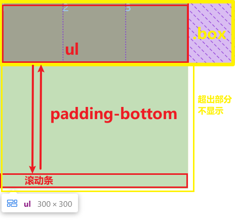
再给这个容器最外层套一个容器,与父容器原本内容保持一样的宽高,并且超出部分不显示
<div class="box"><ul><li>1</li><li>2</li><li>3</li><li>4</li><li>5</li><li>6</li><li>7</li></ul></div>
.box {width: 300px;height: 100px;overflow: hidden;}ul {width: 300px;display: flex;justify-content: space-between;align-items: center;overflow-x: scroll;padding-bottom: 200px;}ul li {width: 100px;height: 100px;background-color: #f90;color: #fff;list-style-type: none;flex-shrink: 0;}
原理:

若有收获,就点个赞吧
0 人点赞
