Histograms直方图
直方图(Histogram)又称质量分布图。是一种统计报告图,由一系列高度不等的纵向条纹或线段表示数据分布的情况。 一般用横轴表示数据类型,纵轴表示分布情况。
seaborn的displot()集合了matplotlib的hist()与核函数估计kdeplot的功能,增加了rugplot分布观测条显示与利用scipy库fit拟合参数分布的新颖用途。具体用法如下:seaborn.distplot(a, bins=None, hist=True, kde=True, rug=False, fit=None, hist_kws=None, kde_kws=None, rug_kws=None, fit_kws=None, color=None, vertical=False, norm_hist=False, axlabel=None, label=None, ax=None)
Parameters:
a : Series, 1d-array, or list.
Observed data. If this is a Series object with a name attribute, the name will be used to label the data axis.
bins : argument for matplotlib hist(), or None, optional #设置矩形图数量
Specification of hist bins, or None to use Freedman-Diaconis rule.
hist : bool, optional #控制是否显示条形图
Whether to plot a (normed) histogram.
kde : bool, optional #控制是否显示核密度估计图
Whether to plot a gaussian kernel density estimate.
rug : bool, optional #控制是否显示观测的小细条(边际毛毯)
Whether to draw a rugplot on the support axis.
fit : random variable object, optional #控制拟合的参数分布图形
An object with fit method, returning a tuple that can be passed to a pdf method a positional arguments following an grid of values to evaluate the pdf on.
{hist, kde, rug, fit}_kws : dictionaries, optional
Keyword arguments for underlying plotting functions.
vertical : bool, optional #显示正交控制
If True, oberved values are on y-axis.
# -*- coding: utf-8 -*-"""Created on Fri Nov 23 19:45:44 2018@author: czh"""%clear%reset -f# In[*]%matplotlib inlineimport numpy as npimport pandas as pdfrom scipy import stats, integrateimport matplotlib.pyplot as plt #导入import seaborn as snssns.set(color_codes=True)#导入seaborn包设定颜色# In[*]np.random.seed(sum(map(ord, "distributions")))x = np.random.normal(size=500)sns.distplot(x, kde=False, rug=True);#kde=False关闭核密度分布,rug表示在x轴上每个观测上生成的小细条(边际毛毯)
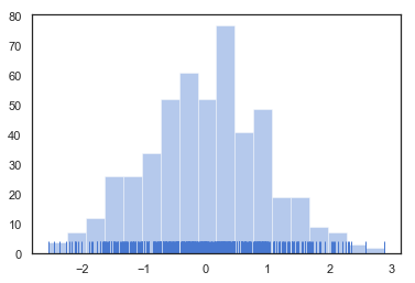
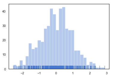
当绘制直方图时,你最需要确定的参数是矩形条的数目以及如何放置它们。利用bins可以方便设置矩形条的数量。如下所示:
sns.distplot(x, bins=30, kde=False, rug=True);
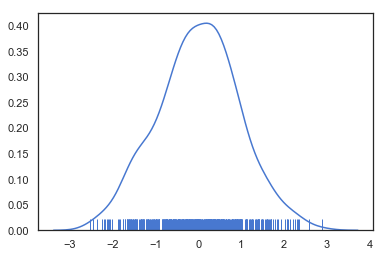
Kernel density estimaton核密度估计
核密度估计是在概率论中用来估计未知的密度函数,属于非参数检验方法之一。.由于核密度估计方法不利用有关数据分布的先验知识,对数据分布不附加任何假定,是一种从数据样本本身出发研究数据分布特征的方法,因而,在统计学理论和应用领域均受到高度的重视。
sns.distplot(x, hist=False, rug=True);#关闭直方图,开启rug细条
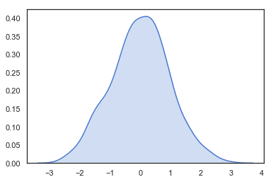
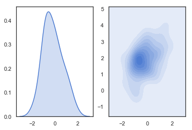
sns.kdeplot(x, shade=True);#shade控制阴影
绘制两个子图
import seaborn as snsimport numpy as npimport matplotlib.pyplot as pltmean, cov = [0, 2], [(1, .5), (.5, 1)]x, y = np.random.multivariate_normal(mean, cov, size=50).Tplt.subplot(121)# 单变量kdesns.kdeplot(x, shade=True)plt.subplot(122)# 双变量kdesns.kdeplot(x, y, shade=True)
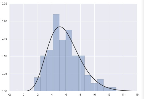
Fitting parametric distributions拟合参数分布
可以利用distplot() 把数据拟合成参数分布的图形并且观察它们之间的差距,再运用fit来进行参数控制。
x = np.random.gamma(6, size=200)#生成gamma分布的数据sns.distplot(x, kde=False, fit=stats.gamma);#fit拟合
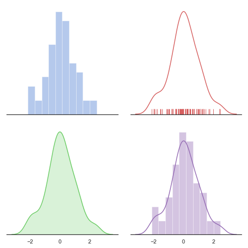
# -*- coding: utf-8 -*-"""Created on Fri Nov 23 19:47:08 2018@author: czh"""%clear%reset -f# In[*]import numpy as npimport seaborn as snsimport matplotlib.pyplot as plt# In[*]sns.set(style="white", palette="muted", color_codes=True)rs = np.random.RandomState(10)# Set up the matplotlib figuref, axes = plt.subplots(2, 2, figsize=(7, 7), sharex=True)sns.despine(left=True)# Generate a random univariate datasetd = rs.normal(size=100)# Plot a simple histogram with binsize determined automaticallysns.distplot(d, kde=False, color="b", ax=axes[0, 0])# Plot a kernel density estimate and rug plotsns.distplot(d, hist=False, rug=True, color="r", ax=axes[0, 1])# Plot a filled kernel density estimatesns.distplot(d, hist=False, color="g", kde_kws={"shade": True}, ax=axes[1, 0])# Plot a historgram and kernel density estimatesns.distplot(d, color="m", ax=axes[1, 1])plt.setp(axes, yticks=[])plt.tight_layout()

若有收获,就点个赞吧
0 人点赞
