通过R语言我们可以绘制两个变量的相关图,我所使用的是皮尔森相关,主要的参数是:①r相关系数②P值。一般对P值的评判标准是P< 0.05
简单的相关系数的分类
0.8-1.0 极强相关
0.6-0.8 强相关
0.4-0.6 中等程度相关
0.2-0.4 弱相关
0.0-0.2 极弱相关或无相关
r描述的是两个变量间线性相关强弱的程度。r的取值在-1与+1之间,若r>0,表明两个变量是正相关,即一个变量的值越大,另一个变量的值也会越大;若r<0,表明两个变量是负相关,即一个变量的值越大另一个变量的值反而会越小。r 的绝对值越大表明相关性越强,要注意的是这里并不存在因果关系。
基础拟合曲线绘制
# -*- coding: utf-8 -*-"""Created on Mon Nov 19 00:57:53 2018@author: czh"""# In[*]#导入各种需要的包#import numpy as npimport matplotlib.pyplot as pltfrom scipy import optimizeimport seaborn as snssns.set()# In[*]import seaborn as snssns.set(style="darkgrid")tips = sns.load_dataset("tips")g = sns.jointplot("total_bill", "tip", data=tips, kind="reg",xlim=(0, 60), ylim=(0, 12), color="m", height=7)
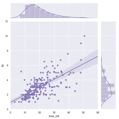
这是通过python语言绘制的线性相关曲线拟合图,感觉比R语言在代码上更简洁,且图片能展示的信息更多。
多分组拟合曲线绘制
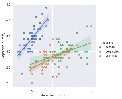
# -*- coding: utf-8 -*-"""Created on Mon Nov 19 00:57:53 2018@author: czh"""# In[*]#导入各种需要的包#import numpy as npimport matplotlib.pyplot as pltfrom scipy import optimizeimport seaborn as snssns.set()# In[*]# Load the iris datasetiris = sns.load_dataset("iris")# Plot sepal with as a function of sepal_length across daysg = sns.lmplot(x="sepal_length", y="sepal_width",hue='species',truncate=True, height=5, data=iris)# Use more informative axis labels than are provided by defaultg.set_axis_labels("Sepal length (mm)", "Sepal width (mm)")

若有收获,就点个赞吧
0 人点赞
