border(开发中)
边框组件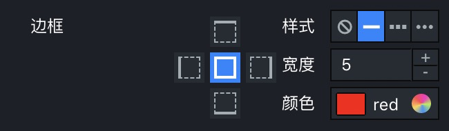
示例:
{"name": "边框","type": "border","default": {"all": {"style": "solid","width": 5,"color": "red"}}}
padding(开发中)
内边距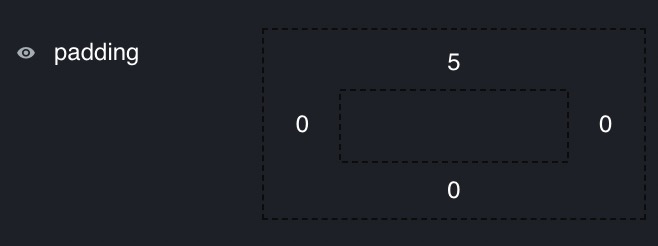
示例:
{"type": "padding","enableHide": true,"default": {"top": 5},"min": 0,"max": 1000}
margin(开发中)
外边距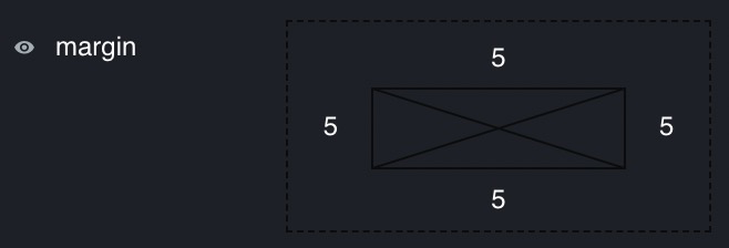
示例:
{"type": "margin","enableHide": true,"default": {"show": false,"top": 5,"bottom": 5,"left": 5,"right": 5},"min": 0,"max": 1000}
_
text
文本输入框,支持定制前后缀。
配置说明:
| Property | Description | Type | remarks |
|---|---|---|---|
| prefix | 前缀 | string |
- |
| suffix | 后缀 | string |
- |
| prefixIcon | 前缀图标 | string |
图标库中名称,如 solid |
| suffixIcon | 后缀图标 | string |
同上 |
值说明:
| Condition | Type | example | remarks |
|---|---|---|---|
| - | string |
abc |
- |
switch
开关,支持选择是否展示文字状态。
配置说明:
| Property | Description | Type | default | remarks |
|---|---|---|---|---|
| statusText | 是否用文字显示状态 | boolean |
false |
- |
值说明:
| Condition | Type | example | remarks | |
|---|---|---|---|---|
| - | boolean |
false |
- |
stepper
步进器,支持定制步长,最值以及前后缀。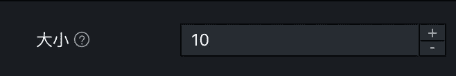
配置说明:
| Property | Description | Type | default | remarks |
|---|---|---|---|---|
| step | 步长 | number |
- | - |
| min | 最小值 | number |
- | - |
| max | 最大值 | number |
- | - |
| prefix | 前缀 | string |
- | - |
| suffix | 后缀 | string |
- | - |
| precision | 精度(小数位数)) | number |
- | 显示精度,仅对小数生效 |
值说明:
| Condition | Type | example | remarks | |
|---|---|---|---|---|
| - | number |
12 |
- |
slider
滑动条,同时支持单滑块和双滑块,支持定制步长,最值,前后缀,精度,可开启范围显示。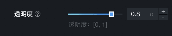
配置说明:
| Property | Description | Type | default | remarks | |
|---|---|---|---|---|---|
| step | 步长 | number |
- | ||
| min | 最小值 | number |
- | ||
| max | 最大值 | number |
- | ||
| prefix | 前缀 | string |
- | ||
| suffix | 后缀 | string |
- | ||
| precision | 精度 | number |
- | 显示精度,仅对小数生效 | |
| mode | 双滑块 or 单滑块 | `’single’ | ‘double’` | 'single' |
- |
| showRange | 是否显示范围 | boolean |
false |
mode == double 生效 | |
| showCurrentRange | 是否显示当前范围 | boolean |
true |
值说明:
| Condition | Type | example | remarks | |
|---|---|---|---|---|
| - | number |
22 |
- |
checkbox
复现框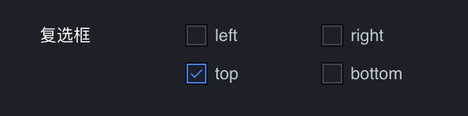
配置说明:
| Property | Description | Type | default | remarks |
|---|---|---|---|---|
| options | 选项列表 | array |
- | - |
| optionCol | 选项定宽 | number |
- | 用来为选项设定固定宽度,和col用法相同 |
值说明:
| Condition | Type | example | remarks | |
|---|---|---|---|---|
| - | array | ['a', 'b'] |
是 options 中的某些项的 value 组成的数组 | [{value: ‘xxx’ ,label: ‘xxx’},…] |
radio
单选框。
配置说明:
| Property | Description | Type | default | remarks |
|---|---|---|---|---|
| options | 选项列表 | array |
- | - |
| optionCol | 选项定宽 | number |
- | 用来为选项设定固定宽度,和col用法相同 |
值说明:
| Condition | Type | example | remarks | |
|---|---|---|---|---|
| - | stirng |
abc |
是 options 中的某项的 value | [{value: ‘xxx’ ,label: ‘xxx’},…] |
buttonRadio
按钮单选器。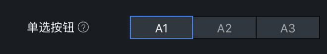
配置说明:
| Property | Description | Type | default | remarks |
|---|---|---|---|---|
| options | 选项列表 | array |
- | [{value: ‘xxx’ ,label: ‘xxx’},…] |
值说明:
| Condition | Type | example | remarks | |
|---|---|---|---|---|
| - | stirng |
abc |
是 options 中的某项的 value |
iconRadio
图标单选器。
配置说明:
| Property | Description | Type | default | remarks |
|---|---|---|---|---|
| options | 选项列表 | array |
- | 示例:[{value: ‘xxx’ ,src: ‘xxx’},…] 此处 src 即可以是图片地址,也可以来自图标图图标名称 |
| optionCol | 选项定宽 | number |
- | 用来为选项设定固定宽度,和col用法相同 |
| evenlySplit | 均匀等分 | boolean |
- | 使 icon 在一行中均匀分布,当和optionCol 同时出现时, evenlySplit 优先 |
值说明:
| Condition | Type | example | remarks | |
|---|---|---|---|---|
| - | stirng |
abc |
是 options 中的某项的 value |
image
图片框。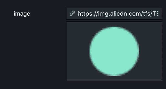
配置说明:
| Property | Description | Type | default | remarks |
|---|---|---|---|---|
| - | - | - | - | - |
值说明:
| Condition | Type | example | remarks | |
|---|---|---|---|---|
| - | stirng |
htttp://123.png |
- | - |
select
选择器,支持开启过滤,支持自定义输入,当内容与字体相关时,可开始渲染字体显示字体演示。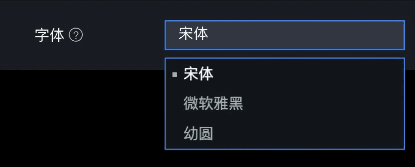
配置说明:
| Property | Description | Type | default | remarks |
|---|---|---|---|---|
| options | 选项列表 | array |
- | [{value:’xxx’, label: ‘xxx’},…] |
| filterable | 是否支持过滤 | boolean |
true | - |
| allowCustom | 是否支持输入自定义 | boolean |
true | filterable == true 生效 |
| useFont | 是否渲染字体 | boolean |
- | - |
值说明:
| Condition | Type | example | remarks | |
|---|---|---|---|---|
| - | stirng |
abc |
是 options 中的某项的 value 或者是 自定义输入 |
imageSelect
图片选择器。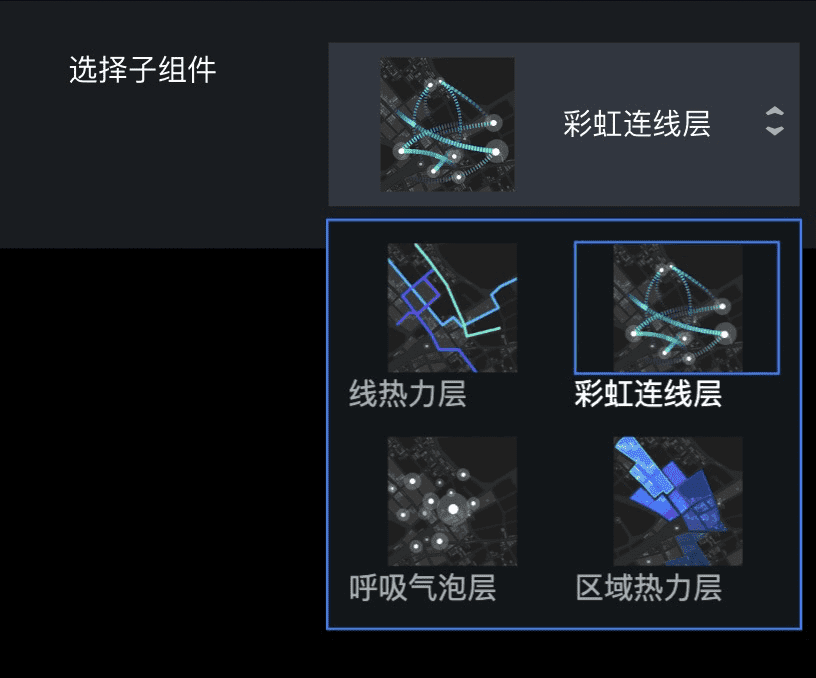
配置说明:
| Property | Description | Type | default | remarks |
|---|---|---|---|---|
| options | 选项列表 | array |
- | [{value:’xxx’, label: ‘xxx’, src:’xxx’}] 此处 src 为图片地址 |
值说明:
| Condition | Type | example | remarks | |
|---|---|---|---|---|
| - | stirng |
abc |
是 options 中的某项的 value |
keyBoard
热键定义器。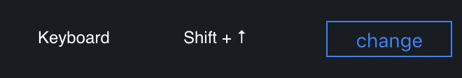
值说明:
| Condition | Type | example | remarks | |
|---|---|---|---|---|
| - | array |
[16, 38] |
- |
fill
填充框,支持三种填充类型以及他们的组合,’flat’ 代表纯色填充, ‘linearGradient’ 代表渐变填充,’image’ 代表图片填充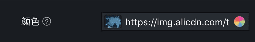
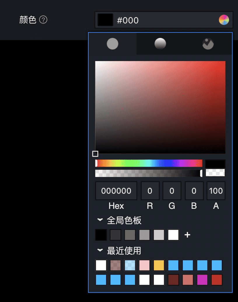
配置说明:
| Property | Description | Type | default | remarks |
|---|---|---|---|---|
| components | 可支持填充类型 | sub-array of ['flat', 'linearGradient', 'image'] |
['flat'] |
值说明:
| Condition | Type | example | remarks | |||
|---|---|---|---|---|---|---|
| 当为纯色填充时 | object |
{type: ‘flat’, value: ‘333’} | ‘#333’ | 当仅有纯色填充方式时,直接value 值 | ||
| 当为线性渐变填充时 | object |
`{type: ‘linearGradient’, value: { angle: 90, stops: [{color: ‘#333’, offset: 0}, {color: ‘red’, offset: 100}] }} | { angle: 90, stops: [{color: ‘#333’, offset: 0}, {color: ‘red’, offset: 100}] }` | 当仅有线性渐变填充方式时,直接value 值 | ||
| 当为图片填充时 | object |
{type: ‘ image’, value: {fillType: ‘fit’, url: ‘http://‘, tileSize: 100}} | {fillType: ‘fit’, url: ‘http://‘, tileSize: 100} | 当仅有图片填充方式时,直接value 值 |
suite
套件,由一组控件构成。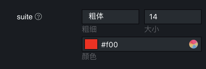
配置说明:
| Property | Description | Type | default | remarks |
|---|---|---|---|---|
| children | 控件模块 | object |
{} |
- |
| enableHide | 配置项对应元素是否能够在画布隐藏 | boolean |
false |
true状态时,显示显隐按钮,当前配置项值中增加show字段 |
值说明:
| Condition | Type | example | remarks | |
|---|---|---|---|---|
| - | object |
{show: xx,top: xx, bottom: xx} |
- |
margin
边距高频套件,由四个步进器组件构成,可定制上下左右四个边距值。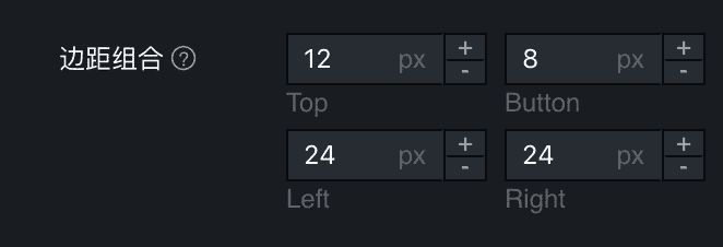
配置说明:
| Property | Description | Type | default | remarks |
|---|---|---|---|---|
| components | 组件模块 | sub-array of ['top', 'bottom', 'left', 'right'] |
['top', 'bottom', 'left', 'right'] |
- |
| enableHide | 配置项对应元素是否能够在画布隐藏 | boolean |
false |
true状态时,显示显隐按钮,当前配置项值中增加show字段 |
值说明:
| Condition | Type | example | remarks | |
|---|---|---|---|---|
| - | object |
{top: xx, bottom: xx, left: xx, right: xx} |
- |
line
线样式高频组件,由线粗细步进器,平滑方式图标单选器,样式选择器和纯色填充框组成。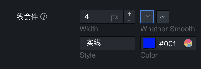
配置说明:
| Property | Description | Type | default | remarks |
|---|---|---|---|---|
| components | 组件模块 | sub-array of ['width', 'curve', 'style', 'color'] |
['width', 'curve', 'style', 'color'] |
- |
| enableHide | 配置项对应元素是否能够在画布隐藏 | boolean |
false |
true状态时,显示显隐按钮,当前配置项值中增加show字段 |
值说明:
| Condition | Type | example | remarks | |
|---|---|---|---|---|
| - | object |
{width: xx, curve: xx, style: xx, color: xx} |
- |
font
字体高频组件,由字体选择器,字体粗细选择器,字体大小步进器和纯色填充框组成。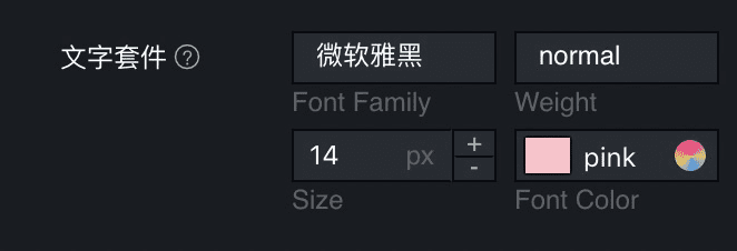
配置说明:
| Property | Description | Type | default | remarks |
|---|---|---|---|---|
| components | 组件模块 | sub-array of ['fontFamily', 'fontWeight', 'fontSize', 'color'] |
['fontFamily', 'fontWeight', 'fontSize', 'color'] |
- |
| enableHide | 配置项对应元素是否能够在画布隐藏 | boolean |
false |
true状态时,显示显隐按钮,当前配置项值中增加show字段 |
值说明:
| Condition | Type | example | remarks | |
|---|---|---|---|---|
| - | object |
{fontFamily: xx, size: xx, color: xx, fontWeight: xx} |
- |
group
组,可用来组织内容,可以折叠或展开组的内容。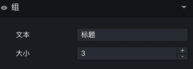
配置说明:
| Property | Description | Type | default | remarks |
|---|---|---|---|---|
| children | 组内容 | object |
{} |
- |
| enableHide | 配置项对应元素是否能够在画布隐藏 | boolean |
false |
true状态时,显示显隐按钮,当前配置项值中增加show字段 |
| fold | 是否默认展开 | boolean |
- |
值说明:
| Condition | Type | example | remarks | |
|---|---|---|---|---|
| - | object |
{font: xx, margin: xx} |
- |
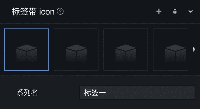
tabs
**
标签组,切换标签,展示当前标签下的内容,可支持动态增减标签组。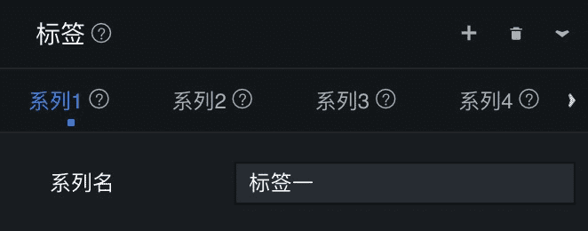
配置说明:
| Property | Description | Type | default | remarks |
|---|---|---|---|---|
| addable | 是否可以动态增减 | bool |
true |
- |
| defaultViewMode | 默认阅读模式 | string |
row |
row |
| maxTabs | 最大项数 | number |
Infinity |
|
| minTabs | 最小项数 | number |
0 |
|
| template | 动态增减的模板 | object |
{} |
- |
| children | 各标签组内容 | array |
[] |
子控件关键字:_icon / _id / _label |
| fold | 是否默认展开 | boolean |
值说明:
| Condition | Type | example | remarks | |
|---|---|---|---|---|
| - | array |
[{font: xx, margin: xx}, {top: xx, bottom: xx}] |
在每个子元素中,可以使用_label更改系列名(如“系列一”改为“模板”),_icon 更改图标 |
menu
菜单,用于组织配置结构,当前仅支持一级菜单及二级菜单;
一级菜单:
二级菜单:
配置说明:
| Property | Description | Type | default | remarks |
|---|---|---|---|---|
| children | 各菜单内容 | object |
{} |
children 配置说明:
| Property | Description | Type | default | remarks |
|---|---|---|---|---|
| mode | 是否嵌套了二级菜单 | string | single |
single:仅一级菜单;multiple:有二级菜单 |
| name | 菜单名 | string |
||
示例写法:
"options": {"name": "菜单","type": "menu","children": {"menuA": {"name": "菜单A","mode": "single","children": {"switch": {"name": "开关","type": "switch","default": true}}},"menuB": {"name": "菜单B","mode": "multiple","children": {"menuB1": {"name": "菜单B1","children": {"text": {"name": "文本","type": "text","default": "Hello"}}},"menuB2": {"name": "菜单B2","children": {"stepper": {"name": "步进器","type": "stepper","default": 1}}}}}}}
示例截图: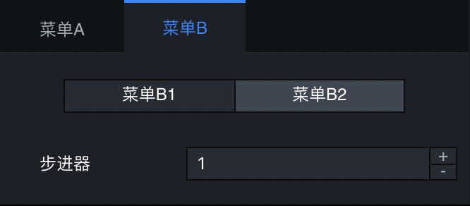

若有收获,就点个赞吧
0 人点赞
