文本颜色
| 样式名 |
描述 |
| .text-theme |
跟主题同色的文本 |
| .text-muted |
浅灰色 |
| .text-gray |
灰色 |
| .text-darkgray |
深灰色 |
| .text-default |
(黑) |
| .text-red |
红色 |
| .text-blue |
蓝色 |
| .text-green |
绿色 |
| .text-yellow |
黄色 |
| .text-white |
白色 |
| .text-fff80 |
白色(80%透明) |
| .text-fff50 |
白色(50%透明) |
背影颜色
| 样式名 |
描述 |
| .bg-theme |
跟主题同色的背景 |
| .bg-muted |
浅灰色 |
| .bg-gray |
灰色 |
| .bg-darkgray |
深灰色 |
| .bg-black |
(黑) |
| .bg-black-50 |
(黑)半透明0.5 |
| .bg-black-70 |
(黑)半透明0.7 |
| .bg-black-80 |
(黑)半透明0.8 |
| .bg-red |
红色 |
| .bg-blue |
蓝色 |
| .bg-green |
绿色 |
| .bg-yellow |
黄色 |
| .bg-white |
白色 |
| .bg-gradual-red |
红色渐变色 |
| .bg-gradual-green |
绿色渐变色 |
| .bg-gradual-purple |
紫色渐变色 |
| .bg-gradual-pink |
粉色渐变色 |
| .bg-gradual-blue |
蓝色渐变色 |
文本对齐
| 样式名 |
描述 |
| .tl |
左对齐 |
| .tc |
居中对齐 |
| .tr |
右对齐 |
文本粗细
| 样式名 |
描述 |
| .fw300 |
对应该的样式 font-weight: 300; |
| .fw400 |
对应该的样式 font-weight: 400; |
| .fw500 |
对应该的样式 font-weight: 500; |
| .fw600 |
对应该的样式 font-weight: 600; 一般加粗用这个 |
| .fw700 |
对应该的样式 font-weight: 700; |
字体大小 font-size
| 样式名 |
描述 内置数值: 20, 22, 24, 26, 28, 30, 32, 34, 36, 38, 40, 44, 46, 50 (常用26,28, 30) |
| .fs30 |
以30为例,fs 代表font-size, 30代表数值 |
文本其它样式
| 样式名 |
描述 |
| .line-through |
文本删除线,一般用在原价格给文字中间加上删除线 |
| .underline |
文本下划线 |
| .line1 |
/文本后面的点点点省略号 line1 就1行出现…/ |
| .line2 |
/文本后面的点点点省略号 line2 就第2行出现…/ |
| .line3 |
/文本后面的点点点省略号 line3 就第3行出现…/ |
外边距 margin
| 样式名 |
描述 内置数值:5, 10, 15, 20, 30, 40, 50 (常用20,30) |
| .ml30 |
以30为例,ml 代表margin-left, 30代表数值 |
| .mr30 |
以30为例,mr 代表margin-right, 30代表数值 |
| .mlr30 |
以30为例,mlr 代表margin-left和margin-right, 30代表数值 |
| .mt30 |
以30为例,mt 代表margin-top, 30代表数值 |
| .mb30 |
以30为例,mb 代表margin-bottom, 30代表数值 |
| .mtb30 |
以30为例,mtb 代表margin-top和margin-bottom, 30代表数值 |
内边距 padding
| 样式名 |
描述 内置数值:5, 10, 15, 20, 30, 40, 50 (常用20,30) |
| .pl30 |
以30为例,pl 代表padding-left, 30代表数值 |
| .pr30 |
以30为例,pr 代表padding-right, 30代表数值 |
| .plr30 |
以30为例,plr 代表padding-left和padding-right, 30代表数值 |
| .pt30 |
以30为例,pt 代表padding-top, 30代表数值 |
| .pb30 |
以30为例,pb 代表padding-bottom, 30代表数值 |
| .ptb30 |
以30为例,ptb 代表padding-top和padding-bottom, 30代表数值 |
宽度,高度
| 样式名 |
描述 内置数值:30, 40, 50, 60, 70, 80, 90, 100, 110, 120, 140, 150, 160, 180, 200, 220, 240, 260, 280, 300, 320, 350,375,400 |
| .w100 |
以100为例,w 代表width, 100代表数值 |
| .h100 |
以100为例,h 代表height, 100代表数值 |
| .wh100 |
以100为例,wh 代表widtht和height, 100代表数值 |
相对&绝对定位 position
| 样式名 |
描述 |
| .relative |
相对定位 ,对应样式 position: relative |
| .abs |
绝对定位 对应样式 position: absolute; z-index: 9; 注意层级默认设为9了 |
| .abs abslt |
与abs组合使用 使用元素定位到父层的左上角 对应样式 left:0; top:0; |
| .abs absrt |
与abs组合使用 使用元素定位到父层的右上角 对应样式 right:0; top:0; |
| .abs abslb |
与abs组合使用 使用元素定位到父层的左下角 对应样式 left:0; bottom:0; |
| .abs absrb |
与abs组合使用 使用元素定位到父层的右下角 对应样式 right:0; bottom:0; |
| .abs abscc |
与abs组合使用 使用元素定位到父层的中央 |
| .abs abslc |
与abs组合使用 使用元素定位到父层的左边中间 |
| .abs absrc |
与abs组合使用 使用元素定位到父层的右边中间 |
| .abs abstc |
与abs组合使用 使用元素定位到父层的上边中间 |
| .abs absbc |
与abs组合使用 使用元素定位到父层的下边中间 |
圆角
| 样式名 |
描述 |
| .radius10 |
radius代表 border-radius, 10代表数值 |
| .radius12 |
radius代表 border-radius, 12代表数值 |
| .radius16 |
radius代表 border-radius, 16代表数值 |
| .radius20 |
radius代表 border-radius, 20代表数值 |
| .radius30 |
radius代表 border-radius, 30代表数值 |
| .radius50 |
radius代表 border-radius, 注意数字为50 如果宽高相等的话代表是一个圆形 (常用) |
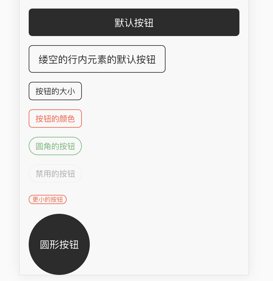
按钮
| 样式名 |
描述 .qui-btn是按钮的基础,下列的样式与它搭配使用实现不同的效果 |
| .qui-btn |
默认是一个块级按钮,颜色为主题色且实心的按钮 |
| .qui-btn inline |
使按钮变成内联元素,就是没有宽度的,宽度由内部文字撑开 |
| .qui-btn outline |
使按钮变成带边框内镂空的效果 |
| .qui-btn round |
使按钮变成大圆角按钮 |
| .qui-btn disabled |
使按钮变成不能点击的按钮 |
| .qui-btn large |
按钮的大小,有四个内置值[large,small,mini,xmini] large是比默认还要大的,small小按钮,mini小小按钮,xmini超小按钮(或者叫tag) xmini一般用做实现那种小标签tag
内置大小的按钮不能满足时可以搭配高度的样式也是可以的 例如qui-btn h50 |
| .qui-btn bg-green |
按钮的颜色,参考上面的背景颜色 例如搭配bg-green就是绿色按钮,如此类推 |
| .qui-btn bg-green inline outline mini |
以上样式都可以多个样式一起和qui-btn 搭配使用 |
<div class="qui-btn">默认按钮</div> <div class="h30"></div> <div class="qui-btn inline outline">缕空的行内元素的默认按钮</div> <div class="h30"></div> <div class="qui-btn inline outline small">按钮的大小</div> <div class="h30"></div> <div class="qui-btn inline outline small bg-red">按钮的颜色</div> <div class="h30"></div> <div class="qui-btn inline outline small bg-green round">圆角的按钮</div> <div class="h30"></div> <div class="qui-btn inline outline small bg-red round disabled">禁用的按钮</div> <div class="h30"></div> <div class="qui-btn inline outline xmini bg-red round">更小的按钮</div> <div class="h30"></div> <div class="qui-btn radius50 wh200">圆形按钮</div>
1像素边框
| 样式名 |
描述 |
| .bor-1px-t |
1像素上边框 |
| .bor-1px-b |
1像素下边框 |
| .bor-1px-l |
1像素左边框 |
| .bor-1px-r |
1像素右边框 |

