效果图: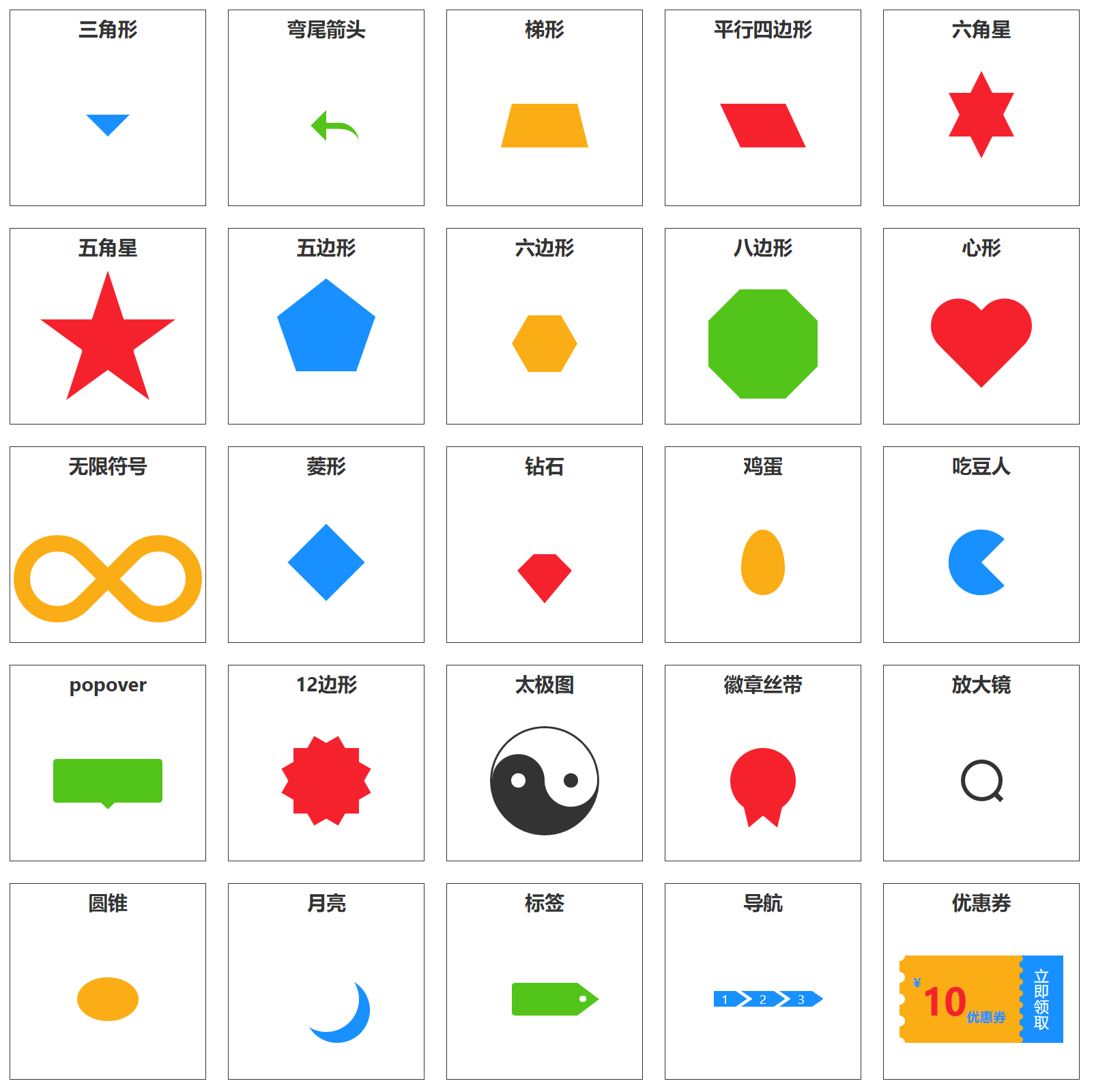
代码:
<!DOCTYPE html><html lang="en"><head><meta charset="UTF-8"><meta http-equiv="X-UA-Compatible" content="IE=edge"><meta name="viewport" content="width=device-width, initial-scale=1.0"><title>CSS绘制各种特殊图形</title><style type="text/css">* { margin: 0; padding: 0; }:root {--primaryText: #333;--primaryColor: #1890ff;--successColor: #52c41a;--warningColor: #faad14;--errorColor: #f5222d;}html {font-family: -apple-system, BlinkMacSystemFont, 'Segoe UI', 'PingFang SC', 'Hiragino Sans GB','Microsoft YaHei', 'Helvetica Neue', Helvetica, Arial, sans-serif, 'Apple Color Emoji','Segoe UI Emoji', 'Segoe UI Symbol';;}ul { list-style: none; }.clearfix::after {content: '';display: table;clear: both;}.container {display: flex;flex-wrap: wrap;width: 1080px;margin: 100px auto;padding: 10px;box-shadow: 0 0 8px var(--primaryText);}.section {display: flex;flex-direction: column;align-items: center;justify-content: center;width: 180px;height: 180px;margin: 10px;border: 1px solid var(--primaryText);box-sizing: border-box;}.section .title {height: 32px;font-size: 18px;font-weight: 700;line-height: 32px;text-align: center;color: var(--primaryText);}.wrapper {flex: 1;display: flex;justify-content: center;align-items: center;}/* 三角形 */.triangle {width: 0;height: 0;border-top: 20px solid var(--primaryColor);border-left: 20px solid transparent;border-right: 20px solid transparent;}/* 弯尾箭头 */.curved-arrow {position: relative;width: 0;height: 0;border-top: 20px solid transparent;border-left: 20px solid var(--successColor);transform: rotate(45deg);}.curved-arrow::after {content: '';position: absolute;left: -10px;top: -25px;width: 30px;height: 12px;border-top: 6px solid var(--successColor);border-radius: 0 30px 0 0;transform: rotate(-45deg);}/* 梯形 */.trapezoid {position: relative;width: 60px;height: 40px;background-color: var(--warningColor);}.trapezoid::before {content: '';position: absolute;left: -10px;border-left: 10px solid transparent;border-bottom: 40px solid var(--warningColor);}.trapezoid::after {content: '';position: absolute;right: -10px;border-right: 10px solid transparent;border-bottom: 40px solid var(--warningColor);}/* 平行四边形 */.parallelogram {width: 60px;height: 40px;background-color: var(--errorColor);transform: skewX(25deg);}/* 六角星 */.hexagram {position: relative;width: 0;height: 0;border-top: 60px solid var(--errorColor);border-left: 30px solid transparent;border-right: 30px solid transparent;}.hexagram::after {content: '';position: absolute;left: -30px;top: -80px;width: 0;height: 0;border-bottom: 60px solid var(--errorColor);border-left: 30px solid transparent;border-right: 30px solid transparent;}/* 五角星 */.pertagram {position: relative;width: 0;height: 0;border-top: 45px solid var(--errorColor);border-left: 62px solid transparent;border-right: 62px solid transparent;}.pertagram::before {content: '';position: absolute;left: -20px;top: -85px;border-top: 62px solid transparent;border-bottom: 62px solid transparent;border-left: 45px solid var(--errorColor);transform: rotate(18deg)}.pertagram::after {content: '';position: absolute;right: -20px;top: -85px;border-top: 62px solid transparent;border-bottom: 62px solid transparent;border-right: 45px solid var(--errorColor);transform: rotate(-18deg)}/* 五边形 */.pentagon {position: relative;width: 54px;border-top: 50px solid var(--primaryColor);border-right: 18px solid transparent;border-left: 18px solid transparent;}.pentagon::after {content: '';position: absolute;left: -18px;top: -85px;width: 0;height: 0;border-right: 45px solid transparent;border-left: 45px solid transparent;border-bottom: 35px solid var(--primaryColor);}/* 六边形 */.hexagon {position: relative;width: 30px;height: 52px; /* Math.cos(30deg) * 30 * 2 */background-color: var(--warningColor);}.hexagon::before {content: '';display: block;position: absolute;left: 0;top: 0;width: 100%;height: 100%;background-color: var(--warningColor);transform-origin: center center;transform: rotate(60deg)}.hexagon::after {content: '';display: block;position: absolute;left: 0;top: 0;width: 100%;height: 100%;background-color: var(--warningColor);transform-origin: center center;transform: rotate(-60deg)}/* 八边形 */.octagon {position: relative;width: 100px;height: 100px;background-color: var(--successColor);}.octagon::before {content: '';position: absolute;top: 0;left: 0;width: 42px;height: 0;border-bottom: 29px solid var(--successColor);border-left: 29px solid #fff;border-right: 29px solid #fff;}.octagon::after {content: '';position: absolute;bottom: 0;left: 0;width: 42px;height: 0;border-top: 29px solid var(--successColor);border-left: 29px solid #fff;border-right: 29px solid #fff;}/* 心形 */.heart {position: relative;width: 100px;height: 80px;}.heart::before,.heart::after {content: '';position: absolute;width: 50px;height: 80px;border-radius: 50px 50px 0 0;background-color: var(--errorColor);}.heart::before {left: 0;top: 0;transform-origin: bottom right;transform: rotate(45deg);}.heart::after {right: 0;top: 0;transform-origin: bottom left;transform: rotate(-45deg);}/* 无限符号 */.infinity {position: relative;width: 100px;height: 50px;}.infinity::before,.infinity::after {content: '';position: absolute;width: 50px;height: 50px;border: 15px solid var(--warningColor);}.infinity::before {left: -36%;top: 0;border-radius: 50% 50% 0 50%;transform: rotate(-45deg);}.infinity::after {right: -36%;top: 0;border-radius: 50% 50% 50% 0;transform: rotate(45deg);}/* 菱形 */.diamond {width: 50px;height: 50px;background-color: var(--primaryColor);transform-origin: center center;transform: rotate(45deg);}/* 钻石 */.cut-diamond {position: relative;width: 20px;border-bottom: 15px solid var(--errorColor);border-left: 15px solid transparent;border-right: 15px solid transparent;}.cut-diamond::before {content: '';position: absolute;left: -15px;top: 15px;width: 0;height: 0;border-top: 30px solid var(--errorColor);border-left: 25px solid transparent;border-right: 25px solid transparent;}/* 鸡蛋 */.egg {width: 40px;height: 60px;border-radius: 50% 50% 50% 50% / 60% 60% 40% 40%;background-color: var(--warningColor);}/* 吃豆人 */.pac-man {width: 0px;height: 0px;border-right: 30px solid transparent;border-top: 30px solid var(--primaryColor);border-left: 30px solid var(--primaryColor);border-bottom: 30px solid var(--primaryColor);border-top-left-radius: 50%;border-top-right-radius: 50%;border-bottom-left-radius: 50%;border-bottom-right-radius: 50%;}/* popover */.popover {position: relative;width: 100px;height: 40px;border-radius: 3px;background-color: var(--successColor);}.popover::after {content: '';position: absolute;left: 50%;bottom: -6px;margin-left: -6px;border-top: 6px solid var(--successColor);border-left: 6px solid transparent;border-right: 6px solid transparent;}/* 12边形 */.burst-12 {position: relative;width: 60px;height: 60px;background-color: var(--errorColor);}.burst-12::before,.burst-12::after {content: '';position: absolute;left: 0;top: 0;width: 100%;height: 100%;background-color: var(--errorColor);transform-origin: center center;}.burst-12::before {transform: rotate(30deg);}.burst-12::after {transform: rotate(60deg);}/* 太极图 */.tai-ji {position: relative;width: 96px;height: 48px;background-color: #fff;border-style: solid;border-width: 2px 2px 50px 2px;border-color: var(--primaryText);border-radius: 50%;}.tai-ji::before {content: "";position: absolute;top: 50%;left: 0;width: 12px;height: 12px;background-color: #fff;border-radius: 50%;border: 18px solid var(--primaryText);}.tai-ji::after {content: "";position: absolute;top: 50%;left: 50%;width: 12px;height: 12px;border: 18px solid #fff;border-radius: 50%;background-color: var(--primaryText);}/* 徽章丝带 */.badge-ribbon {position: relative;width: 60px;height: 60px;border-radius: 50%;background-color: var(--errorColor);}.badge-ribbon::before {content: '';position: absolute;left: 28px;bottom: -9px;margin-left: -20px;border-top: 20px solid var(--errorColor);border-left: 10px solid transparent;border-right: 10px solid transparent;transform: rotate(140deg);}.badge-ribbon::after {content: '';position: absolute;right: 28px;bottom: -9px;margin-right: -20px;border-top: 20px solid var(--errorColor);border-left: 10px solid transparent;border-right: 10px solid transparent;transform: rotate(-140deg);}/* 放大镜 */.magnifying-glass {position: relative;width: 30px;height: 30px;border: 4px solid var(--primaryText);border-radius: 50%;transform: rotate(-45deg);}.magnifying-glass::before {content: '';position: absolute;left: 50%;bottom: -11px;width: 4px;height: 8px;margin-left: -2px;background-color: var(--primaryText);}/* 圆锥 */.cone {width: 0;height: 0;border-top: 40px solid var(--warningColor);border-left: 28px solid transparent;border-right: 28px solid transparent;border-radius: 50%;}/* 月亮 */.moon {width: 60px;height: 60px;border-radius: 50%;box-shadow: 10px 10px 0 0 var(--primaryColor);}/* 标签 */.tag {position: relative;width: 60px;height: 30px;border-top-left-radius: 3px;border-bottom-left-radius: 3px;background-color: var(--successColor);}.tag::before {content: '';position: absolute;right: -20px;top: 0;border-left: 20px solid var(--successColor);border-top: 15px solid transparent;border-bottom: 15px solid transparent;}.tag::after {content: '';position: absolute;right: -8px;top: 50%;width: 6px;height: 6px;margin-top: -3px;border-radius: 50%;background-color: #fff;}/* 导航 */.nav .item {position: relative;float: left;width: 20px;height: 14px;line-height: 14px;font-size: 12px;text-align: center;color: #fff;background-color: var(--primaryColor);}.nav .item:first-child {margin-left: 0;}.nav .item:last-child {margin-right: 0;}.nav .item:not(:first-child)::before {content: '';position: absolute;left: -10px;top: 0;border-left: 10px solid transparent;border-top: 7px solid var(--primaryColor);border-bottom: 7px solid var(--primaryColor);}.nav .item::after {content: '';position: absolute;right: -10px;top: 0;border-left: 10px solid var(--primaryColor);border-top: 7px solid transparent;border-bottom: 7px solid transparent;}.nav .item:not(:first-child) {margin-left: 15px;}/* 优惠券 */.coupon {display: flex;width: 150px;height: 80px;background-color: var(--warningColor);}.coupon .coupon-main {flex: 1;display: flex;align-items: center;padding-left: 20px;position: relative;overflow: hidden;}.coupon .coupon-main em {position: relative;font-style: normal;color: var(--errorColor);font-size: 36px;font-weight: 700;}.coupon .coupon-main em::before {content: attr(data-symbol);position: absolute;left: -10px;top: 0;font-size: 12px;color: var(--primaryColor);}.coupon .coupon-main em::after {content: attr(data-desc);position: absolute;left: 100%;bottom: 0;font-size: 12px;white-space: nowrap;color: var(--primaryColor);}.coupon .coupon-main::before {content: '';position: absolute;left: -5px;top: -5px;height: calc(100% + 10px);border-left: 10px dotted #fff;}.coupon .coupon-vice {position: relative;width: 40px;text-align: center;line-height: 40px;font-size: 14px;color: #fff;background-color: var(--primaryColor);writing-mode: vertical-lr;overflow: hidden;}.coupon .coupon-vice::before {content: '';position: absolute;left: -3px;top: 0;height: 100%;border-right: 6px dotted var(--warningColor);}</style></head><body><div class="container"><section class="section"><h2 class="title">三角形</h2><div class="wrapper"><div class="triangle"></div></div></section><section class="section"><h2 class="title">弯尾箭头</h2><div class="wrapper"><div class="curved-arrow"></div></div></section><section class="section"><h2 class="title">梯形</h2><div class="wrapper"><div class="trapezoid"></div></div></section><section class="section"><h2 class="title">平行四边形</h2><div class="wrapper"><div class="parallelogram"></div></div></section><section class="section"><h2 class="title">六角星</h2><div class="wrapper"><div class="hexagram"></div></div></section><section class="section"><h2 class="title">五角星</h2><div class="wrapper"><div class="pertagram"></div></div></section><section class="section"><h2 class="title">五边形</h2><div class="wrapper"><div class="pentagon"></div></div></section><section class="section"><h2 class="title">六边形</h2><div class="wrapper"><div class="hexagon"></div></div></section><section class="section"><h2 class="title">八边形</h2><div class="wrapper"><div class="octagon"></div></div></section><section class="section"><h2 class="title">心形</h2><div class="wrapper"><div class="heart"></div></div></section><section class="section"><h2 class="title">无限符号</h2><div class="wrapper"><div class="infinity"></div></div></section><section class="section"><h2 class="title">菱形</h2><div class="wrapper"><div class="diamond"></div></div></section><section class="section"><h2 class="title">钻石</h2><div class="wrapper"><div class="cut-diamond"></div></div></section><section class="section"><h2 class="title">鸡蛋</h2><div class="wrapper"><div class="egg"></div></div></section><section class="section"><h2 class="title">吃豆人</h2><div class="wrapper"><div class="pac-man"></div></div></section><section class="section"><h2 class="title">popover</h2><div class="wrapper"><div class="popover"></div></div></section><section class="section"><h2 class="title">12边形</h2><div class="wrapper"><div class="burst-12"></div></div></section><section class="section"><h2 class="title">太极图</h2><div class="wrapper"><div class="tai-ji"></div></div></section><section class="section"><h2 class="title">徽章丝带</h2><div class="wrapper"><div class="badge-ribbon"></div></div></section><section class="section"><h2 class="title">放大镜</h2><div class="wrapper"><div class="magnifying-glass"></div></div></section><section class="section"><h2 class="title">圆锥</h2><div class="wrapper"><div class="cone"></div></div></section><section class="section"><h2 class="title">月亮</h2><div class="wrapper"><div class="moon"></div></div></section><section class="section"><h2 class="title">标签</h2><div class="wrapper"><div class="tag"></div></div></section><section class="section"><h2 class="title">导航</h2><div class="wrapper"><div class="nav"><ul class="list clearfix"><li class="item">1</li><li class="item">2</li><li class="item">3</li></ul></div></div></section><section class="section"><h2 class="title">优惠券</h2><div class="wrapper"><div class="coupon"><div class="coupon-main"><em data-symbol="¥" data-desc="优惠券">10</em></div><div class="coupon-vice">立即领取</div></div></div></section></div></body></html>
实不相瞒,这上面大部分都是我抄的!

若有收获,就点个赞吧
0 人点赞
