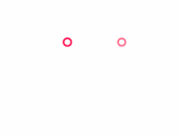
- atom-spinner
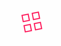
- breeding-rhombus-spinner
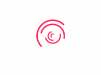
- circles-to-rhombuses-spinner
- fingerprint-spinner
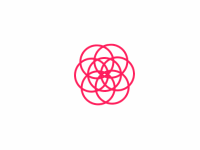
- flower-spinner
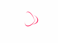
- fulfilling-bouncing-circle-spinner
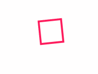
- fulfilling-square-spinner
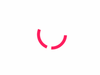
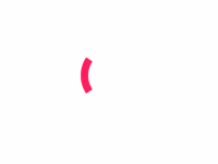
- half-circle-spinner
- hollow-dots-spinner
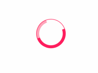
- intersecting-circles-spinner
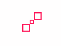
- looping-rhombuses-spinner
- orbit-spinner
- pixel-spinner
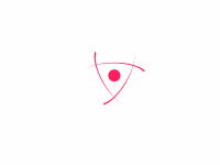
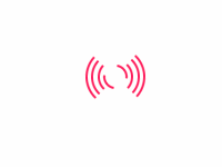
- radar-spinner
- scaling-squares-spinner
- self-building-square-spinner
- semipolar-spinner
- spring-spinner
- swapping-squares-spinner
- trinity-rings-spinner
1202年了,不会真的还有人在用 gif 图来做网页的 loading 效果吧?
atom-spinner
效果预览:
HTML:
<div class="atom-spinner"><div class="spinner-inner"><div class="spinner-line"></div><div class="spinner-line"></div><div class="spinner-line"></div><!--Chrome renders little circles malformed :(--><div class="spinner-circle">●</div></div></div>
CSS:
.atom-spinner, .atom-spinner * {box-sizing: border-box;}.atom-spinner {width: 60px;height: 60px;margin: 100px auto;overflow: hidden;}.atom-spinner .spinner-inner {position: relative;display: block;width: 100%;height: 100%;}.atom-spinner .spinner-circle {display: block;position: absolute;top: 50%;left: 50%;color: #ff1d5e;font-size: calc(60px * 0.24);transform: translate(-50%, -50%);}.atom-spinner .spinner-line {position: absolute;width: 100%;height: 100%;border-radius: 50%;animation-duration: 1s;border-left-width: calc(60px / 25);border-top-width: calc(60px / 25);border-left-color: #ff1d5e;border-left-style: solid;border-top-style: solid;border-top-color: transparent;}.atom-spinner .spinner-line:nth-child(1) {animation: atom-spinner-animation-1 1s linear infinite;transform: rotateZ(120deg) rotateX(66deg) rotateZ(0deg);}.atom-spinner .spinner-line:nth-child(2) {animation: atom-spinner-animation-2 1s linear infinite;transform: rotateZ(240deg) rotateX(66deg) rotateZ(0deg);}.atom-spinner .spinner-line:nth-child(3) {animation: atom-spinner-animation-3 1s linear infinite;transform: rotateZ(360deg) rotateX(66deg) rotateZ(0deg);}@keyframes atom-spinner-animation-1 {100% {transform: rotateZ(120deg) rotateX(66deg) rotateZ(360deg);}}@keyframes atom-spinner-animation-2 {100% {transform: rotateZ(240deg) rotateX(66deg) rotateZ(360deg);}}@keyframes atom-spinner-animation-3 {100% {transform: rotateZ(360deg) rotateX(66deg) rotateZ(360deg);}}
breeding-rhombus-spinner
效果预览:

HTML:
<div class="breeding-rhombus-spinner"><div class="rhombus child-1"></div><div class="rhombus child-2"></div><div class="rhombus child-3"></div><div class="rhombus child-4"></div><div class="rhombus child-5"></div><div class="rhombus child-6"></div><div class="rhombus child-7"></div><div class="rhombus child-8"></div><div class="rhombus big"></div></div>
CSS:
.breeding-rhombus-spinner {position: relative;width: 65px;height: 65px;margin: 100px auto;transform: rotate(45deg);}.breeding-rhombus-spinner, .breeding-rhombus-spinner * {box-sizing: border-box;}.breeding-rhombus-spinner .rhombus {position: absolute;top: calc(65px / 2.3077);left: calc(65px / 2.3077);width: calc(65px / 7.5);height: calc(65px / 7.5);background-color: #ff1d5e;animation-duration: 2000ms;animation-iteration-count: infinite;}.breeding-rhombus-spinner .rhombus:nth-child(2n+0) {margin-right: 0;}.breeding-rhombus-spinner .rhombus.child-1 {animation-name: breeding-rhombus-spinner-animation-child-1;animation-delay: calc(100ms * 1);}.breeding-rhombus-spinner .rhombus.child-2 {animation-name: breeding-rhombus-spinner-animation-child-2;animation-delay: calc(100ms * 2);}.breeding-rhombus-spinner .rhombus.child-3 {animation-name: breeding-rhombus-spinner-animation-child-3;animation-delay: calc(100ms * 3);}.breeding-rhombus-spinner .rhombus.child-4 {animation-name: breeding-rhombus-spinner-animation-child-4;animation-delay: calc(100ms * 4);}.breeding-rhombus-spinner .rhombus.child-5 {animation-name: breeding-rhombus-spinner-animation-child-5;animation-delay: calc(100ms * 5);}.breeding-rhombus-spinner .rhombus.child-6 {animation-name: breeding-rhombus-spinner-animation-child-6;animation-delay: calc(100ms * 6);}.breeding-rhombus-spinner .rhombus.child-7 {animation-name: breeding-rhombus-spinner-animation-child-7;animation-delay: calc(100ms * 7);}.breeding-rhombus-spinner .rhombus.child-8 {animation-name: breeding-rhombus-spinner-animation-child-8;animation-delay: calc(100ms * 8);}.breeding-rhombus-spinner .rhombus.big {top: calc(65px / 3);left: calc(65px / 3);width: calc(65px / 3);height: calc(65px / 3);background-color: #ff1d5e;animation-duration: 2000ms;animation: breeding-rhombus-spinner-animation-child-big 2s infinite;animation-delay: 0.5s;}@keyframes breeding-rhombus-spinner-animation-child-1 {50% {transform: translate(-325%, -325%);}}@keyframes breeding-rhombus-spinner-animation-child-2 {50% {transform: translate(0, -325%);}}@keyframes breeding-rhombus-spinner-animation-child-3 {50% {transform: translate(325%, -325%);}}@keyframes breeding-rhombus-spinner-animation-child-4 {50% {transform: translate(325%, 0);}}@keyframes breeding-rhombus-spinner-animation-child-5 {50% {transform: translate(325%, 325%);}}@keyframes breeding-rhombus-spinner-animation-child-6 {50% {transform: translate(0, 325%);}}@keyframes breeding-rhombus-spinner-animation-child-7 {50% {transform: translate(-325%, 325%);}}@keyframes breeding-rhombus-spinner-animation-child-8 {50% {transform: translate(-325%, 0);}}@keyframes breeding-rhombus-spinner-animation-child-big {50% {transform: scale(0.5);}}
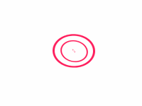
circles-to-rhombuses-spinner
效果预览:

HTML:
<div class="circles-to-rhombuses-spinner">
  <div class="circle"></div>
  <div class="circle"></div>
  <div class="circle"></div>
</div>
CSS:
.circles-to-rhombuses-spinner, .circles-to-rhombuses-spinner * {
  box-sizing: border-box;
}

.circles-to-rhombuses-spinner {
  display: flex;
  align-items: center;
  justify-content: center;
  width: calc( (15px + 15px * 1.125) * 3);
  height: 15px;
  margin: 100px auto;
}

.circles-to-rhombuses-spinner .circle {
  width: 15px;
  height: 15px;
  margin-left: calc(15px * 1.125);
  border-radius: 10%;
  border: 3px solid #ff1d5e;
  background: transparent;
  overflow: hidden;
  transform: rotate(45deg);
  animation: circles-to-rhombuses-animation 1200ms linear infinite;
}

.circles-to-rhombuses-spinner .circle:nth-child(1) {
  margin-left: 0;
  animation-delay: calc(150ms * 1);
}

.circles-to-rhombuses-spinner .circle:nth-child(2) {
  animation-delay: calc(150ms * 2);
}

.circles-to-rhombuses-spinner .circle:nth-child(3) {
  animation-delay: calc(150ms * 3);
}

@keyframes circles-to-rhombuses-animation {
  0% {
    border-radius: 10%;
  }

  17.5% {
    border-radius: 10%;
  }

  50% {
    border-radius: 100%;
  }


  93.5% {
    border-radius: 10%;
  }

  100% {
    border-radius: 10%;
  }
}

@keyframes circles-to-rhombuses-background-animation {
  50% {
    opacity: 0.4;
  }
}
fingerprint-spinner
效果预览:

HTML:
<div class="fingerprint-spinner">
  <div class="spinner-ring"></div>
  <div class="spinner-ring"></div>
  <div class="spinner-ring"></div>
  <div class="spinner-ring"></div>
  <div class="spinner-ring"></div>
  <div class="spinner-ring"></div>
  <div class="spinner-ring"></div>
  <div class="spinner-ring"></div>
  <div class="spinner-ring"></div>
</div>
CSS:
.fingerprint-spinner, .fingerprint-spinner * {
  box-sizing: border-box;
}

.fingerprint-spinner {
  position: relative;
  width: 64px;
  height: 64px;
  margin: 100px auto;
  padding: 2px;
  overflow: hidden;
}

.fingerprint-spinner .spinner-ring {
  position: absolute;
  bottom: 0;
  left: 0;
  right: 0;
  top: 0;
  margin: auto;
  border-radius: 50%;
  border: 2px solid transparent;
  border-top-color: #ff1d5e;
  animation: fingerprint-spinner-animation 1500ms cubic-bezier(0.680, -0.750, 0.265, 1.750) infinite forwards;
}

.fingerprint-spinner .spinner-ring:nth-child(1) {
  width: calc(60px / 9 + 0 * 60px / 9);
  height: calc(60px / 9 + 0 * 60px / 9);
  animation-delay: calc(50ms * 1);
}

.fingerprint-spinner .spinner-ring:nth-child(2) {
  width: calc(60px / 9 + 1 * 60px / 9);
  height: calc(60px / 9 + 1 * 60px / 9);
  animation-delay: calc(50ms * 2);
}

.fingerprint-spinner .spinner-ring:nth-child(3) {
  width: calc(60px / 9 + 2 * 60px / 9);
  height: calc(60px / 9 + 2 * 60px / 9);
  animation-delay: calc(50ms * 3);
}

.fingerprint-spinner .spinner-ring:nth-child(4) {
  width: calc(60px / 9 + 3 * 60px / 9);
  height: calc(60px / 9 + 3 * 60px / 9);
  animation-delay: calc(50ms * 4);
}

.fingerprint-spinner .spinner-ring:nth-child(5) {
  width: calc(60px / 9 + 4 * 60px / 9);
  height: calc(60px / 9 + 4 * 60px / 9);
  animation-delay: calc(50ms * 5);
}

.fingerprint-spinner .spinner-ring:nth-child(6) {
  width: calc(60px / 9 + 5 * 60px / 9);
  height: calc(60px / 9 + 5 * 60px / 9);
  animation-delay: calc(50ms * 6);
}

.fingerprint-spinner .spinner-ring:nth-child(7) {
  width: calc(60px / 9 + 6 * 60px / 9);
  height: calc(60px / 9 + 6 * 60px / 9);
  animation-delay: calc(50ms * 7);
}

.fingerprint-spinner .spinner-ring:nth-child(8) {
  width: calc(60px / 9 + 7 * 60px / 9);
  height: calc(60px / 9 + 7 * 60px / 9);
  animation-delay: calc(50ms * 8);
}

.fingerprint-spinner .spinner-ring:nth-child(9) {
  width: calc(60px / 9 + 8 * 60px / 9);
  height: calc(60px / 9 + 8 * 60px / 9);
  animation-delay: calc(50ms * 9);
}

@keyframes fingerprint-spinner-animation {
  100% {
    transform: rotate( 360deg );
  }
}
flower-spinner
效果预览:

HTML:
<div class="flower-spinner">
  <div class="dots-container">
    <div class="bigger-dot">
      <div class="smaller-dot"></div>
    </div>
  </div>
</div>
CSS:
.flower-spinner,  .flower-spinner * {
  box-sizing: border-box;
}

.flower-spinner {
  display: flex;
  flex-direction: row;
  align-items: center;
  justify-content: center;
  width: 70px;
  height: 70px;
  margin: 100px auto;
}

.flower-spinner .dots-container {
  width: calc(70px / 7);
  height: calc(70px / 7);
}

.flower-spinner .smaller-dot {
  width: 100%;
  height: 100%;
  border-radius: 50%;
  background: #ff1d5e;
  animation: flower-spinner-smaller-dot-animation 2.5s 0s infinite both;

}

.flower-spinner .bigger-dot {
  width: 100%;
  height: 100%;
  padding: 10%;
  border-radius: 50%;
  background: #ff1d5e;
  animation: flower-spinner-bigger-dot-animation 2.5s 0s infinite both;
}

@keyframes flower-spinner-bigger-dot-animation {
  0%, 100% {
    box-shadow: rgb(255, 29, 94) 0px 0px 0px,
      rgb(255, 29, 94) 0px 0px 0px,
      rgb(255, 29, 94) 0px 0px 0px,
      rgb(255, 29, 94) 0px 0px 0px,
      rgb(255, 29, 94) 0px 0px 0px,
      rgb(255, 29, 94) 0px 0px 0px,
      rgb(255, 29, 94) 0px 0px 0px,
      rgb(255, 29, 94) 0px 0px 0px;
  }

  50% {
    transform: rotate(180deg);
  }

  25%, 75% {
    box-shadow: rgb(255, 29, 94) 26px 0px 0px,
      rgb(255, 29, 94) -26px 0px 0px,
      rgb(255, 29, 94) 0px 26px 0px,
      rgb(255, 29, 94) 0px -26px 0px,
      rgb(255, 29, 94) 19px -19px 0px,
      rgb(255, 29, 94) 19px 19px 0px,
      rgb(255, 29, 94) -19px -19px 0px,
      rgb(255, 29, 94) -19px 19px 0px;
  }

  100% {
    transform: rotate(360deg);
    box-shadow: rgb(255, 29, 94) 0px 0px 0px,
      rgb(255, 29, 94) 0px 0px 0px,
      rgb(255, 29, 94) 0px 0px 0px,
      rgb(255, 29, 94) 0px 0px 0px,
      rgb(255, 29, 94) 0px 0px 0px,
      rgb(255, 29, 94) 0px 0px 0px,
      rgb(255, 29, 94) 0px 0px 0px,
      rgb(255, 29, 94) 0px 0px 0px;
  }
}

@keyframes flower-spinner-smaller-dot-animation {
  0%, 100% {
    box-shadow: rgb(255, 29, 94) 0px 0px 0px,
      rgb(255, 29, 94) 0px 0px 0px,
      rgb(255, 29, 94) 0px 0px 0px,
      rgb(255, 29, 94) 0px 0px 0px,
      rgb(255, 29, 94) 0px 0px 0px,
      rgb(255, 29, 94) 0px 0px 0px,
      rgb(255, 29, 94) 0px 0px 0px,
      rgb(255, 29, 94) 0px 0px 0px;
  }

  25%, 75% {
    box-shadow: rgb(255, 29, 94) 14px 0px 0px,
      rgb(255, 29, 94) -14px 0px 0px,
      rgb(255, 29, 94) 0px 14px 0px,
      rgb(255, 29, 94) 0px -14px 0px,
      rgb(255, 29, 94) 10px -10px 0px,
      rgb(255, 29, 94) 10px 10px 0px,
      rgb(255, 29, 94) -10px -10px 0px,
      rgb(255, 29, 94) -10px 10px 0px;
  }

  100% {
    box-shadow: rgb(255, 29, 94) 0px 0px 0px,
      rgb(255, 29, 94) 0px 0px 0px,
      rgb(255, 29, 94) 0px 0px 0px,
      rgb(255, 29, 94) 0px 0px 0px,
      rgb(255, 29, 94) 0px 0px 0px,
      rgb(255, 29, 94) 0px 0px 0px,
      rgb(255, 29, 94) 0px 0px 0px,
      rgb(255, 29, 94) 0px 0px 0px;
  }
}
fulfilling-bouncing-circle-spinner
效果预览:
HTML:
<div class="fulfilling-bouncing-circle-spinner">
  <div class="circle"></div>
  <div class="orbit"></div>
</div>
CSS:
.fulfilling-bouncing-circle-spinner, .fulfilling-bouncing-circle-spinner * {
  box-sizing: border-box;
}

.fulfilling-bouncing-circle-spinner {
  position: relative;
  width: 60px;
  height: 60px;
  margin: 100px auto;
  animation: fulfilling-bouncing-circle-spinner-animation infinite 4000ms ease;
}

.fulfilling-bouncing-circle-spinner .orbit {
  position: absolute;
  top: 0;
  left: 0;
  width: 60px;
  height: 60px;
  border-radius: 50%;
  border: calc(60px * 0.03) solid #ff1d5e;
  animation: fulfilling-bouncing-circle-spinner-orbit-animation infinite 4000ms ease;
}

.fulfilling-bouncing-circle-spinner .circle {
  display: block;
  position: relative;
  width: 60px;
  height: 60px;
  color: #ff1d5e;
  border-radius: 50%;
  border: calc(60px * 0.1) solid #ff1d5e;
  animation: fulfilling-bouncing-circle-spinner-circle-animation infinite 4000ms ease;
  transform: rotate(0deg) scale(1);
}

@keyframes fulfilling-bouncing-circle-spinner-animation {
  0% {
    transform: rotate(0deg);
  }

  100% {
    transform: rotate(360deg);
  }
}

@keyframes fulfilling-bouncing-circle-spinner-orbit-animation {
  0% {
    transform: scale(1);
  }
  50% {
    transform: scale(1);
  }
  62.5% {
    transform: scale(0.8);
  }
  75% {
    transform: scale(1);
  }
  87.5% {
    transform: scale(0.8);
  }
  100% {
    transform: scale(1);
  }
}

@keyframes fulfilling-bouncing-circle-spinner-circle-animation {
  0% {
    transform: scale(1);
    border-color: transparent;
    border-top-color: inherit;
  }
  16.7% {
    border-color: transparent;
    border-top-color: initial;
    border-right-color: initial;
  }
  33.4% {
    border-color: transparent;
    border-top-color: inherit;
    border-right-color: inherit;
    border-bottom-color: inherit;
  }
  50% {
    border-color: inherit;
    transform: scale(1);
  }
  62.5% {
    border-color: inherit;
    transform: scale(1.4);
  }
  75% {
    border-color: inherit;
    transform: scale(1);
    opacity: 1;
  }
  87.5% {
    border-color: inherit;
    transform: scale(1.4);
  }
  100% {
    border-color: transparent;
    border-top-color: inherit;
    transform: scale(1);
  }
}
fulfilling-square-spinner
效果预览:
HTML:
<div class="fulfilling-square-spinner">
  <div class="spinner-inner"></div>
</div>
CSS:
.fulfilling-square-spinner , .fulfilling-square-spinner * {
  box-sizing: border-box;
}

.fulfilling-square-spinner {
  position: relative;
  width: 50px;
  height: 50px;
  margin: 100px auto;
  border: 4px solid #ff1d5e;
  animation: fulfilling-square-spinner-animation 4s infinite ease;
}

.fulfilling-square-spinner .spinner-inner {
  display: inline-block;
  width: 100%;
  vertical-align: top;
  background-color: #ff1d5e;
  opacity: 1;
  animation: fulfilling-square-spinner-inner-animation 4s infinite ease-in;
}

@keyframes fulfilling-square-spinner-animation {
  0% {
    transform: rotate(0deg);
  }

  25% {
    transform: rotate(180deg);
  }

  50% {
    transform: rotate(180deg);
  }

  75% {
    transform: rotate(360deg);
  }

  100% {
    transform: rotate(360deg);
  }
}

@keyframes fulfilling-square-spinner-inner-animation {
  0% {
    height: 0%;
  }

  25% {
    height: 0%;
  }

  50% {
    height: 100%;
  }

  75% {
    height: 100%;
  }

  100% {
    height: 0%;
  }
}
half-circle-spinner
效果预览:
HTML:
<div class="half-circle-spinner">
  <div class="circle circle-1"></div>
  <div class="circle circle-2"></div>
</div>
CSS:
.half-circle-spinner, .half-circle-spinner * {
  box-sizing: border-box;
}

.half-circle-spinner {
  position: relative;
  width: 60px;
  height: 60px;
  margin: 100px auto;
  border-radius: 100%;
}

.half-circle-spinner .circle {
  content: "";
  position: absolute;
  width: 100%;
  height: 100%;
  border-radius: 100%;
  border: calc(60px / 10) solid transparent;
}

.half-circle-spinner .circle.circle-1 {
  border-top-color: #ff1d5e;
  animation: half-circle-spinner-animation 1s infinite;
}

.half-circle-spinner .circle.circle-2 {
  border-bottom-color: #ff1d5e;
  animation: half-circle-spinner-animation 1s infinite alternate;
}

@keyframes half-circle-spinner-animation {
  0% {
    transform: rotate(0deg);

  }
  100%{
    transform: rotate(360deg);
  }
}
hollow-dots-spinner
效果预览:
HTML:
<div class="hollow-dots-spinner">
  <div class="dot"></div>
  <div class="dot"></div>
  <div class="dot"></div>
</div>
CSS:
.hollow-dots-spinner, .hollow-dots-spinner * {
  box-sizing: border-box;
}

.hollow-dots-spinner {
  width: calc(30px * 3);
  height: 15px;
  margin: 100px auto;
}

.hollow-dots-spinner .dot {
  float: left;
  width: 15px;
  height: 15px;
  margin: 0 calc(15px / 2);
  border: calc(15px / 5) solid #ff1d5e;
  border-radius: 50%;
  transform: scale(0);
  animation: hollow-dots-spinner-animation 1000ms ease infinite 0ms;
}

.hollow-dots-spinner .dot:nth-child(1) {
  animation-delay: calc(300ms * 1);
}

.hollow-dots-spinner .dot:nth-child(2) {
  animation-delay: calc(300ms * 2);
}

.hollow-dots-spinner .dot:nth-child(3) {
  animation-delay: calc(300ms * 3);

}

@keyframes hollow-dots-spinner-animation {
  50% {
    transform: scale(1);
    opacity: 1;
  }
  100% {
    opacity: 0;
  }
}
intersecting-circles-spinner
效果预览:
HTML:
<div class="intersecting-circles-spinner">
  <div class="spinnerBlock">
    <span class="circle"></span>
    <span class="circle"></span>
    <span class="circle"></span>
    <span class="circle"></span>
    <span class="circle"></span>
    <span class="circle"></span>
    <span class="circle"></span>
  </div>
</div>
CSS:
.intersecting-circles-spinner, .intersecting-circles-spinner * {
  box-sizing: border-box;
}

.intersecting-circles-spinner {
  display: flex;
  flex-direction: row;
  justify-content: center;
  align-items: center;
  position: relative;
  width: 70px;
  height: 70px;
  margin: 100px auto;
}

.intersecting-circles-spinner .spinnerBlock {
  display: block;
  width: 35px;
  height: 35px;
  transform-origin: center;
  animation: intersecting-circles-spinners-animation 1200ms linear infinite;
}

.intersecting-circles-spinner .circle {
  display: block;
  position: absolute;
  left: 0;
  top: 0;
  width: 100%;
  height: 100%;
  border: 2px solid #ff1d5e;
  border-radius: 50%;
}

.intersecting-circles-spinner .circle:nth-child(1) {
  left: 0;
  top: 0;
}

.intersecting-circles-spinner .circle:nth-child(2) {
  left: calc(35px * -0.36);
  top: calc(35px * 0.2);
}

.intersecting-circles-spinner .circle:nth-child(3) {
  left: calc(35px * -0.36);
  top: calc(35px * -0.2);
}

.intersecting-circles-spinner .circle:nth-child(4) {
  left: 0;
  top: calc(35px * -0.36);
}

.intersecting-circles-spinner .circle:nth-child(5) {
  left: calc(35px * 0.36);
  top: calc(35px * -0.2);
}

.intersecting-circles-spinner .circle:nth-child(6) {
  left: calc(35px * 0.36);
  top: calc(35px * 0.2);
}

.intersecting-circles-spinner .circle:nth-child(7) {
  left: 0;
  top: calc(35px * 0.36);
}

@keyframes intersecting-circles-spinners-animation {
  from { transform: rotate(0deg); }
  to { transform: rotate(360deg); }
}
looping-rhombuses-spinner
效果预览:

HTML:
<div class="looping-rhombuses-spinner">
  <div class="rhombus"></div>
  <div class="rhombus"></div>
  <div class="rhombus"></div>
</div>
CSS:
.looping-rhombuses-spinner, .looping-rhombuses-spinner * {
  box-sizing: border-box;
}

.looping-rhombuses-spinner {
  position: relative;
  width: calc(15px * 4);
  height: 15px;
  margin: 100px auto;
}

.looping-rhombuses-spinner .rhombus {
  position: absolute;
  left: calc(15px * 4);
  width: 15px;
  height: 15px;
  margin: 0 auto;
  border-radius: 2px;
  background-color: #ff1d5e;
  transform: translateY(0) rotate(45deg) scale(0);
  animation: looping-rhombuses-spinner-animation 2500ms linear infinite;
}

.looping-rhombuses-spinner .rhombus:nth-child(1) {
  animation-delay: calc(2500ms * 1 / -1.5);
}

.looping-rhombuses-spinner .rhombus:nth-child(2) {
  animation-delay: calc(2500ms * 2 / -1.5);
}

.looping-rhombuses-spinner .rhombus:nth-child(3) {
  animation-delay: calc(2500ms * 3 / -1.5);
}

@keyframes looping-rhombuses-spinner-animation {
  0% {
    transform: translateX(0) rotate(45deg) scale(0);
  }
  50% {
    transform: translateX(-233%) rotate(45deg) scale(1);
  }
  100% {
    transform: translateX(-466%) rotate(45deg) scale(0);
  }
}
orbit-spinner
效果预览:
HTML:
<div class="orbit-spinner">
  <div class="orbit"></div>
  <div class="orbit"></div>
  <div class="orbit"></div>
</div>
CSS:
.orbit-spinner, .orbit-spinner * {
  box-sizing: border-box;
}

.orbit-spinner {
  width: 55px;
  height: 55px;
  margin: 100px auto;
  border-radius: 50%;
  perspective: 800px;
}

.orbit-spinner .orbit {
  position: absolute;
  width: 100%;
  height: 100%;
  border-radius: 50%;
}

.orbit-spinner .orbit:nth-child(1) {
  left: 0%;
  top: 0%;
  border-bottom: 3px solid #ff1d5e;
  animation: orbit-spinner-orbit-one-animation 1200ms linear infinite;
}

.orbit-spinner .orbit:nth-child(2) {
  right: 0%;
  top: 0%;
  border-right: 3px solid #ff1d5e;
  animation: orbit-spinner-orbit-two-animation 1200ms linear infinite;
}

.orbit-spinner .orbit:nth-child(3) {
  right: 0%;
  bottom: 0%;
  border-top: 3px solid #ff1d5e;
  animation: orbit-spinner-orbit-three-animation 1200ms linear infinite;
}

@keyframes orbit-spinner-orbit-one-animation {
  0% {
    transform: rotateX(35deg) rotateY(-45deg) rotateZ(0deg);
  }
  100% {
    transform: rotateX(35deg) rotateY(-45deg) rotateZ(360deg);
  }
}

@keyframes orbit-spinner-orbit-two-animation {
  0% {
    transform: rotateX(50deg) rotateY(10deg) rotateZ(0deg);
  }
  100% {
    transform: rotateX(50deg) rotateY(10deg) rotateZ(360deg);
  }
}

@keyframes orbit-spinner-orbit-three-animation {
  0% {
    transform: rotateX(35deg) rotateY(55deg) rotateZ(0deg);
  }
  100% {
    transform: rotateX(35deg) rotateY(55deg) rotateZ(360deg);
  }
}
pixel-spinner
效果预览:

HTML:
<div class="pixel-spinner">
  <div class="pixel-spinner-inner"></div>
</div>
CSS:
.pixel-spinner, .pixel-spinner * {
  box-sizing: border-box;
}

.pixel-spinner {
  display: flex;
  flex-direction: row;
  justify-content: center;
  align-items: center;
  width: 70px;
  height: 70px;
  margin: 100px auto;
}

.pixel-spinner .pixel-spinner-inner {
  width: calc(70px / 7);
  height: calc(70px / 7);
  background-color: #ff1d5e;
  color: #ff1d5e;
  box-shadow: 15px 15px  0 0,
    -15px -15px  0 0,
    15px -15px  0 0,
    -15px 15px  0 0,
    0 15px  0 0,
    15px 0  0 0,
    -15px 0  0 0,
    0 -15px 0 0;
  animation: pixel-spinner-animation 2000ms linear infinite;
}

@keyframes pixel-spinner-animation {
  50% {
    box-shadow: 20px 20px 0px 0px,
      -20px -20px 0px 0px,
      20px -20px 0px 0px,
      -20px 20px 0px 0px,
      0px 10px 0px 0px,
      10px 0px 0px 0px,
      -10px 0px 0px 0px,
      0px -10px 0px 0px;
  }
  75% {
    box-shadow: 20px 20px 0px 0px,
      -20px -20px 0px 0px,
      20px -20px 0px 0px,
      -20px 20px 0px 0px,
      0px 10px 0px 0px,
      10px 0px 0px 0px,
      -10px 0px 0px 0px,
      0px -10px 0px 0px;
  }
  100% {
    transform: rotate(360deg);
  }
}
radar-spinner
效果预览:
HTML:
<div class="radar-spinner" :style="spinnerStyle">
  <div class="circle">
    <div class="circle-inner-container">
      <div class="circle-inner"></div>
    </div>
  </div>

  <div class="circle">
    <div class="circle-inner-container">
      <div class="circle-inner"></div>
    </div>
  </div>

  <div class="circle">
    <div class="circle-inner-container">
      <div class="circle-inner"></div>
    </div>
  </div>

  <div class="circle">
    <div class="circle-inner-container">
      <div class="circle-inner"></div>
    </div>
  </div>
</div>
CSS:
.radar-spinner, .radar-spinner * {
  box-sizing: border-box;
}

.radar-spinner {
  position: relative;
  width: 60px;
  height: 60px;
  margin: 100px auto;
}

.radar-spinner .circle {
  position: absolute;
  top: 0;
  left: 0;
  width: 100%;
  height: 100%;
  animation: radar-spinner-animation 2s infinite;
}

.radar-spinner .circle:nth-child(1) {
  padding: calc(60px * 5 * 2 * 0 / 110);
  animation-delay: 300ms;
}

.radar-spinner .circle:nth-child(2) {
  padding: calc(60px * 5 * 2 * 1 / 110);
  animation-delay: 300ms;
}

.radar-spinner .circle:nth-child(3) {
  padding: calc(60px * 5 * 2 * 2 / 110);
  animation-delay: 300ms;
}

.radar-spinner .circle:nth-child(4) {
  padding: calc(60px * 5 * 2 * 3 / 110);
  animation-delay: 0ms;
}

.radar-spinner .circle-inner, .radar-spinner .circle-inner-container {
  width: 100%;
  height: 100%;
  border-radius: 50%;
  border: calc(60px * 5 / 110) solid transparent;
}

.radar-spinner .circle-inner {
  border-left-color: #ff1d5e;
  border-right-color: #ff1d5e;
}

@keyframes radar-spinner-animation {
  50% {
    transform: rotate(180deg);
  }
  100% {
    transform: rotate(0deg);
  }
}
scaling-squares-spinner
效果预览:
HTML:
<div class="scaling-squares-spinner">
  <div class="square"></div>
  <div class="square"></div>
  <div class="square"></div>
  <div class="square"></div>
</div>
CSS:
.scaling-squares-spinner, .scaling-squares-spinner * {
  box-sizing: border-box;
}

.scaling-squares-spinner {
  display: flex;
  flex-direction: row;
  align-items: center;
  justify-content: center;
  position: relative;
  width: 65px;
  height: 65px;
  margin: 100px auto;
  animation: scaling-squares-animation 1250ms;
  animation-iteration-count: infinite;
  transform: rotate(0deg);
}

.scaling-squares-spinner .square {
  position: absolute;
  width: calc(65px * 0.25 / 1.3);
  height: calc(65px * 0.25 / 1.3);
  margin-right: auto;
  margin-left: auto;
  border: calc(65px * 0.04 / 1.3) solid #ff1d5e;
  animation-duration: 1250ms;
  animation-iteration-count: infinite;
}

.scaling-squares-spinner .square:nth-child(1) {
  animation-name: scaling-squares-spinner-animation-child-1;
}

.scaling-squares-spinner .square:nth-child(2) {
  animation-name: scaling-squares-spinner-animation-child-2;
}

.scaling-squares-spinner .square:nth-child(3) {
  animation-name: scaling-squares-spinner-animation-child-3;
}

.scaling-squares-spinner .square:nth-child(4) {
  animation-name: scaling-squares-spinner-animation-child-4;
}


@keyframes scaling-squares-animation {

  50% {
    transform: rotate(90deg);
  }

  100% {
    transform: rotate(180deg);
  }
}

@keyframes scaling-squares-spinner-animation-child-1 {
  50% {
    transform: translate(150%,150%) scale(2,2);
  }
}

@keyframes scaling-squares-spinner-animation-child-2 {
  50% {
    transform: translate(-150%,150%) scale(2,2);
  }
}

@keyframes scaling-squares-spinner-animation-child-3 {
  50% {
    transform: translate(-150%,-150%) scale(2,2);
  }
}

@keyframes scaling-squares-spinner-animation-child-4 {
  50% {
    transform: translate(150%,-150%) scale(2,2);
  }
}
self-building-square-spinner
效果预览:

HTML:
<div class="self-building-square-spinner">
  <div class="square"></div>
  <div class="square"></div>
  <div class="square"></div>
  <div class="square clear"></div>
  <div class="square"></div>
  <div class="square"></div>
  <div class="square clear"></div>
  <div class="square"></div>
  <div class="square"></div>
</div>
CSS:
.self-building-square-spinner, .self-building-square-spinner * {
  box-sizing: border-box;
}

.self-building-square-spinner {
  height: 40px;
  width: 40px;
  margin: 100px auto;
}

.self-building-square-spinner .square {
  float: left;
  position:relative;
  top: calc(-10px * 2 / 3);
  width: 10px;
  height: 10px;
  margin-right: calc(10px / 3);
  margin-top: calc(10px / 3);
  background: #ff1d5e;
  opacity: 0;
  animation: self-building-square-spinner 6s infinite;
}

.self-building-square-spinner .square:nth-child(1) {
  animation-delay: calc(300ms * 6);
}

.self-building-square-spinner .square:nth-child(2) {
  animation-delay: calc(300ms * 7);
}

.self-building-square-spinner .square:nth-child(3) {
  animation-delay: calc(300ms * 8);
}

.self-building-square-spinner .square:nth-child(4) {
  animation-delay: calc(300ms * 3);
}

.self-building-square-spinner .square:nth-child(5) {
  animation-delay: calc(300ms * 4);
}

.self-building-square-spinner .square:nth-child(6) {
  animation-delay: calc(300ms * 5);
}

.self-building-square-spinner .square:nth-child(7) {
  animation-delay: calc(300ms * 0);
}

.self-building-square-spinner .square:nth-child(8) {
  animation-delay: calc(300ms * 1);
}

.self-building-square-spinner .square:nth-child(9) {
  animation-delay: calc(300ms * 2);
}

.self-building-square-spinner .clear{
  clear: both;
}

@keyframes self-building-square-spinner {
  0% {
    opacity: 0;
  }
  5% {
    opacity: 1;
    top: 0;
  }
  50.9% {
    opacity: 1;
    top: 0;
  }
  55.9% {
    opacity: 0;
    top: inherit;
  }
}
semipolar-spinner
效果预览:
HTML:
<div class="semipolar-spinner">
  <div class="ring"></div>
  <div class="ring"></div>
  <div class="ring"></div>
  <div class="ring"></div>
  <div class="ring"></div>
</div>
CSS:
.semipolar-spinner, .semipolar-spinner * {
  box-sizing: border-box;
}

.semipolar-spinner {
  position: relative;
  width: 65px;
  height: 65px;
  margin: 100px auto;
}

.semipolar-spinner .ring {
  position: absolute;
  border-radius: 50%;
  border: calc(65px * 0.05) solid transparent;
  border-top-color: #ff1d5e;
  border-left-color: #ff1d5e;
  animation: semipolar-spinner-animation 2s infinite;
}

.semipolar-spinner .ring:nth-child(1) {
  left: calc(65px * 0.1 * 0);
  top: calc(65px * 0.1 * 0);
  z-index: 5;
  width: calc(65px - 65px * 0.2 * 0);
  height: calc(65px - 65px * 0.2 * 0);
  animation-delay: calc(2000ms * 0.1 * 4);
}

.semipolar-spinner .ring:nth-child(2) {
  left: calc(65px * 0.1 * 1);
  top: calc(65px * 0.1 * 1);
  z-index: 4;
  width: calc(65px - 65px * 0.2 * 1);
  height: calc(65px - 65px * 0.2 * 1);
  animation-delay: calc(2000ms * 0.1 * 3);
}

.semipolar-spinner .ring:nth-child(3) {
  left: calc(65px * 0.1 * 2);
  top: calc(65px * 0.1 * 2);
  z-index: 3;
  width: calc(65px - 65px * 0.2 * 2);
  height: calc(65px - 65px * 0.2 * 2);
  animation-delay: calc(2000ms * 0.1 * 2);
}

.semipolar-spinner .ring:nth-child(4) {
  top: calc(65px * 0.1 * 3);
  left: calc(65px * 0.1 * 3);
  z-index: 2;
  width: calc(65px - 65px * 0.2 * 3);
  height: calc(65px - 65px * 0.2 * 3);
  animation-delay: calc(2000ms * 0.1 * 1);
}

.semipolar-spinner .ring:nth-child(5) {
  left: calc(65px * 0.1 * 4);
  top: calc(65px * 0.1 * 4);
  z-index: 1;
  width: calc(65px - 65px * 0.2 * 4);
  height: calc(65px - 65px * 0.2 * 4);
  animation-delay: calc(2000ms * 0.1 * 0);
}

@keyframes semipolar-spinner-animation {
  50% {
    transform: rotate(360deg) scale(0.7);
  }
}
spring-spinner
效果预览:
HTML:
<div class="spring-spinner">
  <div class="spring-spinner-part top">
    <div class="spring-spinner-rotator"></div>
  </div>
  <div class="spring-spinner-part bottom">
    <div class="spring-spinner-rotator"></div>
  </div>
</div>
CSS:
.spring-spinner, .spring-spinner * {
  box-sizing: border-box;
}

.spring-spinner {
  width: 60px;
  height: 60px;
  margin: 100px auto;
}

.spring-spinner .spring-spinner-part {
  width: 60px;
  height: calc(60px / 2);
  overflow: hidden;
}

.spring-spinner  .spring-spinner-part.bottom {
  transform: rotate(180deg) scale(-1, 1);
}

.spring-spinner .spring-spinner-rotator {
  width: 60px;
  height: 60px;
  border: calc(60px / 7) solid transparent;
  border-right-color: #ff1d5e;
  border-top-color: #ff1d5e;
  border-radius: 50%;
  box-sizing: border-box;
  animation: spring-spinner-animation 3s ease-in-out infinite;
  transform: rotate(-200deg);
}

@keyframes spring-spinner-animation {
  0% {
    border-width: calc(60px / 7);
  }
  25% {
    border-width: calc(60px / 23.33);
  }
  50% {
    transform: rotate(115deg);
    border-width: calc(60px / 7);
  }
  75% {
    border-width: calc(60px / 23.33);
  }
  100% {
    border-width: calc(60px / 7);
  }
}
swapping-squares-spinner
效果预览:
HTML:
<div class="swapping-squares-spinner" :style="spinnerStyle">
  <div class="square"></div>
  <div class="square"></div>
  <div class="square"></div>
  <div class="square"></div>
</div>
CSS:
.swapping-squares-spinner, .swapping-squares-spinner * {
  box-sizing: border-box;
}

.swapping-squares-spinner {
  display: flex;
  flex-direction: row;
  justify-content: center;
  align-items: center;
  position: relative;
  width: 65px;
  height: 65px;
  margin: 100px auto;
}

.swapping-squares-spinner .square {
  position: absolute;
  width:  calc(65px * 0.25 / 1.3);
  height: calc(65px * 0.25 / 1.3);
  margin-right: auto;
  margin-left: auto;
  animation-duration: 1000ms;
  border: calc(65px * 0.04 / 1.3) solid #ff1d5e;
  animation-iteration-count: infinite;
}

.swapping-squares-spinner .square:nth-child(1) {
  animation-name: swapping-squares-animation-child-1;
  animation-delay: 500ms;
}

.swapping-squares-spinner .square:nth-child(2) {
  animation-name: swapping-squares-animation-child-2;
  animation-delay: 0ms;
}

.swapping-squares-spinner .square:nth-child(3) {
  animation-name: swapping-squares-animation-child-3;
  animation-delay: 500ms;
}

.swapping-squares-spinner .square:nth-child(4) {
  animation-name: swapping-squares-animation-child-4;
  animation-delay: 0ms;
}

@keyframes swapping-squares-animation-child-1 {
  50% {
    transform: translate(150%,150%) scale(2,2);
  }
}

@keyframes swapping-squares-animation-child-2 {
  50% {
    transform: translate(-150%,150%) scale(2,2);
  }
}

@keyframes swapping-squares-animation-child-3 {
  50% {
    transform: translate(-150%,-150%) scale(2,2);
  }
}

@keyframes swapping-squares-animation-child-4 {
  50% {
    transform: translate(150%,-150%) scale(2,2);
  }
}
trinity-rings-spinner
效果预览:
HTML:
<div class="trinity-rings-spinner">
  <div class="circle"></div>
  <div class="circle"></div>
  <div class="circle"></div>
</div>
CSS:
.trinity-rings-spinner, .trinity-rings-spinner * {
  box-sizing: border-box;
}

.trinity-rings-spinner {
  display: flex;
  justify-content: center;
  align-items: center;
  flex-direction: row;
  position: relative;
  width: 66px;
  height: 66px;
  margin: 100px auto;
  padding: 3px;
  overflow: hidden;
  box-sizing: border-box;
}
.trinity-rings-spinner .circle {
  display:block;
  position:absolute;
  border-radius:50%;
  border: 3px solid #ff1d5e;
  opacity: 1;
}

.trinity-rings-spinner .circle:nth-child(1) {
  width: 60px;
  height: 60px;
  border-width: 3px;
  animation : trinity-rings-spinner-circle1-animation 1.5s infinite linear;
}
.trinity-rings-spinner .circle:nth-child(2) {
  width: calc(60px * 0.65);
  height: calc(60px * 0.65);
  border-width: 2px;
  animation : trinity-rings-spinner-circle2-animation 1.5s infinite linear;
}
.trinity-rings-spinner .circle:nth-child(3) {
  width: calc(60px * 0.1);
  height: calc(60px * 0.1);
  border-width: 1px;
  animation:trinity-rings-spinner-circle3-animation 1.5s infinite linear;
}

@keyframes trinity-rings-spinner-circle1-animation{
  0% {
    transform: rotateZ(20deg) rotateY(0deg);
  }
  100% {
    transform: rotateZ(100deg) rotateY(360deg);
  }
}
@keyframes trinity-rings-spinner-circle2-animation{
  0% {
    transform: rotateZ(100deg) rotateX(0deg);
  }
  100% {
    transform: rotateZ(0deg) rotateX(360deg);
  }
}
@keyframes trinity-rings-spinner-circle3-animation{
  0% {
    transform: rotateZ(100deg) rotateX(-360deg);
  }
  100% {
    transform: rotateZ(-360deg) rotateX(360deg);
  }
}
1202年,拒绝再用 gif 图片。以上内容均为抄袭,如有雷同,实属必然。

若有收获,就点个赞吧
0 人点赞
