echarts只需要修改其配置项即可
<template><MyPie :data="state.salePie"></MyPie></template><script setup lang='ts'>import { reactive } from 'vue';import {getAdminStat} from '../../request/api'import MyPie from './components/MyPie.vue'const state = reactive<{salePie:{}[]}>({salePie: []})getAdminStat().then(res => {if(res.errno === 0){state.salePie = res.data.salePie;}})</script>
因为要生成两种饼图,直接做成组件复用
<template><div id="pie" style="width: 100%;height:350px"></div></template><script setup lang='ts'>import { defineProps, onMounted, watch } from 'vue'import * as echarts from 'echarts'const props = defineProps<{data: {}[]}>()watch(() => props.data, () => {const arr = props.data.map(item => ({ value: item.today_money, name: item.name }))var myChart = echarts.init(document.getElementById('pie') as HTMLDivElement)var option = {tooltip: {trigger: 'item'},legend: {top: '5%',left: 'center'},series: [{name: 'Access From',type: 'pie',radius: ['40%', '70%'],avoidLabelOverlap: false,label: {show: false,position: 'center'},emphasis: {label: {show: true,fontSize: '40',fontWeight: 'bold'}},labelLine: {show: false},data: arr}]};option && myChart.setOption(option);})</script>
因为数据是异步传入组件里的,因此还是采用watch去监听,然后再处理为饼图需要的数据类型,最后渲染处理。注意生命周期函数的时机
父子组件:
先父组件 beforeCreate Created beforeMount
然后是子组件的beforeCreate Created beforeMount Mounted
最后是父组件的Mounted
饼图配置项
tooltip: {trigger: 'item'},
触发类型:鼠标经过子项时显示提示文字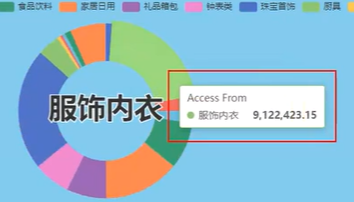
legend: {top: '5%',left: 'center'},
图例方位
legend: {top: 20,right: 10,width: 300,height: 100,orient: 'vertical'},
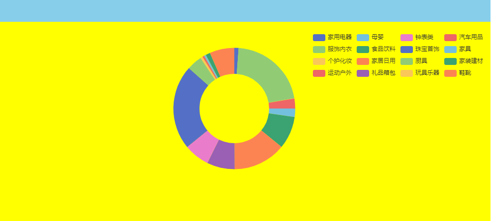 将图例放到右上角对齐
series: [{name: 'Access From',type: 'pie',radius: ['40%', '70%'],center: ['30%','60%'],label: {show: true,},labelLine: {show: true},data: arr}]
center决定主图位置坐标
label为子项标注,labelLine为引线(都默认开启)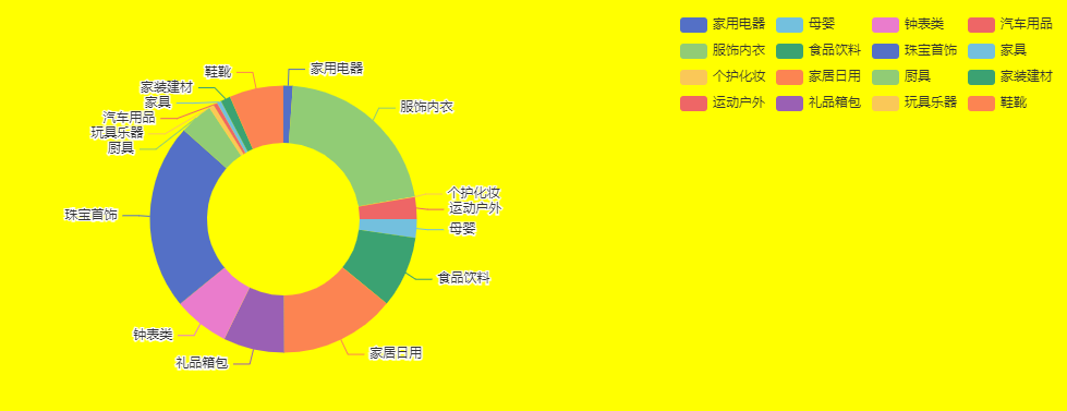
确定真正要展示的数据
需要一个单选按钮和下拉多选框进行数据的筛选
当这些数据变化时,需要根据新的数据去生成饼图
<template><el-radio-group v-model="selectLabel" size="large" @change="dataChange"><el-radio-button label="sale_" >销量</el-radio-button><el-radio-button label="_money" >销售额</el-radio-button></el-radio-group><el-select v-model="selectDay" placeholder="Select" @change="dataChange"><el-optionv-for="item in options":key="item.value":label="item.name":value="item.value"/></el-select><div id="pie" style="width: 100%;height:350px"></div></template>
这里可以用watch去监听,也可以使用element+本身就有的change事件
<script setup lang='ts'>import { defineProps, onMounted, reactive, toRefs, watch } from 'vue'import * as echarts from 'echarts'const props = defineProps<{data: {}[]}>()const state = reactive({selectLabel: '_money',selectDay: 'today',options: [{name: '今天',value: 'today'},{name: '昨天',value: 'yesterday'},{name: '前三天',value: 'three_days'},{name: '前七天',value: 'seven_days'},]})const {selectLabel,selectDay,options} = toRefs(state);const dataChange = () => {initPie();}const initPie = () => {let key ='';if(selectLabel.value === '_money'){key = selectDay.value + selectLabel.value}else{key = selectLabel.value + selectDay.value}const arr = props.data.map(item => ({ value: item[key], name: item.name }))var myChart = echarts.init(document.getElementById('pie') as HTMLDivElement)var option = {tooltip: {trigger: 'item'},legend: {top: 20,right: 10,width: 300,height: 100,orient: 'vertical'},series: [{name: 'Access From',type: 'pie',radius: ['40%', '70%'],center: ['30%','60%'],label: {show: true,},labelLine: {show: true},data: arr}]};option && myChart.setOption(option);}//等有效数据传入之后再生成echartswatch(() => props.data, () => {initPie();})</script>
将生成图标封装为函数,在里面去收集两个框的内容并拼接,随后生成图表
系统提示:不需要重复生成echarts元素
因为在initPie中,我们总是会生成myChart
因此进行优化,可以在外部先设变量myChart,每次生成前进行判断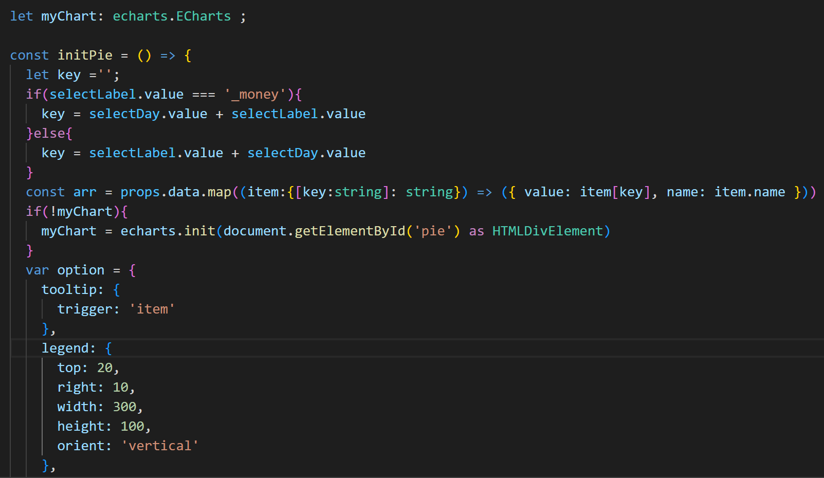
对map里的item也进行快速类型定义
地图
新建地图组件 MyMap.vue
引入echarts和地图数据
import * as echarts from 'echarts';import china from '../../../data/china.json'echarts.registerMap('china',china as any);
需要先对数据进行处理,也是对象数组
const props = defineProps<{ data: {}[] }>()let myChart: echarts.ECharts;watch(() => props.data, () => {const data = props.data.map((item: { [key: string]: string | number }) => ({ name: item.areaName, value: item.saleNum }))if (!myChart) {myChart = echarts.init(document.getElementById('map') as HTMLDivElement)}const options = {tooltip: {show: true,formatter: '{b0}<br/>销量: {c0}',backgroundColor: 'rgba(50,50,50,0.7)',textStyle: {color: '#fff'}},series: {type: 'map',map: 'china',emphasis: {label: {show: false},itemStyle: {areaColor: 'red'}},itemStyle: { borderColor: '#fff' },data},visualMap: {type: 'continuous',min: 0,max: 1000000,calculable: true,inRange:{color: ['#121122','rgba(3,4,5,0.4)','red']}}}options && myChart.setOption(options);})
配置理解
series: {type: 'map',map: 'china',emphasis: {label: {show: false},itemStyle: {areaColor: 'red'}},itemStyle: { borderColor: '#fff' },data},
areaColor为鼠标经过地图区域时显示的颜色
itemStyle: { borderColor: ‘#fff’ },为边框颜色
图例
tooltip: {show: true,formatter: '{b0}<br/>销量: {c0}',backgroundColor: 'rgba(50,50,50,0.7)',textStyle: {color: '#fff'}},
其中formatter可以格式化展示的内容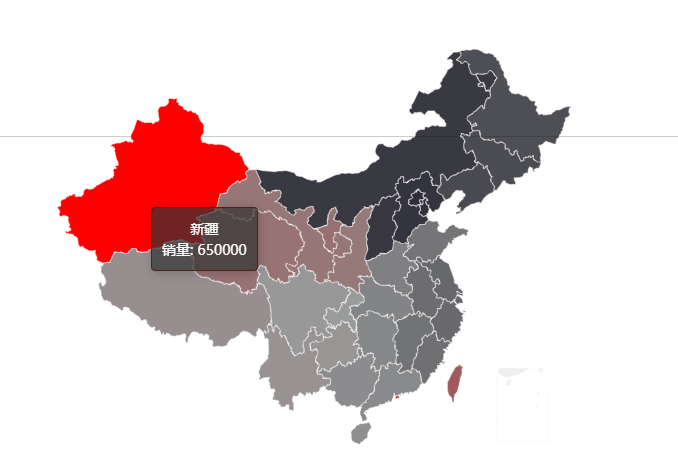
手柄渐变色
visualMap: {type: 'continuous',min: 0,max: 1000000,calculable: true,inRange:{color: ['#121122','rgba(3,4,5,0.4)','red']}}
inRange的数组可以传递很多颜色,分别是数据由少变多的过程,这里red是深的

若有收获,就点个赞吧
0 人点赞
