Rater 星级评分
使用指南
在 page.json 中引入组件
"usingComponents": {"w-scrollable-tab-view": "wuss-weapp/w-scrollable-tab-view/index",}
图片演示
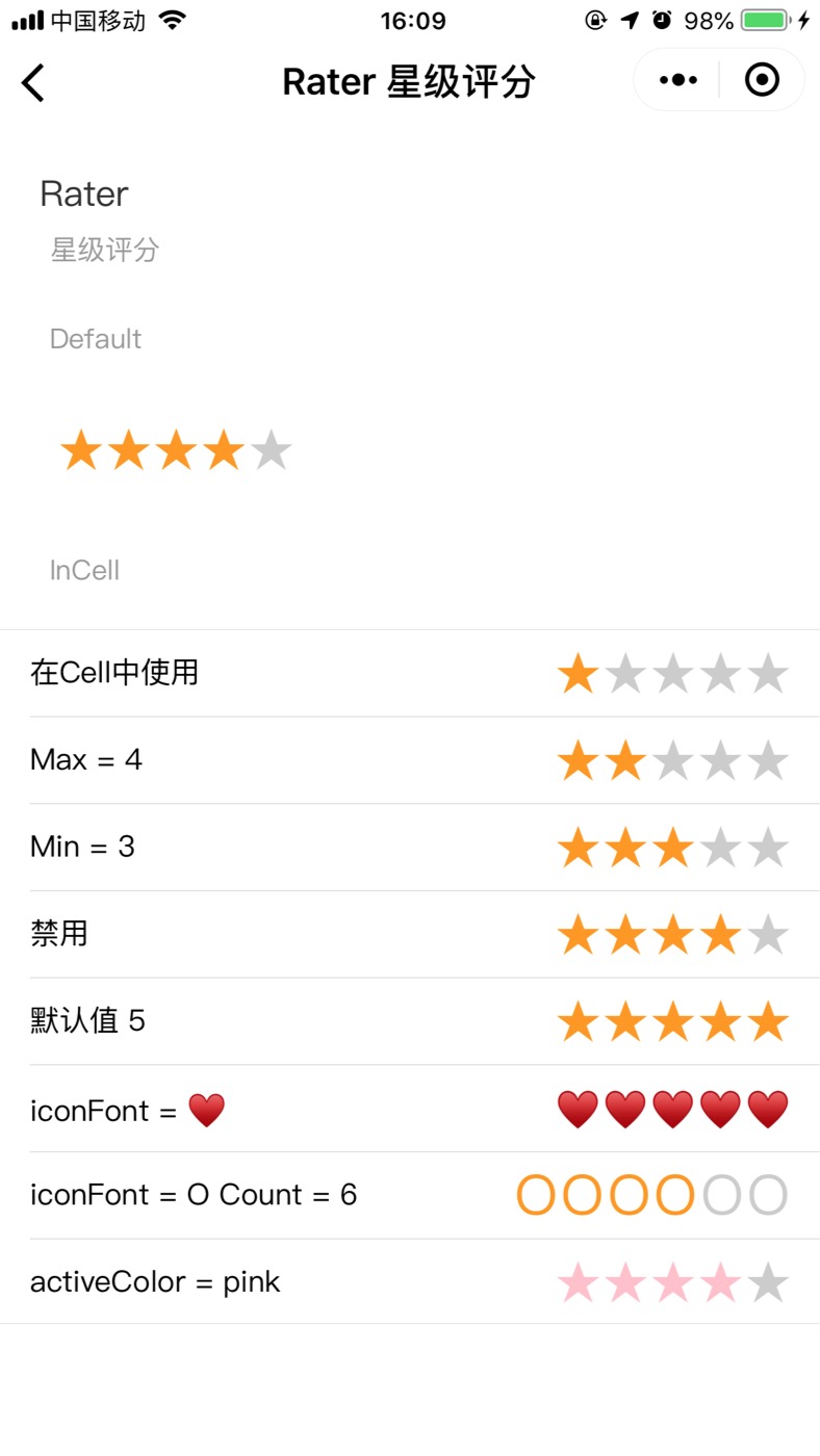
代码演示
<viewclass=""style="padding: 10px 0 10px 30px;display: flex; flex: 1;"hover-class="none"hover-stop-propagation="false"><w-rater/></view><w-pane desc="InCell" /><w-cell-group><w-cell label="在Cell中使用"><w-rater value="1" slot="content" /></w-cell><w-cell label="Max = 4"><w-rater value="2" max="4" slot="content" /></w-cell><w-cell label="Min = 3"><w-rater value="3" min="3" slot="content" /></w-cell><w-cell label="禁用"><w-rater value="4" disabled slot="content" /></w-cell><w-cell label="默认值 5"><w-rater value="5" slot="content" /></w-cell><w-cell label="iconFont = ♥"><w-ratervalue="3"icon-font="♥"font-size="18"slot="content"/></w-cell><w-cell label="iconFont = O Count = 6"><w-ratervalue="4"count="6"icon-font="O"font-size="28"slot="content"/></w-cell><w-cell label="activeColor = pink"><w-rater value="4" active-color="pink" slot="content" /></w-cell></w-cell-group>
-
-
API
Attribute 属性
| 属性 | 说明 | 类型 | 默认值 |
|---|---|---|---|
| count | iconfont的数量 | number | 5 |
| max | 最大可选值 | number | - |
| min | 最小可选值 | number | 0 |
| disabled | 禁用 | boolean | false |
| value | 当前选中值 | number | 0 |
| iconFont | 自定义字体图标 | string | ★ |
| activeColor | 激活的颜色 | string | - |
| margin | 每个iconfont之间的外边距 | number | - |
| fontSize | iconfont大小 | number | - |
Event 事件
| 事件名 | 说明 | 参数 |
|---|---|---|
| onChange | 点击时触发的回调 | e.detail.value |
Slot 插槽
| 名称 | 说明 |
|---|---|
| slot | 设置为options对应字段containerName的slot名字 |
Class 自定义类名
| 类名 | 说明 |
|---|---|
| wuss-class | 根节点样式类 |

若有收获,就点个赞吧
0 人点赞
