Input 输入框
使用指南
在 page.json 中引入组件
"usingComponents": {"w-input": "wuss-weapp/w-input/index",}
图片演示
代码演示
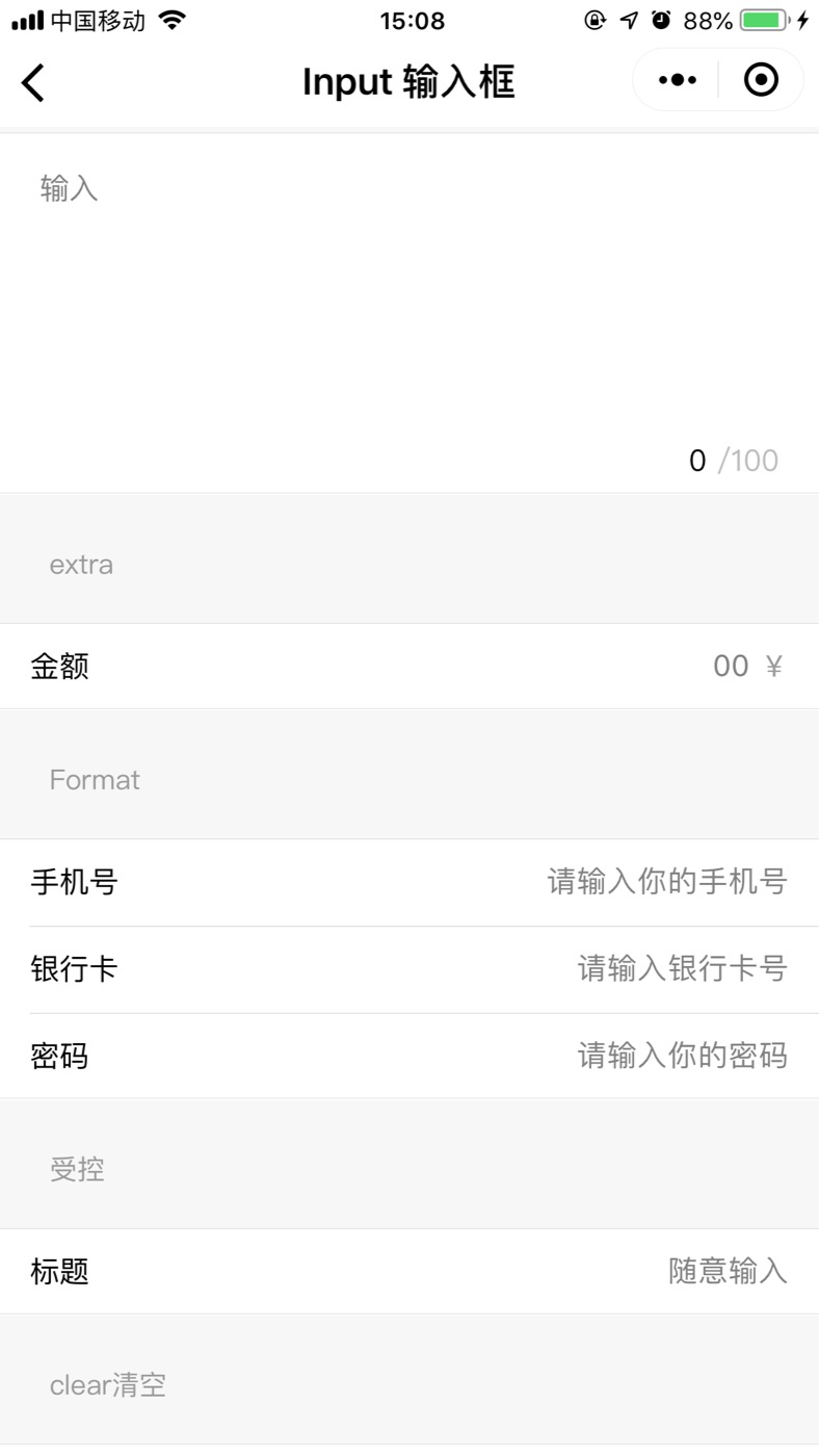
<!--pages/w-input/index.wxml--><w-pane title="Input" desc="输入框" /><w-pane desc="textarea" /><w-cell-group><w-inputclearcount="100"type="textarea"placeholder="输入"/></w-cell-group><w-pane desc="extra" /><w-cell-group><w-inputextra="¥"type="digit"bindextraClick="extraClick"placeholder="00"label="金额"/></w-cell-group><w-pane desc="Format" /><w-cell-group><w-inputtype="mobile"bindblur="iBlur"placeholder="请输入你的手机号"label="手机号"/><w-inputtype="bankCard"label="银行卡"placeholder="请输入银行卡号"/><w-inputtype="password"label="密码"placeholder="请输入你的密码"/></w-cell-group><w-pane desc="受控" /><w-cell-group><w-inputbindchange="iChange"label="标题"placeholder="随意输入"/></w-cell-group><w-pane desc="clear清空" /><w-cell-group><w-inputbindchange="iChange"placeholder="随意输入"label="标题"clear></w-input></w-cell-group><w-pane desc="readOnly and disabled" /><w-cell-group><w-inputreadOnlyvalue="我是值只读"placeholder="只读"label="标题"/><w-inputdisabledlabel="标题"placeholder="我被禁用了"/></w-cell-group><w-pane desc="focus" /><w-cell-group><w-inputtype="text"focus="{{ focus }}"bindfocus="iFocus"placeholder="click button below to foucus"label="标题"/></w-cell-group><w-button type="info" bind:onClick="handleFocus">click to Focus</w-button>
data: {focus: false,},handleFocus() {this.setData({focus: true,});},iChange(e) {console.log('我改变了', e.detail.value);},iFocus(e) {console.log('我获取到焦点了', e.detail.value);},iBlur(e) {console.log('我失去焦点了', e.detail.value);},extraClick(e) {console.log('注释被点击了', e);},
API
Attribute 属性
| 属性 | 说明 | 类型 | 默认值 |
|---|---|---|---|
| value | 默认绑定的值 | string | - |
| type | 输入框的类型,有 [mobile/bankCard/textarea] | string | - |
| disabled | 禁用 | boolean | false |
| maxlength | 最大输入长度 | number | - |
| placeholder | 占位符 | string | - |
| placeholderStyle | 占位符样式 | string | - |
| placeholderClass | 占位符类名 | string | - |
| cursor | 指定focus时的光标位置 | number | - |
| cursorSpacing | 指定光标与键盘的距离 | number/string | - |
| focus | 获取焦点 | boolean | false |
| selectionStart | 光标起始位置,自动聚集时有效,需与selection-end搭配使用 | number | - |
| selectionEnd | 光标结束位置,自动聚集时有效,需与selection-start搭配使用 | number | - |
| adjustPosition | 键盘弹起时,是否自动上推页面 | boolean | false |
| autoHeight | 自动高度 | boolean | false |
| fixed | 如果 textarea 是在一个 position:fixed 的区域,需要显示指定属性 fixed 为 true | boolean | false |
| label | 左侧标签名 | string | - |
| moneyKeyboardAlign | 输入框对齐方式 | string | - |
| labelSpan | 左侧占位宽度[1-5] | number | - |
| extra | 额外的内容 | string | - |
| clear | 是否显示清除按钮 | boolean | false |
| count | 类型为type=textarea时是否显示输入字符的长度 | number | - |
| readOnly | 只读模式 | boolean | false |
Event 事件
| 事件名 | 说明 | 参数 | | onChange | input改变时触发 | —— | | input | input改变时触发 | —— | | onFocus | 被激活触发 | —— | | onConfirm | 回车或点击键盘确定触发 | —— | | onBlur | 失去焦点触发 | —— | | extraClick | 副标题被点击 | —— | | lineChange | 输入框行数变化时调用,仅textarea支持 | —— | | clearClick | 清除按钮被点击时触发 | —— |
Slot 插槽
| 名称 | 说明 | | icon | 设置input左边图标 |
Class 自定义类名
| 类名 | 说明 |
|---|---|
| wuss-class | 无 |
| wuss-class-label | 无 |
| wuss-class-input-wrap | 无 |
| wuss-class-input | 无 |

若有收获,就点个赞吧
0 人点赞
