- plt.text(50,8,s = “均方根误差:”+str(rmse))matplotlib可视化篇—共享坐标轴
- 作图美化
- 参考)">plt.text()函数解析(参考)
plt.text(50,8,s = “均方根误差:”+str(rmse))matplotlib可视化篇—共享坐标轴
作图美化
# 作图美化%config InlineBackend.figure_format = 'retina'%matplotlib inlineimport seaborn as snssns.set(font= "Kaiti",style="ticks",font_scale=1.0)import matplotlibimport matplotlib.pyplot as pltmatplotlib.rcParams['axes.unicode_minus']=False # 解决坐标轴的负号显示问题
简单示例
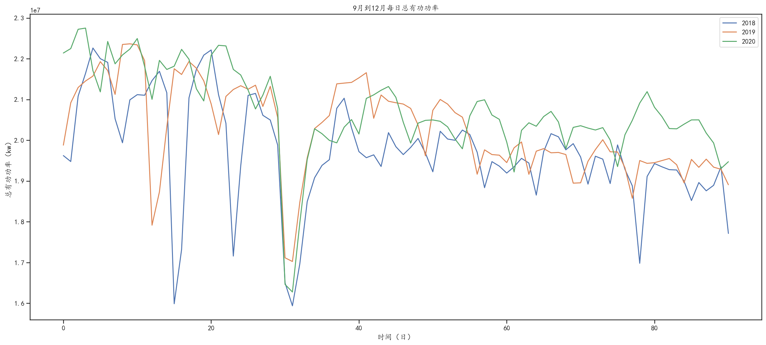
plt.figure(figsize=(21, 9))plt.plot(df.values[243:334, 0], label='2018')plt.plot(df.values[608:699, 0], label='2019')plt.plot(df.values[974:1065, 0], label='2020')plt.ylabel('总有功功率(kw)')plt.xlabel('时间(日)')plt.title('9月到12月每日总有功功率')plt.text(50,8,s = "均方根误差:"+str(rmse))plt.legend(loc="upper right")plt.show()
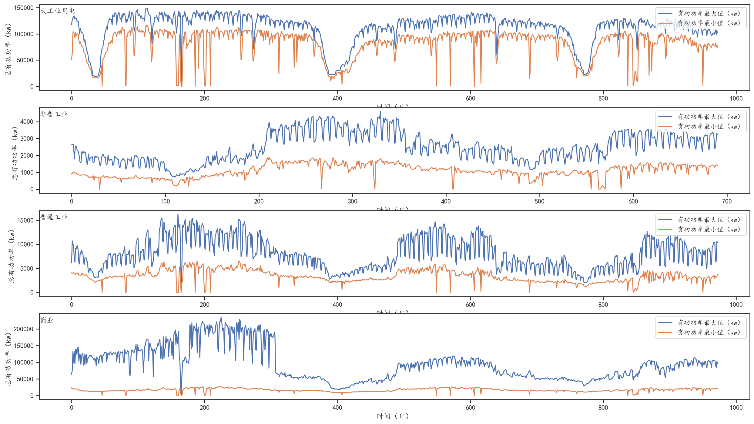
plt.figure(figsize=(15, 10))plt.subplot(3, 1, 1)plt.plot(df.values[243:334, 0])plt.title('2018每日总有功功率', y=0.75, loc='right')plt.subplot(3, 1, 2)plt.plot(df.values[608:699, 0])plt.title('2019每日总有功功率', y=0.75, loc='right')plt.subplot(3, 1, 3)plt.plot(df.values[974:1065, 0])plt.title('2020每日总有功功率', y=0.75, loc='right')plt.show()
plt.text()函数解析(参考)

若有收获,就点个赞吧
0 人点赞
