[TOC]
Node 生成模块化文件的小工具
**talk is cheap, show me the code
目的及用途
- 可以方便地自定义生成各种文件模板,可定制化,configs文件夹放入 .gitignore文件里
- 与脚手架不同,本地可以随便改,不会影响到团队成员开发
- 与vscode的代码片段不同,这种方法更快,而且,不用那么麻烦的格式
正常的vue快捷代码片段
"Print to vueTemplate": {"prefix": "vueTemplate","body": ["<template>"," <div>"," $3"," </div>","</template>","<script>","export default {"," name:'$1',"," props: {"," },"," data() {"," return {"," $2"," }"," },"," created() {"," },"," mounted() {"," },"," methods: {"," }","}","</script>","<style scoped lang='less'>","</style>"],"description": "vue 模板"},
源码
add-module.js
/*** description: 根据模板文件,自动生成模块文件以及目录* @author: taoxiaolin* @create-date: 2019-12-08 23:19:27* @version: V 1.0.0*/// ---------------------- 变量定义 ----------------------const fs = require('fs');const path = require('path');const tplRender = require('json-templater/string');/*var render = require('json-templater/string');render('{{xfoo}} {{say.what}}', { xfoo: 'yep', say: { what: 'yep' } });// yep yep注:{{xfoo}} 两侧不能出现空格 :(*/// 接收输入的模块名const moduleName = process.argv[2];const OUTPUT_PATH = path.join(__dirname, `../game/${moduleName}`);// console.log('out', OUTPUT_PATH, '__dir', __dirname);// 目录const dirMap = {'html': `../game/${moduleName}/`,'js': `../game/${moduleName}/js/`,'less': `../game/${moduleName}/css/`,'img': `../game/${moduleName}/img/`};// 文件最终落地结构以及文件名const fileTargetMap = {'html': `../game/${moduleName}/index.html`,'js': `../game/${moduleName}/js/index.js`,'less': `../game/${moduleName}/css/index.less`};// 引用的文件模板const tplMap = {'html': require('./template/html-tpl.js'),'js': require('./template/js-tpl.js'),'less': require('./template/less-tpl.js')};// 需要渲染变量的模块const needRenderTpl = {'html': {moduleName},'store': {moduleName}};// render示例,如果模板内不需要解析变量的话,就不需要这一步// const htmlStr = tplRender(htmlTpl, { moduleName });// 检测是否存在同名的 moduleif (fs.existsSync(OUTPUT_PATH)) {console.error(`${moduleName}已存在!`);return;}// ---------------------- 函数定义 ----------------------// 开始创建文件以及文件夹/*** @function: 异步方式* @description: 递归创建文件夹* @author: taoixaolin*/// function mkdirs(dirname, callback) {// fs.exists(dirname, (exists) => {// if (exists) {// callback();// } else {// mkdirs(path.dirname(dirname), () => {// fs.mkdir(dirname, callback);// });// }// });// }// 开始创建文件以及文件夹/*** @function: 同步* @description: 递归创建文件夹* @author: taoixaolin*/function mkdirsSync(dirname) {// console.log('mulu: ', mkdirsSync(path.dirname(dirname)));if (fs.existsSync(dirname)) {return true;} else {if (mkdirsSync(path.dirname(dirname))) {fs.mkdirSync(dirname);return true;}}}function createModule() {// 先建总目录,再建分目录mkdirsSync(OUTPUT_PATH);// 创建目录Object.keys(dirMap).forEach((key) => {const folder = path.join(__dirname, dirMap[key]);mkdirsSync(folder);});// 创建文件Object.keys(fileTargetMap).forEach((key) => {const outPath = path.join(__dirname, fileTargetMap[key]);let fileTarget = '';// 如果需要传参数,遍历一下,然后渲染if (needRenderTpl[key]) {const tempObj = {};Object.keys(needRenderTpl[key]).forEach((key2) => {tempObj[key2] = needRenderTpl[key][key2];});fileTarget = tplRender(tplMap[key], tempObj); // 带参数渲染} else {fileTarget = tplRender(tplMap[key], {}); // 不带参数}fs.writeFileSync(outPath, fileTarget); // 文件写入});}// ---------------------- 执行 ----------------------createModule();
del-module.js
const fs = require('fs');const path = require('path');// const rm = require('rimraf');const moduleName = process.argv[2];const DELETE_PATH = path.join(__dirname, `../game/${moduleName}`);function deleteAll(path) {let files = [];if (fs.existsSync(path)) {files = fs.readdirSync(path);files.forEach((file, index) => {const currentPath = path + '/' + file;if (fs.statSync(currentPath).isDirectory()) {deleteAll(currentPath); // 是目录则递归进入下一层} else {fs.unlinkSync(currentPath); // 是文件则删除文件}});fs.rmdirSync(path); // 文件完成之后,删除文件夹} else {throw new Error('目录不存在!');}}deleteAll(DELETE_PATH);
Template 文件
const htmlTpl =`<!DOCTYPE html><html lang="en"><head><meta charset="UTF-8"><meta http-equiv="X-UA-Compatible" content="IE=edge,chrome=1"><meta name="robots" content="index,follow"><meta content="telephone=no" name="format-detection"><meta name="viewport"content="width=device-width,initial-scale=1.0, minimum-scale=1.0, maximum-scale=1.0, user-scalable=no, viewport-fit=cover"><title>Document</title></head><body><div id="app" v-cloak>{{moduleName}}</div></body></html>`;module.exports = htmlTpl;
const indexJsTpl =`import '../css/index.less';import Vue from 'vue/dist/vue.min';// ...还可以加很多很多new Vue({el: '#app',data: {},mounted() {console.log('args', wb.args);},methods: {}});`;module.exports = indexJsTpl;
package.json 配置
"scripts": {"add": "node src/config/add-module.js","del": "node src/config/del-module.js",}"devDependencies": {"json-templater": "^1.2.0"},
CSS Grid 布局推荐
本次分享 grid 将围绕三个问题来展开,即什么是CSS Grid? 它能做什么?为什么要推荐它?;-)
什么是CSS Grid?
gird 即格子的意思,它可以将一个容器划分成 行和列,组成一个个的格子,因此,可以看做是一个二维的布局,而我们经常用的 flex 布局,则是利用“轴线”进行布局,需要对容器指定 flex-direction(默认 row), 所以,flex 是一种一维布局
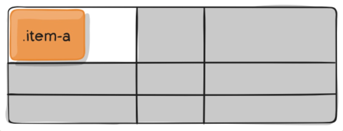
采用网格布局的区域,称为”容器”(container)。容器内部采用网格定位的子元素,称为”项目”(item)。
<div><div><p>1</p></div><div><p>2</p></div><div><p>3</p></div></div>
上面代码中,最外层的 <div> 就是容器,里面第一层的 <div> 是项目
注意:项目只能是容器的顶层子元素,不包含项目的子元素,比如上面代码的 <p> 元素就不是项目。Grid 布局只对项目生效。
两个重要的概念
单元格
行和列的交叉区域,称为”单元格”(cell)。
网格线
划分网格的线,称为”网格线”(grid line)。水平网格线划分出行,垂直网格线划分出列。
CSS Grid 能做什么?有哪些用处?
先介绍一些 grid 比较重要的属性吧
容器属性
display
display: grid 网格项目按行排列,网格项目占用整个容器的宽度。
display: inline-grid 网格项目按行排列, 网格项目宽度由自身宽度决定。
display:grid | inline-grid
grid-template-columns 和 grid-template-rows属性 (重要)
grid-template-columns: 属性定义每一列的列宽
grid-template-rows: 属性定义每一行的行高。
#container{display: grid;grid-template-columns: 100px 100px 100px;grid-template-rows: 100px 100px 100px;// grid-template-columns: 33.33% 33.33% 33.33%;// grid-template-rows: 33.33% 33.33% 33.33%;.item {font-size: 4em;text-align: center;border: 1px solid #e5e4e9;}}
repeat() 函数
这个函数用的非常多, repeat() 接受两个参数,第一个参数是重复的次数,第二个参数是所要重复的值。
// grid-template-rows: 100px 100px 100px;grid-template-rows: repeat(3, 100px);// repeat() 也可以重复某种模式,如下#container{display: grid;grid-template-columns: repeat(2, 100px 20px 80px);grid-template-rows: repeat(3, 100px);}
fr 关键字
为了方便表示比例关系,网格布局提供了fr关键字(fraction 的缩写,意为”片段”)
.container {display: grid;grid-template-columns: 150px 1fr 2fr;}
计算规则:
grid-template-columns: 100px 25% 1fr 2fr;
单位fr和其它长度单位混合使用时,fr的计算基于其它单位分配后的剩余空间。
本例中,1fr = (容器宽度 - 100px - 容器宽度的25%) / 3
minmax() 函数
minmax() 函数产生一个长度范围,表示长度就在这个范围之中。它接受两个参数,分别为最小值和最大值。
grid-template-columns: 1fr 1fr minmax(100px, 1fr);// minmax(100px, 1fr)表示列宽不小于100px,不大于1fr
auto-fill 和 auto-fit
单元格的大小是固定的,但是容器的大小不确定。如果希望每一行(或每一列)容纳尽可能多的单元格,这时可以使用auto-fill关键字表示自动填充。
grid-template-columns: repeat(12, minmax(250px, 1fr)); // 如果容器宽度不够,不会换行// 这样的话,如果行内剩下的空间不足以容纳另外一列时,已有的列能自动扩张占满一整行,不造成空间浪费。grid-template-columns: repeat(auto-fit, minmax(250px, 1fr));
auto-fill 倾向于容纳更多的列,所以如果在满足宽度限制的前提下还有空间能容纳新列,那么它会暗中创建一些列来填充当前行。即使创建出来的列没有任何内容,但实际上还是占据了行的空间。
auto-fit 倾向于使用最少列数占满当前行空间,浏览器先是和 auto-fill 一样,暗中创建一些列来填充多出来的行空间,然后坍缩(collapse)这些列以便腾出空间让其余列扩张。
column-gap, row-gap,grid-gap 属性
用来设置间距,row-gap: 行间距 column-gap: 列间距
grid-gap: <grid-row-gap> <grid-column-gap>; // 如果 grid-gap省略了第二个值,浏览器认为第二个值等于第一个值。
grid-template-areas 属性
网格布局允许指定”区域”(area),一个区域由单个或多个单元格组成。grid-template-areas属性用于定义区域。
grid-template-areas: "header header header""main main sidebar""footer footer footer";.header {grid-area: header;}...
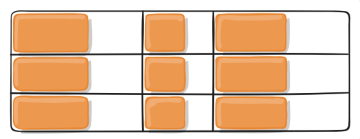
gird-auto-flow 属性
划分网格以后,容器的子元素会按照顺序,自动放置在每一个网格。默认的放置顺序是”先行后列”,即先填满第一行,再开始放入第二行,即下图数字的顺序。
gird-auto-flow: row(默认) | column; // 子元素排列方式grid-auto-flow: row dense; // 表示"先行后列",并且尽可能紧密填满,尽量不出现空格。
justify-items 属性,align-items 属性,place-items 属性
justify-items 属性设置 单元格内容 的水平位置(左中右)align-items 属性设置 单元格内容 的垂直位置(上中下)。
.container {justify-items: start | end | center | stretch;align-items: start | end | center | stretch;}/*start:对齐单元格的起始边缘。end:对齐单元格的结束边缘。center:单元格内部居中。stretch:拉伸,占满单元格的整个宽度(默认值)。*/
justify-content 属性,align-content 属性,place-content 属性
justify-content属性是 整个内容区域 在容器里面的水平位置(左中右),
align-content属性是 整个内容区域 的垂直位置(上中下)。
.container {justify-content: start | end | center | stretch | space-around | space-between | space-evenly;align-content: start | end | center | stretch | space-around | space-between | space-evenly;}

容器所有属性总览
displaygrid-template-columnsgrid-template-rowsgrid-template-areasgrid-templategrid-column-gapgrid-row-gapgrid-gapjustify-itemsalign-itemsjustify-contentalign-contentgrid-auto-columnsgrid-auto-rowsgrid-auto-flowgrid
项目属性
grid-row-start, grid-row-end, grid-column-start, grid-column-end 属性
用网格线编号定位项目
grid-row-start: 2;grid-row-end: 3;grid-column-start: 2;grid-column-end: 3;
grid-row和grid-column属性
合并写法,减少代码量
.item-1 {grid-column-start: 1;grid-column-end: 3;grid-row-start: 1;grid-row-end: 2;}/* 等同于 */.item-1 {grid-column: 1 / 3;grid-row: 1 / 2;}/* 等同于 */.item-1 {background: #b03532;grid-column: 1 / span 2;grid-row: 1 / span 2;}// grid-area 总体简写.item {grid-area: <row-start> / <column-start> / <row-end> / <column-end>;}
justify-self 属性,align-self 属性,place-self 属性
justify-self属性设置单元格内容的水平位置(左中右),跟justify-items属性的用法完全一致,但只作用于单个项目。
align-self属性设置单元格内容的垂直位置(上中下),跟align-items属性的用法完全一致,也是只作用于单个项目。
.item {justify-self: start | end | center | stretch;align-self: start | end | center | stretch;}/*start:对齐单元格的起始边缘。end:对齐单元格的结束边缘。center:单元格内部居中。stretch:拉伸,占满单元格的整个宽度(默认值)。*/
项目所有属性总览
grid-column-startgrid-column-endgrid-row-startgrid-row-endgrid-columngrid-rowgrid-areajustify-selfalign-self
常见布局
两栏布局
// 两栏式布局只需要一行代码// 左列定宽,右列自适应.wrapper {display: grid;grid-template-columns: 100px auto;// grid-template-columns: 100px 1fr;}// 右列定宽,左列自适应.wrapper {display: grid;grid-template-columns: auto 100px;// grid-template-columns: 1fr 100px;}// 左/右不定宽,另一侧自适应.wrapper {display: grid;grid-template-columns: 1fr auto;// grid-template-columns: auto 1fr;}
三栏布局
左列中列定宽,右列自适应
grid-template-columns: 100px 200px auto;
-
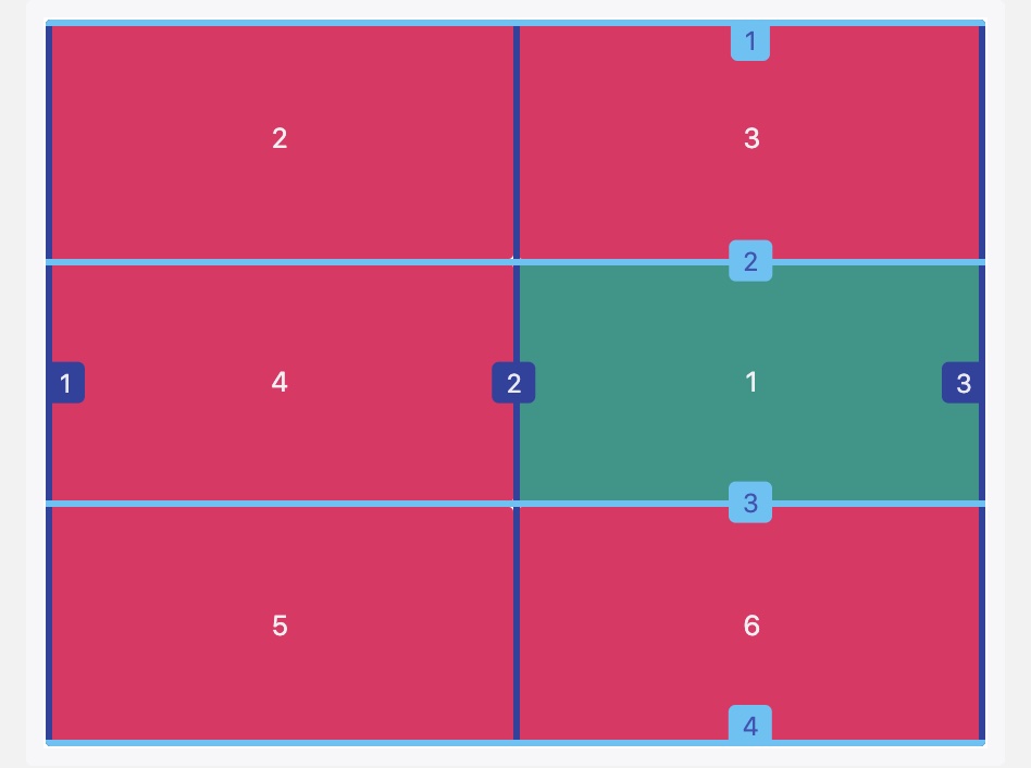
圣杯布局
```less
parent {
height: 600px; display: grid; grid-template-columns: 200px auto 200px; grid-template-rows: 60px auto 60px; grid-template-areas:
"header header header""leftside main rightside""footer footer footer";
}
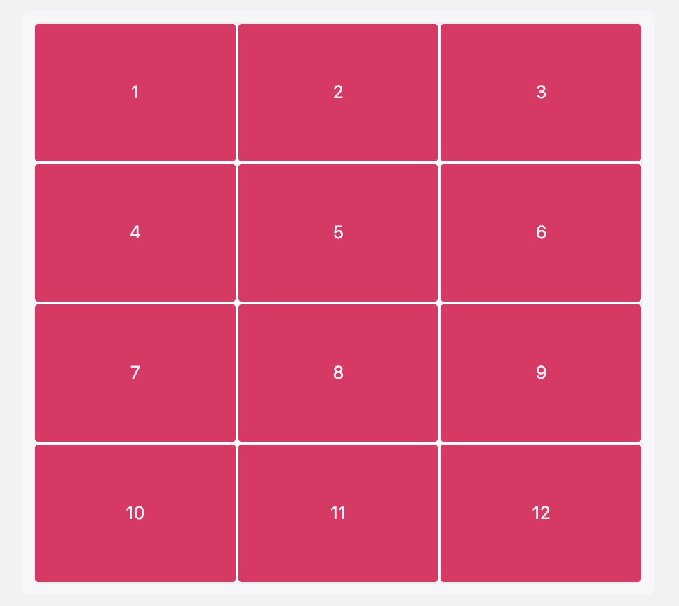
<a name="XNcmx"></a>#### 多列布局<a name="WXQzG"></a>##### 九宫格```less#parent {width: 600px;height: 600px;display: grid;grid-template-columns: repeat(3, 1fr);grid-template-rows: repeat(3, 1fr);}
栅格系统
// 12栏布局grid-template-columns: repeat(12, 1fr);// 24栏布局grid-template-columns: repeat(24, 1fr);
为什么推荐使用 CSS Grid?
与flex的对比
演示代码
Flex
<div class="container-flex"><div class="box box1"><div class="item">1</div></div><div class="box box2"><div class="item">1</div><div class="item">2</div></div><div class="box box3"><div class="item">1</div><div class="item">2</div><div class="item">3</div></div><div class="box box4"><div class="column"><div class="item">1</div><div class="item">2</div></div><div class="column"><div class="item">3</div><div class="item">4</div></div></div><div class="box box5"><div class="column"><div class="item">1</div><div class="item">2</div></div><div class="column"><div class="item">3</div></div><div class="column"><div class="item">4</div><div class="item">5</div></div></div><div class="box box6"><div class="column"><div class="item">1</div><div class="item">2</div><div class="item">3</div></div><div class="column"><div class="item">4</div><div class="item">5</div><div class="item">6</div></div></div><div class="box box7"><div class="item">1</div><div class="item">2</div><div class="item">3</div><div class="item">4</div><div class="item">5</div><div class="item">6</div><div class="item">7</div></div><div class="box box8"><div class="item">1</div><div class="item">2</div><div class="item">3</div><div class="item">4</div><div class="item">5</div><div class="item">6</div><div class="item">7</div><div class="item">8</div></div><div class="box box9"><div class="item">1</div><div class="item">2</div><div class="item">3</div><div class="item">4</div><div class="item">5</div><div class="item">6</div><div class="item">7</div><div class="item">8</div><div class="item">9</div></div></div>
[v-cloak] {display: none;}.container-common {width: 640px;height: 640px;box-sizing: border-box;padding: 5px;background-color: #292929;}.container-flex {.container-common;display: flex;flex-wrap: wrap;.box {width: 180px;height: 180px;margin: 15px;background-color: #E7E7E7;box-sizing: border-box;display: flex;.item {width: 40px;height: 40px;border-radius: 50%;background-color: #292929;margin: 10px;color: white;display: flex;justify-content: center;align-items: center;}}.box1 {justify-content: center;align-items: center;}.box2 {justify-content: space-between;.item:nth-child(2) {align-self: flex-end;}}.box3 {.item:nth-child(2) {align-self: center;}.item:nth-child(3) {align-self: flex-end;}}.box4 {flex-wrap: wrap;justify-content: space-between;.column {display: flex;flex-direction: column;justify-content: space-between;}}.box5 {flex-wrap: wrap;justify-content: space-between;.column {display: flex;flex-direction: column;justify-content: space-between;}.column:nth-child(2) {justify-content: center;}}.box6 {flex-wrap: wrap;align-content: space-between;justify-content: space-between;.column {display: flex;flex-direction: column;}}.box7 {flex-wrap: wrap;}.box8 {flex-wrap: wrap;}.box9 {flex-wrap: wrap;}}
Grid
<div class="container-grid"><div class="box box1"><div class="item">1</div></div><div class="box box2"><div class="item">1</div><div class="item">2</div></div><div class="box box3"><div class="item">1</div><div class="item">2</div><div class="item">3</div></div><div class="box box4"><div class="item">1</div><div class="item">2</div><div class="item">3</div><div class="item">4</div></div><div class="box box5"><div class="item">1</div><div class="item">2</div><div class="item">3</div><div class="item">4</div><div class="item">5</div></div><div class="box box6"><div class="item">1</div><div class="item">2</div><div class="item">3</div><div class="item">4</div><div class="item">5</div><div class="item">6</div></div><div class="box box7"><div class="item">1</div><div class="item">2</div><div class="item">3</div><div class="item">4</div><div class="item">5</div><div class="item">6</div><div class="item">7</div></div><div class="box box8"><div class="item">1</div><div class="item">2</div><div class="item">3</div><div class="item">4</div><div class="item">5</div><div class="item">6</div><div class="item">7</div><div class="item">8</div></div><div class="box box9"><div class="item">1</div><div class="item">2</div><div class="item">3</div><div class="item">4</div><div class="item">5</div><div class="item">6</div><div class="item">7</div><div class="item">8</div><div class="item">9</div></div></div>
[v-cloak] {display: none;}.container-common {width: 640px;height: 640px;box-sizing: border-box;padding: 5px;background-color: #292929;}.container-grid {.container-common;display: grid;grid-template-rows: repeat(3, 1fr);grid-template-columns: repeat(3, 1fr);.box {width: 180px;height: 180px;margin: 15px;background-color: #E7E7E7;box-sizing: border-box;display: grid;grid-template-rows: repeat(3, 1fr);grid-template-columns: repeat(3, 1fr);grid-template-areas: 'a b c''d e f''g h i';.item {width: 40px;height: 40px;border-radius: 50%;background-color: #292929;margin: 10px;color: white;display: flex;justify-content: center;align-items: center;}}.box1 {.item {grid-area: e;}}.box2 {.item:nth-child(2) {grid-area: c;}}.box3 {.item:nth-child(2) {grid-area: e;}.item:nth-child(3) {grid-area: i;}}.box4 {}.box5 {}.box6 {.item:nth-child(1) {grid-area: a;}.item:nth-child(2) {grid-area: c;}.item:nth-child(3) {grid-area: g;}.item:nth-child(4) {grid-area: d;}.item:nth-child(5) {grid-area: f;}.item:nth-child(6) {grid-area: i;}}.box7 {}.box8 {}.box9 {}}
需要注意的地方
浏览器对 css grid的适配情况
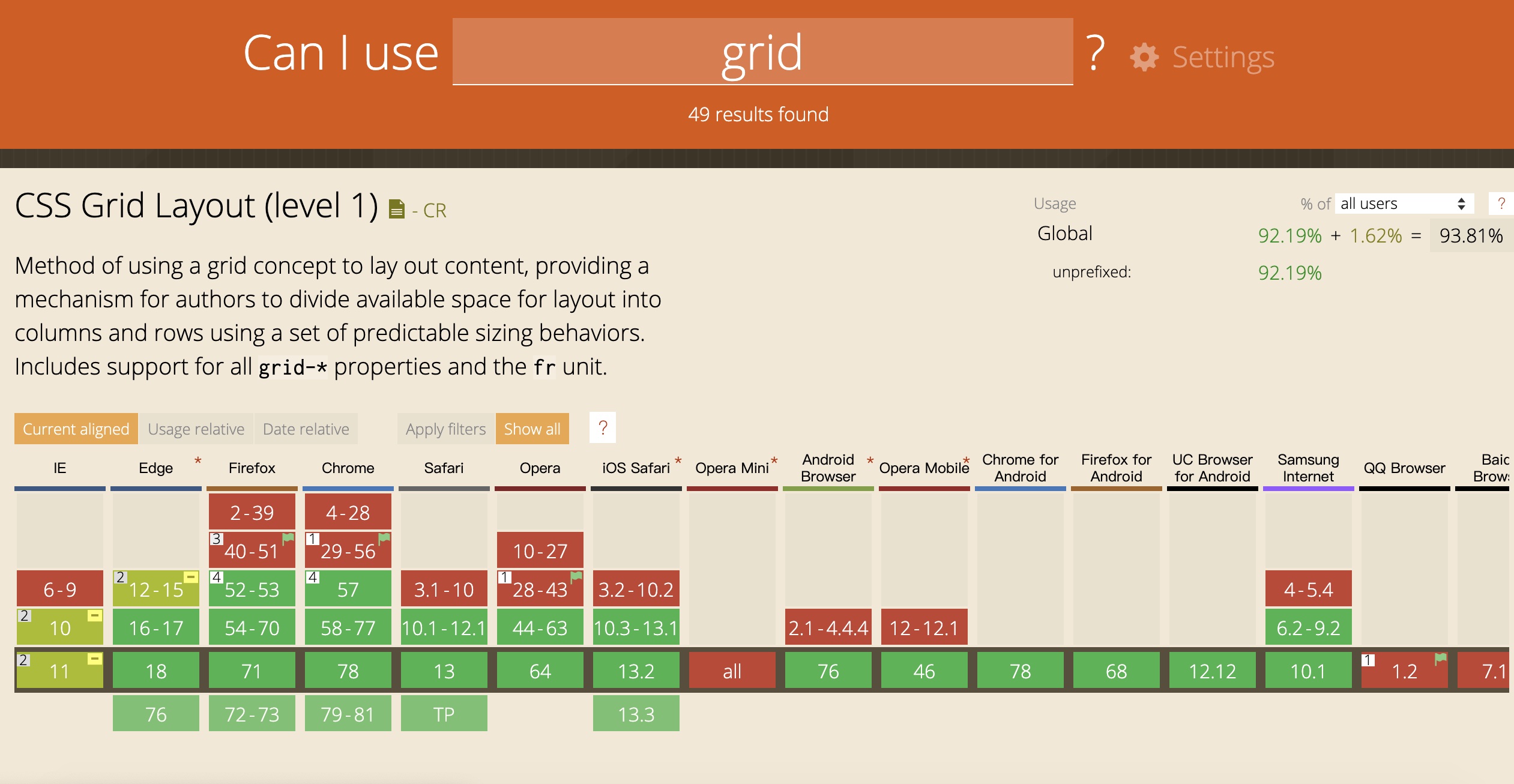
(grid)
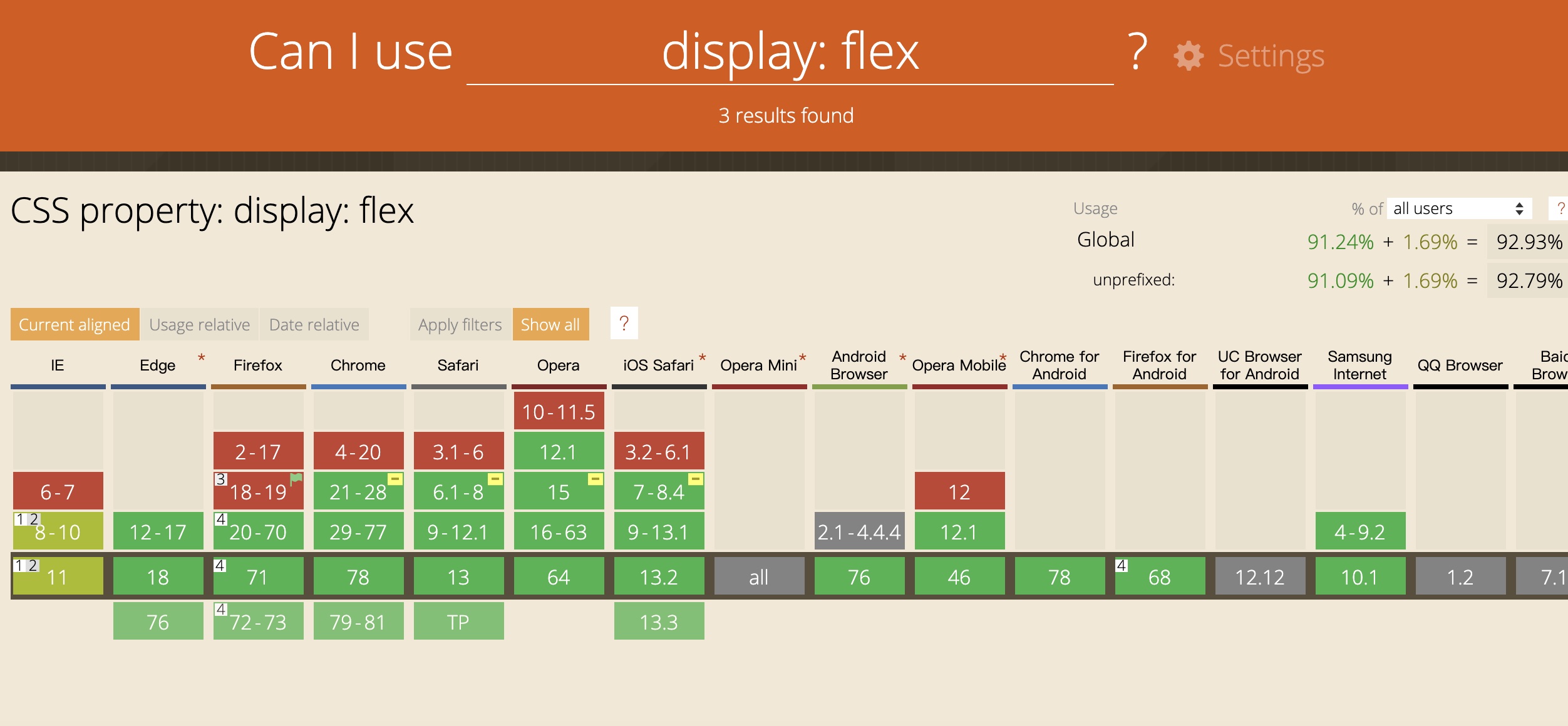 (flex)
学习链接

若有收获,就点个赞吧
0 人点赞
