tags: [css]
- 描述
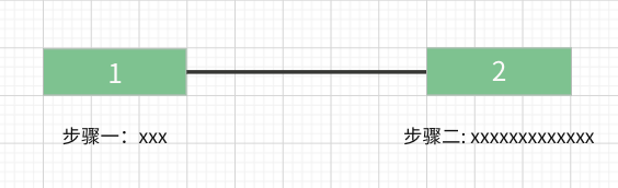
如上图所示,实现一个步骤线的布局(不止两个步骤),表示步骤的盒子长度固定不变,无论描述文字的多少,上方表示步骤的盒子必须与下方的描述文字的中心线对齐。
- 实现
<div class="step"><div class="step-item"><div class="num">1</div><div class="desc-wrapper"><div class="desc">步骤一</div></div></div><div class="step-item"><div class="num">2</div><div class="desc-wrapper"><div class="desc">步骤二描述描述描述</div></div></div></div>
- 方式一
将 desc-wrapper 放置在 .num div 的中心点位置,然后将 desc 向左平移文字长度的 50%;
注: 平移时需要将 desc 脱离文档流


:root {--height: 20px;}.step {display: flex;}.num {border: 1px solid;height: var(--height);text-align: center;line-height: var(--height);width: 72px;}.step-item {position: relative;display: flex;flex-direction: column;align-items: center;}.step-item:not(:last-child)::after {position: absolute;top: calc((var(--height) + 1px * 2 - 1px) / 2);left: 100%;content: '';width: 120px;height: 1px;background: #000;display: block;}.step-item:not(:last-child) {margin-right: 120px;}.desc {position: absolute;white-space: nowrap;transform: translateX(-50%);}
- 方式二
使用 flex 或者 grid 布局设置 desc-wrapper 子元素居中
:root {--height: 20px;}.step {display: flex;}.num {border: 1px solid;height: var(--height);text-align: center;line-height: var(--height)}.step-item {width: 72px;position: relative;}.step-item:not(:last-child)::after {position: absolute;top: calc((var(--height) + 1px * 2 - 1px) / 2);left: 100%;content: '';width: 120px;height: 1px;background: #000;display: block;}.step-item:not(:last-child) {margin-right: 120px;}.desc-wrapper {display: flex; // 或 gridjustify-content: center;}.desc {white-space: nowrap;}
效果


若有收获,就点个赞吧
0 人点赞
