前言
本文是总结《CSS揭秘》书中教述的一些CSS技巧,并呈现了对应的代码和效果,和一些本人对CSS理解补充,非常感谢作者 Lea Verou 编写此书,受益匪浅,一起体会CSS的乐趣
注意
本文不考虑兼容问题,只适用于大部分浏览器和情况,如需考虑兼容,或自行找回退方案,或看《CSS揭秘》本书寻找回退方案
编码追求
- DRY
- Don`t Repeat Yourself,不应该重复你做的事情
- 反义即WET(Write Everything Twice)
- 可维护
- 灵活性
- 轻量级
- 尽可能符合标准
1. CSS编码技巧
可维护性最大的要素:尽量减少改动编辑的地方
当某些值依赖时, 应该把它们的相互关系用代码表达出来
- 根据字号大小改变元素其他属性大小
- 用hsl()改变颜色 ```html
[点击查看【codepen】](https://codepen.io/hegangshi/embed/KKMEVrZ)<a name="FE7Dp"></a>## 代码易维护 vs. 代码量少有时候, **代码易维护和代码量少不可兼得** :- 为元素添加10px宽的边框, **但左侧不加边框**```css/* no good *//* 改动边框长需要改动3处*/border-width: 10px 10px 10px 0;/* good *//* 改动1处,且可读性更高 */border-width: 10px;border-left-width: 0;
currentColor
CSS中有史以来的第一个变量,一直被解析为 color
- 自动与文本颜色保持一致
currentColor本身就是很多CSS颜色属性的初始值,比如border-color、outline-color、text-shadow、box-shadow继承
inherit普通元素继承父元素,伪元素继承宿主元素
字体设定为与页面的其他部分相同
input, select, button{ font: inherit; }a { color: inherit; }
伪元素的背景色继承
.inherit::before {background: inherit; /* important*/border: inherit;}
相信你的眼睛,而不是数字(对于设计而言)
垂直居中,物体从几何中心点再稍微向上挪一点,才能取得理想的视觉效果
- 圆形和矩形相比,会看起来小一点
关于响应式设计
请参考bootstrap的媒体查询尺寸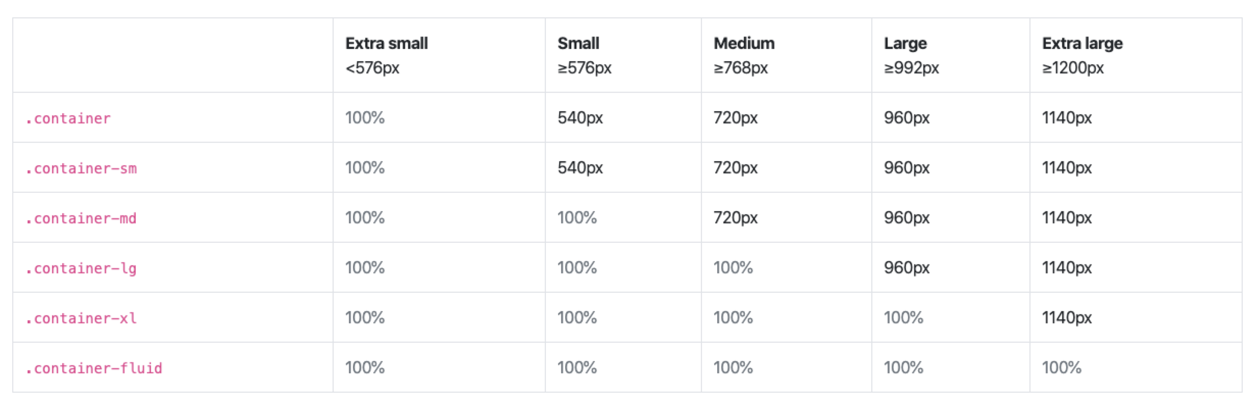
一些建议
- 尽量使用百分比长度来取代固定尺寸。实在做不到,也应该尝试与视图相关单位
vw、vh、vmin、vmax - 需要在较大分辨率下得到固定尺寸,使用
max-width而不是width - 不要忘了为替换元素(例如
img、object、video、iframe等)设置一个max-width,值为100% - 行列式布局时,让视口的宽度来决定列的数量。
Flexbox加上常规的文本折行行为可以实现。 - 使用多列文本时,指定
column-width列宽,而不是指定column-count列数,在较小的屏幕上自动显示为单列布局
合理使用简写
合理使用简写是一种良好的防卫性编码方式,可以抵御未来的风险
- 这两行CSS代码不等价 ```css background: rebeccapurple;
background-color: rebeccapurple;
前者是简写,确保得到纯色背景;但后者有可能是其他效果,因为可能会有 `background-image`展开式写法并不会清空所有相关的其他属性,从而可能会干扰你想要达到的效果。展开式写法是为了 **明确覆盖某个具体的展开式属性**- 展开式属性与简写属性的配合使用**如果只为某个属性提供一个值,那它就会扩散并应用到列表中的每一项**```css/* no good */background: url("/3.png") no-repeat top right / 2em 2em,url("/23.png") no-repeat bottom right / 2em 2em,url("/23.png") no-repeat bottom right / 2em 2em;/* good */background: url("3.png") top right,url("3.png") bottom right,url("3.png") bottom right;background-size: 2em 2em;background-repeat: no-repeat;
预处理器
优点:大型项目中代码更加灵活
缺点:
- CSS的 文件体积 和 复杂度 可能会失控
- 调试难度会增加
- 打包时间增加
- 团队的学习时间增加
- 抽象泄露法则, 它们有它们自己的bug
颜色
hsla()
H是色度,取值在0度~360度之间,0度是红色,120度是绿色,240度是蓝色。360度也是红色。
S是饱和度,是色彩的纯度,是一个百分比的值,取值在0%~100%,0%饱和度最低,100%饱和度最高
L是亮度,也是一个百分比值,取值在0%~100%,0%最暗,100%最亮。
A是不透明度,取值在0.0~1.0,0.0完全透明,1.0完全不透明
HSL是一种圆柱坐标系,其坐标系图如下: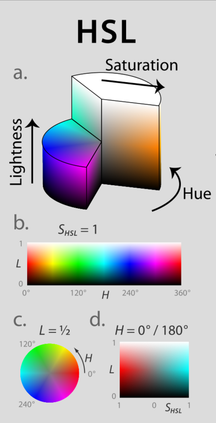
2. 背景与边框
多重边框
box-shadow
- 支持逗号语法,可以创建任意数量的投影,第一个在最上层
- 可以实现多重边框
- 受border-radius影响
和border区别,不占空间(可以用外边距或内边距(inset)来模拟),不会响应事件(可以用inset)
box-shadow: 0 0 0 10px #655,0 0 0 20px deeppink,0 2px 5px 25px rgba(0,0,0,.6);
outline
描边样式十分灵活
可以实现虚线,
box-shadow实现边框不行可以通过
outline-offset,控制和元素边缘之间的间距,接受负值border: 20px solid brown;outline: 2px dashed white;outline-offset: -10px;
只适用于双层背景,多层背景要使用box-shadow
- outline不一定会贴合border-radius,CSS工作组认为是一个bug,未来有可能会改
背景定位
background-clip
指定 背景 绘制区域
- border-box (default)
- padding-box
- content-box
background-origin
指定 背景图片 绘制区域
- border-box
- padding-box (default)
- content-box
点击查看【codepen】padding: 20px;border: 20px solid rgba(0,0,0,.2);background: yellowgreen url(https://www.baidu.com/img/flexible/logo/pc/result.png) no-repeat;background-origin: content-box;background-clip: padding-box;
background-position扩展语法
指定 背景图片 距离任意角的偏移量 ```css background-position: right 20px bottom 10px;
/ calc()方案 / background-position: calc(100% - 20px) calc(100% - 10px);
<a name="OvWJ8"></a>## 边框内圆角box-shadow的扩展距离 = border-radius的一半```cssborder-radius: .8em;padding: 1em;box-shadow: 0 0 0 .4em #655;outline: .6em solid #655;
线性渐变、条纹背景
// 普通渐变.stripe{width: 200px;height: 200px;border: 2px dashed;background: linear-gradient(#fb3,#58a);}// 控制背景大小.stripe2{background: linear-gradient(#fb3 50%,#58a 50%);background-size: 100% 100px;}// 控制背景大小,不重复.stripe3{background: linear-gradient(#fb3 50%,#58a 50%) no-repeat;background-size: 100% 100px;}// 控制背景渐变颜色位置.stripe4{background: linear-gradient(#fb3 0, #fb3 20%, #58a 0, #58a 50%,transparent 0,transparent 100%);}// 斜向条纹 repeating-linear-gradient.sliant-stripe{background:repeating-linear-gradient(60deg,#fb3,#fb3 15px,#58a 0,#58a 30px);}// 同色系条纹.similar-stripe{background: #58a;background-image: repeating-linear-gradient(30deg,hsla(0,0%,100%,.1),hsla(0,0%,100%,.1) 10px,transparent 0,transparent 30px);}
.dot-stripe{ background: tan; background-image: radial-gradient(#655 30%,transparent 0),radial-gradient(#655 30%,transparent 0); background-size: 33px 33px; background-position: 0 0, 15px 15px; }
.checker { background:#eee; background-image:linear-gradient(45deg,#bbb 25%,transparent 0),linear-gradient(45deg,transparent 75%,#bbb 0),linear-gradient(45deg,#bbb 25%,transparent 0),linear-gradient(45deg,transparent 75%,#bbb 0); background-position: 0 0,15px 15px,15px 15px,30px 30px; background-size: 30px 30px; }
[点击查看【codepen】](https://codepen.io/hegangshi/embed/vYKPbjg)- 还可以做弧形切角<a name="NADyU"></a>## 伪随机背景条纹- 背景贴片的尺寸实际上是所有background-size的最小公倍数- 蝉原则:通过质数来增加随机真实性- background-size尽量选质数```css.random {width: 1000px;height: 100px;background: hsla(20, 40%, 90%);background: linear-gradient(90deg,#fb3 11px,transparent 0),linear-gradient(90deg,#ab4 23px,transparent 0),linear-gradient(90deg,#fab4 41px,transparent 0);background-size: 41px 100%,61px 100%,83px 100%;}
点击查看【codepen】
蝉原则可以用于涉及有规律重复的情况:
- 伪随机旋转效果
- 生成随机时长的循环动画
- …
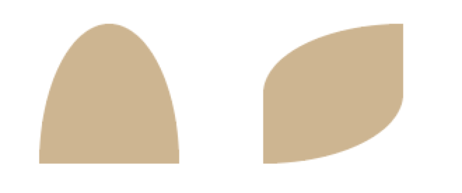
3. 图形
border-radius
- 可以设置8个值,前四个是水平半径,后四个是垂直半径,以
/分开 - 省略不写则用前面的值,垂直半径全不写则和水平半径相同 ```css // 两者等效 border-rabius: 1px / 20px 5px; border-radius: 1px 1px 1px 1px / 20px 5px 20px 5px;
// 半椭圆 border-radius: 50% / 100% 100% 0 0 border-radius: 100% 0 100% 0 / 50%;
<a name="jlKSp"></a>## 图像边框border-image效果不够好```cssbackground: linear-gradient(white, white) padding-box,url(xxx.jpg) border-box0 0 /cover;
蚂蚁行军
.marching-ants{width: 100px;height: 200px;padding: 1em;border: 1px solid transparent;background: linear-gradient(white,white) padding-box,repeating-linear-gradient(-45deg,black 0,black 25%,white 0, white 50%) 0 / .6em .6em;animation: ants 12s linear infinite;}@keyframes ants{to {background-position:100%;}}
图形变换:平行四边形
skew()
嵌套元素方案
.button {width: 100px;height:50px;line-height: 50px;text-align: center;background: tan;transform: skewX(-45deg);}.button > div {transform: skewX(45deg);}
✨伪元素方案
- 伪元素作为背景,进行变换
- 适用于其他任何线性样式,而不想影响内容时
图形变换:菱形图片
clip-path
使用裁剪方式创建元素的可显示区域。区域内的部分显示,区域外的隐藏。
clip-path: ploygon(50% 0,100% 50%,50% 100%,0 50%);
- 此方法可以实现多边形裁切
图形变换:矩形
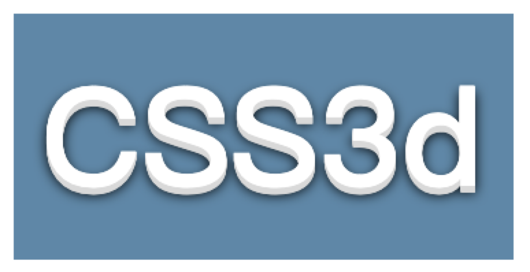
transform: scaleY(1.3) perspective(.5em) rotatex(5deg);transform-origin: bottom;
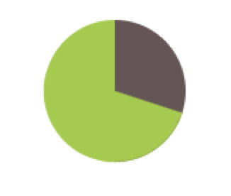
饼状图
animation
```css // 核心 animation: spin 3s linear infinite; animation: bg 6s step-end infinite;
@keyframe spin { to { transform: rotate(.5turn) } }
@keyframe bg { 50% { background: #655; } }
<a name="1T3XM"></a>### animation-delay值可以为负,实际效果就是 **动画跳过指定时间而从中间开始播放了**<a name="oIOXb"></a>### animation-play-statepaused 暂停```html<div class="pie" style="animation-delay:-30s">50</div><style>.pie {float: left;position: relative;width: 100px;margin: 40px;line-height: 100px;border-radius: 50%;background: yellowgreen;background-image: linear-gradient(to right, transparent 50%, #655 0);color: transparent;text-align: center;}@keyframes spin {to {transform: rotate(0.5turn);}}@keyframes bg {50% {background: #655;}}.pie::before {content: "";position: absolute;top: 0;left: 50%;width: 50%;height: 100%;border-radius: 0 100% 100% 0 / 50%;background-color: inherit;transform-origin: left;animation: spin 50s linear infinite, bg 100s step-end infinite;animation-play-state: paused;animation-delay: inherit;}</style>
3. 视觉效果
投影
box-shadow
支持逗号多值创造多层投影,先写的在上层
// 单侧投影box-shadow: 2px 5px 4px -4px rgba(0,0,0,.5);
绘制过程:
- 画出一个rgba(0,0,0,.5)的矩形
- 把它向右移2px,向下移3px
- 使用高斯模糊,进行4px的模糊处理, 阴影色和纯透明色之间的颜色过渡长度近似于模糊半径的两倍 (这里是8px)
- 缩小投影4px,即宽度和高度各减小4px
- 原始元素的交集部分会被切除掉, 没有任何投影绘制在元素的下层
问题:
- box-shadow不能给伪元素或者透明、半透明元素加阴影,可以使用drop-shadow
filter: drop-shadow()
drop-shadow的参数基本和box-shadow差不多,但不包括扩张半径,不包括inset关键字,也不支持逗号分割的多层投影语法。
// 两者等价box-shadow: 2px 2px 10px rgba(0,0,0,.5);filter: drop-shadow(2px 2px 10px rgba(0,0,0,.5));
问题:
- 任何非透明的部分都会被一视同仁地打上投影,包括文本
染色效果
解决图片颜色变化,需要设计出多张图片
其他方案:
- 透明层覆盖图片
- javaScript置入
✨contrast()
调整图像的对比度。值是0%的话,图像会全黑。值是100%,图像不变。值可以超过100%,意味着会运用更低的对比
✨brightness()
控制亮度,如果值是0%,图像会全黑。值是100%,则图像无变化。值超过100%也是可以的,图像会比原来更亮
✨invert()
反转输入图像。值定义转换的比例。100%的价值是完全反转。值为0%则图像无变化
sepia()
将图像转换为深褐色,相当于褪色的效果,值为100%则完全是深褐色的,值为0%图像无变化
saturate()
转换图像饱和度,值为0%则是完全不饱和,值为100%则图像无变化。超过100%的值是允许的,则有更高的饱和度
hue-rotate()
给图像应用色相旋转,和hsla中hue一样,超过360deg的值相当于又绕一圈
具体和其他请看菜鸟联盟的filter介绍
filter: sepia(1) saturate(4) hue-rotate(295deg);

混合模式
mix-blend-mode
元素的直系父元素的内容和元素的背景如何混合,为整个元素设置混合模式
<div class="img"><img src="https://www.baidu.com/img/flexible/logo/pc/result.png" alt=""></div><style>.img{display: inline-block;background: hsl(335,100%,50%);}.img > img{mix-blend-mode: luminosity;}</style>
background-blend-mode
为每层背景元素单独指定混合模式(图片与颜色)
<div class="blend"></div><style>.blend {width: 290px;display: inline-block;height: 69px;background-size: 290px 69px;background-repeat:no-repeat;background-image: linear-gradient(to right, green 0%,white 100%), url('https://www.baidu.com/img/flexible/logo/pc/result.png');background-blend-mode: color-dodge;}</style>
混合模式的动画
只有一个背景图片以及一个透明背景色,不会出现任何混合效果
background-color: hsl(335, 100%, 50%);transition: .5s background-color;background-color: transparent;
具体参数详情可看这里
毛玻璃效果
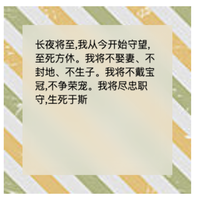
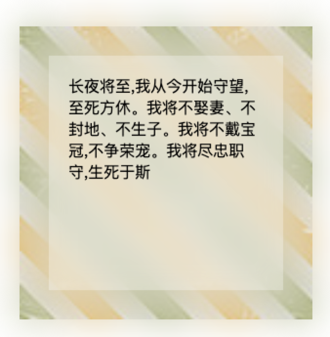
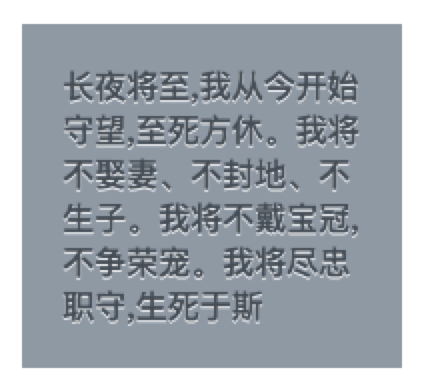
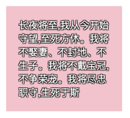
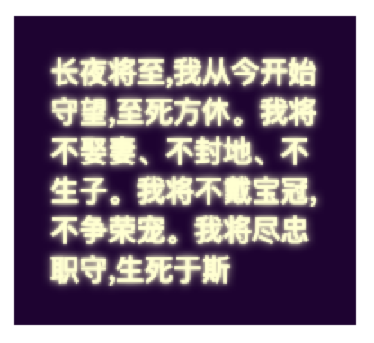
<div class="blur"><div class="blur-item">长夜将至,我从今开始守望,至死方休。我将不娶妻、不封地、不生子。我将不戴宝冠,不争荣宠。我将尽忠职守,生死于斯</div></div><style>// 使用伪元素作为背景.blur{margin: 40px;width: 300px;height: 300px;display: flex;align-items: center;justify-content: center;// 要点二:使父元素变为层叠上下文position: relative;z-index:0;&,.blur-item::before{background: url('https://ss0.bdstatic.com/70cFvHSh_Q1YnxGkpoWK1HF6hhy/it/u=3774887219,31394809&fm=26&gp=0.jpg') 0 / cover fixed;}.blur-item{width: 200px;height: 200px;padding: 20px;position: relative;background: hsla(0,0%,100%,.3);overflow: hidden; // 要点二&::before{content: '';position: absolute;top: 0;left: 0;bottom: 0;right: 0;z-index:-1;filter: blur(20px);margin: -30px; // 要点一}}}</style>
- 要点一: 模糊效果会消减消减实色像素所能覆盖的范围,消减半径正是模糊半径的长度,所以要相对于宿主元素的尺寸再向外扩大至少模糊半径,margin:-30px可以达到效果,但会有一圈模糊效果超出容器,所以加overflow: hidden;
不加margin和不加overflow效果: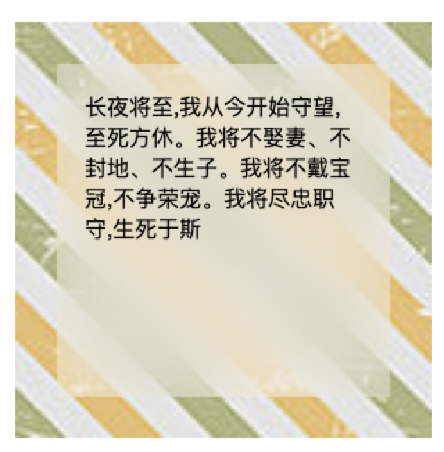
- 要点二:
形成层叠上下文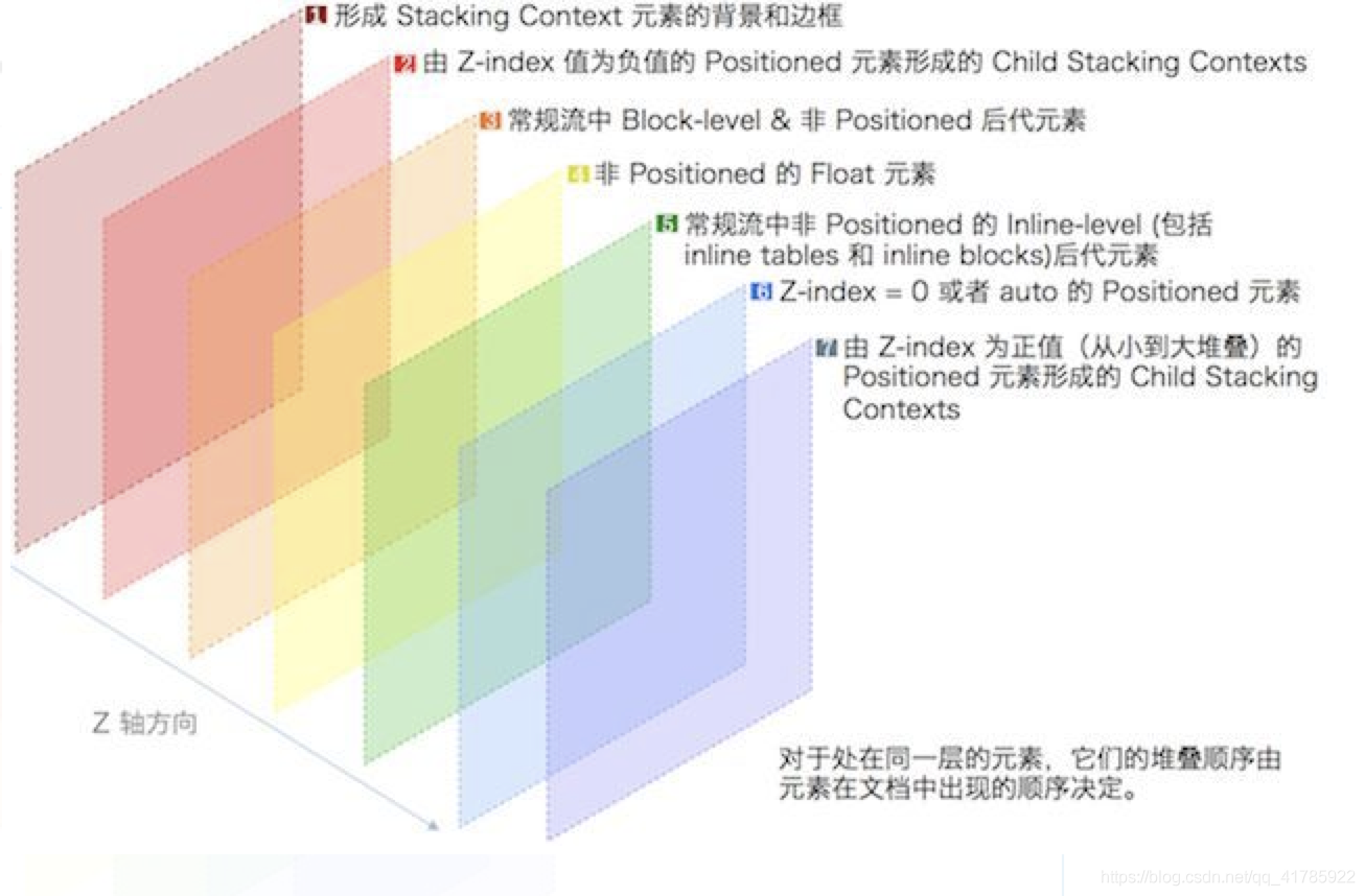
4. 字体排版
连字符断行
hyphens
- none
- manual (defualt) 手工插入软连字符()
- auto
.text-justify{display: inline-block;text-align: justify;hyphens: auto;}
插入换行
伪元素换行
::after{content: '\A';white-space: pre; // 只会作用于伪元素}
文本行的斑马纹
背景颜色加斑马纹
padding: .5em;line-height: 1.5;background: beige;background-size: auto 3em;background-origin:content-box;background-image: linear-grandient(rgba(0,0,0,.2) 50%,transparent 0);
调整tab宽度
white-space: pre;tab-size: 2;
修改单独字符
@font-face {font-family: Ampersand;src: local('xxx'),local('xxx'),local('xxx');unicode-range: U+26; // 十六进制}
自定义下划线
// 通常方案text-decoration: underline; // 不够灵活border-bottom: 1px solid gray; // 文本之间空隙很大,会阻止正常文本换行box-shadow: 0 -1px gray inset; // 同上
// 最佳方案background-image: linear-gradient(gray, gray) no-repeat;background-size: 100% 1px;background-position: 0 1.15em;text-shadow: .05em 0 white, -.05em 0 white; // 为了使字母降部(如p和y)下划线可以自动避让// 极为灵活,虚线下划线background-image: linear-gradient(90deg, gray 66%,transparent 0) repeat-x;background-size: .2em 2px;background-position: 0 1em;// 波浪下划线,两次径向渐变
现实的文字效果
凸版印刷效果
尤其适用 背景和文字对比度高 的场景,只要文字不是黑色并且背景纯白或纯黑就行
原理:
- 人们习惯 光源总是悬在头顶 ,凸起物的下方会产生阴影,而凹陷的底部边缘会被打亮
- 底部浅色投影 或 顶部暗色投影 产生凹进平面的错觉
- 底部暗色投影 或 顶部的浅色投影 产生平面上凸起的错觉
浅背景+深文字, 底部加上浅色投影通常效果最佳
background: hsl(210, 13%, 60%);color: hsl(210, 13%, 30%);text-shadow: 0 0.03em 0.03em hsla(0, 0%, 100%, 0.8);
空心字
background: pink;color:white;text-shadow: 1px 1px black, -1px -1px black,1px -1px black, -1px 1px black;
注意: 当text-shadow宽度增加时候,效果并不好,可以用svg来实现
文字外发光
background: #203;color: #ffc;text-shadow: none;transition: text-shadow 500ms linear;
文字凸起效果
text-shadow: 0 1px hsl(0, 0%, 85%), 0 2px hsl(0, 0%, 85%),0 3px hsl(0, 0%, 85%), 0 4px hsl(0, 0%, 85%), 0 5px hsl(0, 0%, 85%),0 5px 10px black;
环形文字
用SVG实现
6. 用户体验
选用合适的鼠标光标
具体可看鼠标光标
扩大可点击区域
Fitts法则
- 人类 移动到某个目标区域所需的最短时间 是由 目标距离 与 目标宽度 之比所构成的对数函数
可点击区域(热区)向外扩张 往往也可以带来可用性的提升
// border方案border: 10px solid transparent; // 扩张边缘box-shadow: 0 0 0 1px rgba(0,0,0,.3) inset; // 加边框background-clip: padding-box;// ✨伪元素方案xxx::before{content: '';position: absolute;top: -10px; right: -10px; bottom: -10px; left: -10px; // 比宿主元素大出10px}
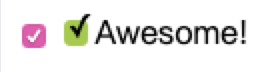
自定义单/复选框
// 使用<label>元素与复选框关联之后,也可以起到触发开关的作用
<input type="checkbox" id="awesome">
<label for="awesome">Awesome!</label>


<style>
#awesome[type="checkbox"] + label::before{
  content:'\a0'; /*不换行空格*/
  display: inline-block;
  vertical-align: .2em;
  width: 0.8em;
  height: 0.8em;
  margin-right: 0.2em;
  border-radius: .2em;
  background: silver;
  text-indent: .15em;
  line-height: .4;
}

#awesome[type="checkbox"]:checked + label::before{
  content:'\2713';
  background: yellowgreen;
}
</style>
通过阴影来弱化背景
HTML方案
.overlay {
  // 遮挡元素
    position: fixed;
  top: 0;
  right: 0;
  bottom: 0;
  left: 0;
  background: rgba(0,0,0,.8);
}

.lightbox {
  // 突出元素
    postion: absolute;
  z-index: 1;
}
伪元素方案
// 不好控制层级
body .dimed::before{
    position: fixed;
  top: 0;
  right: 0;
  bottom: 0;
  left: 0;
  z-index: 1;
  background: rgba(0,0,0,.8);
}
box-shadow方案
// 滚动页面时,遮罩层的边缘就漏出来了,无法产生交互
box-shadow: 0 0 0 50vmax rgba(0,0,0,.8);
backdrop方案
// 浏览器对它支持有限
dialog::backdrop {
    background: rgba(0,0,0,.8);
}
通过阴影+模糊来弱化背景
filter: blur(3px) contrast(.8) brightness(.8);
滚动提示
<style>
.scroll-wrap{
  margin: 100px;
  width: 200px;
  height: 500px;
  border: 1px solid #ccc;
  overflow-y: scroll;
  padding: .3em 1em 0;

  background: linear-gradient(white 30%, transparent), radial-gradient(at top, rgba(0,0,0,.2), transparent 70%), linear-gradient(0deg,white 30%, transparent), radial-gradient(at bottom, rgba(0,0,0,.2), transparent 70%);
  background-repeat: no-repeat;
  background-size: 100% 50px,100% 15px;
  background-position: 0 0,0 0,100% 100%,100% 100%;
  background-attachment: local, scroll,local,scroll;
}
</style>
对比控件
resize
- none (default)
- horizontal
- vertical
点击查看【codepen】overflow: hidden; resize: horizontal;7. 结构与布局
自适应内部元素
fill-available、max-content、min-content、fit-content
具体请看链接
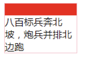
其中最有用的是min-content
内部元素最小宽度值最大的那个元素的宽度作为最终容器的宽度。如果是图片的话最小宽度值就是图片所呈现的宽度,如果是汉字就是一个字的宽度,如果是英文就是单词的宽度。 ```html八百标兵奔北坡,炮兵并排北边跑
<a name="D4Pn9"></a>
## 根据兄弟元素的数量设置样式
```css
// 只有一个节点,两者相等
xxx:first-child:nth-last-child(1)
xxx:only-child
// 当列表正好包含四项时
:first-child:nth-last-child(4)
// 当列表至少包含四项时
:first-child:nth-last-child(n+4)
// 当列表最多包含四项时
:first-child:nth-last-child(-n+4)
// 当列表包含2~6项时
:first-child:nth-last-child(n+2):nth-last-child(-n+6)
//【限制范围】选择第6个到第9个,取两者的交集
:nth-child(-n+9):nth-child(n+6){}
满幅的背景,定宽的内容
// 得到450px居中内容
padding: 1em calc(50% - 450px)
垂直居中
绝对定位优化版
// no good
main{
  position: absolute;
  width: 18em;
  height: 6em;
  top: 50%;
  left: 50%;
  margin-top: -3em;
  margin-left: -9em;
}

// good
main{
    position: absolute;
  top: calc(50% - 3em);
  left: calc(50% - 9em);
}

// better
main{
    position: absolute;
  top: 50%;
  left: 50%;
  transform: translate(-50%, -50%);
}
视口单位
main{
    margin: 50% auto 0; // 基于父元素
     margin: 50vh auto 0; // 基于视口
  transform: translateY(-50%);
}
Flexbox方案
father{
    display: flex;
}

main{
    margin: auto; // 普通盒子中只会水平居中,flexitem会整体居中
}
main{
    display: flex;
  align-items: center;
  justify-content: center;
}
页脚布局
body{
    display: flex;
  flex-flow: column;
  min-height: 100vh;
}

main{
    flex: 1;
}

footer{
    ...
}
8. 过渡与动画
缓动效果
cubic-bezier
定义了一个贝塞尔曲线(Cubic Bezier)。
贝塞尔曲线曲线由四个点 P0,P1,P2 和 P3 定义。P0 和 P3 是曲线的起点和终点。P0是(0,0)并且表示初始时间和初始状态,P3是(1,1)并且表示最终时间和最终状态
具体可见 菜鸟联盟介绍 和 模拟演示
transition: .5s cubic-bezier(.25,.1,.3,.1.5); // 大于1的时候可以产生【越过】效果
逐帧动画
steps()
animation: loader 1s infinite steps(8); // 8帧动画
闪烁效果
animation-direction
- normal (default)
- alternate
- reverse
- alternate-reverse ```css @keyframes blink-smooth{ to { color: transparent } }
.heightlight{ animation: .5s blink-smooth 6 alternate; } ```
沿环形路径平移的动画
可以看这篇文章,非常有意思
2020年11月22日

若有收获,就点个赞吧
0 人点赞
