plt.rc('font', family='Microsoft Yahei', size=10) # 为了可以输入中文标签
legend()
https://blog.csdn.net/qq_33221533/article/details/81431264
plot
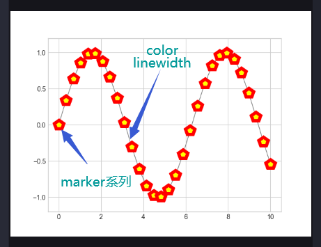
import matplotlib.pyplot as pltimport numpy as npplt.style.use("seaborn-whitegrid")x = np.linspace(0, 10, 30)'''color: 弧线颜色markersize: 标签大小linewidth: 弧线宽度markerfacecolor: 标签颜色markeredgecolor: 标签外框颜色markeredgewidth: 标签外框宽度'''plt.plot(x, np.sin(x), '-p', color="gray",markersize=15,linewidth=1,markerfacecolor='yellow',markeredgecolor='red',markeredgewidth=5)plt.ylim(-1.2,1.2)plt.show()
scatter
https://www.cnblogs.com/shuaishuaidefeizhu/p/11359826.html
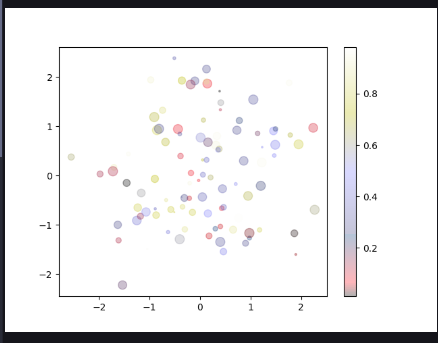
import matplotlib.pyplot as pltimport numpy as nprng = np.random.RandomState(0)x = rng.randn(100)y = rng.randn(100)colors = rng.rand(100)sizes = 100 * rng.rand(100)plt.scatter(x,y,c=colors,s=sizes,alpha=0.3,cmap="gist_stern")plt.colorbar() # 显示颜色条plt.show()
errorbar基本误差线
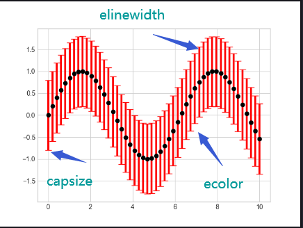
import matplotlib.pyplot as pltimport numpy as npplt.style.use("seaborn-whitegrid")x = np.linspace(0,10,50)dy = 0.8y = np.sin(x)# xerr one-sidederrorbarplt.errorbar(x,y,yerr=dy,fmt='o',color="black",ecolor="red",elinewidth=3,capsize=5)plt.show()
imshow()
https://blog.csdn.net/a892573486/article/details/107542839
plt.imshow(X,cmap=None,norm=None,aspect=None,interpolation=None,alpha=None,vmin=None,vmax=None,origin=None,extent=None,shape=None,filternorm=1,filterrad=4.0,imlim=None,resample=None,url=None,*,data=None,**kwargs,)
参数:X
图像数据。支持的数组形状是:
将标量数据映射到色彩图
- 颜色默认为:rc:image.cmap。 | 颜色图谱 | 描述 | | —- | —- | | autumn | 红-橙-黄 | | bone | 黑-白,x线 | | cool | 青-洋红 | | copper | 黑-铜 | | flag | 红-白-蓝-黑 | | gray | 黑-白 | | hot | 黑-红-黄-白 | | hsv | hsv颜色空间, 红-黄-绿-青-蓝-洋红-红 | | inferno | 黑-红-黄 | | jet | 蓝-青-黄-红 | | magma | 黑-红-白 | | pink | 黑-粉-白 | | plasma | 绿-红-黄 | | prism | 红-黄-绿-蓝-紫-…-绿模式 | | spring | 洋红-黄 | | summer | 绿-黄 | | viridis | 蓝-绿-黄 | | winter | 蓝-绿 |
参数:norm :~matplotlib.colors.Normalize
- 如果使用scalar data ,则Normalize会对其进行缩放[0,1]的数据值内。
默认情况下,数据范围使用线性缩放映射到颜色条范围。 RGB(A)数据忽略该参数。
参数:aspect
{‘equal’,’auto’}或float,可选
- 控制轴的纵横比。该参数可能使图像失真,即像素不是方形的。
- equal:确保宽高比为1,像素将为正方形。(除非像素大小明确地在数据中变为非正方形,坐标使用 extent )。
auto: 更改图像宽高比以匹配轴的宽高比。通常,这将导致非方形像素。
参数:interpolation
str
- 使用的插值方法
- 支持的值有:’none’, ‘nearest’, ‘bilinear’, ‘bicubic’,’spline16′, ‘spline36’, ‘hanning’, ‘hamming’, ‘hermite’, ‘kaiser’,
‘quadric’, ‘catrom’, ‘gaussian’, ‘bessel’, ‘mitchell’, ‘sinc’,’lanczos’. 如果interpolation = ‘none’,则不执行插值
参数:alpha
alpha值,介于0(透明)和1(不透明)之间。RGBA输入数据忽略此参数。
参数:vmin, vmax : scalar,
如果使用 norm 参数,则忽略 vmin , vmax 。
-
参数:origin : {‘upper’, ‘lower’}
将数组的[0,0]索引放在轴的左上角或左下角。
- ‘upper’通常用于矩阵和图像。
-
参数:extent:(left, right, bottom, top)
数据坐标中左下角和右上角的位置。 如果为“无”,则定位图像使得像素中心落在基于零的(行,列)索引上。
直方图 hist
density :density=True是频率图,默认是频数图range :筛选数据范围,默认是最小到最大的取值范围histtype:hist柱子类型,'bar', 'barstacked', 'step', 'stepfilled'orientation:水平或垂直方向rwidth= :柱子与柱子之间的距离,默认是0

若有收获,就点个赞吧
0 人点赞
