一、平时作业
叶老师的个人网站:http://moretrue.cn/
作业一、内容
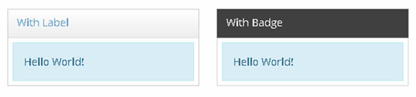
1、请做出如下效果:
<!DOCTYPE html><html lang="zh-cn"><head><meta charset="UTF-8"><title>作业一 01</title><link rel="stylesheet" href="https://cdn.bootcdn.net/ajax/libs/twitter-bootstrap/4.5.0/css/bootstrap.min.css"><meta name="viewport" content="width=device-width, initial-scale=1, shrink-to-fit=no"><link rel="stylesheet" href="css/style.css"><style type="text/css">.box{margin: 1rem;border:#DEDEDE solid 1.5px;width: 250px;height: 100px;}.first-box{height: 30px;padding: 0.25rem;padding-left: 1rem;}.last-outbox{border: solid 1px #D9EDF6;margin: 0.5rem;height: 50px;background-color: #D9EDF6}.last-innerbox{margin: 0.75rem;}.text-color1{color: #729DBD}.text-color2{color: #3A758E}</style></head><body><div class="box float-left"><div class="border-bottom"><div class="first-box text-color1 bg-light">With Label</div></div><div ><div class="last-outbox"><div class="last-innerbox text-color2">Hello World!</div></div></div></div><div><div></div></div><div class="box float-left" ><div class="border-dark first-box bg-dark text-light ">With Badge</div><div ><div class="last-outbox"><div class="last-innerbox text-color2">Hello World!</div></div></div></div><div><div></div></div><script src="https://cdn.bootcdn.net/ajax/libs/jquery/3.5.1/jquery.min.js"></script><script src="https://cdn.bootcdn.net/ajax/libs/popper.js/0.2.0/popper.min.js"></script><script src="https://cdn.bootcdn.net/ajax/libs/twitter-bootstrap/4.5.0/js/bootstrap.min.js"></script></body></html>
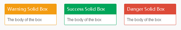
2、请做出如下的三个盒子
<!DOCTYPE html>
<html lang="zh-cn">
<head>
    <meta charset="UTF-8">
    <title>作业一 02</title>
    <link rel="stylesheet" href="https://cdn.bootcdn.net/ajax/libs/twitter-bootstrap/4.5.0/css/bootstrap.min.css">
    <meta name="viewport" content="width=device-width, initial-scale=1, shrink-to-fit=no">
    <link rel="stylesheet" href="css/style.css">
</head>
<body class= " w-100 container-fluid ">
    <div class="row no-gutters">
        <div class="border border-warning m-5 rounded float-left col">
            <div class="bg-warning text-light p-3 h5">
                Warning Solid Box
            </div>
            <div class="p-3">
                The body of the box
            </div>
        </div>
        <div class="border border-success m-5 rounded float-left col">
            <div class="bg-success text-light p-3 h5">
                Success Solid Box
            </div>
            <div class="p-3">
                The body of the box
            </div>
        </div>
        <div class=" border border-danger m-5 rounded float-left col">
            <div class="bg-danger text-light p-3 h5">
                Danger Solid Box
            </div>
            <div class="p-3">
                The body of the box
            </div>
        </div>
    </div>

<script src="https://cdn.bootcdn.net/ajax/libs/jquery/3.5.1/jquery.min.js"></script>
<script src="https://cdn.bootcdn.net/ajax/libs/popper.js/0.2.0/popper.min.js"></script>
<script src="https://cdn.bootcdn.net/ajax/libs/twitter-bootstrap/4.5.0/js/bootstrap.min.js"></script>
</body>
</html>
3、请做出如下的头像效果:

素材:
<!DOCTYPE html>
<html lang="zh-cn">
<head>
    <meta charset="UTF-8">
    <title>作业一  03</title>
    <link rel="stylesheet" href="https://cdn.bootcdn.net/ajax/libs/twitter-bootstrap/4.5.0/css/bootstrap.min.css">
    <meta name="viewport" content="width=device-width, initial-scale=1, shrink-to-fit=no">
    <link rel="stylesheet" href="css/style.css">
</head>
<body class="w-100">
        <div class="m-5 border p-2" style="width:180px">
            <img src="img/img.jpg" class="img-thumbnail p-0" style="border-style:dotted">
        </div>
<script src="https://cdn.bootcdn.net/ajax/libs/jquery/3.5.1/jquery.min.js"></script>
<script src="https://cdn.bootcdn.net/ajax/libs/popper.js/0.2.0/popper.min.js"></script>
<script src="https://cdn.bootcdn.net/ajax/libs/twitter-bootstrap/4.5.0/js/bootstrap.min.js"></script>
</body>
</html>
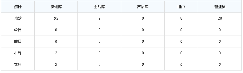
4、请做出如下的表格:
<!DOCTYPE html>
<html lang="zh-cn">
<head>
    <meta charset="UTF-8">
    <title>作业一 04</title>
    <link rel="stylesheet" href="https://cdn.bootcdn.net/ajax/libs/twitter-bootstrap/4.5.0/css/bootstrap.min.css">
    <meta name="viewport" content="width=device-width, initial-scale=1, shrink-to-fit=no">
    <link rel="stylesheet" href="css/style.css">
</head>
<body>
    <table class="table table-hover table-bordered text-center">
        <thead class="thead">
        <tr class="table-primary">
            <th scope="col">统计</th>
            <th scope="col">资讯库</th>
            <th scope="col">图片库</th>
            <th scope="col">产品库</th>
            <th scope="col">用户</th>
            <th scope="col">管理员</th>
        </tr>
        </thead>
        <tbody>
            <tr>
                <th scope="row">总数</th>
                <td>92</td>
                <td>9</td>
                <td>0</td>
                <td>8</td>
                <td>20</td>
            </tr>
            <tr>
                <th scope="row">今日</th>
                <td>0</td>
                <td>0</td>
                <td>0</td>
                <td>0</td>
                <td>0</td>
            </tr>
            <tr>
                <th scope="row">昨日</th>
                <td>0</td>
                <td>0</td>
                <td>0</td>
                <td>0</td>
                <td>0</td>
            </tr>
            <tr>
                <th scope="row">本周</th>
                <td>2</td>
                <td>0</td>
                <td>0</td>
                <td>0</td>
                <td>0</td>
            </tr>
            <tr>
                <th scope="row">本月</th>
                <td>2</td>
                <td>0</td>
                <td>0</td>
                <td>0</td>
                <td>0</td>
            </tr>
        </tbody>
    </table>
<script src="https://cdn.bootcdn.net/ajax/libs/jquery/3.5.1/jquery.min.js"></script>
<script src="https://cdn.bootcdn.net/ajax/libs/popper.js/0.2.0/popper.min.js"></script>
<script src="https://cdn.bootcdn.net/ajax/libs/twitter-bootstrap/4.5.0/js/bootstrap.min.js"></script>
</body>
</html>
作业二、flex布局
1.弹性盒子
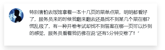
(1)请用float方法做出如图效果,右边需要弹性伸缩
<!DOCTYPE html>
<html lang="zh-cn">
<head>
    <meta charset="UTF-8">
    <title>Test01-1</title>
    <!-- 引入Bootstrap CSS -->
    <link rel="stylesheet" href="https://cdn.bootcdn.net/ajax/libs/twitter-bootstrap/4.5.0/css/bootstrap.min.css">
    <!-- 移动设备优先 -->
    <meta name="viewport" content="width=device-width, initial-scale=1, shrink-to-fit=no">
    <!-- 引入自己的css文件 -->
    <link rel="stylesheet" href="css/style.css">
</head>
<body class="p-5">
    <div class="box w-50 mx-auto shadow p-3" >
        <a href="#" class="float-left p-3"><img src="h2.jpg" class="rounded-circle" style="width: 50px ;height: 50px;"></a>
    <div class="context py-3" style="margin-left: 80px;">
        <p>
        特别害怕去饭馆拿着一本十几页的菜单点菜,明明都看好了,服务员来的时候我翻来翻去还是找不到某几个菜在哪?慌乱极了,有一种开卷考试却找不到答案在哪一页可以抄到的感觉,服务员看着我仿佛在说“还有5分钟交卷了!”
        </p>
    </div>
    </div>
<!-- 注意3个js文件的引入顺序,它们有依赖关系,顺序不能错 -->
<script src="https://cdn.bootcdn.net/ajax/libs/jquery/3.5.1/jquery.min.js"></script>
<script src="https://cdn.bootcdn.net/ajax/libs/popper.js/0.2.0/popper.min.js"></script>
<script src="https://cdn.bootcdn.net/ajax/libs/twitter-bootstrap/4.5.0/js/bootstrap.min.js"></script>
</body>
</html>
(2)请用flex方法实现:
<!DOCTYPE html>
<html lang="zh-cn">
<head>
    <meta charset="UTF-8">
    <title>Test02</title>
    <!-- 引入Bootstrap CSS -->
    <link rel="stylesheet" href="https://cdn.bootcdn.net/ajax/libs/twitter-bootstrap/4.5.0/css/bootstrap.min.css">
    <!-- 移动设备优先 -->
    <meta name="viewport" content="width=device-width, initial-scale=1, shrink-to-fit=no">
    <!-- 引入自己的css文件 -->
    <link rel="stylesheet" href="css/style.css">
</head>
<body class="p-5 d-flex  justify-content-center">
        <div class="box p-3 shadow w-50 d-flex ">
            <a href="#"><img style="width: 50px;height: 50px;" src="h2.jpg" class="rounded-circle"></a>
            <div class="context px-3">
                <p>特别害怕去饭馆拿着一本十几页的菜单点菜,明明都看好了,服务员来的时候我翻来翻去还是找不到某几个菜在哪?慌乱极了,有一种开卷考试却找不到答案在哪一页可以抄到的感觉,服务员看着我仿佛在说“还有5分钟交卷了!”
                </p>
            </div>
        </div>
<!-- 注意3个js文件的引入顺序,它们有依赖关系,顺序不能错 -->
<script src="https://cdn.bootcdn.net/ajax/libs/jquery/3.5.1/jquery.min.js"></script>
<script src="https://cdn.bootcdn.net/ajax/libs/popper.js/0.2.0/popper.min.js"></script>
<script src="https://cdn.bootcdn.net/ajax/libs/twitter-bootstrap/4.5.0/js/bootstrap.min.js"></script>
</body>
</html>
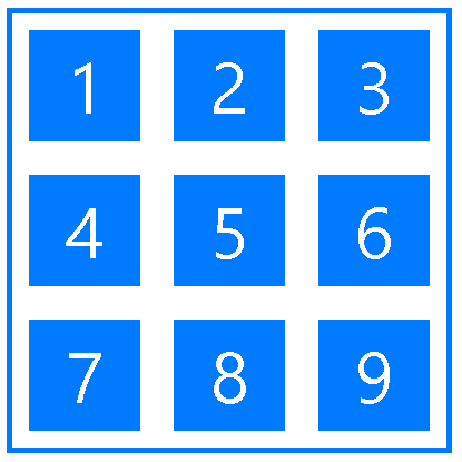
2.请做出如图的计算器效果
<!DOCTYPE html>
<html lang="zh-cn">
<head>
    <meta charset="UTF-8">
    <title>基本框架</title>
    <!-- 引入Bootstrap CSS -->
    <link rel="stylesheet" href="https://cdn.bootcdn.net/ajax/libs/twitter-bootstrap/4.5.0/css/bootstrap.min.css">
    <!-- 移动设备优先 -->
    <meta name="viewport" content="width=device-width, initial-scale=1, shrink-to-fit=no">
    <!-- 引入自己的css文件 -->
    <link rel="stylesheet" href="css/style.css">
    <style type="text/css">
        .wrapper{
            width: 400px;
            height: 400px;
            border: solid 5px;
        }
        .box{
            height: 100px;
            width: 100px;
            font-size: 50px;
        }
    </style>
</head>
<body class="d-flex justify-content-center p-5 ">
        <div class="wrapper border-primary d-flex flex-wrap justify-content-around align-items-center">
            <div class="box box1 bg-primary text-light d-flex justify-content-around align-items-center ">1</div>
            <div class="box box2 bg-primary text-light d-flex justify-content-around align-items-center ">2</div>
            <div class="box box3 bg-primary text-light d-flex justify-content-around align-items-center ">3</div>
            <div class="box box4 bg-primary text-light d-flex justify-content-around align-items-center ">4</div>
            <div class="box box5 bg-primary text-light d-flex justify-content-around align-items-center ">5</div>
            <div class="box box6 bg-primary text-light d-flex justify-content-around align-items-center ">6</div>
            <div class="box box7 bg-primary text-light d-flex justify-content-around align-items-center ">7</div>
            <div class="box box8 bg-primary text-light d-flex justify-content-around align-items-center ">8</div>
            <div class="box box9 bg-primary text-light d-flex justify-content-around align-items-center ">9</div>
        </div>
<!-- 注意3个js文件的引入顺序,它们有依赖关系,顺序不能错 -->
<script src="https://cdn.bootcdn.net/ajax/libs/jquery/3.5.1/jquery.min.js"></script>
<script src="https://cdn.bootcdn.net/ajax/libs/popper.js/0.2.0/popper.min.js"></script>
<script src="https://cdn.bootcdn.net/ajax/libs/twitter-bootstrap/4.5.0/js/bootstrap.min.js"></script>
</body>
</html>
3.请做出如下菜单的效果:

<!DOCTYPE html>
<html lang="zh-cn">
<head>
    <meta charset="UTF-8">
    <title>第三题</title>
    <!-- 引入Bootstrap CSS -->
    <link rel="stylesheet" href="https://cdn.bootcdn.net/ajax/libs/twitter-bootstrap/4.5.0/css/bootstrap.min.css">
    <!-- 移动设备优先 -->
    <meta name="viewport" content="width=device-width, initial-scale=1, shrink-to-fit=no">
    <!-- 引入自己的css文件 -->
    <link rel="stylesheet" href="css/style.css">
    <style type="text/css">
        .box{
            width: 100px;
            height: 50px;
            flex-basis: 19%
        }
        .wrapper{

        }
    </style>
</head>
<body class="p-5">
        <div class="wrapper d-flex justify-content-center w-100 justify-content-between">
            <div class="box box1 bg-primary border text-light d-flex justify-content-center align-items-center ">栏目1</div>
            <div class="box box2 bg-secondary border text-light d-flex justify-content-center align-items-center ">栏目2</div>
            <div class="box box3 bg-secondary border text-light d-flex justify-content-center align-items-center ">栏目3</div>
            <div class="box box4 bg-secondary border text-light d-flex justify-content-center align-items-center ">栏目4</div>
            <div class="box box5 bg-secondary border text-light d-flex justify-content-center align-items-center">栏目5</div>
        </div>
<!-- 注意3个js文件的引入顺序,它们有依赖关系,顺序不能错 -->
<script src="https://cdn.bootcdn.net/ajax/libs/jquery/3.5.1/jquery.min.js"></script>
<script src="https://cdn.bootcdn.net/ajax/libs/popper.js/0.2.0/popper.min.js"></script>
<script src="https://cdn.bootcdn.net/ajax/libs/twitter-bootstrap/4.5.0/js/bootstrap.min.js"></script>
</body>
</html>
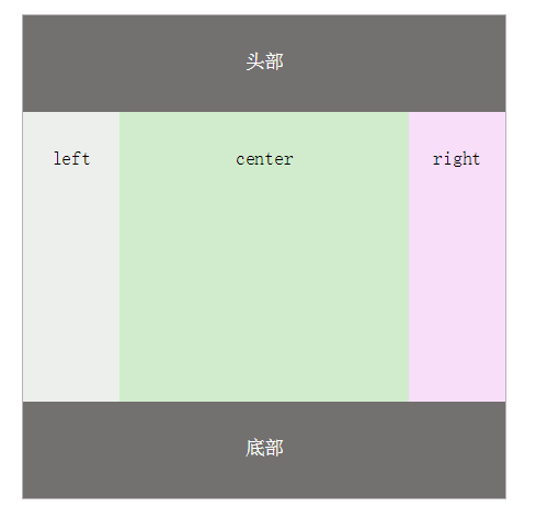
4.请用flex做出如下的布局效果:
<!DOCTYPE html>
<html lang="zh-cn">
<head>
    <meta charset="UTF-8">
    <title>Test05</title>
    <!-- 引入Bootstrap CSS -->
    <link rel="stylesheet" href="https://cdn.bootcdn.net/ajax/libs/twitter-bootstrap/4.5.0/css/bootstrap.min.css">
    <!-- 移动设备优先 -->
    <meta name="viewport" content="width=device-width, initial-scale=1, shrink-to-fit=no">
    <!-- 引入自己的css文件 -->
    <link rel="stylesheet" href="css/style.css">
    <style type="text/css">
        .box{
            height: 300px;
        }
        .box2{
            background: #D1ECCD;
            flex: 1 1 60%;
        }
        .box1{
            background: #EDEFED;
            flex: 0 0 100px;
        }
        .box3{
            flex: 0 0 100px;
            background: #F9DEF9;
        }
    </style>
</head>
<body>
    <div class="wrapper w-100">

             <header class="navbar text-light d-flex justify-content-center align-items-center" style="background: #737070;height: 100px;">头部</header>
       <div>
           <main class="d-flex">
            <div class="box box1  d-flex justify-content-center pt-4">left</div>
            <div class="box box2 d-flex justify-content-center pt-4">center</div>
            <div class="box box3 d-flex justify-content-center pt-4">right</div>
        </main>
       </div>
            <footer class="navbar text-light d-flex justify-content-center align-items-center" style="background: #737070;height: 100px;">底部</footer>
    </div>

<!-- 注意3个js文件的引入顺序,它们有依赖关系,顺序不能错 -->
<script src="https://cdn.bootcdn.net/ajax/libs/jquery/3.5.1/jquery.min.js"></script>
<script src="https://cdn.bootcdn.net/ajax/libs/popper.js/0.2.0/popper.min.js"></script>
<script src="https://cdn.bootcdn.net/ajax/libs/twitter-bootstrap/4.5.0/js/bootstrap.min.js"></script>
</body>
</html>
作业三、响应式布局
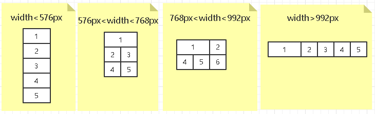
1.用两种方法实现如下的响应式布局效果:
1)媒体查询的方法:
<!DOCTYPE html>
<html lang="en">
<head>
    <meta charset="UTF-8">
    <title>响应式布局01</title>
    <style type="text/css">
        .container{
                flex-wrap: wrap;
                display: flex;
        }
        .box{
            height: 200px;
            flex-basis: 100%
        }
        .box1{
            background: #ccf;
        }
        .box2{
            background: #cfc;
        }
        .box3{
            background: #fcc;
        }
        .box4{
            background: #cff;
        }
        .box5{
            background: #ffc;
        }
        .box6{
            background: #fcc;
        }
        @media (max-width: 576px) {
            .box6{
                display: none;
            }
        }
        @media  (min-width: 576px) and (max-width: 768px) {
            .box2,.box3,.box4,.box5{
            flex-basis : 50%
            }
            .box6{
                display: none;
            }
        }
        @media (min-width: 768px) and (max-width: 992px){
            .box1{
                flex-basis: 66.66%;
            }
            .box3{
                display: none;
            }
            .box2,.box4,.box5,.box6{
                flex-basis: 33.33%
            }
        }
        @media (min-width: 992px) {
            .box1{
                flex-basis: 33.33%;
            }
            .box2,.box3,.box4,.box5{
                flex-basis: 16.66%;
            }
            .box6{
                display: none;
            }
        }
    </style>
</head>
<body class="container">
    <div class="box box1">1</div>
    <div class="box box2">2</div>
    <div class="box box3">3</div>
    <div class="box box4">4</div>
    <div class="box box5">5</div>
    <div class="box box6">6</div>

</body>
</html>
2)bootstrap栅格布局:
<!DOCTYPE html>
<html lang="en">
<head>
    <meta charset="UTF-8">
    <title>响应式布局01-2</title>
    <!-- 引入Bootstrap CSS -->
    <link rel="stylesheet" href="https://cdn.bootcdn.net/ajax/libs/twitter-bootstrap/4.5.0/css/bootstrap.min.css">
    <!-- 移动设备优先 -->
    <meta name="viewport" content="width=device-width, initial-scale=1, shrink-to-fit=no">
    <style type="text/css">

        .box{
            height: 200px;
            flex-basis: 100%;
        }
        .box1{
            background: #ccf;
        }
        .box2{
            background: #cfc;
        }
        .box3{
            background: #fcc;
        }
        .box4{
            background: #cff;
        }
        .box5{
            background: #ffc;
        }
         .box6{
            background: #fcc;
        }
    </style>
</head>
<body class="container-fluid">
    <div class="row">
        <div class="box box1 col-12 col-sm-12 col-md-8 col-lg-4 ">1</div>
        <div class="box box2 col-12 col-sm-6 col-md-4 col-lg-2 ">2</div>
        <div class="box box3 col-12 col-sm-6 d-md-none col-lg-2 d-lg-block">3</div>
        <div class="box box4 col-12 col-sm-6 col-md-4 col-lg-2 ">4</div>
        <div class="box box5 col-12 col-sm-6 col-md-4 col-lg-2 ">5</div>
        <div class="box box6 d-none col-md-4 d-md-block d-lg-none">6</div>
    </div>

    <!-- 注意3个js文件的引入顺序,它们有依赖关系,顺序不能错 -->
<script src="https://cdn.bootcdn.net/ajax/libs/jquery/3.5.1/jquery.min.js"></script>
<script src="https://cdn.bootcdn.net/ajax/libs/popper.js/0.2.0/popper.min.js"></script>
<script src="https://cdn.bootcdn.net/ajax/libs/twitter-bootstrap/4.5.0/js/bootstrap.min.js"></script>
</body>
</html>
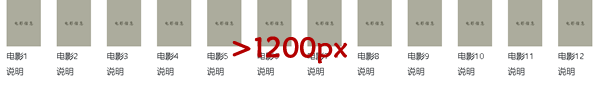
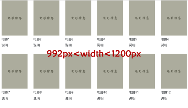
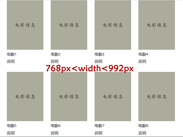
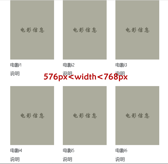
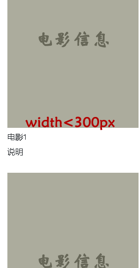
2.实现在不同宽度屏幕下的不同效果,需要自定义一个媒体查询在300px下的实现效果
<!DOCTYPE html>
<html lang="en">
<head>
    <meta charset="UTF-8">
    <title>响应式类的练习与使用02</title>
    <!-- 引入Bootstrap CSS -->
    <link rel="stylesheet" href="https://cdn.bootcdn.net/ajax/libs/twitter-bootstrap/4.5.0/css/bootstrap.min.css">
    <!-- 移动设备优先 -->
    <meta name="viewport" content="width=device-width, initial-scale=1, shrink-to-fit=no">
    <style type="text/css">
        .box{
            height: 150px;
            background: #ACAC9D;
        }
        @media (max-width: 300px;) {
            .boxmin{
                flex-basis: 60%;
            }
            }
            @media (min-width: 300px) and (max-width: 576px) {
                .boxmin{
                flex-basis:45%;
            }
            }
        }
    </style>
</head>
<body>
    <div class="container-fluid">
        <div class="row">
            <div class="my-5 col-xl-1 col-lg-2 col-md-3 col-sm-4 boxmin">
                <div class="box " style="line-height: 150px;text-align: center;">
                     电影信息
                </div>
                  <div >电影1</div>
                <div >说明</div>
            </div>
             <div class="my-5 col-xl-1 col-lg-2 col-md-3 col-sm-4 boxmin">
                <div class="box " style="line-height: 150px;text-align: center;">
                     电影信息
                </div>
                  <div >电影2</div>
                <div >说明</div>
            </div>
            <div class="my-5 col-xl-1 col-lg-2 col-md-3 col-sm-4 boxmin">
                <div class="box " style="line-height: 150px;text-align: center;">
                     电影信息
                </div>
                  <div >电影3</div>
                <div >说明</div>
            </div>
             <div class="my-5 col-xl-1 col-lg-2 col-md-3 col-sm-4 boxmin">
                <div class="box " style="line-height: 150px;text-align: center;">
                     电影信息
                </div>
                  <div >电影4</div>
                <div >说明</div>
            </div>
            <div class="my-5 col-xl-1 col-lg-2 col-md-3 col-sm-4 boxmin">
                <div class="box " style="line-height: 150px;text-align: center;">
                     电影信息
                </div>
                  <div >电影5</div>
                <div >说明</div>
            </div>
             <div class="my-5 col-xl-1 col-lg-2 col-md-3 col-sm-4 boxmin">
                <div class="box " style="line-height: 150px;text-align: center;">
                     电影信息
                </div>
                  <div >电影6</div>
                <div >说明</div>
            </div>
            <div class="my-5 col-xl-1 col-lg-2 col-md-3 col-sm-4 boxmin">
                <div class="box " style="line-height: 150px;text-align: center;">
                     电影信息
                </div>
                  <div >电影7</div>
                <div >说明</div>
            </div>
             <div class="my-5 col-xl-1 col-lg-2 col-md-3 col-sm-4 boxmin">
                <div class="box " style="line-height: 150px;text-align: center;">
                     电影信息
                </div>
                  <div >电影8</div>
                <div >说明</div>
            </div>
            <div class="my-5 col-xl-1 col-lg-2 col-md-3 col-sm-4 boxmin">
                <div class="box " style="line-height: 150px;text-align: center;">
                     电影信息
                </div>
                  <div >电影9</div>
                <div >说明</div>
            </div>
             <div class="my-5 col-xl-1 col-lg-2 col-md-3 col-sm-4 boxmin">
                <div class="box " style="line-height: 150px;text-align: center;">
                     电影信息
                </div>
                  <div >电影10</div>
                <div >说明</div>
            </div>
            <div class="my-5 col-xl-1 col-lg-2 col-md-3 col-sm-4 boxmin">
                <div class="box " style="line-height: 150px;text-align: center;">
                     电影信息
                </div>
                  <div >电影11</div>
                <div >说明</div>
            </div>
             <div class="my-5 col-xl-1 col-lg-2 col-md-3 col-sm-4 boxmin">
                <div class="box " style="line-height: 150px;text-align: center;">
                     电影信息
                </div>
                  <div >电影12</div>
                <div >说明</div>
            </div>

        </div>
    </div>

    <!-- 注意3个js文件的引入顺序,它们有依赖关系,顺序不能错 -->
<script src="https://cdn.bootcdn.net/ajax/libs/jquery/3.5.1/jquery.min.js"></script>
<script src="https://cdn.bootcdn.net/ajax/libs/popper.js/0.2.0/popper.min.js"></script>
<script src="https://cdn.bootcdn.net/ajax/libs/twitter-bootstrap/4.5.0/js/bootstrap.min.js"></script>
</body>
</html>
3.实现一个标题,在>768时,显示完整标题

在<768时,显示字母B

<!DOCTYPE html>
<html lang="en">
<head>
    <meta charset="UTF-8">
    <title>响应式类的练习与使用02</title>
    <!-- 引入Bootstrap CSS -->
    <link rel="stylesheet" href="https://cdn.bootcdn.net/ajax/libs/twitter-bootstrap/4.5.0/css/bootstrap.min.css">
    <!-- 移动设备优先 -->
    <meta name="viewport" content="width=device-width, initial-scale=1, shrink-to-fit=no">
</head>
<body>
    <h1 class="bg-primary p-1 px-2 text-white  d-md-block d-none">Bootstrap</h1>
    <h1 class="bg-warning  p-1 px-2 d-md-none text-white">B</h1>
    <!-- 注意3个js文件的引入顺序,它们有依赖关系,顺序不能错 -->
<script src="https://cdn.bootcdn.net/ajax/libs/jquery/3.5.1/jquery.min.js"></script>
<script src="https://cdn.bootcdn.net/ajax/libs/popper.js/0.2.0/popper.min.js"></script>
<script src="https://cdn.bootcdn.net/ajax/libs/twitter-bootstrap/4.5.0/js/bootstrap.min.js"></script>
</body>
</html>
作业四、导航
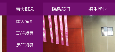
1.请参考南京大学(https://www.nju.edu.cn/)导航栏,做出一样的效果
<!DOCTYPE html>
<html lang="en">
<head>
    <meta charset="UTF-8">
    <title>南京大学导航条</title>
    <!-- 引入Bootstrap CSS -->
    <link rel="stylesheet" href="https://cdn.bootcdn.net/ajax/libs/twitter-bootstrap/4.5.0/css/bootstrap.min.css">
    <!-- 移动设备优先 -->
    <meta name="viewport" content="width=device-width, initial-scale=1, shrink-to-fit=no">
    <style type="text/css">
        .nd{
            background: #721170;
        }
        .nav-link{
            color: #fff;
            padding:0.75rem 1.85rem;


        }
        .nav-link:hover{
            background: #63065f;
            color: #fff;
            margin-top: 0;
            margin-bottom: 0;
        }
        .dropdown-menu{
            padding-top: 0;
            margin-top:0;
            min-width: 100%;
            background-color: #721170;
            border-radius: 0;
            padding-bottom: 0;
            border-top: 0;
        }
        .dropdown-item{
            display: block;
            color: #fff;
            height: 42px;
            line-height: 42px;
            padding: 0 30px;
            align-content: center;
            display: block;
            font-size: 15px;
        }

        .dropdown-item:hover, .dropdown-item:focus {
              color: #63065f;
              text-decoration: none;
              background-color: #f8f9fa;
}
        li.show>.nav-link{
            background: #63065f;
        }
    </style>
</head>
<body>
    <nav class="nd d-flex ">
        <div class="container">
            <ul class="nav justify-content-between">
            <li class="nav-item dropdown">
                <a href="#" class="nav-link" data-toggle="dropdown">南大概况</a>
                <div class="dropdown-menu">
                    <a class="dropdown-item" href="#">南大简介</a>
                    <a class="dropdown-item"  href="#">现任领导</a>
                    <a class="dropdown-item" href="#">历任领导</a>
                    <a class="dropdown-item" href="#">南大校史</a>
                    <a class="dropdown-item" href="#">统计资料</a>
                    <a class="dropdown-item" href="#">南大标识</a>
                </div>
            </li>
            <li class="nav-item"><a href="#" class="nav-link">院系部门</a></li>
            <li class="nav-item"><a href="#" class="nav-link">招生就业</a></li>
            <li class="nav-item"><a href="#" class="nav-link">人才招聘</a></li>
            <li class="nav-item"><a href="#" class="nav-link">人才培养</a></li>
            <li class="nav-item"><a href="#" class="nav-link">科学研究</a></li>
            <li class="nav-item"><a href="#" class="nav-link">合作交流</a></li>
            <li class="nav-item"><a href="#" class="nav-link">文化生活</a></li>
            <li class="nav-item"><a href="#" class="nav-link">校园服务</a></li>
        </ul>
        </div>

    </nav>


<!-- 注意3个js文件的引入顺序,它们有依赖关系,顺序不能错 -->
<script src="https://cdn.jsdelivr.net/npm/jquery@3.5.1/dist/jquery.slim.min.js" integrity="sha384-DfXdz2htPH0lsSSs5nCTpuj/zy4C+OGpamoFVy38MVBnE+IbbVYUew+OrCXaRkfj" crossorigin="anonymous"></script>
<script src="https://cdn.jsdelivr.net/npm/popper.js@1.16.0/dist/umd/popper.min.js" integrity="sha384-Q6E9RHvbIyZFJoft+2mJbHaEWldlvI9IOYy5n3zV9zzTtmI3UksdQRVvoxMfooAo" crossorigin="anonymous"></script>
<script src="https://cdn.jsdelivr.net/npm/bootstrap@4.5.0/dist/js/bootstrap.min.js" integrity="sha384-OgVRvuATP1z7JjHLkuOU7Xw704+h835Lr+6QL9UvYjZE3Ipu6Tp75j7Bh/kR0JKI" crossorigin="anonymous"></script>
</body>
<script type="text/javascript">
    $(function(){
        $('.dropdown').mouseover(function(){
            $(this).find('.nav-link').dropdown('toggle')
        })
        $('.dropdown').mouseout(function(){
            $(this).find('.nav-link').dropdown('toggle')
        })
    })
</script>
</html>
2.请参考thinkphp(http://www.thinkphp.cn/)导航栏,做出一样的效果

<!DOCTYPE html>
<html lang="en">
<head>
    <meta charset="UTF-8">
    <title>ThinkPhP</title>
    <!-- 引入Bootstrap CSS -->
    <link rel="stylesheet" href="https://cdn.bootcdn.net/ajax/libs/twitter-bootstrap/4.5.0/css/bootstrap.min.css">
    <!-- 移动设备优先 -->
    <meta name="viewport" content="width=device-width, initial-scale=1, shrink-to-fit=no">
    <style type="text/css">
        .tp{
            background-color: #000000;
            height: 60px;
        }
        .nav-link{
            font-size: 20px;
            font-weight: bolder;
            color: #fff;
            margin-top: 0.25rem;
        }
        .nav-link:hover{
            background-color: #656565;
            color: #fff;
            margin-top: 0;
            height: 60px;
        }
    </style>
</head>
<body>
<nav class="d-flex tp w-100">
    <div class="container ">
        <ul class="nav">
                <li class="nav-item"><a href="/" class="nav-link">首页</a></li>
                <li class="nav-item"><a href="https://sites.thinkphp.cn/1556332"  class="nav-link">扩展</a></li>
                <li class="nav-item"><a href="https://sites.thinkphp.cn/1556331" class="nav-link">教程</a></li>
                <li class="nav-item"><a href="/topic/index.html"class="nav-link">讨论</a></li>
                <li class="nav-item"><a href="https://blog.thinkphp.cn/" class="nav-link">博客</a></li>
                <li class="nav-item"><a href="https://market.topthink.com" style="color:#6FB737" class="nav-link">服务市场</a></li>
            </ul>
    </div>
</nav>


<!-- 注意3个js文件的引入顺序,它们有依赖关系,顺序不能错 -->
<script src="https://cdn.jsdelivr.net/npm/jquery@3.5.1/dist/jquery.slim.min.js" integrity="sha384-DfXdz2htPH0lsSSs5nCTpuj/zy4C+OGpamoFVy38MVBnE+IbbVYUew+OrCXaRkfj" crossorigin="anonymous"></script>
<script src="https://cdn.jsdelivr.net/npm/popper.js@1.16.0/dist/umd/popper.min.js" integrity="sha384-Q6E9RHvbIyZFJoft+2mJbHaEWldlvI9IOYy5n3zV9zzTtmI3UksdQRVvoxMfooAo" crossorigin="anonymous"></script>
<script src="https://cdn.jsdelivr.net/npm/bootstrap@4.5.0/dist/js/bootstrap.min.js" integrity="sha384-OgVRvuATP1z7JjHLkuOU7Xw704+h835Lr+6QL9UvYjZE3Ipu6Tp75j7Bh/kR0JKI" crossorigin="anonymous"></script>
</body>
</html>
作业五、折叠
1.用折叠实现下拉菜单(不用下拉菜单的data-toggle=”dropdown”)
<!doctype html>
<html lang="en">
  <head>
    <!-- Required meta tags -->
    <meta charset="utf-8">
    <meta name="viewport" content="width=device-width, initial-scale=1, shrink-to-fit=no">
    <!-- Bootstrap CSS -->
    <link rel="stylesheet" href="https://cdn.jsdelivr.net/npm/bootstrap@4.5.0/dist/css/bootstrap.min.css" integrity="sha384-9aIt2nRpC12Uk9gS9baDl411NQApFmC26EwAOH8WgZl5MYYxFfc+NcPb1dKGj7Sk" crossorigin="anonymous">

    <title>下拉菜单</title>
  </head>
  <body>
      <div class="p-1 container">
         <a class="btn btn-primary  dropdown-toggle col-2" data-toggle="collapse" href="#collapseExample" role="button" aria-expanded="false" aria-controls="collapseExample">
          Link with href
        </a>
      <div class="collapse w-100" id="collapseExample">
        <div class="card card-body dropdown-menu p-0">
                <a class="dropdown-item" href="#">Action</a>
                <a class="dropdown-item" href="#">Another action</a>
                <a class="dropdown-item" href="#">Something else here</a>
        </div>
      </div>
      </div>
    <!-- Optional JavaScript -->
    <!-- jQuery first, then Popper.js, then Bootstrap JS -->
    <script src="https://cdn.jsdelivr.net/npm/jquery@3.5.1/dist/jquery.slim.min.js" integrity="sha384-DfXdz2htPH0lsSSs5nCTpuj/zy4C+OGpamoFVy38MVBnE+IbbVYUew+OrCXaRkfj" crossorigin="anonymous"></script>
    <script src="https://cdn.jsdelivr.net/npm/popper.js@1.16.0/dist/umd/popper.min.js" integrity="sha384-Q6E9RHvbIyZFJoft+2mJbHaEWldlvI9IOYy5n3zV9zzTtmI3UksdQRVvoxMfooAo" crossorigin="anonymous"></script>
    <script src="https://cdn.jsdelivr.net/npm/bootstrap@4.5.0/dist/js/bootstrap.min.js" integrity="sha384-OgVRvuATP1z7JjHLkuOU7Xw704+h835Lr+6QL9UvYjZE3Ipu6Tp75j7Bh/kR0JKI" crossorigin="anonymous"></script>
  </body>
</html>
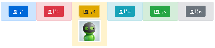
2.用折叠实现如下效果,单击按钮显示各自的图片:
<!doctype html>
<html lang="en">
  <head>
    <!-- Required meta tags -->
    <meta charset="utf-8">
    <meta name="viewport" content="width=device-width, initial-scale=1, shrink-to-fit=no">
    <!-- Bootstrap CSS -->
    <link rel="stylesheet" href="https://cdn.jsdelivr.net/npm/bootstrap@4.5.0/dist/css/bootstrap.min.css" integrity="sha384-9aIt2nRpC12Uk9gS9baDl411NQApFmC26EwAOH8WgZl5MYYxFfc+NcPb1dKGj7Sk" crossorigin="anonymous">
    <style type="text/css">
      .box{
      height: 70px;
      width: 100%;
      }
      .box1{
        background: #cce5ff;
      }
      .box2{
        background-color: #f8d7da;
      }
       .box3{
        background-color: #fff3cd;
      }
       .box4{
        background-color: #d1ecf1;
      }
       .box5{
        background-color:#d4edda;
      }
       .box6{
        background-color: #e2e3e5;
      }
      .btn{
        width: 50%;
        height: 50%;
        text-align: center;
      }
      .coll{
       background-color: #fff3cd;
      }
    </style>
    <title>下拉菜单2</title>
  </head>
  <body>
      <div class="container">
         <div class="row box border-0">
              <div class="box1 col-2 d-flex">
                <button class="btn-primary btn align-self-center  mx-auto" type="button" >图片1</button>
              </div>
              <div class="box2 col-2 d-flex">
                <button class="btn-danger btn align-self-center  mx-auto" type="button" >图片2</button>
              </div>
              <div class="box3 col-2 d-flex">
                <button class="btn-warning btn align-self-center  mx-auto" type="button" data-toggle="collapse" data-target="#collapseExample">图片3</button>
              </div>
              <div class="box4 col-2 d-flex">
                <button class="btn-info btn align-self-center  mx-auto" type="button" >图片4</button>
              </div>
              <div class="box5 col-2 d-flex">
                <button class="btn-success btn align-self-center  mx-auto" type="button" >图片5</button>
              </div>
              <div class="box6 col-2 d-flex">
                <button class="btn-secondary btn align-self-center  mx-auto" type="button" >图片6</button>
              </div>
         </div>
      </div>
      <div class="collapse container" id="collapseExample">
         <div class=" card col-2 coll card border-0" style="margin-left: 32%">
          <div class=" " >
            <img class="mx-3 my-2 border-white" src="1.jpg" style="border:5px solid; width: 80%;height: 80%;">

          </div>
         </div>
      </div>
    <!-- Optional JavaScript -->
    <!-- jQuery first, then Popper.js, then Bootstrap JS -->
    <script src="https://cdn.jsdelivr.net/npm/jquery@3.5.1/dist/jquery.slim.min.js" integrity="sha384-DfXdz2htPH0lsSSs5nCTpuj/zy4C+OGpamoFVy38MVBnE+IbbVYUew+OrCXaRkfj" crossorigin="anonymous"></script>
    <script src="https://cdn.jsdelivr.net/npm/popper.js@1.16.0/dist/umd/popper.min.js" integrity="sha384-Q6E9RHvbIyZFJoft+2mJbHaEWldlvI9IOYy5n3zV9zzTtmI3UksdQRVvoxMfooAo" crossorigin="anonymous"></script>
    <script src="https://cdn.jsdelivr.net/npm/bootstrap@4.5.0/dist/js/bootstrap.min.js" integrity="sha384-OgVRvuATP1z7JjHLkuOU7Xw704+h835Lr+6QL9UvYjZE3Ipu6Tp75j7Bh/kR0JKI" crossorigin="anonymous"></script>
  </body>
</html>
作业六、卡片
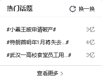
1.请做出微博的热搜卡片,如图所示,(蓝色的不是边框,是外面的背景色)

<!doctype html>
<html lang="en">
<head>
<!-- Required meta tags -->
<meta charset="utf-8">
<meta name="viewport" content="width=device-width, initial-scale=1, shrink-to-fit=no">
<!-- Bootstrap CSS -->
<link rel="stylesheet" href="https://cdn.jsdelivr.net/npm/bootstrap@4.5.0/dist/css/bootstrap.min.css" integrity="sha384-9aIt2nRpC12Uk9gS9baDl411NQApFmC26EwAOH8WgZl5MYYxFfc+NcPb1dKGj7Sk" crossorigin="anonymous">
<style type="text/css">
</style>
<title>卡片</title>
</head>
<body class="container p-3 "style="background-color:#93c5e2;">
<div style="width: 30%;height: 40%;">
<div class="card">
<div class="card-header bg-white d-flex justify-content-between" >
<div class=""><h5>热门话题</h3></div>
<a href="#" class="text-dark card-link"><div id="arrow">
<svg width="1em" height="1em" viewBox="0 0 16 16" class="bi bi-arrow-clockwise" fill="currentColor" xmlns="http://www.w3.org/2000/svg">
<path fill-rule="evenodd" d="M8 3a5 5 0 1 0 4.546 2.914.5.5 0 0 1 .908-.417A6 6 0 1 1 8 2v1z"/>
<path d="M8 4.466V.534a.25.25 0 0 1 .41-.192l2.36 1.966c.12.1.12.284 0 .384L8.41 4.658A.25.25 0 0 1 8 4.466z"/>
</svg>换一换
</a>
</div>
</div>
<div class="card-body ">
<div class="list-group border-0 text-dark ">
<div class=" d-flex justify-content-between ">
<a href="#" class="list-group-item border-0 text-dark py-1 card-link">#小霸王被申请破产#</a>
<span><small class="text-black-50">3亿</small></span>
</div>
<div class="d-flex justify-content-between">
<a href="#" class="list-group-item border-0 text-dark py-1 card-link">#特朗普明年一月将失去...#</a>
<span ><small class="text-black-50">4亿</small></span>
</div>
<div class="d-flex justify-content-between">
<a href="#" class="list-group-item border-0 text-dark py-1 card-link">#武汉一高校食堂员工用...#</a>
<span><small class="text-black-50">3亿</small></span>
</div>
</div>
</div>
<div class="card-footer bg-white text-center">
<a href="#" class="text-dark card-link">查看更多 ></a>
</div>
</div>
</div>
<!-- Optional JavaScript -->
<!-- jQuery first, then Popper.js, then Bootstrap JS -->
<script src="https://cdn.jsdelivr.net/npm/jquery@3.5.1/dist/jquery.slim.min.js" integrity="sha384-DfXdz2htPH0lsSSs5nCTpuj/zy4C+OGpamoFVy38MVBnE+IbbVYUew+OrCXaRkfj" crossorigin="anonymous"></script>
<script src="https://cdn.jsdelivr.net/npm/popper.js@1.16.0/dist/umd/popper.min.js" integrity="sha384-Q6E9RHvbIyZFJoft+2mJbHaEWldlvI9IOYy5n3zV9zzTtmI3UksdQRVvoxMfooAo" crossorigin="anonymous"></script>
<script src="https://cdn.jsdelivr.net/npm/bootstrap@4.5.0/dist/js/bootstrap.min.js" integrity="sha384-OgVRvuATP1z7JjHLkuOU7Xw704+h835Lr+6QL9UvYjZE3Ipu6Tp75j7Bh/kR0JKI" crossorigin="anonymous"></script>
</body>
</html>
2.请写出天猫商品列表效果:
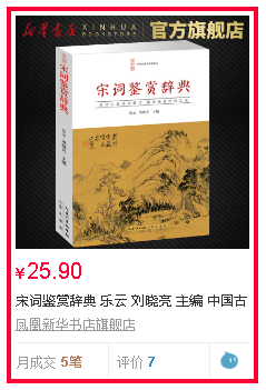
<!doctype html>
<html lang="en">
  <head>
    <!-- Required meta tags -->
    <meta charset="utf-8">
    <meta name="viewport" content="width=device-width, initial-scale=1, shrink-to-fit=no">
    <!-- Bootstrap CSS -->
    <link rel="stylesheet" href="https://cdn.jsdelivr.net/npm/bootstrap@4.5.0/dist/css/bootstrap.min.css" integrity="sha384-9aIt2nRpC12Uk9gS9baDl411NQApFmC26EwAOH8WgZl5MYYxFfc+NcPb1dKGj7Sk" crossorigin="anonymous">
    <style type="text/css">
        .mycol{

            color: #000;
            margin-left: -5px;
        }
        .mycol:hover{
            color: #000;
            text-decoration: none;
            border:5px solid #ff0036;
            z-index: 1;
        }
        .rmb{
            font-size: 14px;
            color: #ff0036;
        }
        .price{
            font-size: 22px;
            color: #ff0036;
            font-weight: bold;
        }
        .mytext{
            font-size: 16px;
            font-family: '宋体';
        }
        .dp{
            font-size: 16px;
            color: #a2a2a2;
        }
    </style>
    <title>卡片02</title>
  </head>
  <body >
    <div class="container pt-2 ">
        <div class="row ">
          <a href="#" class="col mycol card px-0 m-2">
            <div class="card-img-top p-1">
                <img src="TBCard.png" class="card-img-top">
            </div>
            <div class="card-body p-0">
                <span class="rmb">¥</span><span class="price">25.90</span>
            </div>
            <span class="mytext p-0">宋词鉴赏辞典 乐云 刘晓亮 主编 中国古</span>
            <u class="dp">凤凰新华书店旗舰店</u>
            <div class="myfooter card-footer bg-white p-0   d-flex ">
                        <span class="text-muted  col-5 pl-1 border">月成交<span class=" p-2 text-danger">5笔</span></span>
                         <span class="text-muted   col-5 border">评价<span class="p-2 text-primary">7</span></span>
                             <span class="text-muted col-2 d-inline-block border " style="width: 10px;"><img style="width: 20px;height: 20px;" src="AliIcon.png"></span>
            </div>
          </a>
           <a href="#" class="col mycol card px-0 m-2">
            <div class="card-img-top p-1">
                <img src="TBCard.png" class="card-img-top">
            </div>
            <div class="card-body p-0">
                <span class="rmb">¥</span><span class="price">25.90</span>
            </div>
            <span class="mytext p-0">宋词鉴赏辞典 乐云 刘晓亮 主编 中国古</span>
            <u class="dp">凤凰新华书店旗舰店</u>
            <div class="myfooter card-footer bg-white p-0   d-flex ">
                        <span class="text-muted  col-5 pl-1 border">月成交<span class=" p-2 text-danger">5笔</span></span>
                         <span class="text-muted   col-5 border">评价<span class="p-2 text-primary">7</span></span>
                             <span class="text-muted col-2 d-inline-block border " style="width: 10px;"><img style="width: 20px;height: 20px;" src="AliIcon.png"></span>
            </div>
          </a>
        </div>
    </div>

    <!-- Optional JavaScript -->
    <!-- jQuery first, then Popper.js, then Bootstrap JS -->
    <script src="https://cdn.jsdelivr.net/npm/jquery@3.5.1/dist/jquery.slim.min.js" integrity="sha384-DfXdz2htPH0lsSSs5nCTpuj/zy4C+OGpamoFVy38MVBnE+IbbVYUew+OrCXaRkfj" crossorigin="anonymous"></script>
    <script src="https://cdn.jsdelivr.net/npm/popper.js@1.16.0/dist/umd/popper.min.js" integrity="sha384-Q6E9RHvbIyZFJoft+2mJbHaEWldlvI9IOYy5n3zV9zzTtmI3UksdQRVvoxMfooAo" crossorigin="anonymous"></script>
    <script src="https://cdn.jsdelivr.net/npm/bootstrap@4.5.0/dist/js/bootstrap.min.js" integrity="sha384-OgVRvuATP1z7JjHLkuOU7Xw704+h835Lr+6QL9UvYjZE3Ipu6Tp75j7Bh/kR0JKI" crossorigin="anonymous"></script>
  </body>
</html>

若有收获,就点个赞吧
0 人点赞
