一、布局基础
4.1布局容器
容器是BS中最基本的布局元素,在使用默认栅格系统中是必须的。
BS当中有两种布局容器;.container:宽度会随设备浏览器的变化而呈现阶段性的变化。.container-fluid:宽度保持全屏大小
4.2浮动布局实例
通过一个实例,理解浮动布局的使用。
实例:利用浮动,做出如图所示的效果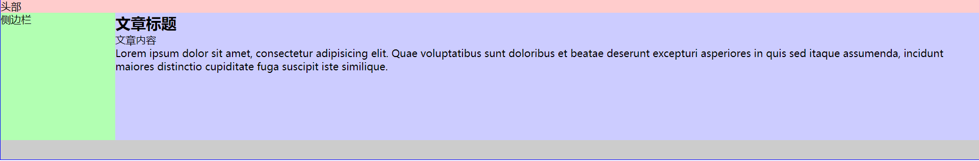
实现过程:
1.首先,把大致结构定义出来
<!DOCTYPE html><html lang="en"><head><meta charset="UTF-8"><title>浮动布局实例</title></head><body><div class="container"><header>头部</header><aside>侧边</aside><main><h1>标题</h1><p>文字</p></main><footer>底部</footer></div></body></html>
效果: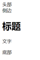 ,没有任何样式。
2.将所有元素,放入容器当中,因为只要设置了容器的位置,里面所有的元素都设置好了。
.container{width:960px;margin:0 auto;//垂直居中border:solid 1px #00f;}
效果: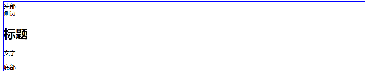
3.将各部分一一赋予样式
(1)头部:
header{background-color: #fcc;}
效果: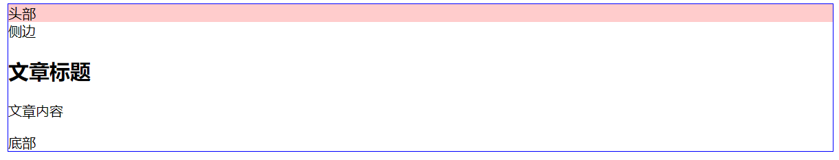
(2)侧边:
aside{width: 180px;height: 200px;background-color: #cfc;float: left; //让其左浮动}
效果: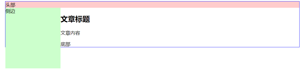
(3)主体部分:
main{width: 780px;height:200px;background-color: #ccf;float: left;}
效果: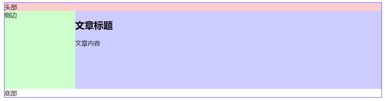
如果加入了边框,(border: 1px solid;)由于总宽度为加入边框之后的宽度,这时会因为整个main元素的总宽度超过了总容器的宽度,main元素会往下“掉”。
如图所示: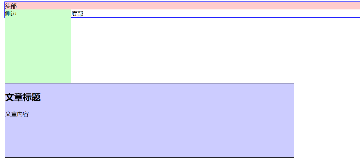
(4)底部:
footer{background-color: #ccc;}
效果: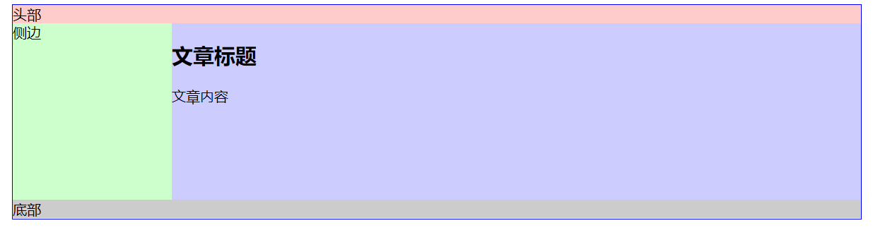
因此,实例就做完了?
其实这里需要注意,当把底部的文字去掉之后,会出现底部的边框会顶到上面去,如图: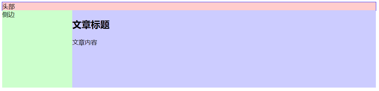
这是因为,浮动会脱离文档流,不会影响文字的显示,而现在footer部分连内容都没有了,下面的元素自然会往上顶。
解决办法:清理浮动
footer{background-color: #ccc;height: 25px;clear: both;}
运行效果: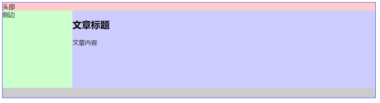
响应式布局实现过程:
或许,有人认为只需把宽度改成百分比,不就行了?
于是代码如下:
<!DOCTYPE html><html lang="en"><head><meta charset="UTF-8"><title>浮动布局实例</title><style type="text/css">.container{width:100%;margin:0 auto;border:solid 1px #00f;}header{background-color: #fcc;}aside{width: 15%;height: 200px;background-color: #cfc;float: left;}main{width: 85%;height:200px;background-color: #ccf;float: left;}footer{background-color: #ccc;height: 25px;clear: both;}</style></head><body><div class="container"><header>头部</header><aside>侧边</aside><main><h2>文章标题</h1><p>文章内容</p></main><footer></footer></div></body></html>
效果: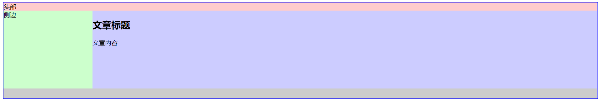
确实看起来很完美,但如果当屏幕缩小到很小的时候(比如手机端),这时侧边的区域会很小,如图: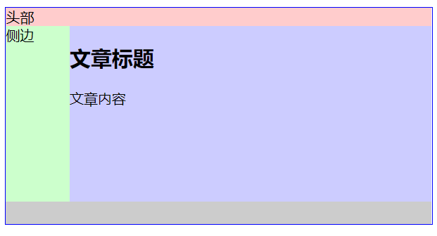
这对我们的使用造成很不方便,因为侧边一般用来作为导航来使用。
因此,侧边栏的宽度是需要固定的。
<!DOCTYPE html><html lang="en"><head><meta charset="UTF-8"><title>浮动布局实例</title><style type="text/css">.container{width:100%;margin:0 auto;border:solid 1px #00f;}header{background-color: #fcc;}aside{width: 180px;height: 200px;background-color: rgba(0, 255, 0, .3);}main{width: 85%;height:200px;background-color: #ccf;}footer{background-color: #ccc;height: 25px;clear: both;}</style></head><body><div class="container"><header>头部</header><aside>侧边</aside><main><h2>文章标题</h1><p>文章内容</p></main><footer></footer></div></body></html>
效果: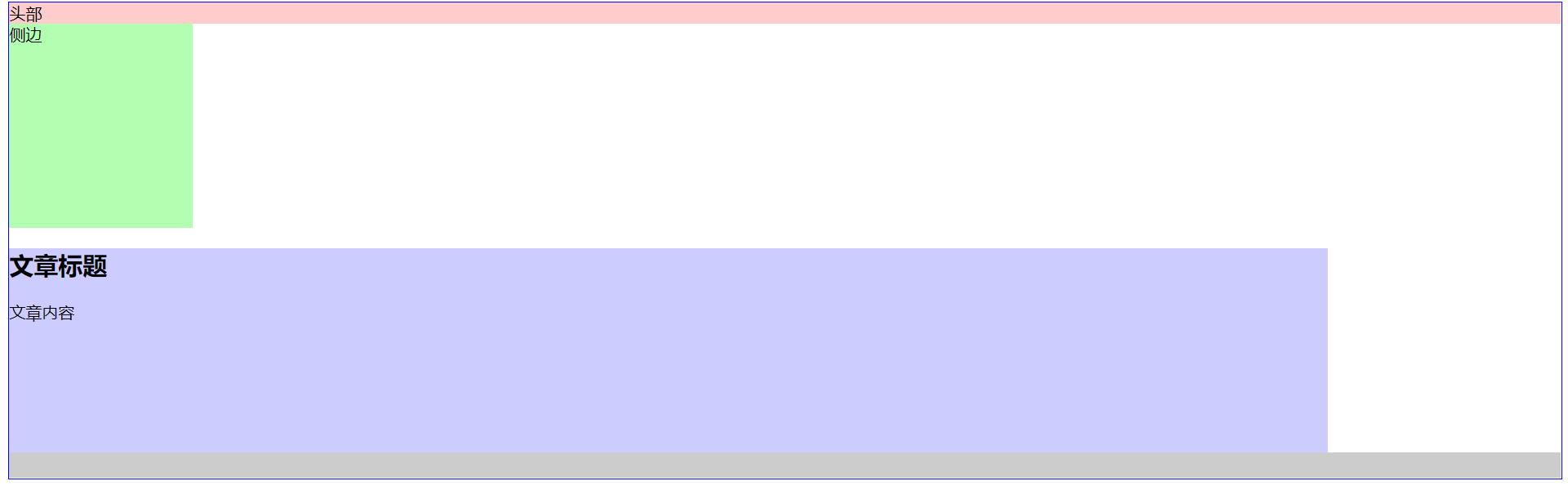
为什么有空隙,因为默认的元素设置。
消除空隙加入:
*{
        margin: 0;
        padding: 0;
    }
效果: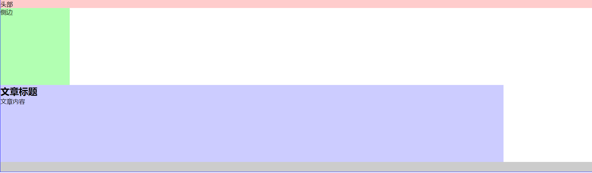
这时,如果让main元素上去,则,在aside中加入左浮动属性。
效果: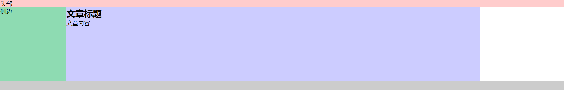
会发现左边部分会重叠。
这时,需要对main元素设置margin属性,将左边的重叠部分设置边距。边距大小为侧边栏的宽度大小。
同时,main右边一块为空,这时把宽度删除掉,会填充掉剩余部分,因为这个container容器宽度为100%。
aside{
        width: 180px;
        height: 200px;
        background-color: rgba(0, 255, 0, .3);
        float: left;
    }
最后,完整代码
<!DOCTYPE html>
<html lang="en">
<head>
    <meta charset="UTF-8">
    <title>浮动布局实例</title>
    <style type="text/css">
        .container{
        width:100%;
        margin:0 auto;
        border:solid 1px #00f;
    }
    *{
        margin: 0;
        padding: 0;
    }
    header{
        background-color: #fcc;
    }
    aside{
        width: 180px;
        height: 200px;
        background-color: rgba(0, 255, 0, .3);
        float: left;

    }
    main{
        height:200px;
        background-color: #ccf;
        margin-left: 180px;
    }
    footer{
        background-color: #ccc;
        height: 25px;
        clear: both;
    }
    </style>
</head>
<body>
    <div class="container">
         <header>头部</header>
    <aside>侧边</aside>
    <main>
        <h2>文章标题</h1>
        <p>文章内容</p>
        <p>Lorem ipsum dolor sit amet, consectetur adipisicing elit. Consequuntur eligendi, illo autem esse praesentium ad iusto fuga repellendus perferendis tenetur sunt fugit vitae illum dolorem in a ex deleniti officia!</p>
    </main>
    <footer></footer>
    </div>

</body>
</html>
最终效果: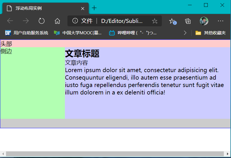
左边的侧边栏不会随着宽度的改变而改变,右边的内容部分则随着宽度的变化而自动排版,弹性布局完成!

若有收获,就点个赞吧
0 人点赞
