antd 中的 Menu 组件用于绘制菜单栏,其实现基于 rc-menu。
本文第一部分介绍菜单栏实现的整体结构;
第二部分介绍 rc-menu;
第三部分介绍 Menu 组件。
需要声明的是,本文使用 RcMenu 指代 rc-menu 输出的 Menu 组件或其实例,使用 Menu 指代 antd 输出的 Menu 组件或其实例、或抽象意义的菜单栏组件,余同。
整体结构
在视图上,菜单栏分为水平布局和垂直布局两种,又支持层叠嵌套(如主菜单 Menu 嵌套子菜单 SubMenu);子菜单的展开形式分为内嵌和浮层两种。Menu 组件通过 props.mode 区分所采用的模式:vertical 为垂直模式;
horizontal 为水平模式;inline 为内嵌模式。菜单栏的垂直布局和水平布局借助样式实现。在水平布局中,超出菜单栏宽度的菜单项需要合并展示,这部分处理逻辑由 rc-menu 中的 DomWrap 组件实现。
在内容上,主菜单和子菜单相仿,功能上有交集。在 rc-menu 中,主菜单 Menu 和子菜单 SubMenu 均通过 SubPopupMenu 组件绘制内容,SubPopupMenu 又使用 DomWrap 控制水平布局时的元素展示。SubPopupMenu 自有的处理逻辑为:控制菜单栏的激活状态(通过 componentDidUpdate, onKeyDown, onItemHover 方法达成,详见下文)。用过 antd 的同学应该了解,Menu 组件下可使用 SubMenu, MenuItem, MenuItemGroup 绘制子菜单或菜单项,父子元素之间就会有状态管理方面的通信需求。针对这个问题,SubPopupMenu 使用 React.clone 方法将父组件实现的状态管理函数或其 props 属性注入到子组件中,从而串联了主菜单与子菜单、主菜单与菜单项、以及子菜单与菜单项。
菜单栏的状态管理分为三种:菜单项的激活状态、菜单项的选中状态、子菜单的展开折叠状态。rc-menu 借助 mini-store 管理这些状态:activeKey 激活的菜单项,selectedKeys 选中的菜单项,openKeys 展开的子菜单。如上文所说,activeKey 由 SubPopupMenu 处理其更新逻辑。selectedKeys, openKeys 均由 RcMenu 处理其更新逻辑。交互层面,当 props.selectedKeys, props.openKeys 变更时,RcMenu 提供的 updateMiniStore 方法将负责更新 store 中的存储数据;当用户行为发生时,RcMenu 提供的 onSelect, onDeSelect, onOpenChange 方法将负责更新 store 中的存储数据,这些方法又通过 SubPopupMenu 长传到 SubMenu, MenuItem, MenuItemGroup 中。简而言之,RcMenu 既通过 props 接受使用者传入的菜单栏整体配置数据,又集成了 selectedKeys, openKeys 的状态管理函数。
在 RcMenu 提供 onSelect, onDeSelect, onOpenChange 方法和 SubPopupMenu 提供的 onItemHover 方法的基础上,子菜单 RcSubMenu 既将 onSelect, onDeSelect 透传给菜单项,又使用 onOpenChange 控制展开折叠状态,onItemHover 更新激活状态。不同于主菜单,子菜单需要以内嵌或浮层形式表现内容,且需要在展开与折叠过程中显示动效。借助 rc-trigger、rc-animate 库,RcSubMenu 集成了浮层显示功能和动效展示逻辑。即,通过 props.mode 判断菜单栏是否采用 inline 模式,RcSubMenu 将以浮层形式绘制子菜单内容;子菜单展开与折叠过程中所采用的动效,取决于顶层容器 Menu 主菜单接受 props 配置。
菜单项 RcMenuItem 通过 props 接受 RcMenu 提供的 onSelect, onDeSelect 方法和 SubPopupMenu 提供的 onItemHover 方法,以便在点击事件、鼠标移入移出时更新 store 中的状态。在 RcMenuItem 的基础上,RcMenuItemGroup 用于绘制成组的菜单项。
下图是 rc-menu 的整体结构: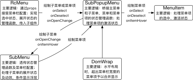
在 rc-menu 实现状态管理的基础上,antd 提供的 Menu 组件用于桥接侧边栏和菜单栏的关联性,维护内置的动效显示,以及样式处理。详见下文。
rc-menu
rc-menu 的类图为: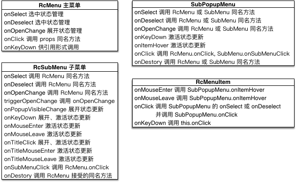
rc-menu 中的状态管理:
- selectedKeys 选中的菜单项:由 RcMenu 提供 onSelect, onDeselect 方法加以管理。onSelect, onDeselect 方法将长传到 RcMenuItem 组件,以便在 RcMenuItem 的 onKeyDown, onClick 行为中更新状态。同时,在 RcMenu 的 componentDidUpdate 生命周期中,也将 props.selectedKeys 更新状态值。
- openKeys 展开的子菜单:由 RcMenu 提供 onOpenChange 方法加以管理。onOpenChange 方法将长传到 RcSubMenu 组件并封装为 RcSubMenu.triggerOpenChange 方法,以便在 RcSubMenu 的 onKeyDown, onTitleClick, onPopupVisibleChange 行为中更新状态。同时,在 RcMenu 的 componentDidUpdate 生命周期中,也将 props.openKeys 更新状态值。
- activeKey 激活的菜单项:由辅助函数 updateActiveKey 加以管理。updateActiveKey 函数被 SubPopupMenu 的 componentDidUpdate, onItemHover 方法调用。其中,onItemHover 方法将长传到 RcSubMenu 或 RcMenuItem 组件,以便在 RcSubMenu 的 onTitleMouseEnter, onTitleMouseLeave 行为或 RcMenuItem 的 onMouseEnter, onMouseLeave 行为中更新状态。
- defaultActiveFirst 是否激活首个菜单项,辅助计算激活的菜单项:由辅助函数 updateDefaultActiveFirst 加以管理。updateDefaultActiveFirst 函数被 RcSubMenu 的 constructor, onKeyDown, onMouseEnter, onTitleClick 方法调用。其中,constructor 将视 RcSubMenu 接受的 props.defaultActiveFirst 设置状态;onKeyDown 将状态更新为 true;onMouseEnter, onTitleClick 均更新为 false。
rc-menu 中的 key 键用于辅助状态管理。key 键仅对于子菜单或菜单项才有效。在默认情况下,SubPopupMenu 会以 ‘0-menu-‘ 作为前缀,递归创建子菜单或菜单项的 key 键,并设置为该子菜单或菜单项的 props.eventKey。当菜单项作为子菜单的元素时,那么菜单项的 key 键就以子菜单的 props.eventKey 作为前缀。当使用者为子菜单或菜单项设置了 key 键时,rc-menu 将以它作为该子菜单或菜单项的 props.eventKey 键。因此,相同的 key 键是不被允许的。
| 1
2
3
4
5
6
7
8
9
10
11
| // 当 SubPopupMenu 作为 RcMenu 的直系子元素时,返回 ‘0-menu-‘
// 其余情况获取子菜单或菜单项的 props.eventKey
function getEventKey(props) {
return props.eventKey || ‘0-menu-‘;
}
// 自动创建 key 键并返回,或者返回使用者设置的 key 键
function getKeyFromChildrenIndex(child, menuEventKey, index) {
const prefix = menuEventKey || ‘’;
return child.key || ${prefix}item_${index};
}
|
| :—- | :—- |
在 store 中,selectedKeys, openKeys 以 key 键作为数组项;activeKey, defaultActiveFirst 以 key 键作为属性名。当用户行为发生时,key 键将被封装到对象中,通过逐级调用 props 方法,冒泡给 RcMenu 实例的 onOpenChange, onSelect, onDeselect 或者 SubPopupMenu 实例的 onItemHover 方法,最终改变 store 的状态。需要说明的是,菜单项的 onClick 也会逐级调用 props 方法,以数组形式拼接子菜单的 key 键,最终冒泡给 RcMenu 接受的 props.onClick 方法。而 RcMenu 接受的 props.onDestory 方法,则是逐级向下传递,最终在每个菜单项的 componentWillUnmount 生命周期中,均执行 onDestory 方法,参数即菜单项的 key 键。特别的,RcMenu 实现的 onKeyDown 实例方法将逐级往下调用 SubPopupMenu, RcSubMenu, RcMenuItem 中的 onKeyDown 方法。在这个过程中,SubPopupMenu 构建的 onKeyDown 实例方法也将在 DomWrap 组件被绑定为视图元素 onKeyDown 事件发生时的执行函数。
| 1
2
3
4
5
6
7
8
9
10
11
12
13
14
15
16
17
18
19
20
21
22
23
24
25
26
27
28
29
30
31
32
33
34
35
36
37
38
39
40
41
42
43
44
45
46
47
48
49
50
51
52
53
54
55
56
57
58
59
60
61
62
63
64
65
66
67
68
69
70
71
72
73
74
75
76
77
78
79
80
81
82
83
84
85
86
87
88
89
90
91
92
| class Menu extends React.Component {
// 以引用形式调用,可依次改变选中的菜单项
// 当遇到子菜单时,先展开子菜单,再选中子菜单项
onKeyDown = (e, callback) => {
// this.innerMenu.getWrappedInstance 用于获得 Menu 下直系子元素 —— SubPopupMenu 实例
this.innerMenu.getWrappedInstance().onKeyDown(e, callback);
}
}
class SubPopupMenu extends React.Component {
onKeyDown = (e, callback) => {
const keyCode = e.keyCode;
let handled;
// 依次选中菜单项或展开子菜单
this.getFlatInstanceArray().forEach((obj) => {
if (obj && obj.props.active && obj.onKeyDown) {
handled = obj.onKeyDown(e);
}
});
if (handled) {
return 1;
}
let activeItem = null;
if (keyCode === KeyCode.UP || keyCode === KeyCode.DOWN) {
activeItem = this.step(keyCode === KeyCode.UP ? -1 : 1);
}
if (activeItem) {
e.preventDefault();
updateActiveKey(this.props.store, getEventKey(this.props), activeItem.props.eventKey);
if (typeof callback === 'function') {<br /> callback(activeItem);<br /> }return 1;<br /> }<br /> };<br />}
class SubMenu extends React.Component {
onKeyDown = (e) => {
const keyCode = e.keyCode;
const menu = this.menuInstance;
const { isOpen, store } = this.props;
// 展开子菜单,更新 defaultActiveFirst 状态<br /> if (keyCode === KeyCode.ENTER) {<br /> this.onTitleClick(e);<br /> updateDefaultActiveFirst(store, this.props.eventKey, true);<br /> return true;<br /> }if (keyCode === KeyCode.RIGHT) {<br /> // 展开状态,选中子菜单项;menu 为 SubMenu 下直系子元素 —— SubPopupMenu 实例<br /> if (isOpen) {<br /> menu.onKeyDown(e);<br /> // 未展开状态,展开子菜单并更新 defaultActiveFirst 状态<br /> } else {<br /> this.triggerOpenChange(true);<br /> updateDefaultActiveFirst(store, this.props.eventKey, true);<br /> }<br /> return true;<br /> }<br /> if (keyCode === KeyCode.LEFT) {<br /> let handled;<br /> if (isOpen) {<br /> handled = menu.onKeyDown(e);<br /> } else {<br /> return undefined;<br /> }<br /> if (!handled) {<br /> this.triggerOpenChange(false);<br /> handled = true;<br /> }<br /> return handled;<br /> }if (isOpen && (keyCode === KeyCode.UP || keyCode === KeyCode.DOWN)) {<br /> return menu.onKeyDown(e);<br /> }<br /> };<br />}
class MenuItem extends React.Component {
onKeyDown = (e) => {
const keyCode = e.keyCode;
if (keyCode === KeyCode.ENTER) {
this.onClick(e);// 更新菜单的选中状态
return true;
}
};
}
|
| :—- | :—- |
以上介绍了 rc-menu 中的状态管理和事件处理逻辑,下面将扼要地介绍 rc-menu 中的各组件。
SubPopupMenu
SubPopupMenu 对激活状态的管理可参见上文,可参见上文及源码。这里只介绍 SubPopupMenu 的层级关系。
SubPopupMenu 可以作为 RcMenu 或 RcSubMenu 的直系子元素,其下可渲染 RcSubMenu 或 RcMenuItem 元素。在其实现中,既将 RcMenu 接受的 props 菜单栏整体配置项注入到子元素;又将 RcMenu 或 SubPopupMenu 提供的状态管理函数(均封装为 SubPopupMenu 的实例方法)注入 RcSubMenu 或 RcMenuItem。上述过程,见于 renderCommonMenuItem 方法,该方法由 renderMenuItem 直接调用。
renderMenuItem 方法的实现与 ref 引用处理一样,两者均让人心生纳闷:前者没有实现的必要;后者在 componentDidMount 生命周期管理实例引用,当菜单内容变化时仍会以缓存持有引用。
| 1
2
3
4
5
6
7
8
9
10
11
12
13
14
15
16
17
18
19
20
21
22
23
24
25
26
27
28
29
30
31
32
33
34
35
36
37
38
39
40
41
42
43
44
45
46
47
48
49
50
51
52
53
54
55
56
57
58
59
60
61
62
63
| class SubPopupMenu extends React.Component {
renderCommonMenuItem = (child, i, extraProps) => {
const state = this.props.store.getState();
const props = this.props;
const key = getKeyFromChildrenIndex(child, props.eventKey, i);// 创建或获取 key 键
const childProps = child.props;
const isActive = key === state.activeKey;
// 混入菜单栏整体配置或状态管理函数、事件绑定函数<br /> const newChildProps = {<br /> mode: childProps.mode || props.mode,<br /> level: props.level,<br /> inlineIndent: props.inlineIndent,<br /> renderMenuItem: this.renderMenuItem,<br /> rootPrefixCls: props.prefixCls,<br /> index: i,<br /> parentMenu: props.parentMenu,<br /> // customized ref function, need to be invoked manually in child's componentDidMount<br /> manualRef: childProps.disabled ? undefined :<br /> createChainedFunction(child.ref, saveRef.bind(this)),<br /> eventKey: key,<br /> active: !childProps.disabled && isActive,<br /> multiple: props.multiple,<br /> onClick: (e) => {<br /> (childProps.onClick || noop)(e);<br /> this.onClick(e);<br /> },<br /> onItemHover: this.onItemHover,<br /> openTransitionName: this.getOpenTransitionName(),<br /> openAnimation: props.openAnimation,<br /> subMenuOpenDelay: props.subMenuOpenDelay,<br /> subMenuCloseDelay: props.subMenuCloseDelay,<br /> forceSubMenuRender: props.forceSubMenuRender,<br /> onOpenChange: this.onOpenChange,<br /> onDeselect: this.onDeselect,<br /> onSelect: this.onSelect,<br /> builtinPlacements: props.builtinPlacements,<br /> itemIcon: childProps.itemIcon || this.props.itemIcon,<br /> expandIcon: childProps.expandIcon || this.props.expandIcon,<br /> ...extraProps,<br /> };<br /> if (props.mode === 'inline') {<br /> newChildProps.triggerSubMenuAction = 'click';<br /> }<br /> return React.cloneElement(child, newChildProps);<br /> };
render() {
// props 处理及解构
// renderMenuItem 将调用 renderCommonMenuItem 渲染子元素
return (
${prefixCls}-hidden} visible={visible}
overflowedIndicator={overflowedIndicator} {…domProps}>
{
React.Children.map(props.children, (c, i) =>
this.renderMenuItem(c, i, eventKey || ‘0-menu-‘)
)
}
);
}
}
|
| :—- | :—- |
DomWrap
对于水平布局的菜单栏,DOMWrap 借助 resize-observer-polyfill,MutationObserver ,当 DOMWrap 实例或其子元素的 dom 内容或尺寸调整时,重新加以渲染。这样,在 DOMWrap 中就可以计算最后一个待显示的菜单项,并将这个菜单项和其余菜单项以 SubMenu 形式合并展示。其处理逻辑有:
- 在 componentDidMount 生命周期为 DOMWrap 实例及其子元素绑定 dom 变更的监听函数。
- 当 dom 变更时,由监听函数调用 setChildrenWidthAndResize 实例方法。setChildrenWidthAndResize 先计算菜单项全显示时的总宽度,再将该宽度和菜单栏实际宽度对比,由此更新 state.lastVisibleIndex(最后一个待显示的菜单项的索引)。
在重绘阶段,DomWrap 将在每个已显示的菜单项后插入一个不予显示的 SubMenu 组件(其样式类带有 ‘overflowed-submenu’ 后缀,eventKey 为 ‘overflowed-indicator’ 后缀);而待合并的菜单项将会用一个显示的 SubMenu 组件包裹,这样在点击时就可以显示浮层。 | 1
2
3
4
5
6
7
8
9
10
11
12
13
14
15
16
17
18
19
20
21
22
23
24
25
26
27
28
29
30
31
32
33
34
35
36
37
38
39
40
41
42
43
44
45
46
47
48
49
50
51
52
53
54
55
56
57
58
59
60
61
62
63
64
65
66
67
68
69
70
71
72
73
74
75
76
77
78
79
80
81
82
83
84
85
86
87
88
89
90
91
92
93
94
95
96
97
98
99
100
101
102
103
104
105
106
107
108
109
110
111
112
113
114
115
116
117
118
119
120
121
122
123
124
125
126
127
128
129
| class DOMWrap extends React.Component {
componentDidMount() {
this.setChildrenWidthAndResize();
if (this.props.level === 1 && this.props.mode === ‘horizontal’) {
const menuUl = ReactDOM.findDOMNode(this);
if (!menuUl) return;this.resizeObserver = new ResizeObserver(entries => {
entries.forEach(this.setChildrenWidthAndResize);
});// 为 DOMWrap 及其子元素绑定监听函数
[].slice.call(menuUl.children).concat(menuUl).forEach(el => {
this.resizeObserver.observe(el);
});// 当子元素列表改变时,重新为子元素绑定监听函数,避免触发不必要的回调
if (typeof MutationObserver !== ‘undefined’) {
this.mutationObserver = new MutationObserver(() => {
this.resizeObserver.disconnect();
[].slice.call(menuUl.children).concat(menuUl).forEach(el => {
this.resizeObserver.observe(el);
});
this.setChildrenWidthAndResize();
});
this.mutationObserver.observe(
menuUl,
{ attributes: false, childList: true, subTree: false }
);
}
}
}getOverflowedSubMenuItem = (keyPrefix, overflowedItems, renderPlaceholder) => {
// this.props.overflowedIndicator 通常是 ‘…’
const { overflowedIndicator, level, mode, prefixCls, theme, style: propStyle } = this.props;
if (level !== 1 || mode !== ‘horizontal’) {
return null;
}
const copy = this.props.children[0];
const { children: throwAway, title, eventKey, …rest } = copy.props;let style = { …propStyle };
let key =${keyPrefix}-overflowed-indicator;if (overflowedItems.length === 0 && renderPlaceholder !== true) {
style = {
…style,
display: ‘none’,
};
} else if (renderPlaceholder) {
style = {
…style,
visibility: ‘hidden’,
position: ‘absolute’,
};
key =${key}-placeholder;
}const popupClassName = theme ?
${prefixCls}-${theme}: ‘’;
const props = {};
menuAllProps.forEach(k => {
if (rest[k] !== undefined) {
props[k] = rest[k];
}
});return (
popupClassName={popupClassName} {…props} key={key}
eventKey={${keyPrefix}-overflowed-indicator} disabled={false} style={style}>
{overflowedItems}
);
}renderChildren(children) {
const { lastVisibleIndex } = this.state;
return (children || []).reduce((acc, childNode, index) => {
let item = childNode;
if (this.props.mode === ‘horizontal’) {
let overflowed = this.getOverflowedSubMenuItem(childNode.props.eventKey, []);
if (lastVisibleIndex !== undefined &&
this.props.className.indexOf(${this.props.prefixCls}-root) !== -1
) {
if (index > lastVisibleIndex) {
// 修改 eventKey 是为了防止隐藏状态下还会触发 openkeys 事件
item = React.cloneElement(childNode, {
style: { display: ‘none’ },
eventKey:${childNode.props.eventKey}-hidden,
className:${childNode.className} ${MENUITEM_OVERFLOWED_CLASSNAME}
});
}
if (index === lastVisibleIndex + 1) {
this.overflowedItems = children.slice(lastVisibleIndex + 1).map(c => {
return React.cloneElement(c, {
key: c.props.eventKey,
mode: ‘vertical-left’
});
});overflowed = this.getOverflowedSubMenuItem(<br /> childNode.props.eventKey,<br /> this.overflowedItems,<br /> );<br /> }<br /> }const ret = [...acc, overflowed, item];if (index === children.length - 1) {<br /> // 设置占位符,以计算 overflowed indicator 的宽度<br /> ret.push(this.getOverflowedSubMenuItem(childNode.props.eventKey, [], true));<br /> }<br /> return ret;<br /> }<br /> return [...acc, item];<br /> }, []);<br /> }
render() {
// Tag 即 this.props.tag,默认为 ul
return (
{this.renderChildren(this.props.children)}
);
}
}
| | :—- | :—- |
SubMenu
除了上文提到的,SubMenu 的处理逻辑还包含:
- 通过 store 获取 props.isOpen 子菜单是否展开, props.active 子菜单是否激活, props.selectedKeys 辅助计算子菜单或子菜单项是否被选中。三者均影响样式。
- 组件层级上,SubMenu 根据菜单栏是否采用 inline 模式,以决定使用 Trigger 组件(rc-trigger 提供)包裹子元素,或者单纯绘制子元素;继而使用 Animate 组件(rc-animate 提供)绘制子元素,子元素均统一由 SubPopupMenu 组件渲染。
| 1
2
3
4
5
6
7
8
9
10
11
12
13
14
15
16
17
18
19
20
21
22
23
24
25
26
27
28
29
30
31
32
33
34
35
36
37
38
39
40
41
42
43
44
45
46
47
48
49
50
51
52
53
54
55
56
57
58
59
60
61
62
63
64
65
66
67
68
69
70
71
72
73
74
75
76
77
78
79
80
81
| class Menu extends React.Component {
// 获取传入子组件的 props.openTransitionName 属性
getOpenTransitionName = () => {
const props = this.props;
let transitionName = props.openTransitionName;
const animationName = props.openAnimation;
if (!transitionName && typeof animationName === ‘string’) {
transitionName =${props.prefixCls}-open-${animationName};
}
return transitionName;
}
}
class SubMenu extends React.Component {
renderChildren(children) {
// 构建 baseProps,按条件只绘制空内容…
const animProps = {};
const transitionAppear = haveRendered || !baseProps.visible || !baseProps.mode === ‘inline’;
if (baseProps.openTransitionName) {
animProps.transitionName = baseProps.openTransitionName;
} else if (typeof baseProps.openAnimation === ‘object’) {
animProps.animation = { …baseProps.openAnimation };
if (!transitionAppear) {
delete animProps.animation.appear;
}
}
return (<br /> <Animate {...animProps} showProp="visible" component="" transitionAppear={transitionAppear}><br /> <SubPopupMenu {...baseProps} id={this._menuId}>{children}</SubPopupMenu><br /> </Animate><br /> );<br /> }
render() {
// props 处理及结构…
const isOpen = props.isOpen;
const isInlineMode = props.mode === ‘inline’;
// 展开按钮<br /> let icon = null;<br /> if (props.mode !== 'horizontal') {<br /> icon = this.props.expandIcon; // ReactNode<br /> if (typeof this.props.expandIcon === 'function')<br /> icon = React.createElement(this.props.expandIcon, { ...this.props });<br /> }const title = (<br /> <div ref={this.saveSubMenuTitle} style={style} className={`${prefixCls}-title`}<br /> {...titleMouseEvents} {...titleClickEvents} aria-expanded={isOpen}<br /> {...ariaOwns} aria-haspopup="true"<br /> title={typeof props.title === 'string' ? props.title : undefined}><br /> {props.title}<br /> {icon || <i className={`${prefixCls}-arrow`} />}<br /> </div><br /> );<br /> const children = this.renderChildren(props.children);return (<br /> <li {...props} {...mouseEvents} className={className} role="menuitem"><br /> {isInlineMode && title}<br /> {isInlineMode && children}<br /> {!isInlineMode && (<br /> <Trigger prefixCls={prefixCls}<br /> popupClassName={`${prefixCls}-popup ${popupClassName}`}<br /> getPopupContainer={getPopupContainer}<br /> builtinPlacements={Object.assign({}, placements, builtinPlacements)}<br /> popupPlacement={popupPlacement} popupVisible={isOpen}<br /> popupAlign={popupAlign} popup={children}<br /> action={disabled ? [] : [triggerSubMenuAction]}<br /> mouseEnterDelay={subMenuOpenDelay}<br /> mouseLeaveDelay={subMenuCloseDelay}<br /> onPopupVisibleChange={this.onPopupVisibleChange}<br /> forceRender={forceSubMenuRender}><br /> {title}<br /> </Trigger><br /> )}<br /> </li><br /> );<br /> }<br />}<br /> |
| :—- | :—- |
其他
Menu 用于绘制主菜单,参见上文或源码。
MenuItem 用于绘制菜单项,将根据 store 中的 activeKey, selectedKeys 渲染样式。除了常规的事件处理函数之外,当菜单项被激活时,MenuItem 将借助 dom-scroll-into-view 使屏幕滚动到指定区域。MenuItem 与 SubMenu 一样,也将使用 props.level 菜单项的层级计算左边距。
MenuItemGroup 用于绘制成组的菜单项,并且带有标题。在 MenuItemGroup 中,实际绘制菜单项所需的 props.renderMenuItem 方法由 SubPopupMenu 提供。
Divider 用于绘制分割线。
Menu
Menu
Menu 作为菜单的容器,其上桥接 Sider 布局组件传入的 context.siderCollapsed, context.collapsedWidth;其下为子菜单或菜单项注入 context.inlineCollapsed, context.antdMenuTheme。其中,context.siderCollapsed 表示侧边栏是否折叠;context.collapsedWidth 表示侧边栏宽度;context.inlineCollapsed 表示内嵌模式的菜单是否折叠,或者侧边栏是否折叠;context.antdMenuTheme 表示菜单所采用的样式风格。
组件层级上,Menu 使用 RcMenu 绘制内容。当传入 props.openKeys 时,Menu 将表现为受控组件,其内置的 state.openKeys 将根据 props.openKeys 作调整,使用者也可以通过 props.onOpenChange 实时获取到实时展开的菜单项;当没有传入 props.openKeys 时,Menu 将表现为非受控组件,state.openKeys 将根据用户行为更新。
在非内嵌模式下,Menu 为 RcMenu 绑定 onClick = this.handleClick 实例方法,以在当用户点击菜单栏的空白区域或子菜单项时,可隐藏弹出的浮层。
在动效处理上,当菜单栏由 inline 模式切换到其他模式或者在 inline 模式下收起菜单(实际菜单需要垂直布局显示)时,先需显示 inline 模式下子菜单的折叠动效,在动效执行完成后,再转换成其他模式(介于 rc-menu 没有针对动效时延的处理)。Menu 使用 switchingModeFromInline 实例属性记录模式转换及折叠状态切换。在此基础上,getRealMenuMode 用于计算菜单实际采用的显示模式,再由 getMenuOpenAnimation 获得待显示的功效。当动效执行完成时,handleTransitionEnd 实例方法将重置 switchingModeFromInline 缓存。
| 1
2
3
4
5
6
7
8
9
10
11
12
13
14
15
16
17
18
19
20
21
22
23
24
25
26
27
28
29
30
31
32
33
34
35
36
37
38
39
40
41
42
43
44
45
46
47
48
49
50
51
52
53
54
55
56
57
58
59
60
61
62
63
64
65
66
67
68
69
70
71
72
73
74
75
76
77
78
79
80
81
82
83
84
85
86
87
88
89
90
91
92
93
94
95
96
97
98
99
100
101
102
103
104
105
106
107
108
109
110
111
112
113
114
115
116
117
118
119
120
121
122
123
124
125
126
127
128
129
130
131
132
133
134
135
136
137
138
139
140
141
142
143
144
145
146
147
148
149
150
151
152
| import cssAnimation from ‘css-animation’;
import raf from ‘raf’;
function animate(node: HTMLElement, show: boolean, done: () => void) {
let height: number;
let requestAnimationFrameId: number;
return cssAnimation(node, ‘ant-motion-collapse’, {
start() {
if (!show) {
node.style.height = ${node.offsetHeight}px;
node.style.opacity = ‘1’;
} else {
height = node.offsetHeight;
node.style.height = ‘0px’;
node.style.opacity = ‘0’;
}
},
active() {
if (requestAnimationFrameId) {
raf.cancel(requestAnimationFrameId);
}
requestAnimationFrameId = raf(() => {
node.style.height = ${show ? height : 0}px;
node.style.opacity = show ? ‘1’ : ‘0’;
});
},
end() {
if (requestAnimationFrameId) {
raf.cancel(requestAnimationFrameId);
}
node.style.height = ‘’;
node.style.opacity = ‘’;
done();
},
});
}
const animation = {
enter(node: HTMLElement, done: () => void) {
return animate(node, true, done);
},
leave(node: HTMLElement, done: () => void) {
return animate(node, false, done);
},
appear(node: HTMLElement, done: () => void) {
return animate(node, true, done);
},
};
class Menu extends React.Component
componentWillReceiveProps(nextProps: MenuProps, nextContext: SiderContext) {
if (this.props.mode === ‘inline’ &&
nextProps.mode !== ‘inline’) {
this.switchingModeFromInline = true;
}
if (‘openKeys’ in nextProps) {
this.setState({ openKeys: nextProps.openKeys! });
return;
}
if ((nextProps.inlineCollapsed && !this.props.inlineCollapsed) ||
(nextContext.siderCollapsed && !this.context.siderCollapsed)) {
this.switchingModeFromInline = true;
this.inlineOpenKeys = this.state.openKeys;// 缓存 inline 模式展开的菜单项
this.setState({ openKeys: [] });
}
if ((!nextProps.inlineCollapsed && this.props.inlineCollapsed) ||
(!nextContext.siderCollapsed && this.context.siderCollapsed)) {
this.setState({ openKeys: this.inlineOpenKeys });
this.inlineOpenKeys = [];
}
}
// Restore vertical mode when menu is collapsed responsively when mounted
// https://github.com/ant-design/ant-design/issues/13104
// TODO: not a perfect solution, looking a new way to avoid setting switchingModeFromInline in this situation
// 折叠状态刷新页面,因为未执行动效,switchingModeFromInline 仍为真,显示为 inline 模式
handleMouseEnter = (e: MouseEvent) => {
this.restoreModeVerticalFromInline();
const { onMouseEnter } = this.props;
if (onMouseEnter) {
onMouseEnter(e);
}
}
handleTransitionEnd = (e: TransitionEvent) => {
// when inlineCollapsed menu width animation finished
// https://github.com/ant-design/ant-design/issues/12864
const widthCollapsed = e.propertyName === ‘width’ && e.target === e.currentTarget;
// Fix for
// https://github.com/ant-design/ant-design-pro/issues/2783
const iconScaled = e.propertyName === ‘font-size’ && (e.target as HTMLElement).className.indexOf(‘anticon’) >= 0;
if (widthCollapsed || iconScaled) {
this.restoreModeVerticalFromInline();
}
}
// 重置 switchingModeFromInline,并重绘菜单
restoreModeVerticalFromInline() {
if (this.switchingModeFromInline) {
this.switchingModeFromInline = false;
this.setState({});
}
}
// 是否折叠,取决于侧边栏的折叠情况、内嵌模式的折叠情况
getInlineCollapsed() {
const { inlineCollapsed } = this.props;
if (this.context.siderCollapsed !== undefined) {
return this.context.siderCollapsed;
}
return inlineCollapsed;
}
// 由 inline 模式转换成其他模式时,首先保持 inline 模式,目的是执行子菜单折叠动效
// 在 inline 模式下,收起菜单也将先保持 inline 模式
getRealMenuMode() {
const inlineCollapsed = this.getInlineCollapsed();
if (this.switchingModeFromInline && inlineCollapsed) {
return ‘inline’;
}
const { mode } = this.props;
return inlineCollapsed ? ‘vertical’ : mode;
}
getMenuOpenAnimation(menuMode: MenuMode) {
const { openAnimation, openTransitionName } = this.props;
let menuOpenAnimation = openAnimation || openTransitionName;
if (openAnimation === undefined && openTransitionName === undefined) {
switch (menuMode) {
case ‘horizontal’:
menuOpenAnimation = ‘slide-up’;
break;
case ‘vertical’:
case ‘vertical-left’:
case ‘vertical-right’:
// When mode switch from inline submenu should hide without animation
if (this.switchingModeFromInline) {
menuOpenAnimation = ‘’;
this.switchingModeFromInline = false;
} else {
menuOpenAnimation = ‘zoom-big’;
}
break;
case ‘inline’:
menuOpenAnimation = animation;
break;
default:
}
}
return menuOpenAnimation;
}
}
|
| :—- | :—- |
SubMenu
SubMenu 使用 RcSubMenu 绘制子菜单。逻辑上,SubMenu 通过 context.antdMenuTheme 设置子菜单的主题样式;又实现 onKeyDown 方法,以桥接 SubPopupMenu 和 RcSubMenu 中的同名方法(参见上文)。
MenuItem
MenuItem 使用 RcMenuItem 绘制菜单项。逻辑上,MenuItem 既像 SubMenu 那样实现了 onKeyDown 方法;又使用 Tooltip 绘制气泡框。当 context.inlineCollapsed 为 true 且 props.level 为 1(菜单项层级为1)时,将使用气泡框组件绘制子元素。
样式处理
菜单折叠前后展示样式: | 1
2
3
4
5
6
7
8
9
10
11
12
13
14
15
16
17
18
19
20
21
22
23
24
25
26
27
28
29
30
31
32
33
34
35
36
37
38
39
40
41
42
43
44
45
46
47
| .@{menu-prefix-cls} {
&-item,
&-submenu-title {
cursor: pointer;
margin: 0;
padding: 0 20px;
position: relative;
display: block;
white-space: nowrap;
transition: color .3s @ease-in-out, border-color .3s @ease-in-out, background .3s @ease-in-out, padding .15s @ease-in-out;
.@{iconfont-css-prefix} {
min-width: 14px;
margin-right: 10px;
font-size: @font-size-base;
transition: font-size .15s @ease-out, margin .3s @ease-in-out;
+ span {
transition: opacity .3s @ease-in-out, width .3s @ease-in-out;
opacity: 1;
}
}
}&-inline-collapsed {
width: @menu-collapsed-width;
> .@{menu-prefix-cls}-item,
> .@{menu-prefix-cls}-item-group > .@{menu-prefix-cls}-item-group-list > .@{menu-prefix-cls}-item,
> .@{menu-prefix-cls}-item-group > .@{menu-prefix-cls}-item-group-list > .@{menu-prefix-cls}-submenu > .@{menu-prefix-cls}-submenu-title,
> .@{menu-prefix-cls}-submenu > .@{menu-prefix-cls}-submenu-title {
left: 0;
text-overflow: clip;// 裁剪超出文本
padding: 0 (@menu-collapsed-width - 16px) / 2 !important;
.@{menu-prefix-cls}-submenu-arrow {// 隐藏展开折叠图标
display: none;
}
.@{iconfont-css-prefix} {
font-size: 16px;
line-height: @menu-item-height;
margin: 0;
+ span {// 隐藏文本
max-width: 0;
display: inline-block;
opacity: 0;
}
}
}
}
}
| | :—- | :—- |子菜单浮层: | 1
2
3
4
5
6
7
8
9
10
11
12
13
14
15
16
17
18
19
20
21
22
23
24
| .@{menu-prefix-cls} {
&-submenu {
&-popup {
position: absolute;
border-radius: @border-radius-base;
z-index: @zindex-dropdown;
background: @menu-popup-bg;.submenu-title-wrapper {
padding-right: 20px;
}&:before {
position: absolute;
top: -7px;
left: 0;
right: 0;
bottom: 0;
content: ‘ ‘;
opacity: .0001;
}
}
}
}
| | :—- | :—- |折叠按钮旋转动效: | 1
2
3
4
5
6
7
8
9
10
11
12
13
14
15
16
17
18
19
20
21
22
23
24
25
26
27
28
29
30
31
32
33
34
35
36
37
38
39
40
41
42
43
44
45
46
47
48
49
50
51
52
53
54
55
56
57
58
59
60
| .@{menu-prefix-cls} {
&-submenu {&-vertical,
&-vertical-left,
&-vertical-right,
&-inline {
> .@{menu-prefix-cls}-submenu-title .@{menu-prefix-cls}-submenu-arrow {
transition: transform .3s @ease-in-out;
position: absolute;
top: 50%;
right: 16px;
width: 10px;
&:before,
&:after {
content: “”;
position: absolute;
vertical-align: baseline;
background: #fff;
background-image: linear-gradient(to right, @menu-item-color, @menu-item-color);// 渐变
width: 6px;
height: 1.5px;
border-radius: 2px;
transition: background .3s @ease-in-out, transform .3s @ease-in-out, top .3s @ease-in-out;
}
&:before {
transform: rotate(45deg) translateY(-2px);
}
&:after {
transform: rotate(-45deg) translateY(2px);
}
}
> .@{menu-prefix-cls}-submenu-title:hover .@{menu-prefix-cls}-submenu-arrow {
&:after,
&:before {
background: linear-gradient(to right, @menu-highlight-color, @menu-highlight-color);
}
}
}&-inline > .@{menu-prefix-cls}-submenu-title .@{menu-prefix-cls}-submenu-arrow {
&:before {
transform: rotate(-45deg) translateX(2px);
}
&:after {
transform: rotate(45deg) translateX(-2px);
}
}&-open {
&.@{menu-prefix-cls}-submenu-inline > .@{menu-prefix-cls}-submenu-title .@{menu-prefix-cls}-submenu-arrow {
transform: translateY(-2px);
&:after {
transform: rotate(-45deg) translateX(-2px);
}
&:before {
transform: rotate(45deg) translateX(2px);
}
}
}
}
}
| | :—- | :—- |清除浮动: | 1
2
3
4
5
6
7
8
9
10
11
12
13
14
15
16
17
18
19
20
21
22
23
24
| .clearfix() {
zoom: 1;
&:before,
&:after {
content: “”;
display: table;
}
&:after {
clear: both;
}
}
.@{menu-prefix-cls} {
.clearfix;
&-horizontal {
&:after {
content: “\20”;
display: block;
height: 0;
clear: both;
}
}
}
|
| :—- | :—- |
结语
本文对子菜单的浮层显示和菜单栏的动效处理仍有不足。关于 rc-animate, rc-trigger,请详见 rc-animate, rc-trigger

若有收获,就点个赞吧
0 人点赞
