Input 组件
Input 组件只关乎布局,其余均为常规处理。props.addonBefore 为前置标签,props.addonAfter 为后置标签,props.prefix 前缀图标,props.suffix 后缀图标。参看官方图例: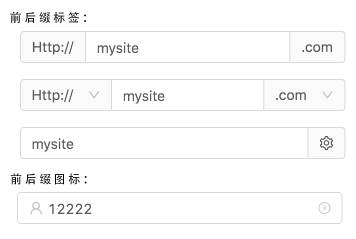
Input 组件在 render 方法执行阶段将绘制出 input 原生组件。
鉴于 react 的实现机制,对于 input 原生组件的处理,有受控组件和非受控组件的区别。
受控组件即根据组件的 state 变化渲染 input 节点的值;
非受控组件只允许组件渲染出 input 节点的默认值,而其实时值将根据用户的操作行为加以改变。
ant design 中的 Input 组件对于受控组件和非受控组件的处理,即是当开发者同时传入 props.value 和 props.defaultValue,props.value 的优先级高于 props.defaultValue,且当 props.value 为 undefined 或 null,均会以空字符串渲染 input 节点的值。
在事件的绑定函数方面,常规的绑定函数均会透传到 input 原生组件上,而 props.onPressEnter, props.onKeyDown 两个绑定函数均会以 inputInstance.handleKeyDown 方法的形式挂载为 input 原生组件的 onKeyDown 绑定函数(inputInstance 为 Input 组件的实例)。
此外,inputInstance 实例内置 focus, blur, select 方法,其功用如 inputInstance.focus 可以在校验表单时使校验失败的输入框组件获得焦点。inputInstance.input 属性用于访问 input 原生节点。
在样式处理方面,笔者将作专文加以阐述。
TextArea 组件
TextArea 组件用于绘制 textarea 原生节点。不同于使用前后标签、前后图标影响渲染输入框组件的布局,TextArea 组件只包含 textarea 节点,没有其他布局元素。
TextArea 组件的特殊处理逻辑是,textarea 节点的高度随用户输入内容而改变,受控于 props.autosize = { minRows?, maxRows? } 属性。
其实现原理为:
- 使用插入文档的隐藏文本框节点计算单行文本的高度,再由 minRows, maxRows 计算文本框的最大最小高度,并计算文本框的高度。计算获得的文本框即 textareaStyles 变量。
- 调用组件实例的 setState 方法,更新 state.textareaStyles,最终构成组件实例的 resizeTextarea 方法。对于受控组件,将在componentWillReceiveProps 生命周期中判断组件获得的 props.value 是否更新,再使用 window.requestAnimationFrame 方式调用 resizeTextarea 方法,以调整文本框的高度。对于非受控组件,在 onChange 事件发生时调用 resizeTextarea 方法。
calculateNodeHeight 函数计算文本框高度源码:
| 1
2
3
4
5
6
7
8
9
10
11
12
13
14
15
16
17
18
19
20
21
22
23
24
25
26
27
28
29
30
31
32
33
34
35
36
37
38
39
40
41
42
43
44
45
46
47
48
49
50
51
52
53
54
55
56
57
58
59
60
61
62
63
64
65
66
67
68
69
70
71
72
73
74
75
76
77
78
79
80
81
82
83
84
85
86
87
88
89
90
91
92
93
94
95
96
97
98
99
100
101
102
103
104
105
106
107
108
109
110
111
112
113
114
115
116
117
118
119
120
121
122
123
124
125
126
127
128
129
130
131
132
133
134
135
136
137
138
139
140
141
142
143
144
145
146
147
| const HIDDEN_TEXTAREA_STYLE = <br /> min-height:0 !important;<br /> max-height:none !important;<br /> height:0 !important;<br /> visibility:hidden !important;<br /> overflow:hidden !important;<br /> position:absolute !important;<br /> z-index:-1000 !important;<br /> top:0 !important;<br /> right:0 !important<br />;
const SIZING_STYLE = [
‘letter-spacing’,
‘line-height’,
‘padding-top’,
‘padding-bottom’,
‘font-family’,
‘font-weight’,
‘font-size’,
‘text-rendering’,
‘text-transform’,
‘width’,
‘text-indent’,
‘padding-left’,
‘padding-right’,
‘border-width’,
‘box-sizing’,
];
let computedStyleCache: {[key: string]: NodeType} = {};
let hiddenTextarea: HTMLTextAreaElement;
function calculateNodeStyling(node: HTMLElement, useCache = false) {
const nodeRef = (
node.getAttribute(‘id’) ||
node.getAttribute(‘data-reactid’) ||
node.getAttribute(‘name’)
) as string;
if (useCache && computedStyleCache[nodeRef]) {
return computedStyleCache[nodeRef];
}
const style = window.getComputedStyle(node);
const boxSizing = (
style.getPropertyValue(‘box-sizing’) ||
style.getPropertyValue(‘-moz-box-sizing’) ||
style.getPropertyValue(‘-webkit-box-sizing’)
);
const paddingSize = (
parseFloat(style.getPropertyValue(‘padding-bottom’)) +
parseFloat(style.getPropertyValue(‘padding-top’))
);
const borderSize = (
parseFloat(style.getPropertyValue(‘border-bottom-width’)) +
parseFloat(style.getPropertyValue(‘border-top-width’))
);
const sizingStyle = SIZING_STYLE
.map(name => ${name}:${style.getPropertyValue(name)})
.join(‘;’);
const nodeInfo: NodeType = {
sizingStyle,
paddingSize,
borderSize,
boxSizing,
};
if (useCache && nodeRef) {
computedStyleCache[nodeRef] = nodeInfo;
}
return nodeInfo;
}
export default function calculateNodeHeight(
uiTextNode: HTMLTextAreaElement,
useCache = false,
minRows: number | null = null,
maxRows: number | null = null,
) {
if (!hiddenTextarea) {
hiddenTextarea = document.createElement(‘textarea’);
document.body.appendChild(hiddenTextarea);
}
// Fix wrap=”off” issue
// https://github.com/ant-design/ant-design/issues/6577
if (uiTextNode.getAttribute(‘wrap’)) {
hiddenTextarea.setAttribute(‘wrap’, uiTextNode.getAttribute(‘wrap’) as string);
} else {
hiddenTextarea.removeAttribute(‘wrap’);
}
// 将影响文本框节点高度的样式属性拷贝给隐藏节点
// overflow 样式属性置为 hidden,以此将滚动条排除在外
let {
paddingSize, borderSize,
boxSizing, sizingStyle,
} = calculateNodeStyling(uiTextNode, useCache);
hiddenTextarea.setAttribute(‘style’, ${sizingStyle};${HIDDEN_TEXTAREA_STYLE});
hiddenTextarea.value = uiTextNode.value || uiTextNode.placeholder || ‘’;
let minHeight = Number.MIN_SAFE_INTEGER;
let maxHeight = Number.MAX_SAFE_INTEGER;
let height = hiddenTextarea.scrollHeight;// 以隐藏节点计算文本框高度
let overflowY: any;
// 根据盒模式调整高度
if (boxSizing === ‘border-box’) {
height = height + borderSize;
} else if (boxSizing === ‘content-box’) {
height = height - paddingSize;
}
if (minRows !== null || maxRows !== null) {
// 计算文本框单行高度
hiddenTextarea.value = ‘ ‘;
let singleRowHeight = hiddenTextarea.scrollHeight - paddingSize;
if (minRows !== null) {<br /> minHeight = singleRowHeight * minRows;<br /> if (boxSizing === 'border-box') {<br /> minHeight = minHeight + paddingSize + borderSize;<br /> }<br /> height = Math.max(minHeight, height);<br /> }<br /> if (maxRows !== null) {<br /> maxHeight = singleRowHeight * maxRows;<br /> if (boxSizing === 'border-box') {<br /> maxHeight = maxHeight + paddingSize + borderSize;<br /> }<br /> overflowY = height > maxHeight ? '' : 'hidden';<br /> height = Math.min(maxHeight, height);<br /> }<br /> }
if (!maxRows) {
overflowY = ‘hidden’;
}
return { height, minHeight, maxHeight, overflowY };
}
|
| :—- | :—- |
setState 更新文本框高度源码:
| 1
2
3
4
5
6
7
8
9
10
11
12
13
14
15
16
17
18
19
20
21
22
23
24
25
26
27
28
29
30
31
32
33
34
35
36
37
38
39
40
41
42
43
44
45
46
47
48
49
50
51
52
53
54
55
56
57
58
59
60
61
62
63
| // 不打断本次渲染,在下一次渲染调整文本框的样式
function onNextFrame(cb: () => void) {
if (window.requestAnimationFrame) {
return window.requestAnimationFrame(cb);
}
return window.setTimeout(cb, 1);
}
function clearNextFrameAction(nextFrameId: number) {
if (window.cancelAnimationFrame) {
window.cancelAnimationFrame(nextFrameId);
} else {
window.clearTimeout(nextFrameId);
}
}
class TextArea extends React.Component
static defaultProps = {
prefixCls: ‘ant-input’,
};
nextFrameActionId: number;
state = {
textareaStyles: {},
};
componentDidMount() {
this.resizeTextarea();
}
componentWillReceiveProps(nextProps: TextAreaProps) {
if (this.props.value !== nextProps.value) {
if (this.nextFrameActionId) {
clearNextFrameAction(this.nextFrameActionId);
}
this.nextFrameActionId = onNextFrame(this.resizeTextarea);
}
}
resizeTextarea = () => {
const { autosize } = this.props;
if (!autosize || !this.textAreaRef) {
return;
}
const minRows = autosize ? (autosize as AutoSizeType).minRows : null;
const maxRows = autosize ? (autosize as AutoSizeType).maxRows : null;
const textareaStyles = calculateNodeHeight(this.textAreaRef, false, minRows, maxRows);
this.setState({ textareaStyles });
}
handleTextareaChange = (e: React.ChangeEvent
if (!(‘value’ in this.props)) {
this.resizeTextarea();
}
const { onChange } = this.props;
if (onChange) {
onChange(e);
}
}
// 余略
}
|
| :—- | :—- |
Search
Search 组件基于 Input 组件制作,其特殊处理是在 inputInstance.onPressEnter 方法执行过程中调用 props.onSearch 方法,适用于远程搜索之类的场景;Search 组件还提供 props.enterButton 属性用于配置输入框的后缀图标,默认使用 search 图标,可渲染文本或按钮。实现请参考 ant design 源码。
Group
Group 组件主要以样式控制多个表单项组件 props.children 的成组渲染。实现请参考 ant design 源码。

若有收获,就点个赞吧
0 人点赞
