01. Introduction to HTML Forms
Forms are a part of everyday life. When we use a physical form in real life, we write down information and give it to someone to process. Think of the times you’ve had to fill out information for various applications like a job, or a bank account, or dropped off a completed suggestion card — each instance is a form!
Just like a physical form, an HTML <form> element is responsible for collecting information to send somewhere else. Every time we browse the internet we come into contact with many forms and we might not even realize it. There’s a good chance that if you’re typing into a text field or providing an input, the field that you’re typing into is part of a <form>!
In this lesson, we’ll go over the structure and syntax of a <form> and the many elements that populate it.
02. How a Form Works
We can think of the internet as a network of computers which send and receive information. Computers need an HTTP request to know how to communicate. The HTTP request instructs the receiving computer how to handle the incoming information. More information can be found in our article about HTTP requests.
The <form> element is a great tool for collecting information, but then we need to send that information somewhere else for processing. We need to supply the <form> element with both the location of where the <form>‘s information goes and what HTTP request to make. Take a look at the sample <form> below:
<form action="/example.html" method="POST"></form>
In the above example, we’ve created the skeleton for a <form> that will send information to example.html as a POST request:
- The
actionattribute determines where the information is sent. - The
methodattribute is assigned a HTTP verb that is included in the HTTP request.
Note: HTTP verbs like POST do not need to be capitalized for the request to work, but it’s done so out of convention. In the example above we could have written method="post" and it would still work.
The <form> element can also contain child elements. For instance, it would be helpful to provide a header so that users know what this <form> is about. We could also add a paragraph to provide even more detail. Let’s see an example of this in code:
<form action="/example.html" method="POST"><h1>Creating a form</h1><p>Looks like you want to learn how to create an HTML form. Well, the best way to learn is to play around with it.</p></form>
The example above doesn’t collect any user input, but we’ll do that in the next exercise. For now, let’s practice making the foundation of an HTML <form>!
03. Text Input
If we want to create an input field in our <form>, we’ll need the help of the <input> element.
The <input> element has a type attribute which determines how it renders on the web page and what kind of data it can accept.
The first value for the type attribute we’re going to explore is "text". When we create an <input> element with type="text", it renders a text field that users can type into. It’s also important that we include a name attribute for the <input> — without the name attribute, information in the <input> won’t be sent when the <form> is submitted. We’ll explain more about submissions and the submit button in a later exercise. For now, let’s examine the following code that produces a text input field:
<form action="/example.html" method="POST"><input type="text" name="first-text-field"></form>
Here’s a screen shot of how the rendered form looks like on a web page for the Chrome browser (different browsers have different default rendering). When initially loaded, it will be an empty box: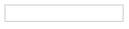
After users type into the <input> element, the value of the value attribute becomes what is typed into the text field. The value of the value attribute is paired with the value of the name attribute and sent as text when the form is submitted. For instance, if a user typed in “important details” in the text field created by our <input> element: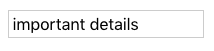
When the form is submitted, the text: "first-text-field=important details" is sent to /example.html because the value of the name attribute is "first-text-field" and the value of value is "important details".
We could also assign a default value for the value attribute so that users have a pre-filled text field when they first see the rendered form like so:
<form action="/example.html" method="POST"><input type="text" name="first-text-field" value="already pre-filled"></form>
Which renders: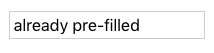
Time to put this knowledge into practice!
04. Adding a Label
In the previous exercise we created an <input> element but we didn’t include anything to explain what the <input> is used for. For a user to properly identify an <input> we use the appropriately named <label> element.
The <label> element has an opening and closing tag and displays text that is written between the opening and closing tags. To associate a <label> and an <input>, the <input> needs an id attribute. We then assign the for attribute of the <label> element with the value of the id attribute of <input>, like so:
<form action="/example.html" method="POST"><label for="meal">What do you want to eat?</label><br><input type="text" name="food" id="meal"></form>
The code above renders: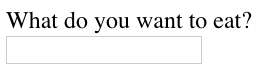
Look, now users know what the <input> element is for! Another benefit for using the <label> element is when this element is clicked, the corresponding <input> is highlighted/selected.
Let’s see the <label> element in action!
05. Password Input
Think about all those times we have to put sensitive information, like a password or PIN, into a <form>. We wouldn’t want our information to be seen by anyone peeking over our shoulder! Luckily, we have the type="password" attribute for <input>!
An <input type ="password"> element will replace input text with another character like an asterisk (*) or a dot (•). The code below provides an example of how to create a password field:
<form><label for="user-password">Password: </label><input type="password" id="user-password" name="user-password"></form>
After a user types into the field, it would look like: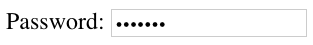
Even though the password field obscures the text of the password, when the form is submitted, the value of the text is sent. In other words, if “hunter2” is typed into the password field, “user-password=hunter2” is sent along with the other information on the form.
06. Number Input
We’ve now gone over two type attributes for <input> related to text. But, we might want our users to type in a number — in which case we can set the type attribute to… (you guessed it)… "number"!
By setting type="number" for an <input> we can restrict what users type into the input field to just numbers (and a few special characters like -, +, and .). We can also provide a step attribute which creates arrows inside the input field to increase or decrease by the value of the step attribute. Below is the code needed to render an input field for numbers:
<form><label for="years"> Years of experience: </label><input id="years" name="years" type="number" step="1"></form>
Which renders: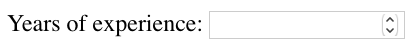
Now it’s time to apply this knowledge.
07. Range Input
Using an <input type="number"> is great if we want to allow users to type in any number of their choosing. But, if we wanted to limit what numbers our users could type we might consider using a different type value. Another option we could use is setting type to "range" which creates a slider.
To set the minimum and maximum values of the slider we assign values to the min and max attribute of the <input>. We could also control how smooth and fluid the slider works by assigning the step attribute a value. Smaller step values will make the slider more fluidly, whereas larger step values will make the slider move more noticeably. Take a look at the code to create a slider:
<form><label for="volume"> Volume Control</label><input id="volume" name="volume" type="range" min="0" max="100" step="1"></form>
The code above renders: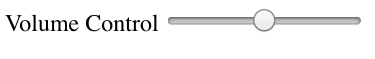
In the example above, every time the slider moves by one, the value of the <input>‘s value attribute changes.
08. Checkbox Input
So far the types of inputs we’ve allowed were all single choices. But, what if we presented multiple options to users and allow them to select any number of options? Sounds like we could use checkboxes! In a <form> we would use the <input> element and set type="checkbox". Examine the code used to create multiple checkboxes:
<form><p>Choose your pizza toppings:</p><label for="cheese">Extra cheese</label><input id="cheese" name="topping" type="checkbox" value="cheese"><br><label for="pepperoni">Pepperoni</label><input id="pepperoni" name="topping" type="checkbox" value="pepperoni"><br><label for="anchovy">Anchovy</label><input id="anchovy" name="topping" type="checkbox" value="anchovy"></form>
Which renders: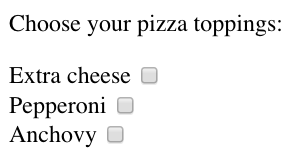
Notice in the example provided:
- there are assigned values to the
valueattribute of the checkboxes. These values are not visible on the form itself, that’s why it is important that we use an associated<label>to identify the checkbox. - each
<input>has the same value for thenameattribute. Using the samenamefor each checkbox groups the<input>s together. However, each<input>has a uniqueidto pair with a<label>.
09. Radio Button Input
Checkboxes work well if we want to present users with multiple options and let them choose one or more of the options. However, there are cases where we want to present multiple options and only allow for one selection — like asking users if they agree or disagree with the terms and conditions. Let’s look over the code used to create radio buttons:
<form><p>What is sum of 1 + 1?</p><input type="radio" id="two" name="answer" value="2"><label for="two">2</label><br><input type="radio" id="eleven" name="answer" value="11"><label for="eleven">11</label></form>
Which renders: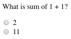
Notice from the code snippet, radio buttons (like checkboxes) do not display their value. We have an associated <label> to represent the value of the radio button. To group radio buttons together, we assign them the same name and only one radio button from that group can be selected.
10. Dropdown list
Radio buttons are great if we want our users to pick one option out of a few visible options, but imagine if we have a whole list of options! This situation could quickly lead to a lot of radio buttons to keep track of.
An alternative solution is to use a dropdown list to allow our users to choose one option from an organized list. Here’s the code to create a dropdown menu:

若有收获,就点个赞吧
0 人点赞
