实现1px 宽度,适配移动端
.box {position: relative;padding: 10px 0;border-radius: 4px;}.box::after {content: "";position: absolute;bottom: 0;left: 0;width: 100%;height: 1px;background-color: #999;transform: scaleY(.5);transform-origin: 0 0;}<div class="box">1234</div>
.box2 {margin-top: 20px;padding: 10px;border-radius: 5px;/* border: 1px solid #999; *//*- X 偏移量 `0`- Y 偏移量 `0`- 阴影模糊半径 `0`- 阴影扩散半径 `0.5px`- 阴影颜色*/box-shadow: 0 0 0 0.5px #999;}<div class="box2"></div>
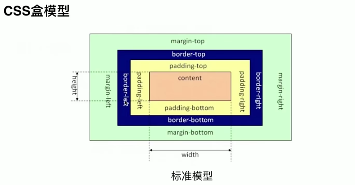
盒模型
content / padding / border / margin
box-sizing
作用:box-sizing 属性定义了 user agent 应该如何计算一个元素的总宽度和总高度。
box-sizing: content-box(默认值,标准盒模型) | border-box;
content-box
width 和 height 只包括内容的宽和高,不包括边框(border),内边距(padding),外边距(margin)。
如:.box {width: 350px; border: 10px solid black;},在浏览器中的渲染的实际宽度将是 370px。
注意:内边距、边框和外边距都在这个盒子的外部。border-box
width 和 height 属性包括内容,边框,内边距,不包括外边距。
如:.box {width: 350px; border: 10px solid black;},导致在浏览器中呈现的宽度为350px的盒子。内容框不能为负,并且被分配到0,使得不可能使用border-box使元素消失。
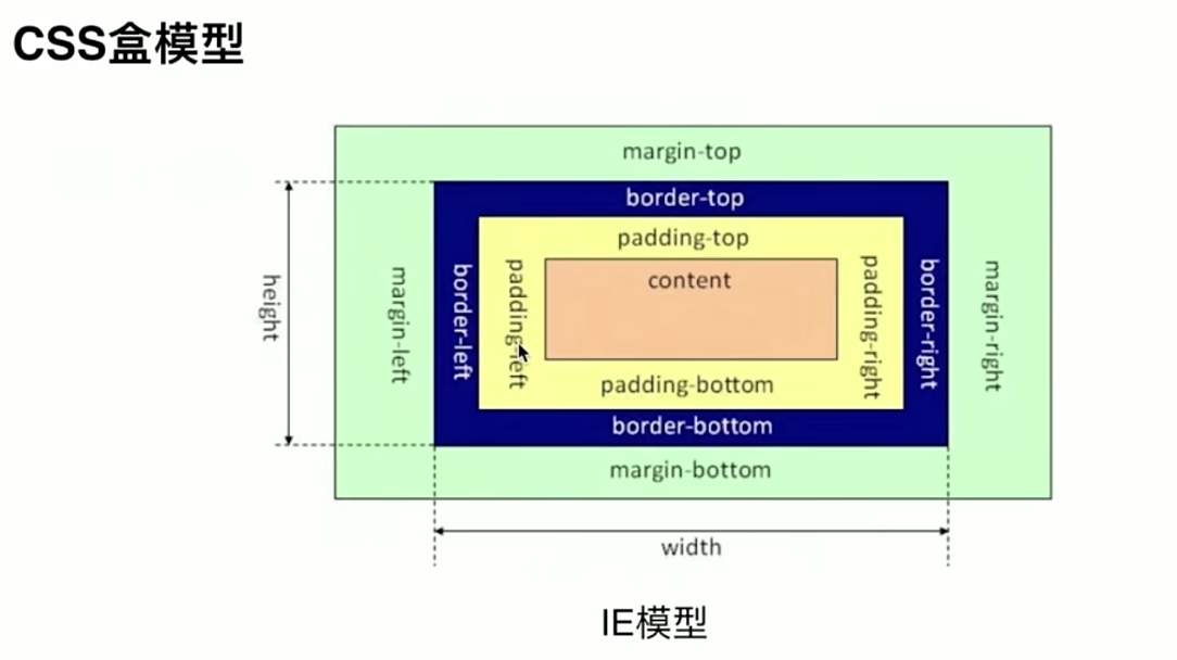
box-sizing: content-box; // 浏览器默认属性,标准盒模型设置box-sizing: border-box; // IE盒模型设置
JS 如何设置获取盒模型对应的宽和高
样式:内联样式(标签上设置的样式),
<style></style>标签内设置的样式,通过<link>引入的样式文件。dom.style.width/heigth // 获取的是内联样式,拿不到 style 和 link 样式。dom.currentStyle.width/height // 渲染之后的样式,都可以拿到,但是兼容性不好,只有 IE 支持。window.getComputedStyle().width/height // 各个主流浏览器都支持dom.getBoundingClientRect().width/heigth // 获取页面中某个元素的左上右下分别相对浏览器视窗的位置。getBoundingClientRect 是 DOM 元素到浏览器可视范围的距离(不包含文档卷起的部分)。该函数 dom.getBoundingClientRect() 返回一个 Object 对象,该对象有6个属性:top, left, right, bottom, width, height
用
getBoundingClientRect()来获取页面元素的位置:var X= this.getBoundingClientRect().left+document.documentElement.scrollLeft;var Y =this.getBoundingClientRect().top+document.documentElement.scrollTop;
判断元素是否在可视区域:
function isElementInViewport (el) {var rect = el.getBoundingClientRect();return (rect.top >= 0 &&rect.left >= 0 &&rect.bottom <= (window.innerHeight || document.documentElement.clientHeight) && /*or $(window).height() */rect.right <= (window.innerWidth || document.documentElement.clientWidth) /*or $(window).width() */);}
实例题(根据盒模型解释边距重叠)
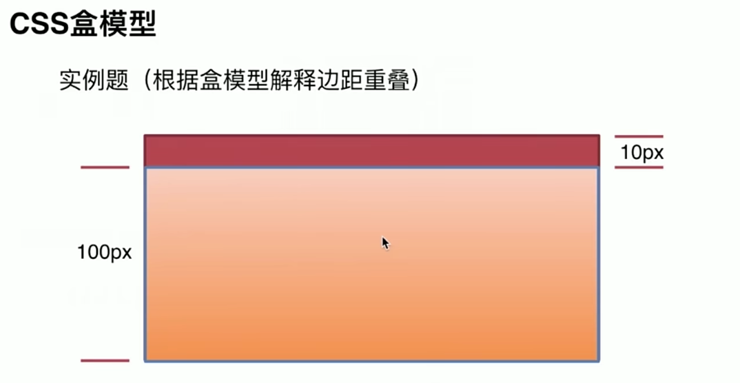
- 父子元素边距重叠(子元素height 为 100px, margin-top: 10px;则父元素height 也为:100px,给父元素设置 overflow: hidden 后,则父元素height 变为 110px)
- 兄弟元素之前边距重叠,上下元素,上元素设置 margin-bottom: 10px, 下元素设置 margin-top: 5px, 则取两者的最大值
- 空元素取两者的最大值
举例:
<!DOCTYPE html><html lang="en"><head><meta charset="UTF-8"><meta name="viewport" content="width=device-width, initial-scale=1.0"><title>box-sizing</title><style>* {margin: 0;padding: 0;}body {background-color: #eee;}.container {width: 400px;margin: 50px auto;}.parent {width: 200px;height: 200px;background-color: #fff;border: 10px solid orange;}.child {background-color: palegoldenrod;}</style></head><body><div class="container"><h1>box-sizing: content-box</h1><section class="parent"><p>Parent container</p><div class="child" style="width: 100%; box-sizing: content-box;"><p>Child container</p></div></section></div><div class="container"><h1>box-sizing: content-box</h1><section class="parent"><p>Parent container</p><div class="child" style="width: 100%; box-sizing: content-box; border: 10px solid blueviolet; padding: 5px;"><p>Child container</p></div></section></div><div class="container"><h1>box-sizing: border-box</h1><section class="parent"><p>Parent container</p><div class="child" style="width: 100%; box-sizing: border-box; border: 10px solid blueviolet; padding: 5px;"><p>Child container</p></div></section></div></body></html>
.box {height: 0;width: 0;border: 50px solid rebeccapurple;/* 重点 */border-bottom-color: transparent;border-right-color: transparent;}
CSS选择器权重
!important > inline > id > class > tag > * > inherit > default
- !important:大于其他
- 行内:1000
- id选择器:100
- 类,伪类和属性选择器,如.content:10
- 类型选择器和伪元素选择器:1
- 通配符、子选择器、相邻选择器:0
同级别的后写的优先级高。
相同class样式,css中后写的优先级高,和html中的class名字前后无关
水平垂直都居中
- 文本水平居中:text-algin: center
- 文本垂直居中:line-height等于容器height;display: flex; algin-items: center;
- div水平居中:
- margin: 0 auto;
- 已知父元素宽度:margin-left: width / 2; transform: tranlateX(-50%)
- 未知父元素宽度:position: absolute: top: 50%; transform: tranlateY(-50%)
- display: flex; justify-content: center;
div垂直居中:
- 已知父元素高度:margin-top: height / 2; transform: tranlateY(-50%)
- 未知父元素高度:position: absolute: top: 50%; transform: tranlateY(-50%)
display: flex; algin-items: center;
<!DOCTYPE html><html lang="en"><head><meta charset="UTF-8"><meta name="viewport" content="width=device-width, initial-scale=1.0"><title>垂直水平都居中</title></head><body><style>.parent {width: 300px;height: 300px;border: 1px solid red;}.child {width: 100px;height: 100px;background-color: cadetblue;}</style><!--一、和绝对定位相关1. position: absolute; + 负margin (定宽)2. position: absolute; + margin: auto; (定宽)--><!-- <style>.parent {position: relative;}.child {position: absolute;top: 50%;left: 50%;margin-top: -50px;margin-left: -50px;}</style> --><!-- <style>.parent {position: relative;}.child {position: absolute;top: 0;right: 0;left: 0;bottom: 0;margin: auto;}</style> --><!--3. position: absolute; + calc() (定宽)--><!-- <style>.parent {position: relative;}.child {position: absolute;top: calc(50% - 50px);left: calc(50% - 50px);}</style> --><!--二、不定宽其实也就是子元素的宽高是不参与到计算中的4. position: absolute; + tansform (不定宽)--><!-- <style>.parent {position: relative;}.child {position: absolute;top: 50%;left: 50%;transform: translate(-50%, -50%); /* tansform: translate(x, y); */}</style> --><!--5. flex 布局--><!-- <style>.parent {display: flex;/* 方法一:给父元素设置以下两个属性 *//* justify-content: center;align-items: center; */}.child {/* 方法二:给子元素设置以下两个属性 */align-self: center;justify-self: center;}</style> --><!--6. grid 布局--><style>.parent {display: grid;/* 方法一:给父元素设置以下两个属性 *//* justify-content: center;align-items: center; */}.child {/* 方法二:给子元素设置以下两个属性 */align-self: center;justify-self: center;}</style><div class="parent"><div class="child"></div></div></body></html>
清除浮动
浮动影响:
由于浮动元素脱离了文档流,所以父元素的高度无法被撑开,影响了与父元素同级的元素
- 与浮动元素同级的非浮动元素会跟随其后,因为浮动元素脱离文档流不占据原来的位置
- 如果该浮动元素不是第一个浮动元素,则该元素之前的元素也需要浮动,否则容易影响页面的结构显示
清除浮动方法:
- 使用clear: both清除浮动;
在浮动元素后面放一个空的div标签,div设置样式clear:both来清除浮动。它的优点是简单,方便兼容性好,但是一般情况下不建议使用该方法,因为会造成结构混乱,不利于后期维护。 利用伪元素after来清除浮动;
给父元素添加了:after伪元素,通过清除伪元素的浮动,达到撑起父元素高度的目的。.clearfix:after{content: "";display: block;visibility: hidden;clear: both;}
使用CSS的overflow属性
当给父元素设置了overflow样式,不管是overflow:hidden或overflow:auto都可以清除浮动只要它的值不为visible就可以了,它的本质就是建构了一个BFC,这样使得达到撑起父元素高度的效果动画
transition(过渡)
transition 是多个属性的简写。
transition-property:过渡属性
- transition-duration:过渡时间长度
- transition-delay:延迟几秒执行
- transition-timing-function
- linear:匀速
- ease-in:加速
- ease-out:减速
- cubic-bezier函数:自定义速度模式,可以使用工具网站来定制。
transition 缺点:
- 需要事件触发,所以没法在网页加载时自动发生;
- 是一次性的,不能重复发生,除非一再触发;
只能定义开始状态和结束状态,不能定义中间状态,也就是说只有两个状态;
/* 变化在1s过渡 */transition: 1s;/* 指定过渡属性 */transition: 1s height;/* 指定多个属性同时发生过渡 */transition: 1s height, 1s width;/* 指定delay延时时间 */transition: 1s height, 1s 1s width;/* 指定状态变化速度 */transition: 1s height ease;/* 指定自定义移状态变化速度 */transition: 1s height cubic-bezier(.83,.97,.05,1.44);
animation
animation 是多个属性的简写。
animation-name: 指定一个 @keyframes 的名称,动画将要使用这个@keyframes定义。
- animation-duration: 整个动画需要的时长。
- animation-timing-function: 动画进行中的时速控制,比如 ease 或 linear.
- animation-delay: 动画延迟时间。
- animation-direction: 动画重复执行时运动的方向。
- animation-iteration-count: 动画循环执行的次数。
- animation-fill-mode: 设置动画执行完成后/开始执行前的状态,比如,你可以让动画执行完成后停留在最后一幕,或恢复到初始状态。
- animation-play-state: 暂停/启动动画。 ```css .element:hover { animation: 1s rainbow; / animation: 1s rainbow infinite; 关键字infinite让动画无限次播放 animation: 1s rainbow 3; 指定动画播放次数 / }
@keyframes rainbow { 0% { background: #c00; } 50% { background: orange; } 100% { background: yellowgreen; } } // from…to… @keyframes newA { from {…} to {…} }
<a name="zR5dh"></a>## 优化 CSS 来提高性能的方法有哪些???1. 雪碧图2. CSS 文件压缩3. 选择器避免嵌套过深4. 公共样式提取,避免重复编码<a name="SyUtf"></a>## flex 布局(弹性布局)**基本概念**:- 容器&项目:采用 Flex 布局的元素,称为 Flex 容器(flex container),简称"容器"。它的所有子元素自动成为容器成员,称为 Flex 项目(flex item),简称"项目"。- 主轴&交叉轴:堆叠的方向,默认主轴是水平方向,交叉轴是垂直方向。可通过flex-derection: column设置主轴为垂直方向。**容器属性:**- display: flex- flex-direction:主轴的方向(即项目的排列方向),row | row-reverse | column | column-reverse;- flex-wrap:是否换行,nowrap | wrap | wrap-reverse;- flex-flow:direction 和 wrap简写- justify-content:主轴对齐方式,flex-start | flex-end | center | space-between | space-around;- align-items:交叉轴对齐方式,flex-start | flex-end | center | baseline | stretch;- align-content: 多根轴线的对齐方式。如果项目只有一根轴线,该属性不起作用。flex-start | flex-end | center | space-between | space-around | stretch;**项目的属性:**- order:项目的排列顺序,数值越小,排列越靠前,默认为0。- flex-grow:放大比例,默认为0,指定元素分到的剩余空间的比例。- flex-shrink:缩小比例,默认为1,指定元素分到的缩减空间的比例。- flex-basis:分配多余空间之前,项目占据的主轴空间,默认值为auto- flex:grow, shrink 和 basis的简写,默认值为0 1 auto- align-self:单个项目不一样的对齐方式,默认值为auto,auto | flex-start | flex-end | center | baseline | stretch;```css// flex: 1; 是哪几个属性的简写?flex: 1;flex-grow: 1;flex-shrink: 1;flex-basis: 0%;
谈谈对BFC的理解
BFC 是什么?
块格式化上下文(Block Formatting Context,BFC) 是Web页面的可视CSS渲染的一部分,是块盒子的布局过程发生的区域,也是浮动元素与其他元素交互的区域。
浏览器对**BFC**的限制规则是:
- 生成BFC元素的子元素会一个接一个的放置。
- 垂直方向上他们的起点是一个包含块的顶部,两个相邻子元素之间的垂直距离取决于元素的margin特性。在BFC— 中相邻的块级元素的外边距会折叠(Mastering margin collapsing)。
- 生成BFC元素的子元素中,每一个子元素左外边距与包含块的左边界相接触(对于从右到左的格式化,右外边距接触右边界),即使浮动元素也是如此(尽管子元素的内容区域会由于浮动而压缩),除非这个子元素也创建了一个新的BFC(如它自身也是一个浮动元素)
书面解释:BFC(Block Formatting Context) 块格式化上下文:
- Block: Block在这里可以理解为Block-level Box,指的是 块级盒子 的标准
- Formatting context:块级上下文格式化,它是页面中的一块渲染区域,并且有一套渲染规则,它决定了其子元素将如何定位,以及和其他元素的关系和相互作用
BFC是指一个独立的渲染区域,只有Block-level Box参与, 它规定了内部的Block-level Box如何布局,并且与这个区域外部毫不相干.
它的作用是在一块独立的区域,让处于BFC内部的元素与外部的元素互相隔离.
个人理解 BFC
- 内部的Box会在垂直方向上一个接一个的放置
- 内部的Box垂直方向上的距离由margin决定。(完整的说法是:属于同一个BFC的两个相邻Box的margin会发生折叠,不同BFC不会发生折叠。)
- 每个元素的左外边距与包含块的左边界相接触(从左向右),即使浮动元素也是如此。(这说明BFC中子元素不会超出他的包含块,而position为absolute的元素可以超出他的包含块边界)
- BFC的区域不会与float的元素区域重叠(两栏布局)
举例:<div class="box1"></div><div class="box2"></div><style>.box1, .box2 {width: 100px;height: 100px;}.box1 {float: left; // 触发BFCbackground: red;}.box2 {background: green;overflow: hidden; // 若不设置,则两个 div 重叠在一块;设置后,将 box2 形成 BFC 盒子,此时就不会重叠。}</style>
- 计算BFC的高度时,浮动子元素也参与计算。
BFC盒子会把内部的float盒子算进高度中,这也是为什么前面可以通过给父级盒子设置float: leftposition: absoluteoverflow: hidden来解决浮动的高度塌陷问题,因为这些做法都使父级盒子变成一个BFC盒子,而BFC盒子会把内部的float盒子算进高度,顺势解决了高度塌陷问题。
如何形成 BFC?
BFC触发条件:
- 根元素,即HTML元素
- position: fixed/absolute
- float: left / right
- overflow不为visible。overflow: auto / hidden / scroll
- display: inline-block / table-cell / table-caption / table / inline-table / flex / inline-flex / grid / inline-grid
作用是什么?
- 防止margin发生重叠(不管是 margin-top 还是 margin-bottom)
- 两栏布局,防止文字环绕等
- 清除浮动:父元素设置overflow: hidden触发BFC实现清除浮动,防止父元素高度塌陷,后面的元素被覆盖,实现文字环绕等等。
- 消除相邻元素垂直方向的边距重叠:第二个子元素套一层,并设置overflow: hidden,构建BFC使其不影响外部元素。
- 消除父子元素边距重叠,父元素设置overflow: hidden
BFC使用场景如下:
<!-- BFC垂直方向边距重叠 --><section id="margin"><style>#margin{background: pink;overflow: hidden;}#margin>p{margin: 5px auto 25px;background: red;}</style><p>1</p><div style="overflow:hidden"> // 重点<p>2</p></div><p>3</p></section>
<!-- 2 BFC不与float重叠 --><section id="layout"><style media="screen">#layout{background: red;}#layout .left{float: left;width: 100px;height: 100px;background: pink;}#layout .right{height: 110px;background: #ccc;overflow: auto; // 重点}</style><div class="left"></div><div class="right"></div></section>
<!-- BFC子元素即使是float也会参与计算 --><section id="float"><style media="screen">#float{background: red;overflow: auto; // 方法一/*float: left;*/ // 方法二}#float .float{float: left;font-size: 30px;}</style><div class="float">我是浮动元素</div></section>
浮动
浮动相关的内容可以和 BFC 内容相互关联。
<div class="box"><div class="left"></div><div class="right"></div></div>.box {border: 1px solid black;padding: 5px;width: 450px;}.left {width: 100px;height: 100px;background-color: red;float: left;}.right {width: 100px;height: 100px;background-color: red;float: right;}
产生原因?
浮动的元素会脱离文档流。
一个元素一旦浮动,就会脱离文档流,那么它的父元素就不管它了,布局也会往前推进,所有会出现我们常见的 父元素高度塌陷 现象。
清除浮动
将父级也设置为浮动(不推荐)
.box {border: 1px solid black;padding: 5px;width: 450px;float: left}
缺点:父级设成了浮动,爷级也会受影响,无限套娃。给父级增加定位
absolute(不推荐).box {border: 1px solid black;padding: 5px;width: 450px;position: absolute;}
缺点:position:absolute也会脱离文档流啊,影响了整体布局给父级设置
overflow:hidden(一般).box {border: 1px solid black;padding: 5px;width: 450px;overflow:hidden}
缺点:当文本过长,且包含过长英文时,会出现英文文本被隐藏的情况给父级设置对应的高度
.box {border: 1px solid black;padding: 5px;width: 450px;height: 100px}
缺点:不灵活末尾增加空元素,并且给空元素设置
clear: both```html
.bottomDiv { clear: both; }
<br />缺点:增加了一个元素- 给父级添加伪元素,并且设置 `clear: both` (推荐) ,clear 属性只有块级元素才生效,伪元素是内联元素,需要通过 display: block; 来变为块级元素。```css.box::after {content: '.';height: 0;display: block;clear: both;}
CSS 渲染层、合成层是什么?浏览器如何创建新的渲染层?
在 DOM 树中每个节点都会对应一个渲染对象(RenderObject),当它们的渲染对象处于相同的坐标空间(z 轴空间)时,就会形成一个渲染层( RenderLayers)。
渲染层将保证页面元素以正确的顺序堆叠,这时候就会出现层合成(composite),从而正确处理透明元素和重叠元素的显示。对于有位置重叠的元素的页面,这个过程尤其重要,因为一旦图层的合并顺序出错,将会导致元素显示异常。
浏览器如何创建新的渲染层
- 根元素 document
- 有明确的定位属性(relative、fixed、sticky、absolute)
- opacity < 1
- 有 CSS fliter 属性
- 有 CSS mask 属性
- 有 CSS mix-blend-mode 属性且值不为 normal
- 有 CSS transform 属性且值不为 none
- backface-visibility 属性为 hidden
- 有 CSS reflection 属性
- 有 CSS column-count 属性且值不为 auto 或者有 CSS column-width 属性且值不为 auto
- 当前有对于 opacity、transform、fliter、backdrop-filter 应用动画
- overflow 不为 visible
注意!不少人会将这些合成层的条件和渲染层产生的条件混淆,这两种条件发生在两个不同的层处理环节,是完全不一样的 具体可以看看这篇文章 浏览器层合成与页面渲染优化
为什么用translate来改变位置而不是定位?
translate()是transform的一个值。
改变transform或opacity不会触发浏览器重新布局(reflow)或重绘(repaint),只会触发复合(compositions)。而改变绝对定位会触发重新布局,进而触发重绘和复合。transform使浏览器为元素创建一个 GPU 图层,但改变绝对定位会使用到 CPU。 因此translate()更高效,可以缩短平滑动画的绘制时间。
而translate改变位置时,元素依然会占据其原始空间,绝对定位就不会发生这种情况。

若有收获,就点个赞吧
0 人点赞
