如何批量处理评论信息情感分析,并且在时间轴上可视化呈现?
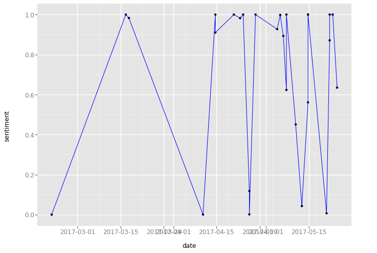
import pandas as pdfrom snownlp import SnowNLPdef get_sentiment_cn(text):s = SnowNLP(text)return s.sentimentsdf = pd.read_excel("../dataset/restaurant-comments.xlsx")#from dateutil import parser#df["date"] = df.date.apply(parser.parse)df["sentiment"] = df.comments.apply(get_sentiment_cn)%pylab inlinefrom ggplot import *ggplot(aes(x="date", y="sentiment"), data=df) + geom_point() \+ geom_line(color = 'blue') + scale_x_date(labels = date_format("%Y-%m-%d"))
运行结果如下:
修改文件:/usr/local/lib/python3.5/dist-packages/ggplot/stats/smoothers.py
把 pandas.lib 改为 pandas,如下所示:
from pandas.lib import Timestamp -> from pandas import Timestamp

若有收获,就点个赞吧
0 人点赞
