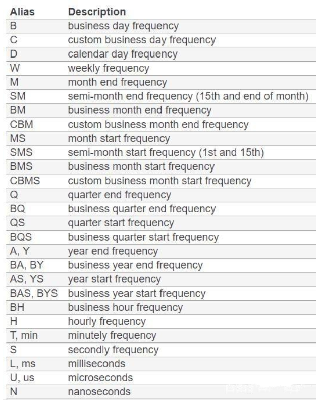
中文显示异常
plt.rcParams['font.sans-serif'] = ['Microsoft YaHei']plt.rcParams['font.serif'] = ['Microsoft YaHei']
坐标轴
设置XY坐标范围
axes.set_xlim([xmin,xmax])axes.set_ylim([ymin,ymax])
设置最小刻度间隔
axes_score.yaxis.set_minor_locator(MultipleLocator(2.5))axes_score.xaxis.set_minor_locator(MultipleLocator(0.5))
设置x轴时间刻度间隔
axes_score.xaxis.set_minor_locator(mdate.MonthLocator()) #X轴时间间隔-月axes_score.xaxis.set_major_locator(mdate.HourLocator()) #X轴时间间隔-小时
设置(自定义)x轴时间标注间隔
axes_score.xaxis.set_major_formatter(mdate.DateFormatter('%Y-%m')) # 设置x坐标格式plt.xticks(pd.date_range(start=date[0],end=date[-1],freq='5M'), # 自定义时间标注间隔,5M表示5个月rotation=90,fontproperties = 'Times New Roman',size=6) # 标签选择90度
设置y轴的刻度
axes.set_yticks([70, 75, 80, 85, 90, 95])
轴反向
# x轴ax.xaxis.set_ticks_position('top') #将x轴的位置设置在顶部ax.invert_xaxis() #x轴反向# y轴ax.yaxis.set_ticks_position('right') #将y轴的位置设置在右边ax.invert_yaxis() #y轴反向
共享坐标
方法一
# 共享坐标轴 方法一t = np.arange(0.01, 5.0, 0.01)s1 = np.sin(2 * np.pi * t)s2 = np.exp(-t)s3 = np.sin(4 * np.pi * t)plt.subplots_adjust(top=2) #位置调整ax1 = plt.subplot(311)plt.plot(t, s1)plt.setp(ax1.get_xticklabels(), fontsize=6)plt.title('我是原坐标')# 只共享X轴 sharexax2 = plt.subplot(312, sharex=ax1)plt.plot(t, s2)# make these tick labels invisibleplt.setp(ax2.get_xticklabels(), visible=False)plt.title('我共享了X轴')# 共享X轴和Y轴 sharex、shareyax3 = plt.subplot(313, sharex=ax1, sharey=ax1)plt.plot(t, s3)plt.xlim(0.01, 5.0) #不起作用plt.title('我共享了X轴和Y轴')plt.show()
方法二
# 共享坐标轴 方法二x = np.linspace(0, 2 * np.pi, 400)y = np.sin(x ** 2)f, axarr = plt.subplots(2, sharex=True)f.suptitle('共享X轴')axarr[0].plot(x, y)axarr[1].scatter(x, y, color='r')f, (ax1, ax2) = plt.subplots(1, 2, sharey=True)f.suptitle('共享Y轴')ax1.plot(x, y)ax2.scatter(x, y)f, axarr = plt.subplots(3, sharex=True, sharey=True)f.suptitle('同时共享X轴和Y轴')axarr[0].plot(x, y)axarr[1].scatter(x, y)axarr[2].scatter(x, 2 * y ** 2 - 1, color='g')# 间距调整为0f.subplots_adjust(hspace=0)# 设置全部标签在外部for ax in axarr:ax.label_outer()
隐藏刻度线、标签和边线
隐藏所有刻度线和标签
plt.axis('off')ax.axis('off')
隐藏刻度线和标签
plt.xticks([])plt.yticks([])ax.set_xticks([])ax.set_yticks([])
隐藏刻度线
plt.tick_params(bottom=False, top=False, left=False, right=False)ax.tick_params(bottom=False, top=False, left=False, right=False)
隐藏边线
for i in ['top', 'right', 'bottom', 'left']:ax.spines[i].set_visible(False)
轴标签旋转加字体设置
plt.xticks(x,rotation=90,fontproperties = 'Times New Roman',size=6) #标签选择90度,x表示画图x坐标,所有点显示plt.yticks(fontproperties = 'Times New Roman',size=10) #y标签
设置x、y轴标题
axes.set_ylabel("Generation Consistency")axes.set_xlabel("KB Row Number")
添加图例
axes.legend()
画网格线
axes.grid(True) # 全部ax.grid(axis='y') # 绘制y轴方向网格线条ax.grid(axis='x') # 绘制x轴方向网格线条
添加数据标签
方法一
for x_, y_ in zip(x, y):axes.text(x_, y_, y_, ha='left', va='bottom', fontsize=10.5)for x_, y_ in zip(x, y2):axes.text(x_, y_, y_, ha='left', va='bottom', fontsize=10.5)
方法二
逐个获取需要标注的点的横纵坐标 x与 y,然后在位置 (x, y+0.3) 处以 10.5 的字体显示出 y 的值,‘center’ 和 ‘bottom’ 分别指水平和垂直方向上的对齐方式。
for x, y in zip(xList, yList):plt.text(x, y+0.3, '%.0f'%y, ha='center', va='bottom', fontsize=10.5)

若有收获,就点个赞吧
0 人点赞
