一、Text
1.1 构造函数:
const Text(String this.data, {Key? key,this.style,this.strutStyle,this.textAlign,this.textDirection,this.locale,this.softWrap,this.overflow,this.textScaleFactor,this.maxLines,this.semanticsLabel,this.textWidthBasis,this.textHeightBehavior,})
1.2 主要参数说明:
style:用于指定文本显示的样式如颜色、字体、粗细、背景等
textAlign:文本对齐方式
- TextAlign.left:左对齐。
- TextAlign.right:右对齐。
- TextAlign.center:居中对齐。
- TextAlign.start:文字开始的方向对齐,如果文字方向是从左到右,就左对齐,反之则右对齐。
- TextAlign.end:文字开始的相反方向对齐,如果文字方向是从左到右,就右对齐,反之则左对齐。
- TextAlign.justify:两端对齐,当文字不足一行时,中间的文字会被拉伸。
textDirection:用于控制文字的显示方向
- TextDirection.ltr:文字方向从左到右。
- TextDirection.rtl:文字方向从右到左。
overflow:用于表示文本的截断方式
- TextOverflow.ellipsis:多余文本截断后以省略符表示。
- TextOverflow.clip:剪切多余文本,多余文本不显示。
- TextOverflow.fade:将多余的文本设为透明。
textScaleFactor:控制文本缩放
maxLines:最大显示行数
1.3 代码示例:
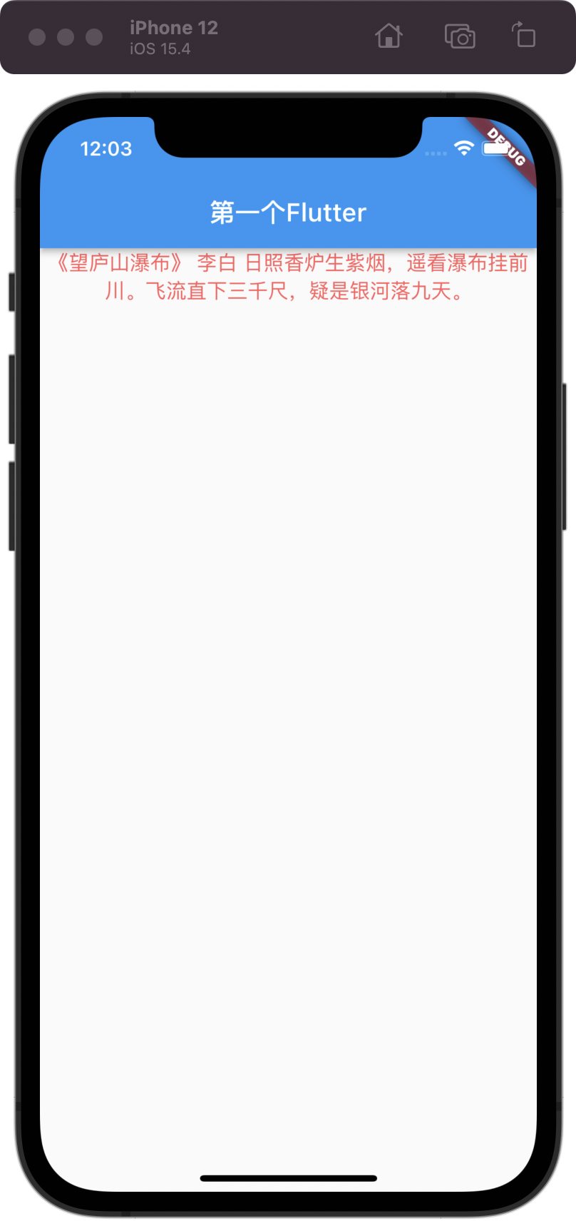
Widget _buildText() {return const Text("《望庐山瀑布》 李白 日照香炉生紫烟,遥看瀑布挂前川。飞流直下三千尺,疑是银河落九天。",style: TextStyle(color: Color(0xFFFF5C5C),fontSize: 16,),textAlign: TextAlign.center,textDirection: TextDirection.ltr,// textScaleFactor: 2,// overflow: TextOverflow.ellipsis,// maxLines: 1,);}
1.4 显示效果:
二、TextSpan
Text 的所有文本内容只能按同一种样式,如果我们需要对一个 Text 内容的不同部分按照不同的样式显示,可以使用TextSpan。
2.1 构造函数:
const TextSpan({this.text,this.children,TextStyle? style,this.recognizer,MouseCursor? mouseCursor,this.onEnter,this.onExit,this.semanticsLabel,this.locale,this.spellOut,})
2.2 主要参数说明:
text:文本内容
children:一个TextSpan的数组,TextSpan可以包括其他TextSpan
style:用于指定文本显示的样式如颜色、字体、粗细、背景等
recognizer:文本片段上手势识别处理
2.3 代码示例:
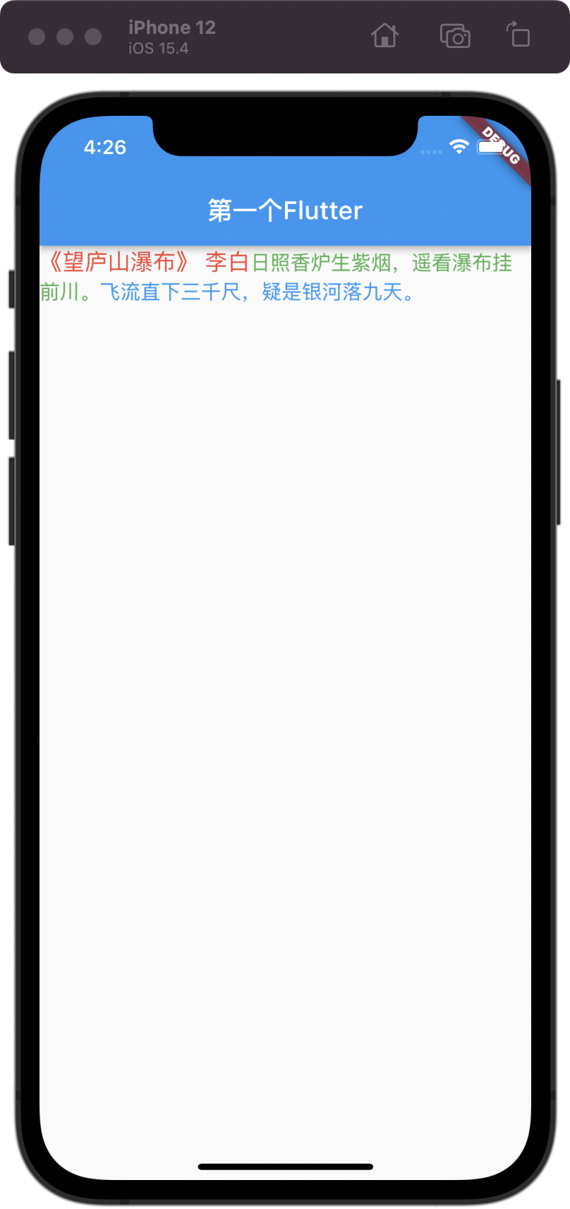
Widget _buildTextSpan() {return Text.rich(TextSpan(children: [TextSpan(text: "《望庐山瀑布》 李白",style: const TextStyle(color: Colors.red, fontSize: 18),recognizer: TapGestureRecognizer()..onTap = () {debugPrint("《望庐山瀑布》 李白");},),TextSpan(text: "日照香炉生紫烟,遥看瀑布挂前川。",style: const TextStyle(color: Colors.green, fontSize: 16),recognizer: TapGestureRecognizer()..onTap = () {debugPrint("日照香炉生紫烟,遥看瀑布挂前川。");},),TextSpan(text: "飞流直下三千尺,疑是银河落九天。",style: const TextStyle(color: Colors.blue, fontSize: 16),recognizer: TapGestureRecognizer()..onTap = () {debugPrint("飞流直下三千尺,疑是银河落九天。");},),],),);}
2.4 显示效果:
三、Button
3.1 ElevatedButton
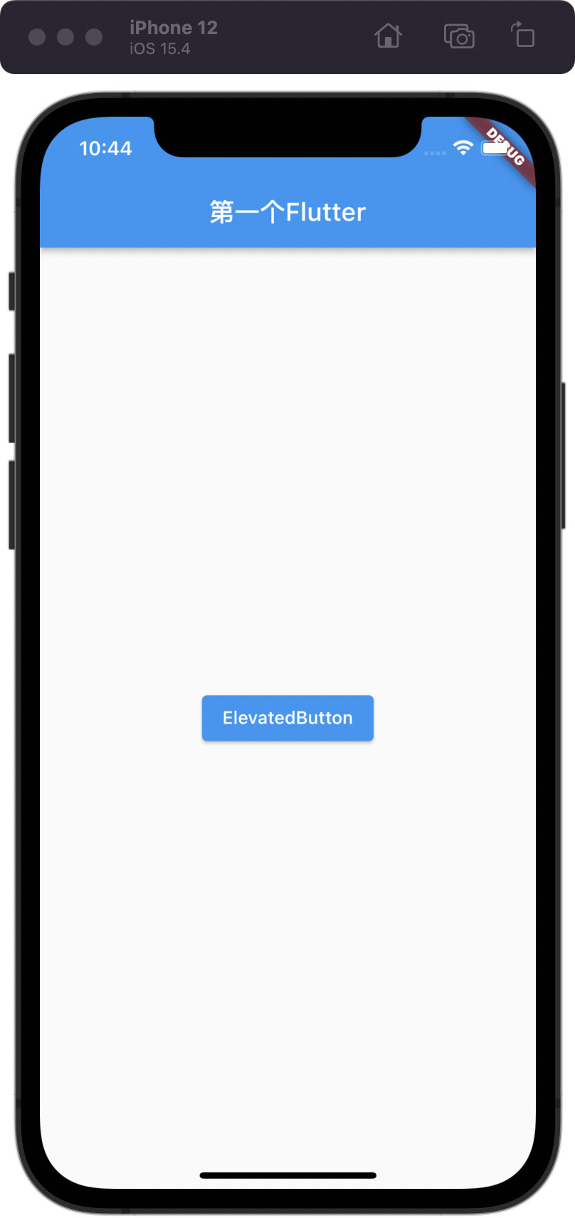
ElevatedButton “漂浮”按钮,它默认带有阴影和灰色背景。按下后,阴影会变大
3.1.1 构造函数:
const ElevatedButton({Key? key,required VoidCallback? onPressed,VoidCallback? onLongPress,ValueChanged<bool>? onHover,ValueChanged<bool>? onFocusChange,ButtonStyle? style,FocusNode? focusNode,bool autofocus = false,Clip clipBehavior = Clip.none,required Widget? child,})
3.1.2 主要参数说明:
onPressed:点击回调
onLongPress:长按回调
child:子组件
style:样式
const ButtonStyle({this.textStyle,this.backgroundColor, //背景色this.foregroundColor, //前景色this.overlayColor, // 高亮色,按钮处于focused, hovered, or pressed时的颜色this.shadowColor, // 阴影颜色this.elevation, // 阴影值this.padding, // paddingthis.minimumSize, //最小尺寸this.fixedSize,this.maximumSize,this.side, //边框this.shape, //形状this.mouseCursor, //鼠标指针的光标进入或悬停在此按钮的[InkWell]上时。this.visualDensity, // 按钮布局的紧凑程度this.tapTargetSize, // 响应触摸的区域this.animationDuration, //[shape]和[elevation]的动画更改的持续时间。this.enableFeedback,this.alignment,this.splashFactory,})
3.1.3 代码示例:
Widget _buildElevatedButton() {return Center(child: ElevatedButton(child: const Text("ElevatedButton"),onPressed: () {debugPrint("_buildElevatedButton");},),);}
3.1.4 显示效果:
3.2 TextButton
TextButton文本按钮,默认背景透明并不带阴影。按下后,会有背景色
3.2.1 构造函数:
const TextButton({Key? key,required VoidCallback? onPressed,VoidCallback? onLongPress,ValueChanged<bool>? onHover,ValueChanged<bool>? onFocusChange,ButtonStyle? style,FocusNode? focusNode,bool autofocus = false,Clip clipBehavior = Clip.none,required Widget child,})
3.2.2 主要参数说明:
onPressed:点击回调
onLongPress:长按回调
child:子组件
style:样式
3.2.3 代码示例:
Widget _buildTextButton() {return Center(child: TextButton(child: const Text("TextButton"),onPressed: () {debugPrint("_buildTextButton");},),);}
3.2.4 显示效果:

3.3 OutlinedButton
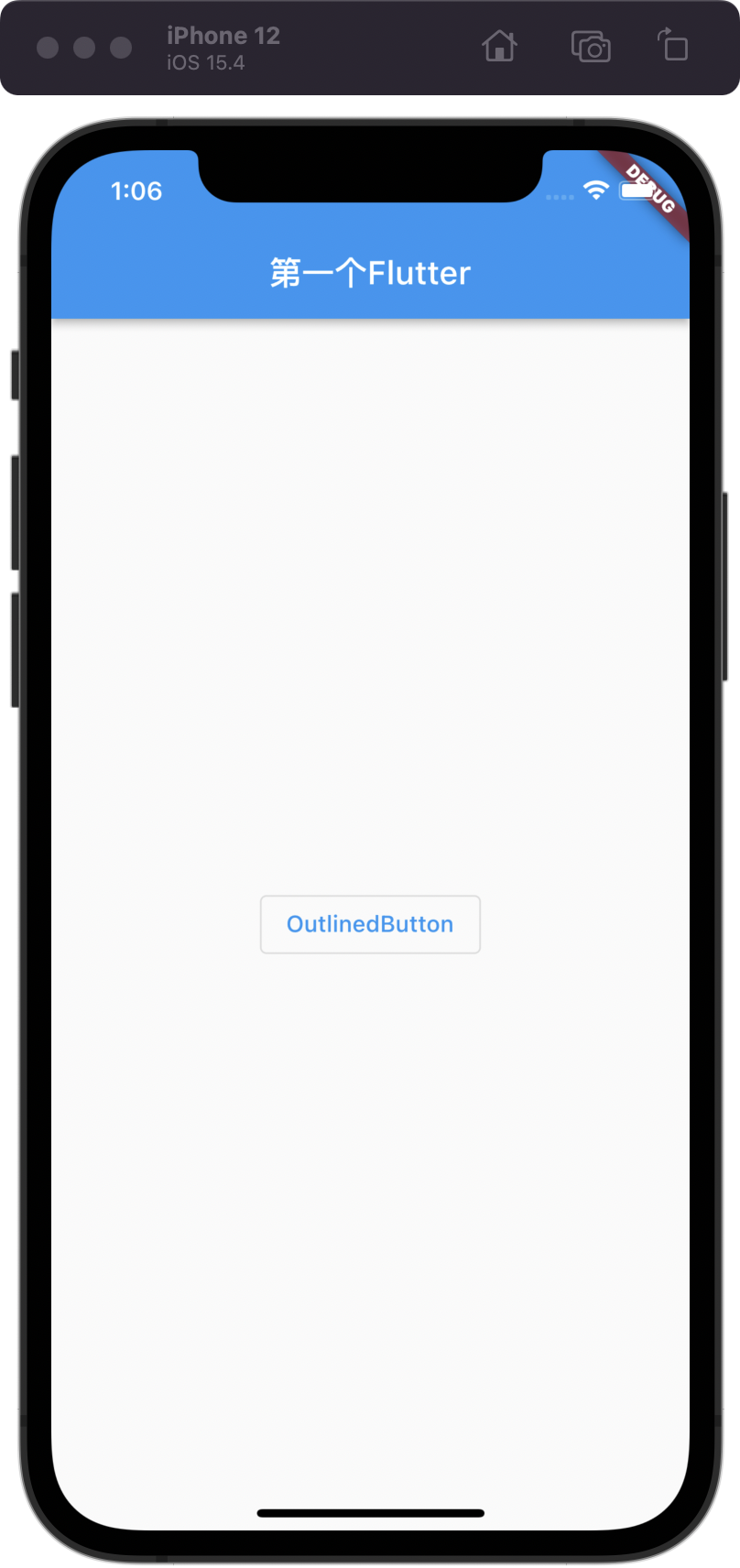
OutlinedButton默认有一个边框,不带阴影且背景透明。按下后,边框颜色会变亮、同时出现背景和阴影(较弱)
3.3.1 构造函数:
const OutlinedButton({Key? key,required VoidCallback? onPressed,VoidCallback? onLongPress,ValueChanged<bool>? onHover,ValueChanged<bool>? onFocusChange,ButtonStyle? style,FocusNode? focusNode,bool autofocus = false,Clip clipBehavior = Clip.none,required Widget child,})
3.3.2 主要参数说明:
onPressed:点击回调
onLongPress:长按回调
child:子组件
style:样式
3.3.3 代码示例:
Widget _buildOutlinedButton() {return Center(child: OutlinedButton(child: const Text("OutlinedButton"),onPressed: () {debugPrint("_buildOutlinedButton");},),);}
3.3.4 显示效果:
3.4 IconButton
IconButton是一个可点击的Icon,不包括文字,默认没有背景,点击后会出现背景
3.4.1 构造函数:
const IconButton({Key? key,this.iconSize,this.visualDensity,this.padding = const EdgeInsets.all(8.0),this.alignment = Alignment.center,this.splashRadius,this.color,this.focusColor,this.hoverColor,this.highlightColor,this.splashColor,this.disabledColor,required this.onPressed,this.mouseCursor,this.focusNode,this.autofocus = false,this.tooltip,this.enableFeedback = true,this.constraints,required this.icon,})
3.4.2 主要参数说明:
iconSize:icon大小
color:icon 颜色
highlightColor:按下去高亮的颜色
splashColor:点击时闪过的颜色
disabledColor:icon 不可点击颜色,onPressed == null 时生效
onPressed:点击回调
tooltip:长按按钮时的组件提示语句
icon:icon组件
3.4.3 代码示例:
Widget _buildIconButton() {return Center(child: IconButton(tooltip: "IconButton",icon: const Icon(Icons.add_circle_rounded),onPressed: () {debugPrint("_buildIconButton");},),);}
3.4.4 显示效果:
3.5 带图标的按钮
ElevatedButton、TextButton、OutlineButton都有一个icon 构造函数,通过它可以轻松创建带图标的按
factory ElevatedButton.icon({Key? key,required VoidCallback? onPressed, //点击响应VoidCallback? onLongPress,ValueChanged<bool>? onHover,ValueChanged<bool>? onFocusChange,ButtonStyle? style,FocusNode? focusNode,bool? autofocus,Clip? clipBehavior,required Widget icon, //Icon组件required Widget label, //文本组件})factory TextButton.icon({Key? key,required VoidCallback? onPressed, //点击响应VoidCallback? onLongPress,ValueChanged<bool>? onHover,ValueChanged<bool>? onFocusChange,ButtonStyle? style,FocusNode? focusNode,bool? autofocus,Clip? clipBehavior,required Widget icon, //Icon组件required Widget label, //文本组件})factory OutlinedButton.icon({Key? key,required VoidCallback? onPressed, //点击响应VoidCallback? onLongPress,ButtonStyle? style,FocusNode? focusNode,bool? autofocus,Clip? clipBehavior,required Widget icon, //Icon组件required Widget label, //文本组件})
四、Image
Flutter 中通过Image组件来加载并显示图片,Image的数据源可以是asset、文件、内存以及网络。
1.1 构造函数:
const Image({Key? key,required this.image, // AssetImage从Asset中加载图片的 ImageProvider,NetworkImage从网络加载图片的 ImageProvider。this.frameBuilder,this.loadingBuilder,this.errorBuilder,this.semanticLabel,this.excludeFromSemantics = false,this.width, //图片宽度this.height, //图片高度this.color, //图片的混合色值this.opacity,this.colorBlendMode, //混合模式this.fit, //缩放模式this.alignment = Alignment.center, //对齐方式this.repeat = ImageRepeat.noRepeat, //重复方式this.centerSlice,this.matchTextDirection = false,this.gaplessPlayback = false,this.isAntiAlias = false,this.filterQuality = FilterQuality.low,})
Image也提供了一个快捷的构造函数Image.asset用于从asset中加载、显示图片
Image.asset(String name, {Key? key,AssetBundle? bundle,this.frameBuilder,this.errorBuilder,this.semanticLabel,this.excludeFromSemantics = false,double? scale,this.width,this.height,this.color,this.opacity,this.colorBlendMode,this.fit,this.alignment = Alignment.center,this.repeat = ImageRepeat.noRepeat,this.centerSlice,this.matchTextDirection = false,this.gaplessPlayback = false,this.isAntiAlias = false,String? package,this.filterQuality = FilterQuality.low,int? cacheWidth,int? cacheHeight,})
Image也提供了一个快捷的构造函数Image.network用于从网络加载、显示图片
Image.network(String src, {Key? key,double scale = 1.0,this.frameBuilder,this.loadingBuilder,this.errorBuilder,this.semanticLabel,this.excludeFromSemantics = false,this.width,this.height,this.color,this.opacity,this.colorBlendMode,this.fit,this.alignment = Alignment.center,this.repeat = ImageRepeat.noRepeat,this.centerSlice,this.matchTextDirection = false,this.gaplessPlayback = false,this.filterQuality = FilterQuality.low,this.isAntiAlias = false,Map<String, String>? headers,int? cacheWidth,int? cacheHeight,})
1.2 主要参数说明:
image:AssetImage从Asset中加载图片的 ImageProvider,NetworkImage从网络加载图片的 ImageProvider。
width:图片宽度
height:图片高度
color:图片的混合色值
colorBlendMode:混合模式
fit:缩放模式
BoxFit.contain 全图居中显示但不充满,显示原比例BoxFit.cover 图片可能拉伸,也可能裁剪,但是充满容器BoxFit.fill 全图显示且填充满,图片可能会拉伸BoxFit.fitHeight 图片可能拉伸,可能裁剪,高度充满BoxFit.fitWidth 图片可能拉伸,可能裁剪,宽度充满BoxFit.scaleDown 效果和contain差不多, 但是只能缩小图片,不能放大图片
alignment:对齐方式
Alignment.topLeft:垂直靠顶部水平靠左对齐Alignment.topCenter:垂直靠顶部水平居中对齐Alignment.topRight:垂直靠顶部水平靠右对齐Alignment.centerLeft:垂直居中水平靠左对齐Alignment.center:垂直和水平居中都对齐Alignment.centerRight:垂直居中水平靠右对齐Alignment.bottomLeft:垂直靠底部水平靠左对齐Alignment.bottomCenter:垂直靠底部水平居中对齐Alignment.bottomRight:垂直靠底部水平靠右对齐
repeat:重复方式
ImageRepeat.noRepeat不重复ImageRepeat.repeat X、Y 轴都重复ImageRepeat.repeatX只在 X 轴重复ImageRepeat.repeatY只在 Y 轴重复
1.3 代码示例:
1.4 显示效果:
五、TextField
1.1 构造函数:
const TextField({Key? key,this.controller,this.focusNode,this.decoration = const InputDecoration(),TextInputType? keyboardType,this.textInputAction,this.textCapitalization = TextCapitalization.none,this.style,this.strutStyle,this.textAlign = TextAlign.start,this.textAlignVertical,this.textDirection,this.readOnly = false,ToolbarOptions? toolbarOptions,this.showCursor,this.autofocus = false,this.obscuringCharacter = '•',this.obscureText = false,this.autocorrect = true,SmartDashesType? smartDashesType,SmartQuotesType? smartQuotesType,this.enableSuggestions = true,this.maxLines = 1,this.minLines,this.expands = false,this.maxLength,this.maxLengthEnforced = true,this.maxLengthEnforcement,this.onChanged,this.onEditingComplete,this.onSubmitted,this.onAppPrivateCommand,this.inputFormatters,this.enabled,this.cursorWidth = 2.0,this.cursorHeight,this.cursorRadius,this.cursorColor,this.selectionHeightStyle = ui.BoxHeightStyle.tight,this.selectionWidthStyle = ui.BoxWidthStyle.tight,this.keyboardAppearance,this.scrollPadding = const EdgeInsets.all(20.0),this.dragStartBehavior = DragStartBehavior.start,this.enableInteractiveSelection = true,this.selectionControls,this.onTap,this.mouseCursor,this.buildCounter,this.scrollController,this.scrollPhysics,this.autofillHints = const <String>[],this.clipBehavior = Clip.hardEdge,this.restorationId,this.enableIMEPersonalizedLearning = true,})
const TextField({Key? key,this.controller, //控制器,可以控制 textField 的输入内容,也可以监听 textField 改变this.focusNode, //焦点控制this.decoration = const InputDecoration(), //TextField组件的装饰(外观)参数,类型是InputDecorationTextInputType? keyboardType, //TextInputType,键盘类型this.textInputAction, //键盘完成按钮样式this.textCapitalization = TextCapitalization.none, //大小写,默认为 TextCapitalization.nonethis.style, //字体样式this.strutStyle, //字体的布局样式this.textAlign = TextAlign.start, //文字对齐方式,默认为 TextAlign.startthis.textAlignVertical, //文字纵轴对齐方式this.textDirection, //TextDirection.ltr 是居左,TextDirection.rtl 是居右,和 textAlign 效果一致this.readOnly = false, //只读属性,默认为 falseToolbarOptions? toolbarOptions, //长按时弹出的按钮设置,(如赋值,粘贴,全部选中等)this.showCursor, //是否显示光标,默认为 truethis.autofocus = false, //是否自动聚焦,默认为 falsethis.obscuringCharacter = '•', //加密输入时的替换字符,默认为 '•'this.obscureText = false, //是否加密,默认为 falsethis.autocorrect = true, //是否自动更正,默认为 trueSmartDashesType? smartDashesType, //SmartDashesType 智能替换破折号,例如连续输入三个'-' 会自动替换成一个'——',当 obseretext == true 时,smartDashesType 默认不可用SmartQuotesType? smartQuotesType, //SmartQuotesType 智能替换引号,根据文字情况智能替换为左引号或者右引号,当 obseretext == true 时,SmartQuotesType 默认不可用this.enableSuggestions = true, //是否在用户输入时显示输入建议,此标志仅影响Android,默认为 truethis.maxLines = 1, //最大行数this.minLines, //最小行数this.expands = false, //是否填充父控件,默认为 falsethis.maxLength, //最大长度this.maxLengthEnforced = true, //是否强制限制,或者只提供字符计数器和警告,默认为 truethis.maxLengthEnforcement, //this.onChanged, //输入框文字改变回调this.onEditingComplete, //输入框完成回调this.onSubmitted, //提交按钮点击回调this.onAppPrivateCommand,this.inputFormatters, //格式化输入,注意这里比 onChanged 先执行this.enabled, //是否可用this.cursorWidth = 2.0, //光标宽度,默认为 2.0this.cursorHeight, //光标高度this.cursorRadius, //光标圆角this.cursorColor, //光标颜色this.selectionHeightStyle = ui.BoxHeightStyle.tight, //选中高度样式,默认为 ui.BoxHeightStyle.tightthis.selectionWidthStyle = ui.BoxWidthStyle.tight, //选中宽度样式,默认为 ui.BoxWidthStyle.tightthis.keyboardAppearance, //键盘外观,此设置仅适用于iOS设备,iOS的白色以及黑色风格键盘this.scrollPadding = const EdgeInsets.all(20.0), //滚动后距离边缘的距离,默认为 EdgeInsets.all(20.0)this.dragStartBehavior = DragStartBehavior.start, //启动阻力,默认为 DragStartBehavior.startthis.enableInteractiveSelection = true, //默认为True,如果为false,则大多数辅助功能支持选择文本、复制和粘贴,移动插入符号将被禁用。this.selectionControls,this.onTap, //点击事件this.mouseCursor, //鼠标悬停,Web可以了解this.buildCounter, //InputDecorator.counter 自定义小工具this.scrollController, //滚动控制器this.scrollPhysics, //滚动物理效果this.autofillHints = const <String>[], //自动填充this.clipBehavior = Clip.hardEdge,this.restorationId,this.enableIMEPersonalizedLearning = true,})
decoration:用于设置输入框相关的样式
icon:设置左边显示的图标
labelText:在输入框上面显示一个提示的文本
hintText:显示提示的占位文字
border:输入框的边框,默认底部有一个边框,可以通过InputBorder.none删除掉
filled:是否填充输入框,默认为false
fillColor:输入框填充的颜色
textInputAction参数控制软键盘右下角的按键,说明如下:
none:android上显示返回键,ios不支持。
unspecified:让操作系统自己决定哪个合适,一般情况下,android显示“完成”或者“返回”。
done:android显示代表“完成”的按钮,ios显示“Done”(中文:完成)。
go:android显示表达用户去向目的地的图标,比如向右的箭头,ios显示“Go”(中文:前往)。
search:android显示表达搜索的按钮,ios显示”Search”(中文:搜索)。
send:android显示表达发送意思的按钮,比如“纸飞机”按钮,ios显示”Send”(中文:发送)。
next:android显示表达“前进”的按钮,比如“向右的箭头”,ios显示”Next”(中文:下一项)。
previous:android显示表达“后退”的按钮,比如“向左的箭头”,ios不支持。
continueAction:android 不支持,ios仅在ios9.0+显示”Continue”(中文:继续)。
join:Android和ios显示”Join”(中文:加入)。
route:android 不支持,ios显示”Route”(中文:路线)。
emergencyCall:android 不支持,ios显示”Emergency Call”(中文:紧急电话)。
newline:android显示表达“换行”的按钮,ios显示”换行“。
1.2 主要参数说明:
controller:控制器,可以控制 textField 的输入内容,也可以监听 textField 改变
focusNode:焦点控制
decoration:TextField组件的装饰(外观)参数,类型是InputDecoration
keyboardType:TextInputType,键盘类型
textInputAction:键盘完成按钮样式
textCapitalization:大小写,默认为 TextCapitalization.none
style:字体样式
strutStyle:字体的布局样式
textAlign:文字对齐方式,默认为 TextAlign.start
textAlignVertical:文字纵轴对齐方式
textDirection:TextDirection.ltr 是居左,TextDirection.rtl 是居右,和 textAlign 效果一致
readOnly :只读属性,默认为 false
toolbarOptions:长按时弹出的按钮设置,(如赋值,粘贴,全部选中等)
showCursor:是否显示光标,默认为 true
autofocus:是否自动聚焦,默认为 false
obscuringCharacter:加密输入时的替换字符,默认为 ‘•’
obscureText = false:是否加密,默认为 false
autocorrect:是否自动更正,默认为 true
smartDashesType:SmartDashesType 智能替换破折号,例如连续输入三个’-‘ 会自动替换成一个’——‘,当 obseretext == true 时,smartDashesType 默认不可用
smartQuotesType:SmartQuotesType 智能替换引号,根据文字情况智能替换为左引号或者右引号,当 obseretext == true 时,SmartQuotesType 默认不可用
enableSuggestions:是否在用户输入时显示输入建议,此标志仅影响Android,默认为 true
maxLines:最大行数
minLines:最小行数
expands:是否填充父控件,默认为 false
maxLength:最大长度
maxLengthEnforced = true:是否强制限制,或者只提供字符计数器和警告,默认为 true
onChanged:输入框文字改变回调
onEditingComplete:输入框完成回调
onSubmitted:提交按钮点击回调
inputFormatters:格式化输入,注意这里比 onChanged 先执行
enabled:是否可用
cursorWidth:光标宽度,默认为 2.0
cursorHeight:光标高度
cursorRadius:光标圆角
cursorColor:光标颜色
selectionHeightStyle:选中高度样式,默认为 ui.BoxHeightStyle.tight
selectionWidthStyle:选中宽度样式,默认为 ui.BoxWidthStyle.tight
keyboardAppearance:键盘外观,此设置仅适用于iOS设备,iOS的白色以及黑色风格键盘
scrollPadding:滚动后距离边缘的距离,默认为 EdgeInsets.all(20.0)
dragStartBehavior:启动阻力,默认为 DragStartBehavior.start
enableInteractiveSelection:默认为True,如果为false,则大多数辅助功能支持选择文本、复制和粘贴,移动插入符号将被禁用。
onTap:点击事件
mouseCursor:鼠标悬停,Web可以了解
buildCounter:InputDecorator.counter 自定义小工具
scrollController:滚动控制器
scrollPhysics:滚动物理效果
autofillHints:自动填充
1.3 代码示例:
1.4 显示效果:

若有收获,就点个赞吧
0 人点赞
