渐变动画效果
利用CSS背景渐变色,并设置比较大比例的背景,通过CSS动画控制背景位置移动以实现效果。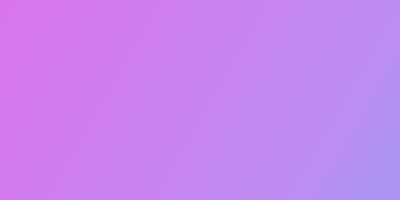
@keyframes fluxay {0% {background-position: 0;}50% {background-position: 100%;}100% {background-position: 0;}}.fluxay-box {width: 400px;height: 200px;/* 根据需要设置颜色 */background-image: linear-gradient(120deg, #db73ec, #be8ef3, #5ab4f5, #73ecec, #73ecb4, #a7ec73, #ecdd73, #eca073, #ec7389);background-size: 800%;animation: fluxay 8s infinite;}
文字流光效果
Animate.css官网的标题文字颜色效果。
@keyframes hue {from {filter: hue-rotate(0);}to {filter: hue-rotate(360deg);}}.text-hue {color: #f35626;background-color: coral;-webkit-background-clip: text;-webkit-text-fill-color: transparent;background-image: -webkit-linear-gradient(45deg, #f35626, #feab3a);animation: hue 12s infinite linear;}

若有收获,就点个赞吧
0 人点赞
