折线图/Line Charts
现在你已经熟悉编码环境了,是时候去学习如何制作你自己的图表了。
在这个教程中,你将学习仅用Python去绘制专业效果的折线图/line charts,之后,在下列的练习中,你将在真实世界中的数据集中展示你的新技能。
启动Notebook
我们从启动我们的编程环境开始。
In [1]:
import pandas as pdimport matplotlib.pyplot as plt%matplotlib inlineimport seaborn as snsprint("Setup Complete")
Setup Complete
选择数据集
本教程的数据集跟踪了音乐流服务 Spotify 上的全球每日播放量,我们先专注于2017年和2018年的五首流行歌曲:
- “Shape of You”, by Ed Sheeran (link)
- “Despacito”, by Luis Fonzi (link)
- “Something Just Like This”, by The Chainsmokers and Coldplay (link)
- “HUMBLE.”, by Kendrick Lamar (link))
- “Unforgettable”, by French Montana (link))
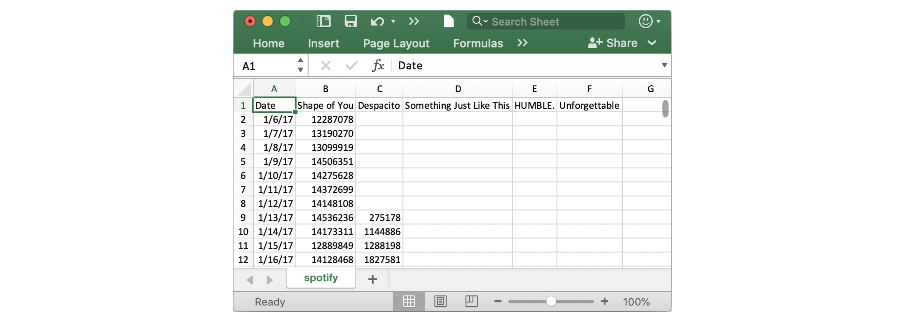
注意第一个日期是2017年1月6日,对应的是Ed Sheeran歌曲”The SHape of You”的发行日期。通过此表,你能看到”The Shape of You”在发布当天全球播放量是12,287,078。注意到其他歌曲在第一行没有值,那是因为它们还没有发行。
加载数据
跟你前面学到的一样,咱们还是用 pd.read_csv 加载数据。
In [2]:
# Path of the file to readspotify_filepath = "../input/spotify.csv"# Read the file into a variable spotify_dataspotify_data = pd.read_csv(spotify_filepath, index_col="Date", parse_dates=True)
运行完上面的两行代码后,咱们就可以通过 spotify_data 获取数据。
检查数据
咱们可以用 head 方法打印出数据的前5行。
In [3]:
# Print the first 5 rows of the dataspotify_data.head()
Out [3]:
| Shape of You | Despacito | Something Just Like This | HUMBLE. | Unforgettable | |
|---|---|---|---|---|---|
| Date | |||||
| 2017-01-06 | 12287078 | NaN | NaN | NaN | NaN |
| 2017-01-07 | 13190270 | NaN | NaN | NaN | NaN |
| 2017-01-08 | 13099919 | NaN | NaN | NaN | NaN |
| 2017-01-09 | 14506351 | NaN | NaN | NaN | NaN |
| 2017-01-10 | 14275628 | NaN | NaN | NaN | NaN |
现在检查数据的前5行跟上面的数据(你在Excel里看到的)一致。
空记录上会出现
NaN,它是“Not a Number”的缩写。
咱们当然也能看看最后5行啦,只需要一小点变化(把 .head() 改成 .tail()):
In [4]:
# Print the last five rows of the dataspotify_data.tail()
Out [4]:
| Shape of You | Despacito | Something Just Like This | HUMBLE. | Unforgettable | |
|---|---|---|---|---|---|
| Date | |||||
| 2018-01-05 | 4492978 | 3450315.0 | 2408365.0 | 2685857.0 | 2869783.0 |
| 2018-01-06 | 4416476 | 3394284.0 | 2188035.0 | 2559044.0 | 2743748.0 |
| 2018-01-07 | 4009104 | 3020789.0 | 1908129.0 | 2350985.0 | 2441045.0 |
| 2018-01-08 | 4135505 | 2755266.0 | 2023251.0 | 2523265.0 | 2622693.0 |
| 2018-01-09 | 4168506 | 2791601.0 | 2058016.0 | 2727678.0 | 2627334.0 |
谢天谢地,一切看起来都是正确的,每首歌曲每天有数百万个全球播放量,我们可以继续绘制数据了!
绘制数据
现在数据集已被加载到了notebook,咱们仅需要一行代码就行画张折线图!
In [5]:
# Line chart showing daily global streams of each songsns.lineplot(data=spotify_data)
Out [5]:
/opt/conda/lib/python3.6/site-packages/pandas/plotting/_matplotlib/converter.py:102: FutureWarning: Using an implicitly registered datetime converter for a matplotlib plotting method. The converter was registered by pandas on import. Future versions of pandas will require you to explicitly register matplotlib converters.To register the converters:>>> from pandas.plotting import register_matplotlib_converters>>> register_matplotlib_converters()warnings.warn(msg, FutureWarning)<matplotlib.axes._subplots.AxesSubplot at 0x7f5329aa3940>
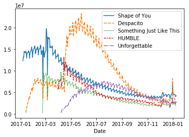
如同你看到的,代码真的短,有俩重要的部分:
sns.lineplot告诉notebook我们想要绘制一张这戏那图。- 你在这个课程学到的每个命令都会以
sns开头,这指出了这些命令都是来自 seaborn 库。举例,咱们用sns.lineplot画折线图,很快你将学到用sns.barplot和sns.heatmap去画柱图跟热力图。
- 你在这个课程学到的每个命令都会以
data=spotify_data用来选择会被用来画图的数据。
留意下你以后绘制图表时总会用相似的格式,而且唯一更改数据的方式就是数据集的名字。因此,假如你正在使用一个不用的数据集 financial_data,举例,要用如下代码:
sns.lineplot(data=financial_data)
有时还有其他细节要去调整,比如图形的大小跟图表的标题,每个选项都能被一行简单的代码配置。
In [6]:
# Set the width and height of the figureplt.figure(figsize=(14,6))# Add titleplt.title("Daily Global Streams of Popular Songs in 2017-2018")# Line chart showing daily global streams of each songsns.lineplot(data=spotify_data)
Out [6]:
<matplotlib.axes._subplots.AxesSubplot at 0x7f532994d940>
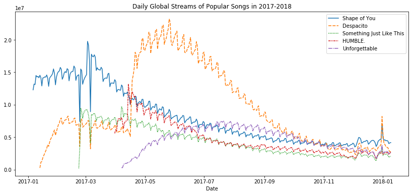
第一行代码设置了图形大小 14 英寸宽 6 英寸高,就靠这行代码你能设置任何图形的大小。接着,你要是想用一个定制大小,可以改变14和6的值成你希望的宽度和高度。
第二行代码设置了图形的标题,要注意标题必须总是用引号("...")括起来。
绘制数据的子集
到这儿,你已经学会了如何为数据的所有列画出一条线,在这节,你将学习如何画出所有列的子集。
我们首先打印出所有列的名字,用一行代码就可以了,你能使用到所有的数据集上———仅仅换下数据集的名字(在这里是sporify_data)。
In [7]:
list(spotify_data.columns)
Out [7]:
['Shape of You','Despacito','Something Just Like This','HUMBLE.','Unforgettable']
下面的代码单元格中,咱们画出与数据集中前两列对应的线。
In [8]:
# Set the width and height of the figureplt.figure(figsize=(14,6))# Add titleplt.title("Daily Global Streams of Popular Songs in 2017-2018")# Line chart showing daily global streams of 'Shape of You'sns.lineplot(data=spotify_data['Shape of You'], label="Shape of You")# Line chart showing daily global streams of 'Despacito'sns.lineplot(data=spotify_data['Despacito'], label="Despacito")# Add label for horizontal axisplt.xlabel("Date")
Out [8]:
Text(0.5, 0, 'Date')
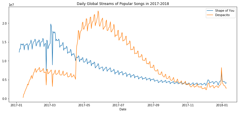
代码前两行是设置图形的大小和标题的(看起来很熟悉是吧)。
下面两行没行都添加一条线到折线图里。例如,考虑添加了”Shape of You”这条线的第一行。
# Line chart showing daily global streams of 'Shape of You'sns.lineplot(data=spotify_data['Shape of You'], label="Shape of You")
代码看起来很像咱们用来画出数据集所有线的代码,不过有一些关键的不同:
我们用了
data=spotify_data['Shape of You]代替data=spotify_data。通常,要只绘制一列,我们使用此格式将列的名称放在单个引号中,并将其括在方括号中。(为了确保正确指定列的名称,可以使用上面学习的命令打印所有列名的列表。)咱们还添加了
label="Shape of You"以让该线出现在图例中并设置了它相应的标签。
最后一行代码修饰了水平轴(或者X轴)的标签,其中所需标签应放在引号("...")中。
Waht’s Next?
Put your new skills to work in a coding exercise!

若有收获,就点个赞吧
0 人点赞
