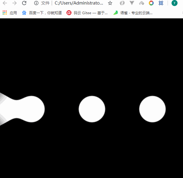
一、新建一个div水平居中
二、div装3个圆
三、对div进行flex布局
四、需要一个左右移动的影子
.circle:nth-child(2){box-shadow: 350px 0px 0px yellow;}
//动画@keyframes changePs{from{box-shadow: 350px 0px 0px yellow;}to{box-shadow: -350px 0px 0px yellow;}}.circle:nth-child(2){animation:changePs 2s infinite alternate linear/* 无限循环 交替的 匀速的*/}
五、filter //滤镜
.item{filter:blur(20px) contrast(20)/* 高斯模糊 对比度 */}
<!DOCTYPE html><html lang="en"><head><meta charset="UTF-8"><meta name="viewport" content="width=device-width, initial-scale=1.0"><meta http-equiv="X-UA-Compatible" content="ie=edge"><title>Document</title><style>body{margin:0;padding:0;background: #000;}.item{width:600px;height:600px;background: #000;margin-left: auto;margin-right: auto;display:flex;justify-content: space-around;align-items: center;filter:blur(20px) contrast(20)/* 高斯模糊 对比度 */}.circle{width:96px;height:96px;background: #fff;border-radius: 50%;}.circle:nth-child(2){animation:changePs 1.5s infinite alternate linear/* 无限循环 交替的 匀速的*/}@keyframes changePs{from{box-shadow: 350px 0px 0px #fff;}to{box-shadow: -350px 0px 0px #fff;}}</style></head><body><div class="item"><div class="circle"></div><div class="circle"></div><div class="circle"></div></div></body></html>

若有收获,就点个赞吧
0 人点赞
