Decoration(装饰)
- 装饰的抽象类,包含了一些装饰接口的定义(颜色渐变、背景、背景图、背景混合模式等)。Decoration是BoxDecoration及ShapeDecoration的父类。
BoxDecoration(盒子装饰)
BoxDecoration({// 背景色,如果color为null,则装饰不会绘制背景颜色this.color,// 背景图,如果color为null,则装饰不会绘制背景图像this.image,// 设置边框线的样式,含边框线宽、颜色、是否显示边框,使用Border对象创建this.border,// 圆角的弧度的半径,使用BorderRadius不同的构建方法可以统一或单独设置this.borderRadius,// 阴影集合,List<BoxShadow>类型this.boxShadow,// 渐变色设置this.gradient,// 设置背景色、背景图以及渐变色混合模式的属性,具体看BlendMode说明this.backgroundBlendMode,// 设置形状,只用枚举对象BoxShape,只有矩形和圆形可选this.shape = BoxShape.rectangle,})
- border与borderRadius注意事项说明:border可以单独设置每个方向上的颜色不同(使用Border构造方法创建),但是如果这样做,borderRadius设置的圆角属性将不起作用且会抛错。下图为border宽及颜色单独设置实现的效果图。

LinearGradient(线性渐变色)
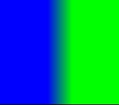
LinearGradient线性渐变,从某个点到某个点线性渐变。
LinearGradient({// 渐变起始位置,Alignment对象this.begin = Alignment.centerLeft,// 渐变结束位置,Alignment对象this.end = Alignment.centerRight,// 渐变色集合@required List<Color> colors,// 各个渐变色结束点,stops值数需与colors数相等,stops值范围在0~1之间List<double> stops,// 渐变重复模式this.tileMode = TileMode.clamp,})
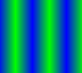
- titleMode效果与 begin及end属性有关,如果begin、end已跨越了整个控件(如begin=Alignment(0,0.5)、end=Algnment(1,0.5)),则看不出效果.只有begin和endAlignment横轴与纵轴跨度不到1时,才有效。以下分别为TileMode.clamp、TileMode.mirror、TileMode.repeated三种模式在线性渐变中的效果差异。

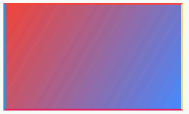
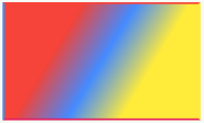
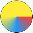
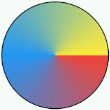
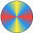
- 下图是通过设置BoxDecoration.gradient左上到右下角,红蓝线性渐变的效果图,以及红蓝黄三色渐变效果
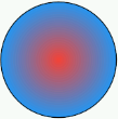
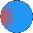
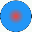
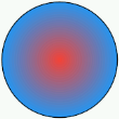
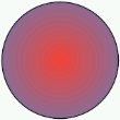
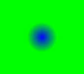
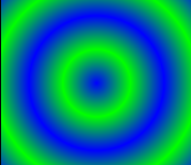
RadialGradient(径向渐变)
RadialGradient径向渐变,是以渐变圆心为中心,向外以同心圆的形式渐变。
RadialGradient({// 径向渐变中心点this.center = Alignment.center,// 渐变区域范围,0.5刚好全部区域都渐变this.radius = 0.5,// 渐变色集合@required List<Color> colors,// 各个渐变色结束点,stops值数需与colors数相等,stops值表示各个颜色占圆半径的比例List<double> stops,// 渐变重复模式this.tileMode = TileMode.clamp,// 焦点(暂时不清楚用法)this.focal,// 焦点半径(暂时不清楚用法)this.focalRadius = 0.0,})
- center = Alignment.center 与 center = Alignment.centerLeft
- radius = 0.25、radius = 0.5 与 radius = 1.0的差异,依次为0.25、0.5及1.0
- TitleMode.repeated、TitleMode.clamp及TitleMode.mirror

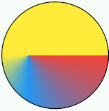
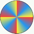
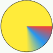
SweepGradient(扫描渐变)
SweepGradient扫描渐变,像钟表指针顺时针扫过的方向进行渐变
SweepGradient({// 扫描渐变中心点this.center = Alignment.center,// 渐变开始角度this.startAngle = 0.0,// 渐变结束角度最大为2π,且默认为2πthis.endAngle = math.pi * 2,// 渐变的颜色集合@required List<Color> colors,// 渐变结束集合List<double> stops,this.tileMode = TileMode.clamp,})
- center = Alignment(0,0)与 center = Alignment(-0.5,0)比对

- startAngle = 0.0时,endAngle = math.pi 与 endAngle = 2*math.pi 的比对图
- TitleMode.repeated、TitleMode.clamp及TitleMode.mirror比对图
ShapeDecoration
ShapeDecoration({// 背景颜色this.color,// 背景图this.image,// 渐变色设置(线性、中心放射)this.gradient,// 阴影设置(值为List<BoxShadow>、)this.shadows,// 边框形状设置(可设置类型如:CircleBorder、ContinuousRectangleBorder、RoundedRectangleBorder、BeveledRectangleBorder等继承自抽象类ShapeBorder的类)@required this.shape,})
ShapeBorder(边框)
- CircleBorder、RoundedRectangleBorder、ContinuousRectangleBorder及BeveledRectangleBorder都是继承自抽象类ShapeBorder。用于设置Widget的几何边框形状。
- BorderSize(边框属性)、边框设置,BorderSize是用于设置边框属性的类。
BorderSide({// 边框线的颜色this.color = const Color(0xFF000000),// 边框线的宽度this.width = 1.0,// 是否绘制边框线this.style = BorderStyle.solid,})
CircleBorder(圆形边框)
圆形边框
// 边框线的设置CircleBorder({ this.side = BorderSide.none })
BorderSize&&CircleBorder使用示例,及展示效果
Container(height: 60.0,width: 60.0,decoration: ShapeDecoration(shape: CircleBorder(side: BorderSide(color: Colors.green,width: 10.0,style: BorderStyle.solid,),),),)

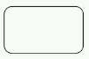
RoundedRectangleBorder(圆角边框)
- 圆角矩形边框,可统一或单独设置矩形各个角的圆角弧度(选用BorderRadius不同的构造函数)
RoundedRectangleBorder({// 边框线的样式,BorderSize对象this.side = BorderSide.none,// 边框圆角设置,可单独或统一设置矩形每个角的圆角弧度this.borderRadius = BorderRadius.zero,})
ContinuousRectangleBorder(连续矩形边框)
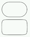
连续矩形边框,相对于RoundedRectangleBorder而言,ContinuousRectangleBorder(连续矩形边框)圆角和边框线之间过渡更为平滑。
ContinuousRectangleBorder({// 边框线的样式,BorderSize对象this.side = BorderSide.none,// 边框圆角设置,可单独或统一设置矩形每个角的圆角弧度this.borderRadius = BorderRadius.zero,})
下图为同样圆角弧度的RoundedRectangleBorder(圆角矩形边框)和ContinuousRectangleBorder(连续矩形边框)的对比图。上方的为RoundedRectangleBorder,下方的为ContinuousRectangleBorder。
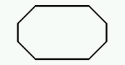
BeveledRectangleBorder(斜角矩形边框)
- 斜角矩形边框
BeveledRectangleBorder({// 边框线的样式,BorderSize对象this.side = BorderSide.none,// 边框圆角设置,可单独或统一设置矩形矩形角半径this.borderRadius = BorderRadius.zero,})
DecoratedBox(装饰盒子)
继承自Widget,为任意Widget(小部件)添加装饰的Widget(小部件)。
DecoratedBox({// 键Key key,// 装饰、如BoxDecoration或ShapeDecoration@required this.decoration,// 装饰作为前景或背景this.position = DecorationPosition.background,// 需要装饰的小部件Widget child,})
常用实践场景
圆形头像的几种实现方式
- 使用CircleAvatar实现
Container(width: 100,height: 100,child: CircleAvatar(backgroundImage: AssetImage('images/cat_gray.jpg'),),)

- 使用Container的decoration属性
或Container(width: 100,height: 100,decoration: BoxDecoration(shape: BoxShape.circle,image: DecorationImage(image: AssetImage('images/cat_gray.jpg'),fit: BoxFit.cover,),),)
Container(width: 100,height: 100,decoration: ShapeDecoration(shape: CircleBorder(),image: DecorationImage(image: AssetImage('images/cat_gray.jpg'),fit: BoxFit.cover,),),)

若有收获,就点个赞吧
0 人点赞
