BottomNavigationBar
Material Design风格的底部导航栏。
BottomNavigationBar({// 键Key key,// 底部导航栏的图标及文字样式,此处可以单独设置图标选中及未选中时的图标颜色及大小(此处设置的属性有限级最高,有限采用此处属性)@required this.items,// 底部导航栏的图标点击事件函数(默认会传入当前点击的按钮索引位置)this.onTap,// 当前选中按钮的索引this.currentIndex = 0,// 底部导航栏海拔高度,和投影范围及颜色深度有关(值为0时无投影,值越大投影范围越大且颜色越浅)this.elevation = 8.0,// 底部导航栏类型,一共两种fixed(图标固定大小)和shifting(选中图标有突出变大的动画,且可设置飞溅变换底部导航栏背景颜色)BottomNavigationBarType type,// 选中图标及文字的颜色,只能指定fixedColor和selectedItemColor之一,后者是首选,fixedColor仅为了向后兼容而存在Color fixedColor,// 底部导航栏的背景颜色,当type为shifting时,可以设置BottomNavigationBarItem.backgroudColor,选中后该颜色会飞溅覆盖导航栏的背景颜色this.backgroundColor,// 统一设置图标的大小(单独设置过图标大小的,不会受此属性影响)this.iconSize = 24.0,// 统一设置图标及文字选中的颜色(单独设置过选中的文字颜色及图标颜色,不会受此属性影响)Color selectedItemColor,// 统一设置图标及文字未选中颜色(单独设置过未选中文字颜色及图标颜色,不会受此属性影响)this.unselectedItemColor,// 统一设置选中的图标样式,含图标大小、透明度、颜色this.selectedIconTheme = const IconThemeData(),// 统一设置未选中图标样式,含图标大小、透明度、颜色this.unselectedIconTheme = const IconThemeData(),// 统一设置选择标签的文字大小this.selectedFontSize = 14.0,// 统一设置未选中标签文字大小this.unselectedFontSize = 12.0,// 统一设置选中的标签文字的样式,如颜色、大小、样式this.selectedLabelStyle,// 统一设置未选中标签文字的样式,如颜色、大小、样式this.unselectedLabelStyle,// 设置选中的标签文字是否显示this.showSelectedLabels = true,// 设置未选中标签文字是否显示bool showUnselectedLabels,})
unselectedLabelStyle和showSelectedLabels属性差异比对
两个值均被false时效果 两个值均被true时效果
- type属性差异比对
type值为BottomNavigationBarType.shifting type值为BottomNavigationBarType.fixed
- BottomNavigationBar.items概述
BottomNavigationBarItem({// 未选中导航栏按钮图标,可为Icon或ImageIcon类型,可以单独设置图标的颜色及大小@required this.icon,// 导航栏按钮标签文字,不管你要不要显示,必须设置否则报错给你看this.title,// 选中时导航栏按钮图标,可为Icon或ImageIcon类型,可以单独设置图标的颜色及大小Widget activeIcon,// BottomNavigationBar.type为shifting时有效,该颜色会在选中该按钮时以飞溅的效果覆盖导航栏原有背景色this.backgroundColor,})
BottomAppBar
通常与Scaffold.bottomNavigationBar一起使用,其有别于BottomNavigationBar。主要区在于Scaffold中使用FloatingActionButton,FloatingActionButton与底部导航栏重叠,使用后BottomanAppBar会有打孔的效果,而使用BottomNavigationBar则只是一般的重叠效果。对于实现底部导航栏需要的代码量而言,BottomanAppBar方式实现需要代码量要比BottomNavigationBar的方式要多很多,但是其可自定义性相对较高一些。
BottomAppBar({// 键Key key,// 颜色this.color,// 底部导航栏海拔高度,和投影范围及颜色深度有关(值为0时无投影,值越大投影范围越大且颜色越浅)this.elevation,// BottomAppBar形状this.shape,//this.clipBehavior = Clip.none,// 缺口边距this.notchMargin = 4.0,// 缺口边距this.child,})
BottomAppBar与BottomNavigationBar实现效果差异比对


BottomAppBar实现的打孔效果 BottomNavigationBar实现的重叠效果
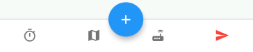
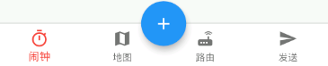
CupertinoTabBar
IOS中Cupertino设置风格的底部导航栏

若有收获,就点个赞吧
0 人点赞
