Tab参数
| 参数 | 说明 | 类型 | 可选值 | 默认值 |
|---|---|---|---|---|
| type | tab导航的样式 | string | light & dark | —— |
| navWidth | tab导航width | number | —— | —— |
| navHeight | tab导航height | number | —— | —— |
| activeColor | 高亮颜色 | string | —— | —— |
| activeBgColor | 高亮状态下背景色 | string | —— | —— |
| itemBgColor | tab导航item单个背景,default模式下为图上第二个tab效果 | string | —— | —— |
| navColor | tab导航统一颜色,highlight模式下可控制整体theme颜色 | string | —— | —— |
| navBgColor | tab导航背景色 | string | —— | —— |
| navBorderColor | tab导航边框颜色 | string | —— | —— |
| onNavClick | tab选项切换时点击事件,可用于自定义tab切换效果,返回false会阻止 tab切换,可用户实现loading效果 | function | —— | —— |
TabItem参数
| 参数 | 说明 | 类型 | 可选值 | 默认值 |
|---|---|---|---|---|
| label | 展示的title | string | —— | —— |
| navProps | 属性对象,定制导航slot时候会传递到slot-scope中,可在对应到slot中获取使用 | object | —— | —— |
| exists | 和v-if一个效果,控制tab是否渲染,因为整个tab使用slot实现用v-if实现响应效率不好,所以添加exists属性实现类似效果 | boolean | true | false & true |
Event
| 事件名称 | 说明 | 回调参数 |
|---|---|---|
| onTabSpill | tabIndex超出tab个数会小于0时会触发 | 新的value,tabIndex最大值 |
Slot
| slot name | 说明 |
|---|---|
| tab-nav-item | 可定制tab导航item,使用slot-scope可获取label, index, active, navProps属性,具体用法可参考demo |
引入代码
import Vue from 'vue'import { Tab, TabItem } from 'genie-ui'
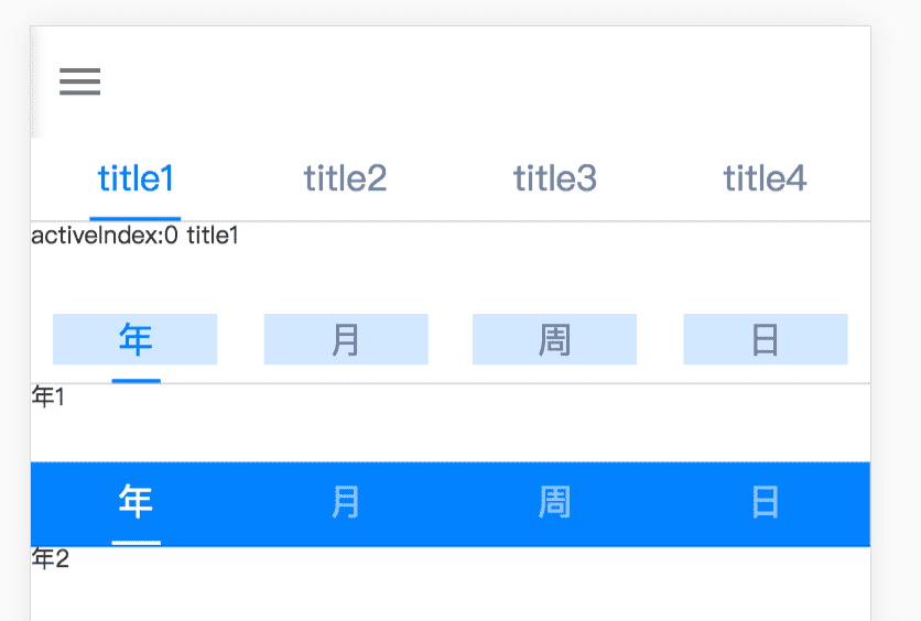
默认风格
// html<tab v-model="tabIndex" style="height: 80px" :nav-list="navList"><div slot-scope="{ activeIndex, nav }">activeIndex:{{activeIndex}} {{nav.label}}</div></tab>// jsdata() {return : {navList: [ { label: 'title1' }, { label: 'title2' }, { label: 'title3' }, { label: 'title4' } ]}}
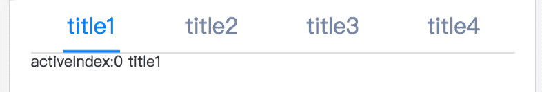
浅背景样式
<tab v-model="tabIndex" type="light" style="height: 80px"><iot-tab-item label="年">年1</iot-tab-item><iot-tab-item label="月">月</iot-tab-item><iot-tab-item label="周">周</iot-tab-item><iot-tab-item label="日">日</iot-tab-item></tab>
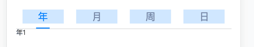
深色背景样式
<tab v-model="tabIndex" type="dark" style="height: 80px"><iot-tab-item label="年">年2</iot-tab-item><iot-tab-item label="月">月</iot-tab-item><iot-tab-item label="周">周</iot-tab-item><iot-tab-item label="日">日</iot-tab-item></tab>
使用slot定制导航item
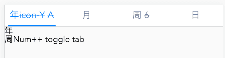
<template><div><tab v-model="tabIndex" ><span slot="tab-nav-item" slot-scope="{ label, index, active, navProps }">{{label}}<s v-if="navProps.icon">{{navProps.icon}}</s><s v-if="navProps.num">{{navProps.num}}</s><s v-if="active">A</s></span><tab-item label="年" :nav-props="{icon: 'icon-Y'}">年</tab-item><tab-item label="月" :exists="tabExists1">月</tab-item><tab-item label="周" :nav-props="propsWeek">周</tab-item><tab-item label="日">日</tab-item></tab><a @click="propsWeek.num++">周Num++</a><a @click="tabExists1 = !tabExists1">toggle tab</a></div></template><script>import Vue from 'vue'import { Tab, TabItem } from 'genie-ui'export default{components: {Tab,TabItem},data() {return {tabIndex: 0,tabExists1: true,propsWeek: {num: 1}}}}</script>

若有收获,就点个赞吧
0 人点赞
