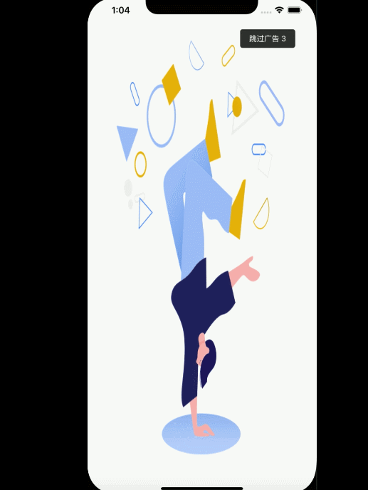
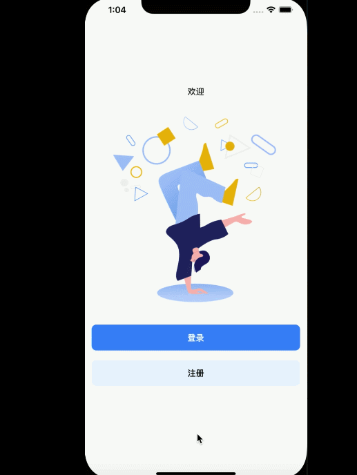
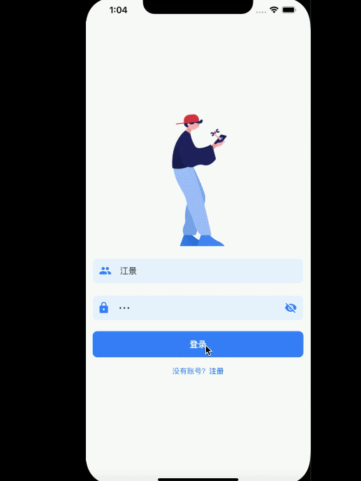
| 欢迎、引导 | 登录、注册 | 主页 |
|---|---|---|
 |
 |
 |
组件化
组件化编程就像是搭积木一样的开发。把整个应用拆分成许多部分,每部分各自管理自己的组件以及数据状态,这样达到一个更好的可维护性,可扩展性。
组件类型
展示组件
- 展示型组件并不维护数据状态,它更多的作用是用来展示效果与数据。
容器组件
- 容器组件并不涉及 UI 方面,而是负责处理数据与状态。
布局组件
- 特定的布局方式,建议是把它们封装成一个布局组件。
页面组件
页面组件负责当前页面的组件结构。
…
Flutter Widget
在 Flutter 中,Widget 大体分为两种
StatelessWidget
无状态组件,至始至终都不需要改变
StatefulWidget
有状态组件,需要根据状态改变而改变,根据状态展示
栗子
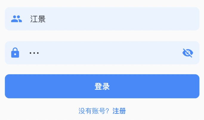
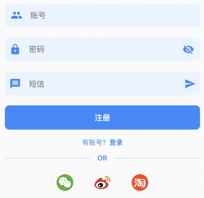
在构建一个登录、注册界面时,分析整体界面布局,发现有些样式基本上是一致的,只不过显示文案不一样,通常情况下,可以把它们封装成一组通用组件,传递属性控制其显示。
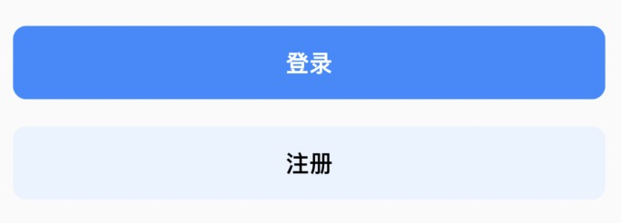
- 登录按钮、注册按钮
- 账号输入框、密码输入框
- 社交登录展示
- 这些组件在显示上是一致的,样式不一致,这样可以封装成组件,可以复用
按钮、输入框、社交登录按钮
Flutter Svg 图片使用
使用第三方模块
flutter_svgpubspec.yaml 添加依赖
flutter_svg:git:url: git://github.com/gskinnerTeam/flutter_svg.gitref: 12b55b464d2e253f411a17798527a7daa2c00ceb
SvgPicture API 调用
- 基本使用
SvgPicture.asset(iconSrc, height: 60.w, width: 60.w)
- SvgPicture.asset 可以加载显示一张 svg 图
- SvgPicture 更丰富 API 可以查看其文档
按钮封装
创建一个 widgets 包,专门用来放 app 组件
在 widgets 目录下也可以根据不同业务划分不同的组件;
- 比如登录、注册… 用来授权的界面组件,可以创建一个 auth 包
- 比如订单模块用到的组件,可以创建 order 包
- 通用的组件可以创建 common 包
- 具体划分需要根据 app 实际场景来做
创建 auth_button.dart
widgets -> auth -> auth_button.dart
命名 ATHAuthButton
ATH前缀,具体可根据项目名称或公司规则
class ATHAuthButton extends StatelessWidget {// 按钮显示文本final String text;// 点击事件final Function press;// 显示样式(颜色)final Color color, textColor;const ATHAuthButton({Key key,this.text,this.press,this.color = kPrimaryColor,this.textColor = Colors.white,}) : super(key: key);@overrideWidget build(BuildContext context) {return Container(// 设置边距// 24.w 16.w 使用 flutter_screenutil 模块提供的屏幕适配,// dart sdk>=2.6 版本扩展语法margin: EdgeInsets.symmetric(horizontal: 24.w, vertical: 16.w),// 宽度 double.infinity 表示撑满整个手机屏幕宽度width: double.infinity,// ClipRRect 可以裁截,设置圆角child: ClipRRect(borderRadius: BorderRadius.circular(16.w),// TextButton flutter 2.0 版本中新组件child: TextButton(onPressed: press,// 按钮样式style: ButtonStyle(padding: MaterialStateProperty.all(EdgeInsets.symmetric(vertical: 20.h)),backgroundColor: MaterialStateProperty.all(color)),child: Text(text,style: TextStyle(color: textColor,fontWeight: FontWeight.bold,fontSize: 28.sp),),),),);}}
社交按钮
- 创建 social_icons.dart
class ATHSocialIcon extends StatelessWidget {// 图片final String iconSrc;// 按钮事件final Function press;const ATHSocialIcon({Key key,this.iconSrc,this.press,}) : super(key: key);@overrideWidget build(BuildContext context) {return GestureDetector(onTap: press,child: Container(margin: EdgeInsets.symmetric(horizontal: 16.h),padding: EdgeInsets.all(16.w),decoration: BoxDecoration(border: Border.all(width: 2.w, color: kPrimaryLightColor),shape: BoxShape.circle,),// 使用child: SvgPicture.asset(iconSrc, height: 60.w, width: 60.w),),);}}
输入框封装
Flutter 输入框组件 TextField,输入框组件提供了可以输入能力
栗子: 账号输入框
创建 auth_account_input.dart
import 'auth_text_field_wrap.dart';class ATHAuthAccountInput extends StatelessWidget {final String hintText;// 输入框前缀图片final IconData icon;// 监听输入改变事件final ValueChanged<String> onChanged;// 输入控制器final TextEditingController controller;const ATHAuthAccountInput({Key key,this.hintText,this.icon = Icons.person,this.controller,this.onChanged,}) : super(key: key);@overrideWidget build(BuildContext context) {return ATHAuthTextFieldWrap(child: TextField(onChanged: onChanged,controller: controller,decoration: InputDecoration(icon: Container(padding: EdgeInsets.only(left: 16.w),child: Icon(Icons.people,color: kPrimaryColor,),),hintText: hintText,border: InputBorder.none,),),);}}
- InputDecoration 修饰输入框边框样式
ATHAuthTextFieldWrap
- 该组件只是为了统一边距
- 也可以省略该组件,设置其使用父容器边距即可
class ATHAuthTextFieldWrap extends StatelessWidget {final Widget child;const ATHAuthTextFieldWrap({Key key,this.child,}) : super(key: key);@overrideWidget build(BuildContext context) {return Container(margin: EdgeInsets.symmetric(horizontal: 24.w, vertical: 20.h),width: double.infinity,decoration: BoxDecoration(color: kPrimaryLightColor,borderRadius: BorderRadius.circular(16.w),),child: child,);}}

若有收获,就点个赞吧
0 人点赞
