文字相关
文字换行
word-wrap:break-word;word-break:break-all;overflow: hidden;/*这个参数根据需要来绝对要不要*/
超出隐藏
单行文字
p{width:100px;overflow:hidden;white-space:no-wrap;text-overfow:ellipsis;}
多行文字
p{width:100px;overflow: hidden;display: -webkit-box;-webkit-box-orient: vertical;-webkit-line-clamp: 2;}.text {width: 100px;word-wrap:break-word; /* 内容存在英语或数字时强制换行 */overflow: hidden; /* 隐藏溢出部分 */text-overflow: ellipsis; /* 显示省略符号来代表被隐藏的文本 */display: -webkit-box; /* 将对象作为弹性伸缩盒子模型显示 */-webkit-box-orient: vertical; /* 设置盒子内排列顺序为纵向 */-webkit-line-clamp: 2; /* 限制块元素显示的文本的行数 */}拓展内容适用范围 : 因为使用了Webkit的css拓展属性,该方法适用于Webkit浏览器以及移动端注: 1.-webkit-line-clamp用来限制在一个块元素显示的文本的行数为了实现该效果,它需要组合其他的WebKit属性。常见结合属性:2.display: -webkit-box; 必须结合的属性 ,将对象作为弹性伸缩盒子模型显示3.-webkit-box-orient 必须结合的属性 ,设置或检索伸缩盒对象的子元素的排列方式
需要注意的是:
将height 设置为 line-height 的整数倍,防止超出的文字露出。
可参考文档 :https://juejin.im/post/5acccdab5188255cb07d7386
文字竖排
1.transform:rotate()
<!DOCTYPE html><html><head><title>test</title><meta charset="UTF-8"></head><style>.one {margin: 150px auto;width: 200px;font-size: 20px;line-height: 24px;transform:rotate(90deg);-ms-transform:rotate(90deg); /* IE 9 */-moz-transform:rotate(90deg); /* Firefox */-webkit-transform:rotate(90deg); /* Safari 和 Chrome */-o-transform:rotate(90deg); /* Opera */}</style><body><div class="one">欲话毗陵君反袂</div><div class="one">ENGLISH</div></body></html>
2.break-word
word-wrap: break-word;/*英文的时候需要加上这句,自动换行*/word-break:break-all;
3.writing-mode
writing-mode:vertical-rl | vertical-lr | lr-tb | tb-rl
- vertical-rl:垂直方向自右而左的书写方式。即 top-bottom-right-left
- vertical-lr:垂直方向内内容从上到下,水平方向从左到右
- lr-tb:从左向右,从上往下;
- tb-rl:从上往下,从右向左。
去除button默认样式
border: 1px solid transparent;outline: 0;
去除原生 textarea 右下角样式
textarea{resize:none}去边框border:none
css实现常用图形
https://www.zhangxinxu.com/wordpress/2019/01/pure-css-shapes/
三角形
向上三角形<div class="div"></div>.div{width: 0;border-left: 50px solid transparent;border-right: 50px solid transparent;border-bottom: 100px solid red;}向下三角形.div{width: 0;border-left: 50px solid transparent;border-right: 50px solid transparent;border-top: 100px solid red;}方向朝左.div {width: 0;border-top: 50px solid transparent;border-right: 100px solid red;border-bottom: 50px solid transparent;}方向朝右.div {width: 0;border-top: 50px solid transparent;border-left: 100px solid red;border-bottom: 50px solid transparent;}
三角形实现原理
带尖角的说话泡泡
按钮
设置条件:
字体颜色
外边框颜色
长度宽度固定
需要注意:
内容文字长度不固定
文字一般都是居中状态
<div class="btn">工具齐全</div><view class="btn">工具齐全</view>
.btn{width: 100px;height: 50px;border: 1px solid black;font-size: 18px;color: #333;display: flex;justify-content: center;align-items: center;}.btn{width: 100rpx;height: 50rpx;border: 1rpx solid black;font-size: 18rpx;color: #333;display: flex;justify-content: center;align-items: center;}
标签
设置条件:
字体颜色
外边框颜色
padding 边距
需要注意:
内容文字长度不固定
需要使用行内块元素 ,在不设置宽度的情况下,border会默认浏览器宽度。
<div class="tag">工具齐全</div><view class="tag">工具齐全</view>
.tag{padding:10px;color:#999;font-size:26px;border:1px solid black;display:inline-block;}.tag{padding:10rpx;color:#999;font-size:26rpx;border:1rpx solid black;display:inline-block;}
加载更多的样式
示例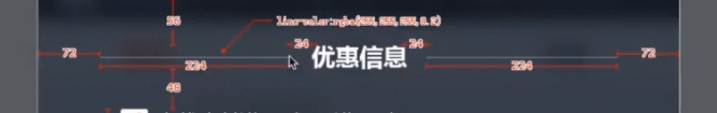
需求:根据不同的屏幕适应,实际上线条的长度长度不是固定的,是自适应的
布局模板
<div class="title"><div class="line"></div><div class="text">优惠信息</div><div class="line"></div></div>.title{display: flex;width: 80%;margin: 28px auto 24px auto;}.line{flex:1;position: relative;top: -6px;border-bottom: 1px solid #ccc;}.text{padding: 0 12px;font-size: 14px;font-weight: 700;}
中间文字,两边横线
https://blog.csdn.net/qq_36671474/article/details/77371588
使用伪类
<!DOCTYPE html><html><head><meta charset="utf-8"><title>CSS伪类实现中间文字两边横线效果</title><style>.wrap {position: absolute;text-align: center;width: 100%;}.wrap div {line-height: 20px;}/*CSS伪类用法*/.wrap div:after, .wrap div:before {position: absolute;top: 50%;background: #ddd;content: "";height: 1px;width: 45%;}/*调整背景横线的左右距离*/.wrap div:before {left: 0;}.wrap div:after {right: 0;}</style></head><body><div class="wrap"><div>暂无数据</div></div></body></html>
Tooltip 文字提示
跟随三角形
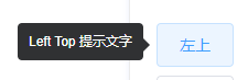
- 伪元素
2.绝对定位
页面占满
position: absolute;top: 0;bottom: 0;left: 0;width: 100%;
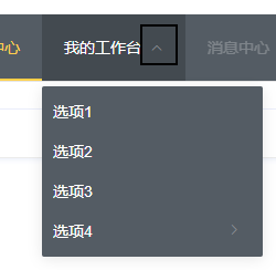
navMenu
右侧下拉按钮 跟随鼠标hover,进行展示
按钮实现 : 字体图标/图片
按钮变化 : 翻转
transform : rotate(180deg)
遮罩层
.mask {position: absolute; //或者 fixedwidth: 100%;height: 100%;top: 0;left: 0;background:rgba(0,0,0,0.6) //使用rgba 而不是 opacity}
::after伪类
实现下划线,右侧线等效果
.article-box {padding-top: 15px;padding-bottom: 15px;position: relative;}.article-box:after {content: " ";position: absolute;height: 5px;right: 0;bottom: 0;left:0;background-color: #E9E9E9;border: 1rpx solid lightgray;}

若有收获,就点个赞吧
0 人点赞
