作者Olha bahaieva
Being a designer means using a lot of tools at the same time. You want to build the app and share the project with your team. Google has the best options for you to collaborate with other team members.
作为一个设计师意味着你需要同时使用许多工具。你想要构建一款应用程序,并且将它分享给你的团队。谷歌为你提供了与其他团队成员合作的最佳选项!
Google tools are excellent for file management or booking a call. You can use a spreadsheet for your data, and many more. It’s so convenient. You’re happy to use all this. It makes your life easier and more productive.
谷歌工具对于文件管理或是预约电话还是很棒的的。你也可以用电子表格来记录你的数据或是其它东西。它真的太方便了!你乐于使用这些东西,因为它让你的生活更加的轻松,也更加有效率。
But Google did a big nasty surprise! They refreshed icon design, and your eyes feel pain now. What’s happened?
但是谷歌最近做了一个令人厌恶的重大惊喜!他们重做了Icon的设计,让你感觉辣眼(原文为:你的眼睛现在感觉痛了)。那么到底发生了什么?
Color Doesn’t Work Anymore
颜色不再好使了(或1.颜色不再行得通了2.颜色不再可行3.颜色不再起作用了)
Ok, here is the drum sound. New icons are available in your G-Suite. It sounds interesting; you want to check them right away. But when you open your Google tools, you see the same crazy things. This is a new icon design.
好的,鼓声起(用来制造氛围)。新的icon已经能在你的G-suite显示了。这听起来很棒,你迫不及待地想看看它们。但当你打开你的谷歌工具时,你会发现同样令人抓狂的事情——这是一套新的icon设计
I want to remind you how old icons worked.
我想先提醒下你,旧的图标是怎么发挥作用的
If you see a white icon with red strokes, it’s an email icon. If you see blue, it’s a calendar or documents. Green stands for Google Hangouts. It’s so good if you pick the right tool within one second by color.
如果你看到一个白底红边的图标,那是邮件。如果你看到蓝色的图标,那有可能是日历或者文档。绿色的则是谷歌环聊(Google hangouts,一款聊天工具)。这太棒了,因为你能在一秒内就通过颜色选对工具。
That’s was a distinguished difference for you before. Now it’s gone, and with this recent change, Google killed this visual difference.
在以前,那些区别对你来说是很明显的的(或者很显眼的,很好区分的)。但随着最近的这次修改,这种区别度没了,谷歌杀死了这种视觉差异。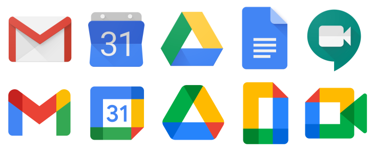
Compare the first line of icons with the second one from the image above. What do you see in the first line? I see how icons vary. You can see it too. But let’s compare the old and new designs.
将上面图片第一行的图标与第二行的比较下。你在第一行图标里发现了什么?我发现了图标间的差异,这你也能发现。来,让我们将新的设计设计与旧设计做个对比。
New icons look almost the same. And here is a big problem. You need over 2–3 seconds to understand what’s tool is in front of you. Did you have the same experience with the old icon design? No.
新图标看起来几乎是一摸一样的。然后现在有一个大问题。你需要2到3秒钟来搞明白你面前的工具到底是什么?你在看旧icon设计时有这种体验吗?没有。
In the new design, Google lost the quickest way to differentiate tools with color variation.
在新的设计中,谷歌失去了这种用颜色变化来区分工具的最快方式。
This meme will blast your mind. Do you see the new design the same? I agree with this comparison.
这个迷因(meme,即网络梗图)会冲击你的想法。你能发现新设计长的都一样吗?我认同这种对比(或者比较,或者这张meme的对比)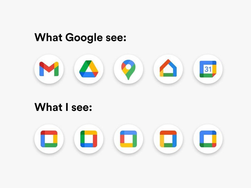
Image from Reddit(图片来源:Reddit)
With the recent change and small icon size, all designers will spend more time. Selecting the proper tool from this drop-down is not as fast as it was.
随着最近的修改以及小的图标尺寸,所有的设计师都将会花更多的时间(去辨认图标)。从下拉选单中选择合适的工具不再像以前一样快速。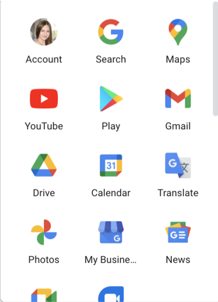
Image by Author
What’s your reaction to this mess? Where is the X tool I’m looking for? And you’ll be right. I see all the tools the same also.
你对这堆杂乱无章的东西第一反应是什么?我要找的XX工具在哪呢?你是对的(“太对了”更符合中文),我看这些工具时也是同样的反应。
Geometry Design Makes Icons Worse
几何化设计让图标变得更糟糕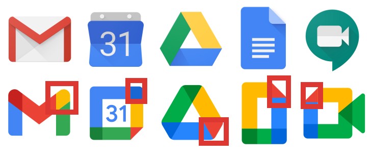
Effect by Author. Image Credits: Google
Do you see these geometry parts? Well, color isn’t the only problem with new icons. Google wanted to make icons universal for all their tools. And now they have something in common. This is an overlapping effect for corners.
你看到了那些几何化的部分了吗?嗯,颜色不仅是新图标唯一的问题。谷歌想让(这种)图标(风格)适用于他们所有的工具。于是,这些图标现在就有了一些共同点,就是圆角的重叠效果。
Geometry overlapping corners become such a solution. Yes, icons have something in common now. But all icons stopped work for users even more than with the color issues. Color isn’t the only problem now.
几何重叠圆角就这样成了一个解决方案。是的,现在的图标确实有一些共同点。但与颜色问题相比,(这样的解决方式)所有的让用户更弄不清这些图标了。颜色现在不是唯一的问题。
Now, all icons are similar. There is the same color mix plus overlaps. Design similarity comes with a shape solution.
现在,所有的图标都很相似。相同的颜色组合加上重叠。设计的相似性又有了形状解决方案。(可删,不是很好,只是想表达谷歌为了图标设计的相似性,用了这种形状解决方案,作者反讽)
The good news is the general icon shape stays as it was. This somehow helps to identify tools. The simplicity of design has holes inside of some icons. It’s a way to balance complicated shape overlaps. The white spacingsalso help somehow.
好消息是整体图标形状还保持着原样。这在某种程度上有助于识别工具。这些简洁的设计也在一些图标中保留了一些洞。这是一种平衡复杂形状重叠的方法。白色的间距同样对于(平衡复杂形状重叠)也有一定的帮助
Overlaps aren’t solid. Google designers used it in different places of icon shapes. It means that not all corners have such an effect. It’s another proof for minimizing visual simplicity.
(这些)重叠也并不是一致的(统一的,牢固的,solid也有一致的意思)。谷歌设计师把重叠用在图标形状的不同地方。但并不意味着所有的圆角都用了这样的效果。这也是另一个他们降低了视觉简洁性(visual simplicity)的证明。
Viewing the whole icon picture doesn’t seem to look better from all these design attempts.
从所有的这些设计尝试来看,整个图标的观感并没有变得更好。
People With Disabilities Have More Problems Now
残障人士(或“障碍人士”更好?)现在的问题更多了
When you design an app or website, you think about contrast and how well colors combine. It also includes checking your product for standards for people with eye disabilities. It might be a contrast or color check. Or even both.
当你设计一个app或者网站时,你会考虑对比度和颜色的组合。这同样包括检查你的产品是否符合有视觉障碍人士的标准。它可以是一个对比度或者颜色检查。甚至二者都有。
The new Google icon design can’t pass any usability test for icons. It’s impossible.
新的谷歌图标设计无法通过任何图标的可用性测试。这是不可能的(它们绝对通过不了测试)
I have advice for Google designers. When you almost close your eyes, try to find the proper icon. You’ll see that it’s not possible.
我对于谷歌的设计师有个建议:当你几乎闭上眼睛的时候,试着找到合适的图标。然后你会发现:那是不可能的。
If you can’t recognize the proper icon, so what about people with disabilities? They need no comments. Just look here.
如果你认不出合适的图标,那么残疾人呢?他们(甚至)不需要评论,看看这里就知道了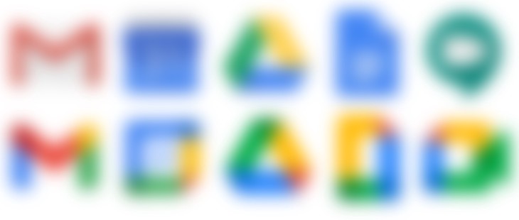
Effect by Author. Image Credits: Google
In the first line, I can make a difference between the tools. But in the second row, I have doubts. And yes, I have standard eyes — I have no problems.
在第一行,我可以区分出不同的工具。但在第二行,我会很困惑。是的,我没有视力问题——我的视力合格(原文是:我有标准的眼睛——我没有问题,会让人读不懂)
To not repeat Google’s design mistake, it’s worth checking your icons properly with all tests. And even 1–1 session. Icons are as important as an app or web design. They need testing.
为了不重复谷歌的设计错误,值得用所有的测试来检查你的图标是否合适。甚至是一对一采访(1-1 session)。图标像app和网页设计一样重要。他们需要测试。
And even more. We must validate every design concept. The more validation, the better.
甚至,我们一定要验证每一个设计概念。验证越多),结果越好(原文:验证越多越好)
The main takeaway here is that if you aren’t familiar with previous design icons, it’s hard to identify new tools. I have a good visual memory to combine my old icon knowledge with a new design and find the proper tool. And again, I will need over 2–3 seconds to think about it.
这里我主要的心得是,如果你不熟悉以前的图标设计,就很难识别新的工具。我有很好的视觉记忆力来将新的设计和对旧的图标认知结合起来并且找到合适的工具时。但每当我这样做时,我也需要2-3秒以上的时间思考(直接翻译意思不明确,就意译了)
If you go further with the target audience and segmentation, you find that Gen Z will have new icon problems, and here is why. If I’m Gen Z, I don’t use Google’s tools every day — I better spend my time on social media.
(需要补一句:那么可能对于习惯了扁平化设计的Z世代,他们更容易接受吗?)如果你进一步了解目标受众和划分,你会发现Z世代(1995到2005出生的人)有新的图标问题,原因如下:如果我是Z世代,我不会每天使用谷歌工具——我最好把事件都花在社交媒体上。
And let’s assume that Gen Z starts to using Google’s tools every day. It’s inconvenient to read tool titles every time. But what to do if icon design is similar right now?
我们假设Z世代开始每天使用谷歌的工具。每次都要看工具标题是很不方便的。但如果现在的图标都很相似,该怎么办?
Millennials know old design. It’s much easier for them to make tool identification, but it’s not user-friendly. And the older the generation, the more problems they have. But it’s just another detail. Design is all about details.
千禧一代知道老设计长什么样。对于他们来说,识别工具要容易得多。但这并不方便用户使用。而且越是老一代,他们的问题越多。但这只是另一个细节。设计全是关于细节的(或者翻译成设计就是由细节组成的,或者设计就是有关于细节的)
Final Thoughts
最后的总结
As a designer, you’re using Google tools every day. It means you repeatedly click on icons. With the recent Google change, you’ll spend more time identifying the tool you need.
作为一名设计师,你每天都在使用谷歌工具。这意味着你反复点击图标。随着最近谷歌的变化,你将花费更多的时间来识别你需要的工具。
If I was a Google designer, I went over A/B testing to clarify if this new design works or not. I read a lot of bad feedback about Google’s recent change. All designers need to be aware of similarities that can kill your workflow.
如果我是谷歌的设计师,我就会通过AB测试来明确这个新设计是否可行。我读到了很多关于谷歌最近变化的糟糕反馈。所有的设计师都需要意识到相似性会扼杀你的工作流程。
Google’s example perfectly shows how old design works better than new. It’s worth including visual differentiation in your own design. Google’s example is an outstanding example of a designer’s mistake. Don’t repeat them.
谷歌的例子完美地展示了旧设计如何比新设计更可行。在你自己的设计中,加入视觉差异是值得的。谷歌的例子是一个设计师犯错(原文为:“设计师的错误”,不通)的杰出例子。切忌重蹈覆辙

